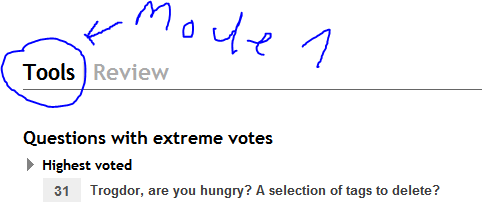
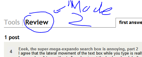
It seems one of my suggestions in Usability Improvements for the > 10k Moderation Tools had been implemented. One or two days ago, the "review" link disappeared from the Tools and appeared on the top navigation bar.
This was a great usability improvement, as most 10k+ users that I know check both "review" and "tools" on a frequent basis. The (almost hidden) link to "review" that we used to have within Tools seemed quite inefficient. This has all been described in Proposal 2a of my feature request.
Starting August 15th, to the surprise of many, the "review" link disappeared again!

I therefore propose that the "review" link should be put back into the top bar again. It allows for quick and easy navigation between two completely different moderation tools with expressly different use cases. We should be encouraging people with 10k+ rep to click on this link and spend some time helping to clean up the site.
The top bar for 10k+ users should really look like this:

If you really think that 5 links in the toolbar is too many (even considering the generally massive size of screens nowadays), then you could hide the "faq" link instead. It isn't really needed by 10k+ users, and if they do need to access it, they can always do so through the link in the footer at the bottom of the page.
The current "stop-gap" approach with nested tabs is a truly horrible piece of UI, unlikely to be discovered or frequented by the users we should be aiming to attract with this feature. Something else needs to be done, and it might as well be something that makes this more conspicuous rather than less.


reviewhasn't been displaced byblog, I don't see it on sites where I have 10k rep, even when there is noblog.review - chat - main - about - faq. Like Al, on Android I seemod - tools - chat - meta - faq. No other sites with 10k rep for me to test ...