Is it possible to remove the annoying ad with the dying starfish?
Certainly, this is not what my career should feel like.

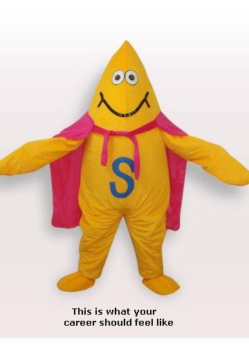
To address this issue, I suggest the immediate casting of a new, less lackluster starfish. I propose this fellow:

Justice has been done! The SE Director of Marketing contacted me last night and the super-starfish has been signed for a modelling contract with Stack Overflow.
Yeah. And there's a lot more wrong with that ad than just that.
The orange of the starfish is potentially offensive for people who don't like dutch royalty and/or victims of the Orange Free State.
the Careers logo looks like the reception bars on your mobile phone; the fact that there's six bars could make people from rural areas with bad reception feel inferior. Did anybody think of that when dreaming this up in their fancy New York office?
the "this is what your career should feel like" text is hovering above the water. Are you insinuating that my career is supposed to sink? Or that it is about to sink?
regarding showing careers ads in general. Isn't this sending the message that my career isn't going exactly as it should? How dare you suggest such a thing?
I suppose if you're the sort of person who identifies with the starfish, you could take it badly.
But what if you identify with the viewer: the overlord staring down on the starfish, which is withering in the hot rays of your unbridled contempt!
Yes, what if your career is that of a senior developer, and the starfish is one of your unworthy minions! The starfish is gasping, begging, to drink in the delicious seawater of your knowledge? Your career is to pick up that sad, startled, starving starfish and place him lovingly back into the ocean of your vast experience -- leaving behind the unblemished beachfront of pristine architecture
It's all in how you look at things.
Having looked at this for a while, I can see how this is offensive in oh so many ways. For the sake of being constructive, how about a more neutral alternative:

Surely you can't find any fault with that....
This is what your career should feel like followed by a bottom bar in the colour of crap, yeah, nothing at fault with that.
I was walking along the beach one day and I noticed a boy in the distance. When I got closer, I saw that there were thousands of dying starfishes on the beach and he was throwing them one by one back into the sea.
I said "There are thousands of starfish and you'll never be able to save them all"
Then he started throwing them at me
I'm not a fan of the orange. In Canada, that could be misinterpreted as support for the NDP party. As such, I'm recommending a design which doesn't favour any particular color over another. This way we can appear politically neutral and avoid any sort of pointless controversy.
Also, the font should suggest my career should be a little more fun, don't you think?

Yes, of course it's dying. Starfish out of water, like any fish out of water, need to be thrown back into the sea as soon as possible. All they can do is lie there, hoping that someone will rescue them! What's pleasant about that?
Therefore, I propose this. Much, much better.

Or if they mean your career should feel like the kind of holiday where you do nothing but lie on the beach all day, well, these things get old really soon, and make you itch (as does the sand) for going back to your real job, doing real things again.
Or do they want you to identify with a the life of a starfish, having only your five paws to type with, thinking in base five and having a hard time with numbers in base ten?
I mean, they can't just mean that your career should feel like a starfish, do they? I'm not entirely sure what a starfish feels like, but I'm quite certain I don't want my job to feel like that.
No, not a good ad.
In the interest of addressing concerns that the above ads focus excessively on careers, I have mocked up the following ad:

This one is the ultimate I think:

status-completed?