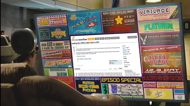
[Update 2]
I've provided feedback and this doesn't seem to be going anywhere different. So I'm done with this question and all the responses and comments. Let this RIP.
[End of Update 2]
[Update]
OK guys, for all you funny people out there, here's a screenshot of what I see (with the ads highlighted in red). I find the Red Gate Software ads very distracting and ugly on a useful website like Stack Overflow. On a quick look (the way humans usually browse) can you tell whether the question on this page is "Zero in on memory leaks rapidly" or "store image in database or in a system file? [closed]"? I find the single ad on the sidebar to be somewhat OK, although it's also huge. But the ads interleaved between the question and the answers just don't look good. They should either be smaller in size or removed from that column altogether.
It's not just the Red Gate ads, many other ads look distracting and make it difficult to read the actual question and answers.
[End of Update. Read on for the original post.]
I'm marking this as a bug since it's making the site painful to use.
Why has Stack Overflow become so bloated with heavily distracting graphical ads? Weren't the previously displayed ads on the sidebar making enough money?
I understand the need for money to run a heavily loaded site like this, but it's getting worse with time. It used to be better looking some months ago. Now huge graphical ads show up everywhere and make it difficult to even read the question and answers (on the side, between the title and question, between answers, and so on).
I'm hoping someone from the core Stack Overflow team would respond before anyone else decides to trash this question as irrelevant.


shoes. How boring.