11

I was recently editing a rather long answer on Worldbuilding.SE (but this applies everywhere), and I was trying to see what my formatting looked like and if it was working correctly. However, because of the long answer, the top of the markdown box was in the way and I had to scroll down to see what I had been typing. This gets annoying when I have to do it a lot.

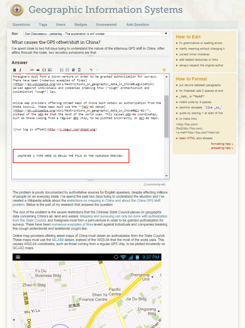
My feature request is to have an option to put these boxes side-by-side so that we can see both what we are typing and what that looks like when rendered with Markdown.

NOTE: For users who do not want the UI changed/think it won't work: enter image description here
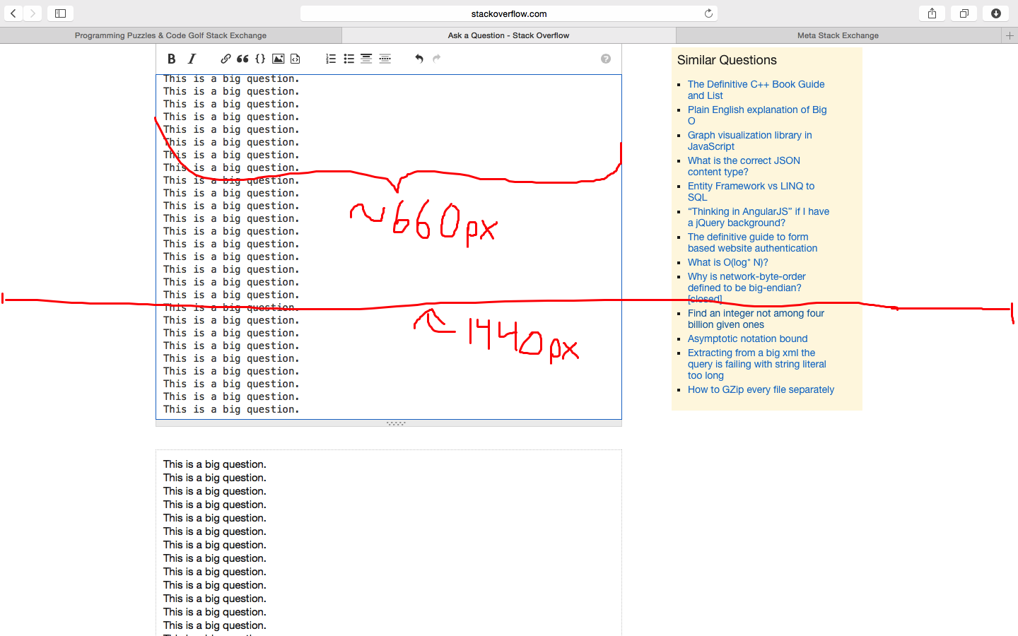
This is how it looks on my computer. There is a lot of margin space to use up for this if some layout changes are acceptable. Also, I think it would be a better idea (than my original feature request) to add an option to do this instead of just putting the boxes side by side, especially because there is not as much margin space on smaller monitors to use. After reading comments, I can see many mixed opinions about whether it would work.

3
  • 3
    This doesn't work, you want neither the textbox nor the rendered HTML to be so narrow that they fit next to each other.
    – yo'
    Commented Feb 17, 2015 at 19:24
  • 2
    I feel the pain here. I have a large monitor and it would be nice to toggle an option to view the editor and preview side-by-side. Commented Feb 18, 2015 at 1:41
  • Here's a feature request to implement side-by-side preview the same way Discourse does. Commented Apr 9, 2015 at 22:21

2 Answers 2

2

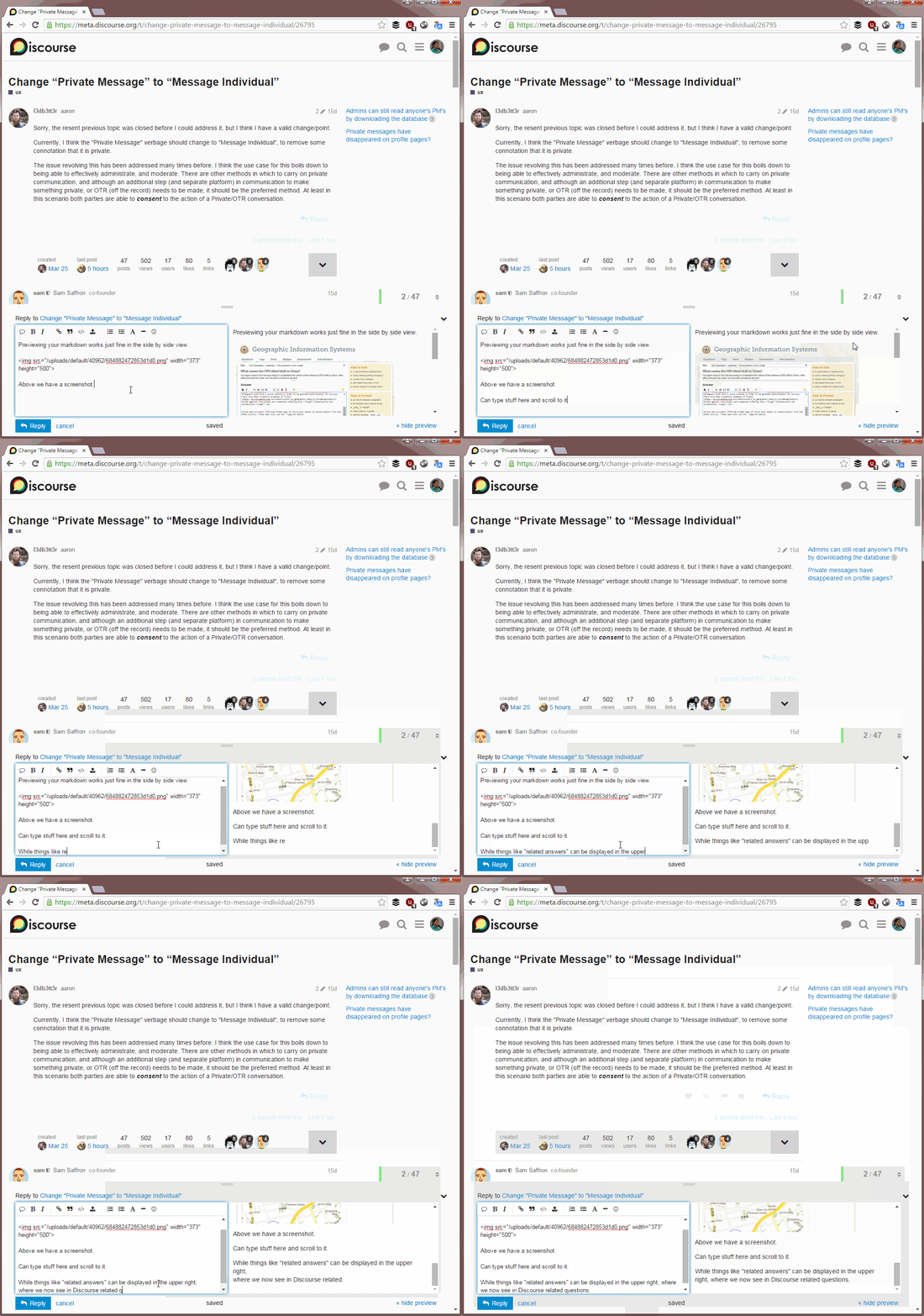
I'm often writing or editing answers that include a screenshot, which make accessing the preview annoying - one has to scroll the page up and down constantly:

Scrolling up and down constantly is annoying

Ironically, I have to this right now as I type this answer.

But he'res a better way, which we see on Discourse.org:

Discourse does it better

So I've filed a feature request to...

implement side-by-side preview the same way Discourse does.

1

I can't imagine that I have a narrow textarea with a narrow preview of what is supposed to be my post. Since the width wouldn't fit, it wouldn't even work as a preview. Maybe it would for plain text (but who needs preview for plain text), but as soon as you include images, headers, code snippets etc., the width starts to play a very important role.

My approach is that I learned how the markdown syntax works, including nuances like "a code block inside a list or a quote" and "a backtick inside an inline code", and "lists nested in lists", and since then, I don't use the preview but to check that code blocks and images fit in the page. Changing the width would remove this feature of the preview.


Considering the drawing that has appeared with the question: The 660/1440 px idea is plain wrong. The right panel that contains useful stuff (especially the Similar Questions, if only more people clicked couple of them before hitting "Post Your Question", the number of dupes would drop significantly), and you have to count it as well. The page width is 980 px, This means that a 1600-pixel-wide screen is actually not enough.

8
  • 2
    For us with larger resolutions it would work just fine, just as the OP illustrated.
    – jgauffin
    Commented Feb 18, 2015 at 6:20
  • @jgauffin That means two designs for each site, automatic switching between them based on the width, etc. Nothing that would be expected to ever happen.
    – yo'
    Commented Feb 18, 2015 at 9:01
  • 1
    Two designs? I think not. It can be solved with media queries and CSS. Or as kittycat suggested, with a checkbox. Nothing that would be expected to ever happen, are you working at SO? If not, don't speak on behalf of them.
    – jgauffin
    Commented Feb 18, 2015 at 9:03
  • @jgauffin I wrote "expected to", so it is clearly my expectation, so please do not read what I did not write. It's just my guess based on my previous experience here, and on my own experience with website design. You want multiple designs only when the gain from it is large, because the troubles it brings are large. And "solved with media query and CSS" actually means "debug the new feature on all 100+ site designs, get bug reports on a half of them because something went wrong, even so slightly. Etc."
    – yo'
    Commented Feb 18, 2015 at 9:13
  • I simply stated that your own experience have nothing to do with the decision. 1. All sites run the same codebase. 2. If you adjust the HTML in the post-editor tag it would be quite easy to toggle between horizontal and vertical layouts with css.
    – jgauffin
    Commented Feb 18, 2015 at 9:21
  • @jgauffin If things are so simple since all sites run the same codebase, then why we have 42 design bugs on TeX.SX? Now multiply it by the number of sites. The fact that the codebase is the same doesn't make things trivial, it only makes them simpler. Btw, you simply stated something, why the imperative in this your sentence? "If not, don't speak on behalf of them."
    – yo'
    Commented Feb 18, 2015 at 9:24
  • My first reaction was that you worked for SE due to your statement. I just felt that it would be easier if only them expressed something regarding if it will be implemented or not. Anything else is just guesses and nothing that helps the OP. Regarding design bugs, I'm not saying that everything is easy. This change has a limited scope.
    – jgauffin
    Commented Feb 18, 2015 at 9:30
  • I've addressed changing the width vs. code block scrolling in this feature request to implement side-by-side preview the same way Discourse does. Commented Apr 9, 2015 at 22:21

Not the answer you're looking for? Browse other questions tagged .