181

I come from lands afar, also known as Hardware Recommendations Stack Exchange. Over there, we have a serious problem with first-time Stack Exchange users coming along and asking off-topic questions - to the extent that 50% of incoming questions are closed. We've had a few attempts at solving this, but none have really worked.

So, this afternoon, I got together a group of people who had never seen Stack Exchange before. I gave them each a question (on various topics, each intended for a different site in the network), and asked them to find the most appropriate site to ask it, noting down the troubles they had along the way.

(They were all terrible questions, though the topic was clear. I did ask them not to actually post, but, by happy chance, the one who actually did demonstrated my issue perfectly.)

This post is a list of their most common problems with the sites as first-time users.

Help! How do I start?

People didn't start reading from the top bar. When they landed on a Stack Exchange site, the most common behaviour was:

  • read the site title
  • read the banner, be confused by it (more on that later)
  • read question titles

After that, actions start diversifying. The point is, they don't see the topbar. Which, in turn, means they don't see the help link. Of 20 participants, only one ever saw a help center - and that wasn't by getting there from the topbar link. The topbar help link fails its purpose.

It's Free! Now sign up.

When you're a first-time user, your view of a site has a dismissible banner across the top giving you a 30-second introduction to the site:

new-user banner

That seems helpful enough, until you read the wording for the first time and notice this:

It's 100% free, no registration required.

Sign up

It's not technically incorrect or in any way wrong, but it reads very strangely for a first-time user. "You don't need to register - click me to register!"

Why can't I answer?

Okay, my test group weren't meant to be posting answers. Still, they identified this as another weird thing. Having just read that banner, and seeing "anyone can post an answer", the next thing many of them did was click on a question to see if its topic matched their question. When they scrolled down to read the answers, there weren't any, and they discovered that they couldn't post an answer either.

"What? But it said anyone could post an answer - how am I meant to do that?"

Of course, the question they're looking at has been closed. This raises several points:

  • they didn't notice [on hold] in the title (or didn't place any significance on it)
  • they scrolled past the close message
  • there was no way to tell why they couldn't answer

When they did notice the close reason, it was generally fairly good at explaining what had happened, so that much is working. Perhaps we just need to emphasise the reason, and add a note to the bottom of the page in place of the answer controls explaining why the controls aren't present.

Hot Network Questions - what?

HNQ was one of the most confusing features mentioned. On a page full of questions about gardening, looking at the sidebar and seeing questions about Star Wars and Windows 10 next to each other confused my test group. Some sample reactions:

  • Aren't those questions off topic here?

  • What's the network?

  • What's Hot?

  • Why are they here with the gardening questions?

Ah, so I ask here. Or do I?

Many sites' scopes are not immediately obvious. That's not a bad thing, it's just a product of the system that a site can't take absolutely all questions about one topic. However, it seems that we do need to make sure the guidance is available.

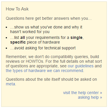
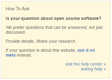
On the Ask Question page (/questions/ask), there's an info box on the right-hand side of the page. Some sites have customised this with a custom message; others use the default.

A customised message (Hardware Recommendations):

HR's custom "ask question" guidance

The standard message (Open Source):

OS's standard question guidance

In both cases, my test group didn't notice, or didn't fully read this information until after they'd typed their question into the box.

At that point, if the guidance makes the question they've just typed off-topic, the majority reaction was "but I've already typed it out... they won't mind, right?". Clearly, that's not the reaction we want. If this guidance could be moved to the left hand side of the page, in consistency with most people's reading direction of left-to-right, I think more people would read the guidance before posting an off-topic question.


I've got a small table of results, which shows the site I intended the question for, the site the user decided to post on, the time it took them to reach a decision (hh:mm) and whether the question was on-topic at their decided site.

Intended Decision TTD On Topic?
SU HR 00:12 n
HR HR 00:08 y
SO SO 00:03 y
Progs SQA 00:20 n?
Workplace Workplace 00:19 y?
SF SO 00:05 n
Gardening Gardening 00:15 y
ELL EL&U 00:10 y?
CS TCS 00:12 shrug
Apple Apple 00:07 y
SF&F Movies 00:25 y?
Bicycles Bicycles 00:09 y
Aviation Aviation 00:11 y
Security Progs 00:07 n?
Physics Physics 00:06 y
Homebrew Beer 00:17 n
Writers WB 00:13 n
DBA SO 00:15 y?
Crypt Security 00:08 y?
Biology Biology 00:06 y

So that's the results of my mini-research study on Stack Exchange. No doubt there are some obvious and some less obvious solutions to each of these points; if we could consider doing some of these things we'd make the sites a lot friendlier to first-time users. As a side benefit, we'd also give them more guidance, potentially reducing off-topic questions on some sites. So - can we make SE more friendly to first-timers?

40
  • 20
    I wonder if this would make a good series of questions on ux.stackexchange.com ;) Commented May 25, 2016 at 20:11
  • 16
    Nice study! One small nitpick: Your expectation that they will see and use the help was wrong. I have never seen a first time user wanting to start with the help. They didn't see it because they weren't looking for it - but if they had seen it, they wouldn't have clicked it anyway. "Being read first thing by a new user" is not the purpose of the help, and so the topbar does not fail.
    – rumtscho
    Commented May 25, 2016 at 20:13
  • 4
    Funny you mention this, I just met with a few other CMs to discuss some testing I want to do regarding helping new users. Not necessarily with some of the items you mention, mainly with asking questions.
    – Taryn Staff
    Commented May 25, 2016 at 20:14
  • 4
    Another thing worth noting... on some sites, specific tags have popup-notices with additional "help" text for that tag... unfortunately, the popup often goes unnoticed due to the fact that it is poorly placed and may never pop up at all since it appears after focus is removed from the tag entry bar... and the next point of focus is, inevitably, the "Post this Question" button.
    – Catija
    Commented May 25, 2016 at 20:16
  • 2
  • 8
    @rumtscho That's funny- My first reaction to finding Stack Overflow and wanting to ask a question was, "Oh, this looks like it could help me. What are the rules for this place?" followed by finding and reading through the help center. :)
    – Kendra
    Commented May 25, 2016 at 20:24
  • 16
    @gnat As someone who only uses "smaller sites", I find it disappointing that that's the opinion. Smaller sites have fewer users who can help moderate the site and those users can become overtaxed with dealing with those problems that could potentially be reduced with some UI tweaks.
    – Catija
    Commented May 25, 2016 at 20:36
  • 3
    Give some thought to the title. I didn't expect this at all after reading it. Perhaps "usability issues for new users" or something similar?
    – user1228
    Commented May 25, 2016 at 20:38
  • 4
    @Catija this approach is likely a remainder from ancient times when it was expected that every smaller site eventually grows big and will reuse large-scale solutions that work at Stack Overflow. "8,000 questions about bicycles a day, why not?" This theory was officially dismissed a year or two ago but you see, some of its idiosyncrasies are still with us
    – gnat
    Commented May 25, 2016 at 20:45
  • 3
    I would be curious if you were able to repeat this study with an A/B study like my suggestion what the outcome might be.
    – enderland
    Commented May 25, 2016 at 20:49
  • 6
    @Peanut I might do, but my aim here wasn't to study for the sake of doing studies. It was to get data about how I can solve HR's problem, primarily - the rest of the network was a bonus.
    – ArtOfCode
    Commented May 25, 2016 at 21:02
  • 5
    Did any of your test users create accounts, or was this all based on the "new visitor" version of the site? I'm particularly wondering about closed questions, which I thought were always filtered out in the not-logged-in view. If they created accounts, though (or maybe only if they registered?), they'd then see all those on-hold questions pop up. Commented May 25, 2016 at 21:26
  • 3
    @Monica the one who posted on HR ended up with an unregistered account, which did indeed see all the on-hold questions pop up.
    – ArtOfCode
    Commented May 25, 2016 at 21:29
  • 4
    One solution might be to filter questions that have been closed or put on-hold if you have 1 reputation point. Avoids the "why can't I answer" question at least
    – Ramhound
    Commented May 27, 2016 at 22:39
  • 5
    Unstated but critically important: Stack is not a recommendation engine. So if 50% of questions are closed, this is unfortunately evidence that the underlying topic does not match what the engine is designed to do. You should look at Slant. Commented Jun 10, 2016 at 2:20

2 Answers 2

80

Good job! This is awesome. There's a lot of useful observations here, but here are a few I'd highlight specifically:

The default copy in the hero is kinda goofy. It has that, "No charge - EVER. Enter your credit card below!" vibe. This actually got fixed on SO:

enter image description here

Normally, weird copy getting updated would get pushed to all sites, assuming it makes sense, but in this case, it was discovered in the context of some SO-specific A/B tests, so that didn't happen. We'll work on fixing that ASAP.

The absence of an "answer" button on closed questions is bad UX. It's happening more on HR due to the higher close rate, but it's sub-optimal anywhere: Sometimes a button isn't where the user expects it to be, and the only signal for why (that the question is closed) is off-screen, plus it requires you to know something most people won't intuit (that closed questions won't accept new answers). I personally hadn't seen that raised before. It's slightly more work - requires some minor design thought on whether to grey out a button, what copy to use, etc. But I think it's low cost to benefit - we'll look at adding something there.

The "ask question" page (and sidebar guidance specifically) aren't really great at helping new users be successful. I think your points here are dead-on, and this one needs more work than what you've described. At some point not-too-far-off, I'd like to see us put some real work into more of a "guided" version of how to ask, with more structured fields ("What did you want to happen?", "What was the actual result", etc.), and some guidance for each that's not easy to miss. I also like enderland's Pre-fill question-box with text for new users (A/B study proposal), or something similar. This needs a bit more time available to kickoff, but I really want to see if we can't devote some focus to this page before this year's up.

9
  • 25
    "Default copy", "weird copy", "hero"? Was that answer written on a "smart" device by any chance? ;-) Commented May 26, 2016 at 0:05
  • 7
    Looking forward to seeing what you guys end up doing. My recommendation is to get someone with an HCI background involved for your studies. That can be really useful and even if SE has no actual employees, there are a lot of us around who can help at least ;-)
    – enderland
    Commented May 26, 2016 at 12:37
  • @enderland thanks - really appreciate the offer and insights. And we've been working on about putting a bit more discipline around user/usability testing for features that target new users, and thinking long term about the need for more dedicated UX/HCI expertise in house
    – Jaydles Staff
    Commented May 26, 2016 at 12:43
  • 1
    @Jaydles: You might find this interesting: meta.programmers.stackexchange.com/a/8061. It's directly relevant to some of the issues raised here.
    – user102937
    Commented May 26, 2016 at 18:14
  • 2
    I've been saying you need an opt-out wizard for new questioners forever. As an SO veteran, I'd opt-in - I'd probably ask more questions if I felt more confident they wouldn't be seemingly arbitrarily declared off-topic.
    – Aaron Hall
    Commented May 26, 2016 at 18:34
  • 1
    To Aaron's point. I would spend more time answering questions, if every other question I read, wasn't completely out of scope.
    – Ramhound
    Commented May 27, 2016 at 22:42
  • 2
    I agree with @RobertHarvey, people won't want to spend time learning about a site until they are actually ready to get invested by posting a Question or an Answer. THAT is the point you need to catch their attention, by putting up something that says "Wait! Before asking/answering, read this to make sure you're doing it right!". Browsing is easy and entertaining, with very little "work" involved. Posting involves much more investment from a person, and at that point most people want to be sure they're "doing it right".
    – Rachel
    Commented May 28, 2016 at 21:36
  • 6
    How bout that ask page, eh? ;) also: six months? What the heck happened to 6 to 8 weeks? Commented Jun 10, 2016 at 2:25
  • 2
    @JeffAtwood Since you left that time sort of just... went... :P
    – Tim
    Commented Jun 13, 2016 at 1:03
-1

I love your idea to move the infobox and while at it, I would extend the idea. After the user entered the question's name, the system already do a lookup with the question name on the site in question, but if the lookup would find more result on another site, could the system display a hotlink direct there in the infobox, like "Is this question could fit on sitename instead ?"

To prevent too much load, it could do a simple search on site that tend to overlaps (like for me on SF, it could be on SO & SU)

3
  • 14
    This sounds more like its own Feature Request than something that should be tagged onto this discussion.
    – Catija
    Commented May 26, 2016 at 14:14
  • 1
    Good ideas, I like them, but I agree with Catija. You should post this as a new feature request - include a link to this question if it adds context.
    – ArtOfCode
    Commented May 26, 2016 at 20:01
  • 7
    Don't follow that advice, it's already been suggested meta.stackexchange.com/questions/12570/… meta.stackexchange.com/questions/117145/…
    – random
    Commented May 28, 2016 at 15:47

You must log in to answer this question.

Not the answer you're looking for? Browse other questions tagged .