38

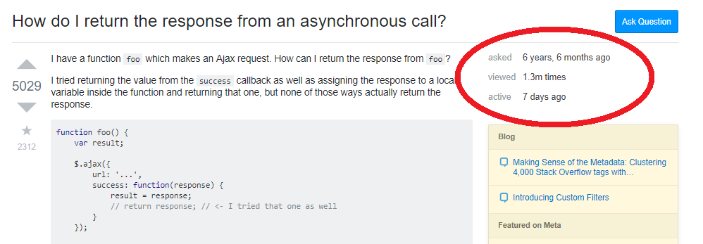
Recently, the system was changed to show question statistics (asked, views, last active) underneath the question title, rather than on the sidebar as before. This appears to be in response to this feature request, which requests that this be done for narrower viewports.

However, this was also implemented for wider viewports. Can this please be changed so it's only on narrower viewports? Personally, I find the info to be in a rather unnatural spot. Second, as a mildly autistic person I find the information a bit hard to ignore, and too eye-catching. Finally, this change has broken existing user scripts which add information to the former sidebar; it will take some time for user script authors to update their scripts, leaving them out of commission for a potentially long time.

I also agree with this answer to the original question asking about this feature (was deleted by a mod as it didn't answer the question), which states that aside information should be in the sidebar, not in the main content.

6
  • 7
    That info just get in the way of the reader, which probably is trying to (quickly) solve a problem in their code, reading a plethora of questions.. Couldn't agree more!
    – gsamaras
    Commented Jul 25, 2019 at 17:40
  • 4
    Agreed. Please reconsider.
    – user371773
    Commented Jul 25, 2019 at 17:44
  • 14
    "Finally, this change has broken existing user scripts which add information to the former sidebar" That really should not be a consideration for site design changes. I'm not against user scripts, but if a design change is an improvement, and it happens to break user scripts... tough. Commented Jul 25, 2019 at 18:23
  • 3
    @NicolBolas Yes, I'm aware of the usual policy that user script maintainers are expected to keep up with site changes. However, the experience as a user is less than ideal, since that takes time on the part of the maintainer, during which the script won't be usable. Commented Jul 25, 2019 at 18:52
  • 7
    Agreed. that way it was the best. if this change is a must for some reasons, please consider it on narrow viewports only. If the actual reason for doing this is responsive design, then this is a not a good change.
    – Vishwa
    Commented Jul 26, 2019 at 4:03
  • 1
    It feels a lot like Catija's answer to the question you link kiiinda answers this as something that's part of their overall plans, only delayed. Kinda feels unlikely the cheese will be moved back
    – Journeyman Geek Mod
    Commented Jul 28, 2019 at 14:18

4 Answers 4

17

I believe the new layout is harmful (for those with larger screens) because the previous configuration logically delimited identifiers with a newline, whereas the newer configuration delimits it using a bit of whitespace and bolded text. It takes less mental effort to process the former. Is this easier to parse?

foo: 256
bar: 42
baz: lorem ipsum

Or this?

foo: 256    bar: 42    baz: lorem ipsum

If you quickly want to know the value of "bar", which takes more mental effort to parse?

Fundamentally, newlines are better mental delimiters than horizontal whitespace.

4
  • 2
    "newlines are better mental delimiters than horizontal whitespace" Wouldn't that be just as true for narrow views than wide ones? I mean, if horizontal lists are that much worse, then why should those on narrow views be forced to suffer? And if it's not really that much of a problem, if the difference is trivial enough that narrow view users can tolerate it just fine, then what's wrong with having them on wide views too? Commented Jul 28, 2019 at 13:31
  • 1
    @NicolBolas For users with narrow screens, I can imagine that there wouldn't be enough horizontal real estate. I don't use a mobile device so I can't comment on that, though. Commented Jul 29, 2019 at 5:46
  • I understand that. My point is that your argument that vertical space is better is undermined by your tacit admission that the difference is sufficiently slight for narrow screen users to not have a UX that is significantly worse. Because if vertical space were that much better, then you would argue that it should always be vertical. Unless you're just saying that narrow screen users should just expect a significantly worse UX. That is, if narrow screen users can be OK with the horizontal line, why can't wide screen users be equally OK with it? Commented Jul 29, 2019 at 13:34
  • 1
    @NicolBolas Because if you use a narrow screen, you might have to suffer through tradeoffs that you otherwise would not make. Commented Jul 30, 2019 at 0:41
11

Hopefully the stats get restored to the sidebar, but until that happens (if it does), if you find the new position of the question stats too distracting and want to put them back in the sidebar, you can install this userscript. Screenshot:

enter image description here

It re-creates the #qinfo table in the sidebar, so in addition to the more appropriate placement of the stats, older userscripts that depended on data in the table have a chance of continuing to work, like Roomba Forecaster.

Post moved here from Why are the sidebar stats for a question now under the title?, as suggested by Tinkeringbell.

10
+50

On desktop, this modification does not help in terms of readability, usability or accessibility.

First, it strays from a basic web readability principle:

Multiple chunks of information presented vertically as list items (like the page stats were in the sidebar) are easier to read, scan and digest than when presented in narrative form (like they are now, which looks like an odd sentence).

The latter creates a greater cognitive burden.

Also, the natural flow of the main content is disrupted, because visitors are forced to read meta data, which can't be ignored, as it's right below the main title.

The placement of this data in such a high-profile spot within the main content also implies that the information is of great importance. In reality, however, it's just <aside> information, and should be set aside from the main content (the sidebar location was perfect).

Then there's the fact that the key-value pairs have minimal space and formatting separating them.

enter image description here

Weak headings. A reliance on space, with minimal differentiation, for all facets of separation.

If you must create a horizontal list of key-value pairs, a greater effort should be made to distinguish them from one another. But the people at SE HQ appear to know this already.

Stack profile page layout:

enter image description here


Perhaps there are other factors driving this change that we aren't aware of because, for the reasons listed above, it falls short of a layout improvement.

Hopefully, the previous layout will be restored.

0

This may be unpopular, but I disagree. It will take a while to get used to, of course, for experienced SE users like us, but this is not a harmful change.

Personally, I find the info to be in a rather unnatural spot.

Really? I think the current location is much more natural than the old location. As I said here, look at what else is in the right sidebar: links to the blog, hot/featured meta posts, linked and related questions, a sample of the HNQ list, ... All of that falls into the category of "here's some other stuff that you might want to click through to", not info about the post you're actually viewing. It kind of makes sense to put info about the post in the same part of the screen as the post itself. (Not necessarily immediately below the title, but that would be a whole different FR: yours is specifically about moving it back to the sidebar.)

Finally, this change has broken existing user scripts which add information to the former sidebar; it will take some time for user script authors to update their scripts, leaving them out of commission for a potentially long time.

In no reasonable universe should that even be a consideration. If you modify your SE experience with some add-ons, that's on you, but don't expect the people who design the site to cater to whatever add-ons some users might or might not have used. The vast majority of users don't use any extra enhancements to their SE experience, and the few who do shouldn't expect to be a factor, at all, in site design decisions.


This whole post smacks of "move my cheese back" and XKCD 1172. You can't expect SE to undo a change they've just made, although you can certainly change it back yourself using another add-on.

4
  • Ideally, this can be added as a setting. Like the navigation bar. But forcing it by default for all users crippling existing UX isn't nice. Commented Jul 26, 2019 at 20:19
  • 4
    @MikhailKholodkov: Referring to this change as "crippling" is hyperbolic. There is a huge difference between the stickiness of the top bar or the large left sidebar, and the positioning of a couple of pieces of text. This isn't taking up massive amounts of space, nor does any space it takes up follow you past the title. There's no justification for making a configuration option for it. If they're going to get into that level of minutiae for configurations, then I can think of a lot more useful configuration options than this. Commented Jul 27, 2019 at 16:01
  • @NicolBolas Whereas that's probably an exaggeration the change does cripple existing UX. I'm not even talking about changing the position of the stats. The rounding of the views is a loss of information comparing to the old style. Especially for posts in the 1k-100k view range and those people wondering how close they are to one of the "X people viewed" badges. I still think that such changes better be configured. Commented Jul 27, 2019 at 16:08
  • 2
    @MikhailKholodkov: "The rounding of the views is a loss of information comparing to the old style." If you care about the exact number, you can just mouse-over the number to get the exact value. For most people, an order-of-magnitude is good enough. Commented Jul 27, 2019 at 16:09

You must log in to answer this question.

Not the answer you're looking for? Browse other questions tagged .