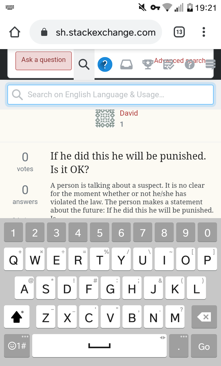
17

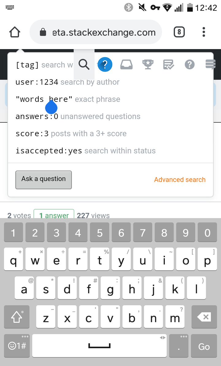
One thousand words: broken :(

The search hints are obsuring the search box, which isn't particularly helpful.

  • My screen has an admittedly small resolution of 360x640 720x1280
  • I'm using Chrome on Android
  • I'm using the 'full site' with 'responsiveness' turned on.

Edit

It looks like there has been an update, and search now looks like this:

updated design

Great! You can see what you're typing!

Unfortunately it still looks broken.

16
  • 1
    It looks OK on a 1080p Android using Chrome: i.imgur.com/xAhf9O3.jpg. 360x640 is an awfully low resolution, even for LG's budget lineup. Commented Sep 4, 2019 at 14:55
  • 1
    Also, are you sure that's actually the resolution? Your screenshot is 1193x720. Commented Sep 4, 2019 at 14:57
  • 1
    On your screenshot, the button and link color are wrong, which makes me think that CSS isn't loaded correctly. Can you clear cache and reload the site (or try in incognito) to see if that helps? When I test a 320x640 resolution on my desktop browser, it looks fine. Testing Android/Chrome with a bigger resolution also doesn't show these problems for me.
    – Ham Vocke
    Commented Sep 4, 2019 at 14:57
  • @TheWanderer oops, I got it from a browser 'what's my resolution' thing. I've updated to include the resolution of my phone model. Commented Sep 4, 2019 at 15:51
  • 1
    @HamVocke it's fine, until the keyboard squashes it up. This makes Chrome's effective resolution much smaller. Commented Sep 4, 2019 at 15:52
  • @HamVocke - resolution of the viewport in that screenshot is 720x~547 Commented Sep 4, 2019 at 15:54
  • 1
    I'm able to reproduce it by entering split screen and making the window slightly shorter than default: i.imgur.com/NGhiiPP.jpg. It seems like the hint layout has some sort of bottom bound, but no hard top bound. Commented Sep 4, 2019 at 16:36
  • @HamVocke - I have a very large screen size but if I rotate my phone to landscape mode (which I almost never do) I can easily reproduce this bug. The hint must be moved down at least as far as the word "user:1234".
    – Rob
    Commented Sep 4, 2019 at 16:45
  • If I use the phone's back button to dismiss the keyboard the hint jumps down into the perfect position - but even removing the [Ask A Question] button, moving the words "Advanced Search" to the top, and reducing the line spacing won't be enough to avoid the keyboard. Also the CSS Bug that TylerH (Dev) explains remains a problem.
    – Rob
    Commented Sep 4, 2019 at 18:18
  • @Rob wouldn't it be easier to fix the top position? Commented Sep 4, 2019 at 19:19
  • @Rob the search bar's bottom position is between "words here" and answers. It needs to be lower than that. Commented Sep 4, 2019 at 19:23
  • 1
    marcellothearcane & @TheWanderer - The question and my first screenshot coincide with their positioning, if it's between "words here" and answers for The wanderer they need to upload their own screenshot. --- Marcello, Ham probably needs to address the prior CSS Bug first, I haven't suggested "fixing the top position" in the CSS, nor is it clear why one would need the "Ask a Question" button on a search hint (are you supposed to not make the search, and just ask?).
    – Rob
    Commented Sep 4, 2019 at 19:56
  • 1
    @Rob removing the 'ask a question' is probably worth another question (ironically) Commented Sep 4, 2019 at 20:29
  • @Rob I already did. My first comment shows the search bar is below the top bar. Commented Sep 4, 2019 at 20:30
  • 2
    Thanks, I can reproduce now. The popover component tries to be clever with repositioning when one of its edges hits the viewport. I'm investigating if we can turn this off for this popover.
    – Ham Vocke
    Commented Sep 5, 2019 at 7:23

1 Answer 1

0

This has been fixed on my phone now. Since it's not an issue any longer, I'm going to accept this answer.

You must log in to answer this question.

Not the answer you're looking for? Browse other questions tagged .