47

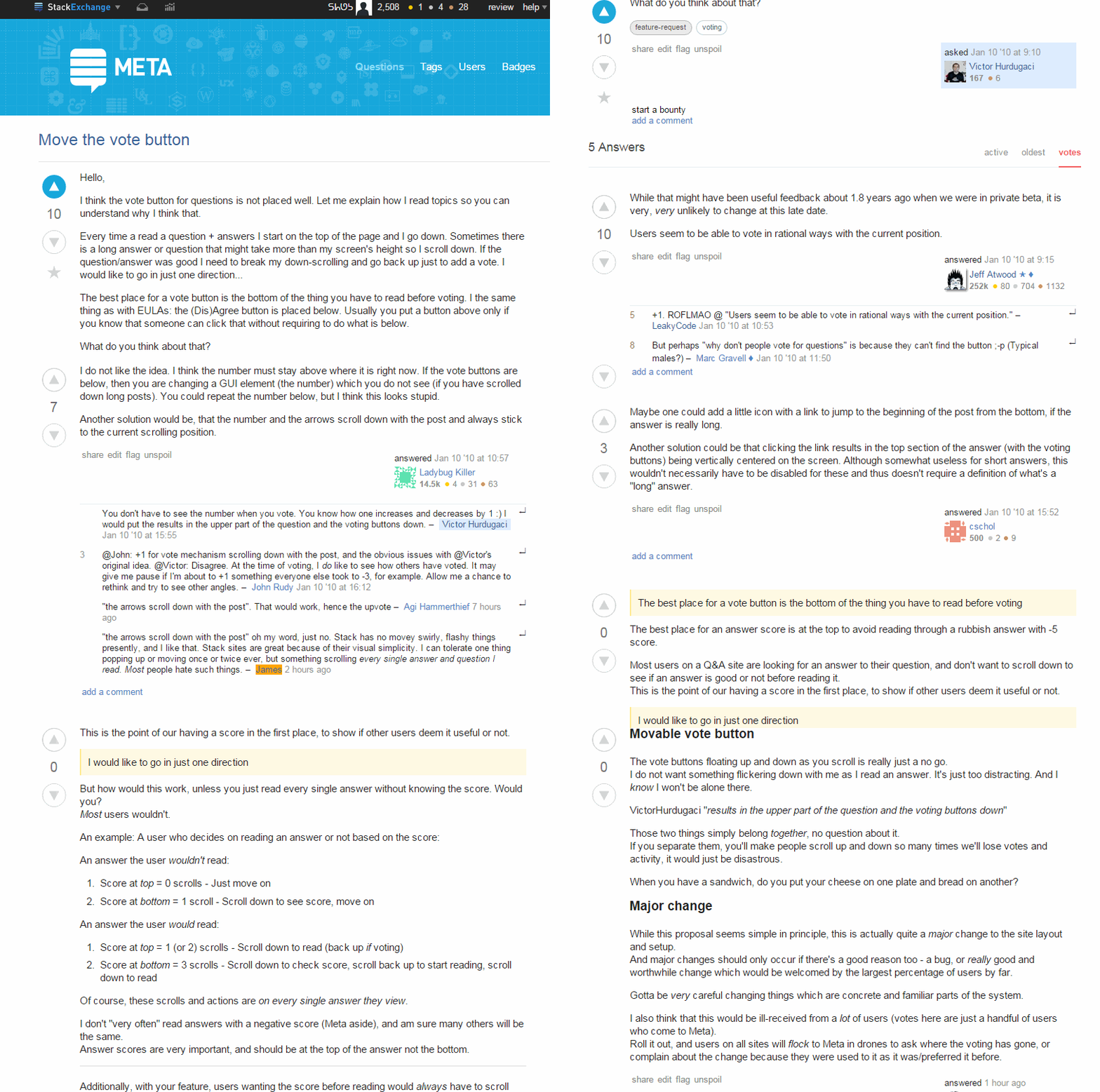
I think the vote button for questions is placed poorly. Let me explain how I read topics so you can understand why I think that.

Every time I read a question + answers I start on the top of the page and I go down. Sometimes there is a long answer or question that might take more than my screen's height so I scroll down. If the question/answer was good I need to break my down-scrolling and go back up just to add a vote. I would like to go in just one direction….

The best place for a vote button is the bottom of the thing you have to read before voting. It's the same thing as with EULAs: the (dis)agree button is placed below. Usually you put a button above only if you know that someone can click that without requiring to do what is below.

What do you think about this?

2
  • 2
    Quora has the vote button shown throughout the entire posts, so regardless of how long the post is, you could vote at the start of the post, at the bottom of the post, or even halfway through it. It's at the bottom, and small, so it doesn't feel annoying as compared to SE's version.
    – Pacerier
    Commented Jun 8, 2015 at 9:14
  • 1
    I had asked a duplicate of this here: meta.stackoverflow.com/questions/271449/…
    – nwinkler
    Commented Jun 8, 2015 at 14:24

9 Answers 9

76

This is one of those features that could be useful at times, but annoying at others.

I like @LadybugKiller's idea of having the voting buttons stick to the questions whilst scrolling, so I made a userscript to do just that.

It uses EmzoMartin's Sticky-Element jQuery plugin. The code is simply $('.vote').sticky($('.vote').parent().parent().parent().parent().parent());

I have added this to my SE Additional Optional Features userscript.

Please go there to install :)

Here it is in action: enter image description here

13
  • Awesome. That looks like what I wanted, but how do I use it? (what plugins/add-ons do I need to install for FF/Chrome, if any?) If you explain that, I'll upvote. Commented May 4, 2015 at 10:20
  • 1
    @AgiHammerthief If you follow the link to my userscript on stackapps (just above the gif), under the section The script, there is now a section starting To install... - please follow that to install it :) Commented May 4, 2015 at 10:26
  • 39
    I like it a lot and I think SE should strongly consider anything that encourages more and better voting .. particularly on longer posts that took more effort! Commented May 8, 2015 at 20:19
  • 12
    We'll be running a split test shortly to test this idea out - I have high hopes for it! Commented Jun 4, 2015 at 17:59
  • 6
    Another term for A/B testing - will roll it out to half of registered users to see how it affects their voting behavior. Commented Jun 4, 2015 at 18:39
  • This is cool! Does it work on Safari on iPad? Chrome? Even if desktop only, would you please provide a link to your userscript, where I can then choose the install option? I have an account there but this tech-y stuff is way over my head! Thanks :) I just found stackapps.com/questions/6091/se-additional-optional-features... Is that it? Commented Jun 4, 2015 at 20:56
  • @Sue Yeah - that's the link. Most of the info on how to install is there - just install an extension Greasemonkey or Tampermonkey (dependong on your browser), and clikc the 'Official version' link in step2. It will automatically install. SE's implementation is for half of the users - so you might not already be in it, so you might want to sue this userscript. It does add load of other extra features as well! You can turn them off in the control panel. More info is on that page. :) Commented Jun 5, 2015 at 6:11
  • 2
    @JarrodDixon, one annoying thing about these is that they "jump", ie. they are first fixed to the left of the post as part the page, but as you scroll down, they quite visibly " jump" out of the page and become fixed. This is quite noticeable on a low end mobile device (yes, I use the desktop version of the site), especially if you fling or scroll quickly. Commented Jun 5, 2015 at 11:55
  • Has a bug with zooming and side scrolling
    – Travis J
    Commented Jun 5, 2015 at 17:16
  • @ᔕᖺᘎᕊ - Sorry to only ping you, but it seemed like your post was getting a lot of attention already so I just kind of tacked it on here as a comment as it seemed topical. Didn't want to be too intrusive.
    – Travis J
    Commented Jun 5, 2015 at 19:11
  • @TravisJ no problem! I was just letting you know! Sometimes you can forget to ping someone! Jarrod will probs see the comment anyways - so it's fine! :) Commented Jun 5, 2015 at 19:51
  • 2
    FWIW, in modern browsers just adding the CSS .votecell .vote { position: sticky; top: 0 } will mostly achieve this. And it will be perfectly flicker-free even on slow devices. (It won't make the buttons move down below the bottom of the post text, though. Some might consider this a feature.) Commented Mar 18, 2018 at 23:32
  • @Ilmari thanks! I never knew that! Commented Mar 19, 2018 at 6:35
23

I do not like the idea. I think the number must stay above where it is right now. If the vote buttons are below, then you are changing a GUI element (the number) which you do not see (if you have scrolled down long posts). You could repeat the number below, but I think this looks stupid.

Another solution would be, that the number and the arrows scroll down with the post and always stick to the current scrolling position.

5
  • You don't have to see the number when you vote. You know how one increases and decreases by 1 :) I would put the results in the upper part of the question and the voting buttons down. Commented Jan 10, 2010 at 15:55
  • 6
    @John: +1 for vote mechanism scrolling down with the post, and the obvious issues with @Victor's original idea. @Victor: Disagree. At the time of voting, I do like to see how others have voted. It may give me pause if I'm about to +1 something everyone else took to -3, for example. Allow me a chance to rethink and try to see other angles.
    – John Rudy
    Commented Jan 10, 2010 at 16:12
  • 1
    "the arrows scroll down with the post". That would work, hence the upvote Commented May 2, 2015 at 9:27
  • 3
    "the arrows scroll down with the post" oh my word, just no. Stack has no movey swirly, flashy things presently, and I like that. Stack sites are great because of their visual simplicity. I can tolerate one thing popping up or moving once or twice ever, but something scrolling every single answer and question I read. Most people hate such things.
    – James
    Commented May 2, 2015 at 14:51
  • 2
    I like the idea (unlike James ;p), so I used it in my userscript :) +1! Commented May 2, 2015 at 17:32
19

While that might have been useful feedback about 1.8 years ago when we were in private beta, it is very, very unlikely to change at this late date.

Users seem to be able to vote in rational ways with the current position.

6
  • 17
    +1. ROFLMAO @ "Users seem to be able to vote in rational ways with the current position."
    – mmx
    Commented Jan 10, 2010 at 10:53
  • 19
    But perhaps "why don't people vote for questions" is because they can't find the button ;-p Commented Jan 10, 2010 at 11:50
  • 7
    How about having it dynamically stay on screen, if scrolling would push it off? Seems like a simple jQuery... ;-)
    – AviD
    Commented Feb 26, 2012 at 10:52
  • 7
    Just because something's always been a certain way, doesn't mean you can't change it if you get enough people requesting it (although ~10 is not a SE majority). (Yes, that will cause friction while people adapt to change, but change is a given in all things). Commented May 2, 2015 at 9:26
  • 5
    possibly though it might be visually annoying if the buttons stay locked to the top of the screen as you scroll down. Not opposed to that, these days. I think you'd need a height threshold for it to appear, you don't want buttons sliding around everywhere on small posts either. Commented May 4, 2015 at 7:26
  • 3
    I reject your reality and substitute my own (actually, somebody else's)! Commented May 4, 2015 at 18:05
11

The best place for a vote button is the bottom of the thing you have to read before voting

The best place for an answer score is at the top to avoid reading through a rubbish answer with -5 score.

Most users on a Q&A site are looking for an answer to their question, and don't want to scroll down to see if an answer is good or not before reading it.
This is the point of our having a score in the first place, to show if other users deem it useful or not.

I would like to go in just one direction

But how would this work, unless you just read every single answer without knowing the score. Would you?
Most users wouldn't.

An example: A user who decides on reading an answer or not based on the score:

An answer the user wouldn't read:

  1. Score at top = 0 scrolls - Just move on
  2. Score at bottom = 1 scroll - Scroll down to see score, move on

An answer the user would read:

  1. Score at top = 1 (or 2) scrolls - Scroll down to read (back up if voting)
  2. Score at bottom = 3 scrolls - Scroll down to check score, scroll back up to start reading, scroll down to read

Of course, these scrolls and actions are on every single answer they view.

I don't "very often" read answers with a negative score (Meta aside), and am sure many others will be the same.
Answer scores are very important, and should be at the top of the answer not the bottom.


Additionally, with your feature, users wanting the score before reading would always have to scroll down. Whereas how it is now, having read an answer and having to scroll back up to vote is only an "occasional" action, as we don't vote on every answer we read.
(We can't given the vote limit.)

Movable vote button

The vote buttons floating up and down as you scroll is really just a no go.
I do not want something flickering down with me as I read an answer. It's just too distracting. And I know I won't be alone there.

VictorHurdugaci "results in the upper part of the question and the voting buttons down"

Those two things simply belong together, no question about it.
If you separate them, you'll make people scroll up and down so many times we'll lose votes and activity, it would just be disastrous.

When you have a sandwich, do you put your cheese on one plate and bread on another?

Major change

While this proposal seems simple in principle, this is actually quite a major change to the site layout and setup.
And major changes should only occur if there's a good reason too - a bug, or really good and worthwhile change which would be welcomed by the largest percentage of users by far.

Gotta be very careful changing things which are concrete and familiar parts of the system.

I also think that this would be ill-received from a lot of users (votes here are just a handful of users who come to Meta).
Roll it out, and users on all sites will flock to Meta in drones to ask where the voting has gone, or complain about the change because they were used to it as it was/preferred it before.

2
  • 1
    If you're a non-voting reader, sort by votes and keep reading until you get what you came for. But voting controls and score are not a sandwich. You don't need to know the score to figure out what to do with a voting button, and you don't need voting buttons to figure out what the score means, and you really shouldn't need to look at the score after you vote, and you most particularly shouldn't vote without reading the answer. But, I'm not affected as I usually end up voting for the comment saying "does anybody else find it strange that this incorrect answer has so many votes?".
    – sh1
    Commented Jun 8, 2015 at 2:58
  • @sh1 The sandwich reference was because the original proposal was voting at the bottom of answers - ie away from where it should be, like the cheese and bread. "I usually end up voting for the comment saying 'does anybody else find it strange that this incorrect answer has so many votes?'", yeah, that happens a fair bit. It's argued downvoting is fair in this case (even by a mod) to even out the scores between the good and better answers. I see the logic, and don't disagree with it, but I struggle to dvote an answer based another answer.
    – James
    Commented Jun 8, 2015 at 11:01
4

Maybe one could add a little icon with a link to jump to the beginning of the post from the bottom, if the answer is really long.

Another solution could be that clicking the link results in the top section of the answer (with the voting buttons) being vertically centered on the screen. Although somewhat useless for short answers, this wouldn't necessarily have to be disabled for these and thus doesn't require a definition of what's a "long" answer.

4

In the past day or two, the little vote widget for questions has started following the question up and down the window for the extent of the question. If it is a long question, that little widget becomes quite annoying. The original placement at the top-left was a clean and proper placement for the widget.

While I'm all for improvement, I caution against adding all the latest 'gee-whiz' animated bells and whistles just because you can. SO is clean and non-intrusive. The more animated widgets get added, the closer the site moves to the dividing line between clean/enjoyable and annoying. The line is different for all users, and I'll admit that I prefer a clean usable interface without animated distractions.

This isn't a complaint saying remove it, but rather a suggestion that animated parts of the site have some type of user-preference that allows users who find the moving widgets annoying to simply -- turn them off. (or disable moving animations, or something similar)

The script features that update your comment inbox, etc. are all perfectly fine, they provide no distraction because they don't move. Having the vote counter flittering up/down the left side of the browser window is something I would like to turn off. Recognizing others may love it and think it is the greatest thing since sliced-bread, don't de-animate it, but please find a way to allow users to turn it off.

Remember, somebody's latest gee-whiz feature, is a bug to someone else -- if it can't be turned off.

4
  • 2
    If you're trying to talk about the actual test (which it seems you are) and want to add some feedback, you're looking for this post (just copy and paste and delete). The current question is the question that prompted SE to start the A/B test. Commented Jun 6, 2015 at 8:46
  • That looks like the correct feedback page. As for as this post, are you saying it should be deleted? I'm happy to delete it if it is out of place here, but the general proposition regarding keeping the UI clean/unobtrusive is a general UI principal applicable everywhere. I've watched many desktops and applications fail miserably as a result of forgetting it. Let me know what your intent was with delete. If you are referring to this post, I'll remove it when I get your response. Commented Jun 6, 2015 at 18:44
  • yeah - I was originally thinking to delete this post, but seeing as you've got a few upvotes now, you could just post the same thing again if you want. My only reason for saying so was that this was a feature-request to have it, and the other question is the announcement about it. What you could do is remove the part about the test in this post and only keep the disagreement part, and copy and paste this (original version) as a new answer on the other question :) Commented Jun 6, 2015 at 19:09
  • 1
    Thanks for the response. I've removed the part about the test. Commented Jun 6, 2015 at 19:12
3

I do think that the voting buttons for the actual question should be located elsewhere for the same reasons as you. In fact I can't even remember setting a question as a favorite after I've read the question itself, only if it has had an interesting title.

If I was the one in charge, I'd try to anchor the voting/favorite thingy to the end of the question for a moment and see how that affects people's behavior. If there's no significant change, switch it back.

0
2

This feature had been removed, but you can still do it with a TamperMonkey user-script:

// ==UserScript==
// @name         Sticky post vote buttons
// @namespace    http://tampermonkey.net/
// @version      1
// @description  Sticky post vote buttons
// @author       RANDOM HOMO SAPIEN
// @match       *://*.askubuntu.com/*
// @match       *://*.mathoverflow.net/*
// @match       *://*.serverfault.com/*
// @match       *://*.stackapps.com/*
// @match       *://*.stackexchange.com/*
// @match       *://*.stackoverflow.com/*
// @match       *://*.superuser.com/*
// @grant        none
// ==/UserScript==

(function() {
    'use strict';
    $('.votecell .vote').css({'position': 'sticky', 'top': '60px'});
})();

Floating vote buttons (script)

-1

Maybe what you want is not to have the buttons stick, but when the page has been stationary for a second or two, and the bottom of the answer is within view, to have the voting controls disappear from the top and reappear at the bottom.

This simultaneously makes them more accessible, and also acts as a visual "don't forget to vote".

By the looks of some of the feedback on the current trial, it looks like right now it's a visual "vote!vote!vote!vote!vote!vote!vote!".

You must log in to answer this question.

Not the answer you're looking for? Browse other questions tagged .