33

The top bar's recent problems were mostly fixed, however there's still one thing that bugs me:

small text used for notification count

The number is smaller than before, and harder to read. Compare with how it used to be before the changes:
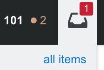
notification count before changes

Two factors affect the readability from what I see:

  1. Font size - became smaller.
  2. Background around the number - used to be a spacy rectangle, now it's a small circle.

Can the previous design of the counts be restored, or the existing design be improved please?

12
  • 2
    I love the circular one, but I’d juice up the padding and enlarge font size a bit
    – nicael
    Commented Apr 7, 2022 at 13:58
  • 1
    @nicael well maybe for the reputation count circular design fits as the trophy icon is kind of circular. But the notification drawer is square, so circle just doesn't feel right hence less readable. Commented Apr 7, 2022 at 14:07
  • 2
    @ShadowWizardSaysNoMoreWar I think it makes much more sense to design all bubbles with the same shape instead of trying to make each bubble "fit" its background icon...
    – wimi
    Commented May 11, 2022 at 13:10
  • @wimi sure, I have no issue with same shape, but want it to be the shape it was before that's all. Commented May 11, 2022 at 13:19
  • 1
    The padding around the numbers have increased.. Although, it does seem to hide the icons almost completely...
    – Justin
    Commented May 13, 2022 at 1:28
  • @Justin yeah, well, it might still change again so until dev officially post something we can't really know. Commented May 13, 2022 at 5:01
  • If anyone is interested, I made a userscript to revert the header bar changes: github.com/GingerIndustries/userscripts/raw/main/…
    – Ginger
    Commented May 13, 2022 at 12:11
  • @Ginger thanks, and you also better post this as answer, comments are temporary and might vanish without notice. Commented May 13, 2022 at 19:52
  • Regarding the bounty: It would be great to give some closure to this post: Has the issue been fixed (is the work on the indicators over)? Will there be any more upcoming changes?
    – Justin
    Commented Jun 26, 2022 at 6:28
  • 1
    @Justin no it's not fixed yet, because still worse than before. I'll update with the current design if I won't forget, and explain why still not good. Commented Jun 26, 2022 at 6:32
  • Pinging as a reminder, in case you've forgotten :)
    – Justin
    Commented Jul 1, 2022 at 9:21
  • 1
    @Justin well, bad_code just posted answer explaining it very well, I just couldn't find words to describe what's still wrong so didn't want to post screenshot where it's apparently fixed while it's not. Commented Jul 2, 2022 at 7:38

1 Answer 1

3
+50

For the same reasons I've mentioned before the notifications are still overall small and hard to see.

I used to be able to walk around the house and see from a distance if there was an event on screen. Now it's just harder.

Getting hit by the large green +N🟩 sign also felt like a satisfying experience (like the checkout at an online store). I could understand making the box smaller if the aim was reducing effects of gamification on users, but as a design choice it reduced the visual appeal of gaining reputation.

You must log in to answer this question.

Not the answer you're looking for? Browse other questions tagged .