46

For those who don’t know me, I’m the Director of Design at Stack Overflow. I’m responsible for the team of designers who work on the public sites.

The visuals of Stack Overflow and the network sites have remained largely unchanged since I joined Stack Exchange, Inc. in 2017. The aging design has become frustrating for me, for our designers, and for our audience. We all deeply care about the sites and want the visual aesthetics to reflect that, in addition to making the site(s) feel welcoming and less intimidating.

What is a design vision and why do you need one?

A design vision is intended to provide top level inspiration and guidance for the design team. It helps designers create a unified experience when working on different projects. With new features coming down the pipeline for both our community and Teams products, it is imperative for us to align on a visual direction. We can build new components in our existing design language, but we’d like to use this unique opportunity to evolve.

The design vision is not something that is written in stone and being shipped as is. This means that each designer will be able to work within their unique problem—taking research, user/community feedback, and other constraints into account.

Show us this vision, please

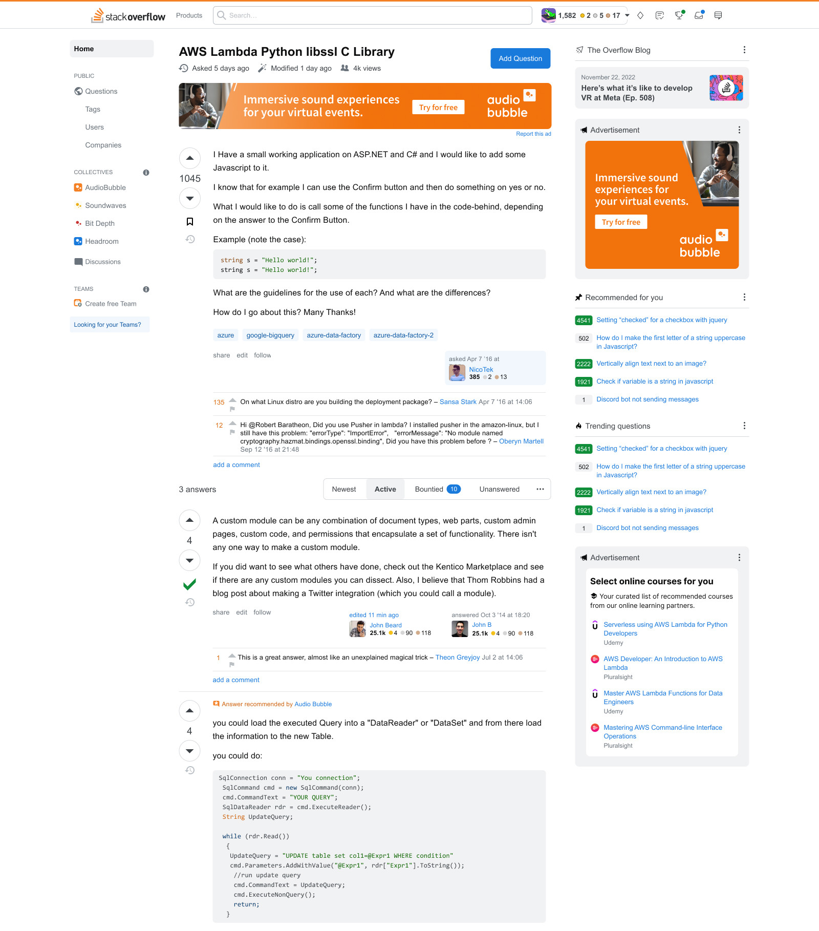
Composition of Stack Overflow in new UI style

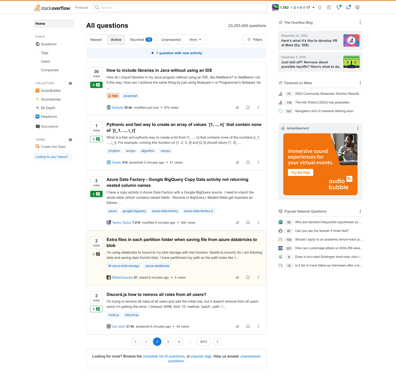
Composition of Stack Overflow question page in new UI style

As you can see, there are inconsistencies, things we haven’t touched yet, and items pushed very far visually just for the sake of exploration. There is a lot that is different here: top navigation, sidebar widgets, post summary, and more—but the only things that are finalized right now are our colors and the items we’ve already shipped (like buttons). Nothing else is set. It is simply meant to portray a visual identity described by the team as simple, modern, efficient, and scalable.

How will you bring the design vision to life?

We are working on many things right now and simply don’t have the capacity to go heads down into a redesign. You’ll see designers build new features in this style (e.g., Search) and you’ll also see designers pick up “components” (e.g., buttons). In short, things will be shipped iteratively and may feel disjointed from time to time. No matter how they ingest this design vision, we will be bringing major ideas to you with time to provide feedback, and we commit to reviewing that feedback carefully. If we believe a change is very minor and will not impact your workflow, we may make the change and discuss only if an issue arises. For instance, we may not bring every change that adjusts a border by 1px to the community in advance, but if we add a new section to the page, we’d bring that in advance.

So what’s next?

We have three designers eager to discuss specific components with you that they want to work on. They have now made individual meta posts regarding the left side navigation, user cards, and the post summary display. I want to reiterate that development has not started on these components. We are bringing you our thoughts early in hopes of gathering useful feedback based on your time spent on the sites that can influence the design.

I look forward to hearing from you all and building on, improving, and implementing our vision for Stack Overflow and the Stack Exchange network.

53
  • 200
    "The aging design has become frustrating for me, for our designers, and for our audience." - only one of these really matter, in my humble opinion.
    – Jamiec
    Commented Aug 8, 2023 at 16:05
  • 76
    And, do you really have to push the blog articles even more onto the Q/A readers/contributors? The blog articles are not relevant to us. Commented Aug 8, 2023 at 16:11
  • 92
    I'm sorry, but I don't understand what the vision is. Do the images represent the design vision? Apparently, you are critiquing it. What kind of answers are you expecting from us? Is this an announcement and no answers are expected? Commented Aug 8, 2023 at 16:14
  • 38
    Also, why are you only showing screenshots of the questions and Q/A pages? These pages don't actually need any design changes; they mostly work just fine. There are however other pages that are in deep need of refreshments and enhancements. Review pages, for instance. Commented Aug 8, 2023 at 16:15
  • 33
    @Jamiec: At first I agreed with you, but then I thought about it some more from the perspective of a line-of-business software engineer. While pleasure working with a system I'm maintaining is not the highest priority, or even the second-highest, it does make it easier to put a little extra time, focus, and inspiration into it, rather than having to consciously avoid focusing on what I dislike. How much more for a visual designer, whose aesthetic taste is more clearly necessary to produce good artistic work? (Not that SE needs to be fine art. But it should look good and flow smoothly.) Commented Aug 8, 2023 at 16:22
  • 27
    While one picture is worth 1000 words, I'm old school, and love to read instead of staring at a picture trying to figure out the differences. Can you please provide a list of the planned changes? Commented Aug 8, 2023 at 17:30
  • 16
    @idmean I disagree. The screenshots with the changes are not random. Someone made them, and know exactly what changed. I don't like it this way and want to know those changes. I understand SE motivation against it, would be easier to resist the changes this way, but still, want to try and ask for it even though it's futile. Commented Aug 8, 2023 at 17:36
  • 21
    The purpose of this post (and the images in it) is basically to say, "Here's the overall look we're going for." The subsequent posts (mentioned above) will share more details about proposed changes to individual elements in the left sidebar and other parts of the UI, rather than trying to discuss them all here. (We'll edit in links to those posts once they go up.) So if y'all see an element missing from this mockup, or the wrong UI element being used in this mockup, be patient – it's only a mockup.
    – V2Blast Staff
    Commented Aug 8, 2023 at 17:54
  • 24
    No one said the screenshots' contents are random, @ShadowTheGPTWizard — just that they don't represent any actual, set in stone, changes. They illustrate a high level vision of how a unified design for the sites might look like in the future. That being the case, I don't think it's particularly relevant to have a wall of text saying stuff like "the inbox has a blue dot, instead of a red one" because... that might not be the final product. 1/2
    – JNat StaffMod
    Commented Aug 8, 2023 at 18:07
  • 43
    I also think it's uncharitable to say that we're not describing the changes deliberately because it makes it harder for you to contest them, when we're coming to you without decisions having been made, and mention that you can expect more posts to discuss more specific changes... :\ 2/2
    – JNat StaffMod
    Commented Aug 8, 2023 at 18:07
  • 28
    @JNat I think the conflict is coming from not understanding which aspects of these screenshots are useful information, and which are not useful/distracting. To me, a "vision" means "what we want the site to look like", so if that includes changes that are not intended, why are they there? Perhaps they are there to demonstrate something else important but more subtle, like a specific color scheme or change in spacing. But, so far, it seems like all the most obvious differences from the current site are not intended to demonstrate changes that are part of the vision, so which parts are? Commented Aug 8, 2023 at 18:36
  • 14
    When working on the top bar, please be aware of some of the pitfalls encountered last time it was changed. Big example is how it impacted reviews. Another important one may be feedback the last one received.
    – Andy
    Commented Aug 8, 2023 at 18:58
  • 61
    It's a bit unfortunate that this post is probably receiving a much more chilled response due to confusion about the actual scope of the changes. This is the kind of preview I'd hesitate to show my boss simply because I fear he'd focus on some specific points that aren't actually part of the scope, and I spend half the meeting explaining that. If you don't have all the context, it's very easy to misunderstand these screenshots. Commented Aug 8, 2023 at 19:04
  • 11
    @V2Blast guess it all boils down to the general mistrust, or more accurate lack of trust, between myself and SE as a company. And it's one of those cases where I'll be happy to be wrong. But even so, yes, I would like to have wall of text where I can see what I might otherwise miss from comparing screenshots to what we have today. Commented Aug 8, 2023 at 19:27
  • 25
    @curiousdannii I can see the pictures and I still don't see or understand what is different about this "vision". It looks like what already exists now. 🤷🏻‍♂️ What is the point?
    – Drew Reese
    Commented Aug 10, 2023 at 1:45

35 Answers 35

1
2
2

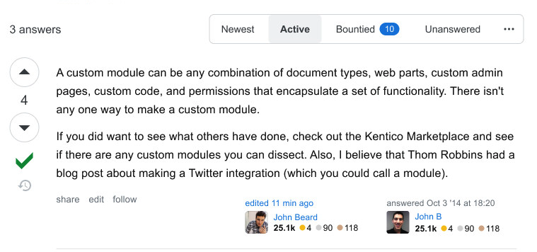
I know that the images which you shared is not the final version, but I wanna know... what's gonna happen to the footer?

enter image description here

Is it gonna be removed or redesigned?

2
  • 3
    Definitely not going to be removed! May eventually be touched, but not a top priority.
    – Piper Staff
    Commented Aug 9, 2023 at 13:14
  • @Piper Thanks for the information :) Commented Aug 9, 2023 at 13:58
0

Is it possible to have some sort of "theme selection" that the user can choose? I think a major issue is that for any new design that is shipped/implemented, there will inevitably be people who liked/were more comfortable with the older design, compared to the new design. In other words, every new design will inevitably lead to some happy users becoming less happy users. (Of course, it's possible that the opposite can also happen; maybe the new design will make some users even happier. However, it's just not a good look, and will lead to major fusses, to make previously happy users unhappy.)

Proposal: there could be some "theme selection" somewhere in Settings, containing (at least) all "looks" that the SE site had through history, that allows a user to go through and click the one they are happiest with.

For example, Reddit went through a design change, but you can still use the "old style" by appending "old." in front of the URL. That way, users who are "stuck in their ways" so to speak have the option to see the aesthetic that they like, while the site can move on ahead and change with the times.


In some sense this is quite clumsy, since it's possible a user could like one aspect of one design, and another aspect of another. But I imagine that making a theme selection page with that level of flexibility is quite hard. I do think however that even this clumsy theme selection page, containing the historical themes, will allow users already content with the way the site looks to remain happy and not inevitably complain about every design change.


P.S.: this also aligns with another common point people raise, namely asking for a dark mode. This "theme selection" page can host historical themes, as well as new themes like the requested dark mode.

4
  • 3
    reddit's change was much more than just visual design. it's way heavier (resources), slower, and more unresponsive.
    – starball
    Commented Aug 14, 2023 at 1:02
  • @starball sure. But my point is that they at least offered the options for users to choose between, which is what I'm advocating SE to do.
    – D.R
    Commented Aug 14, 2023 at 1:04
  • yes, but then factor in the maintenance burden. SE Inc already neglects several simple design bugs that are easy to fix.
    – starball
    Commented Aug 14, 2023 at 1:06
  • 1
    @starball such as? Anyways, my answer was an attempt to find a solution to resolve the dichotomy (A) never update the design of the site and (B) update, and surely make some/many previously happy users unhappy. If my solution is too "expensive" w.r.t. whatever metric is relevant, then I guess too bad, SE has resigned itself to being dogpiled every time they make a design change. Plus, is it genuinely so difficult to make a couple CSS templates? Like come on, regarding the recent vote button change, users made their own scripts to revert to the old style almost immediately!
    – D.R
    Commented Aug 14, 2023 at 1:16
-1

Please do not show excerpts in the questions list

When I browse the Top Questions page (i.e. the front page when logged in), most questions in the list are uninteresting to me based on the title and tags alone. The same is even more true of the All Questions page: for most questions in that list, I do not need to read an excerpt to know that I am not interested in that question.

So what the excerpts are really doing is slowing me down as I hunt for questions whose titles do look interesting. If I can scroll through 50 titles easily then I might find 5 worth clicking on. If it takes me the same amount of scrolling to see 10 question titles then I will only find one interesting question. If I also have to click to navigate to the next page in order to see more than just 5 questions, I will lose interest very quickly.

5
  • 4
    Note: despite "Home" being shown as highlighted in the left sidebar in that mockup, I believe the "All Questions" page is what you see when you click the Questions link in the left sidebar. This already uses the post summary element that includes excerpts of the displayed posts. (I don't believe the designers are currently looking at changing that, but keep an eye out for the upcoming post about the post summary display.)
    – V2Blast Staff
    Commented Aug 9, 2023 at 22:29
  • @V2Blast Yes, that is how I understood the mockup image, since it shows a page titled All Questions. Nonetheless I ask that if either or both of these lists is to be redesigned (as the mockup is differnet to the current design), the new design should not include excerpts.
    – kaya3
    Commented Aug 9, 2023 at 23:00
  • 7
    Interesting. I find the excerpts useful on most of the sites I use, partly because not many people make an effort to write good titles. Sure, if the title is terrible, there's a good chance the question isn't worth reading, but there are plenty of ok questions with suboptimal titles.
    – PM 2Ring
    Commented Aug 10, 2023 at 9:40
  • 3
    @V2Blast I know it's not really on-topic, but the disctinction between "Home" / "Top Questions", and "Questions" / "All Questions" has never made much sense to me. Why do they use different designs? Why is the "Bountied" filter on both, but other filters are not? What do "Active", "Interesting", and "Hot" actually mean, and why are two of them on one screen and one on the other?
    – IMSoP
    Commented Aug 10, 2023 at 12:03
  • 1
    As to this actual suggestion, I agree with PM 2Ring that excerpts are useful to include, and have downvoted with the usual Meta meaning of "I don't share your opinion", rather than "I think you were wrong to post it". I do agree that the design should be optimised for scanning, and fitting a decent number of questions on the page, but that can be done with careful consideration of whitespace and contrast.
    – IMSoP
    Commented Aug 10, 2023 at 12:12
-3

Are the symbols used on the UI part of the design vision?


Below is included to help clear up the above question; it not propose changing features and user interface elements as those requests should be posted as a question using .

Let's take the symbols used to show that the OP has chosen or not an answer as the "accepted answer". The symbols used are tick marks, gray and green.

  • The gray tick mark is only shown to the question creator.
  • The green tick mark is shown only when the question creator has accepted an answer.

The following image shows an answer with the green tick mark:

Accepted answer

Source: Crooped image taken from one of the images included in the question

Only some users understand the meaning of this symbol in the public Q&A platform, as is commonly found in comments and posts referencing the "correct answer" instead of the "accepted answer". Sometimes there is no "semantic" / "pragmatic" difference, but other times the author thinks the answer with the green thick mark is correct when it isn't.


It will be nice if the Design Vision leans toward something closer to a "universal" approach. Remember that the audience is global despite using English on almost all sites. There are sites in Japanese, Portuguese, Russian and Spanish.

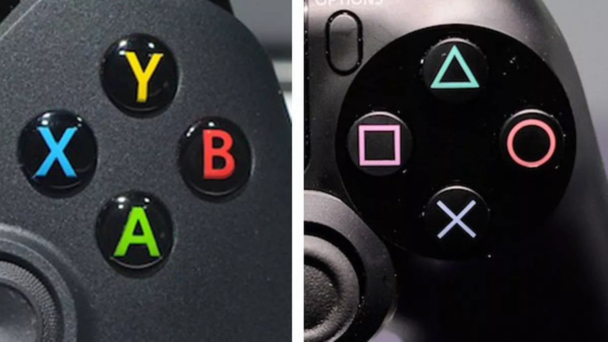
One source of inspiration might be PlayStation. While it's a product developed by a Japanese company, they use simple geometric shapes, a triangle, a circle, a square, and a cross mark, instead of ASCII characters, A, B, X, and Y, as Xbox One does.

Xbox One Vs Playstation 4

source: https://www.mirror.co.uk/news/technology-science/technology/xbox-one-vs-playstation-4-2843214


As mentioned in comments to this answer, the tick mark meaning varies. In some countries tick marks are used to mark incorrect answers and errors, but in others, it's used to mark correct answers / approved elements.

One of the contexts where the tick marks are used to signal that a specific element was approved is a quality assurance review in the manufacturing and assembling industry. I have used tick marks this way when reviewing assembled electrical harnesses in a manufacturing plant when comparing the sample against the product specification drawing. All the elements in the physical part should be marked in the drawing with a tick mark; the missing elements were circled, and the elements present in the physical part having problems were marked with an X.


Would the new design vision concerns include "semantics" / "pragmatics" of the design elements like the accepted answer indicator?

I'm sorry for not using designer terminology correctly; I don't have experience with "design vision" and haven't used ChatGPT or similar GenAI tools to write this, only Grammarly.

7
  • 6
    We will be replacing icons throughout the site eventually, but because there are so many we will likely look for the most similar replacement and not be reviewing each use case in depth. HOWEVER, when a component gets reworked, the designer will take into account the usability working alongside the community to do this.
    – Piper Staff
    Commented Aug 8, 2023 at 16:54
  • 2
    @Piper Thanks for your kind response. Commented Aug 8, 2023 at 16:55
  • 3
    Some forum/Q&A sites use a medal-symbol for this, which I think better conveys having deemed "best" but not necessarily "correct". OTOH a green tick mark is a very universal symbol. Commented Aug 8, 2023 at 18:05
  • 4
    Actually the tick strikes me as very American. In school here in my country (admittedly, many decades ago), a tick mark would indicate an error in a test. The "correct" or "accepted" symbol would look like a stylized lowercase t with a dot on each side below the crossbar. On a form with empty boxes where each corresponds to a piece of text describing an answer or option, we would cross, not tick, the boxes we chose.
    – tripleee
    Commented Aug 9, 2023 at 15:44
  • 2
    The error tick is usually in red, and not green, though, @tripleee. I can confirm that the tick is still used for errors here (hi from your neighboring country). Commented Aug 9, 2023 at 19:08
  • 2
    There's no universal symbol, but the Stack Exchange site is Anglo-focused, and so using a tick makes sense. But it would also be reasonable for the non-English sites to be able to have a different symbol if one would make more sense. Commented Aug 10, 2023 at 23:31
  • 1
    @curiousdannii Considering the diversity of the public Q&A platform and that it has International sites in Japanese, Portuguese, Russian and Spanish it would be nice if it leans to be less USA-focused. Commented Aug 11, 2023 at 15:41
-4

It looks like we might be in for another extremely disappointing spate of design changes...

Since there are already a lot of answers and quite a lot of text, let me stick to some key messages and principles.

  1. Be more humble: Your design should be a public service, not a visionary experiment.

  2. Start by reverting/fixing onerous and injurious previous design element changes

    Some examples:

    All of these were rejected by the users - some staunchly rejected - and still they persist.

  3. Don't redesign without mass public demand. Just say no to that nasty urge.

  4. In (website) design, Newer != Better and also Fashionable != Better.

Finally, remember the first ethical rule for doctors: Primum non nocere.

1
  • 2
    Here you can find more links of requests to revert previous design changes, feel free to add them to your list
    – hkotsubo
    Commented Aug 14, 2023 at 23:50
1
2

You must log in to answer this question.

Not the answer you're looking for? Browse other questions tagged .