23

Mac OS 10.6 (a.k.a. Snow Leopard) includes a pretty new font called Menlo that supersedes Monaco as the default monospaced font.

I'd like to petition the overflowers to include it right after Consolas in the font-family for code on Stackoverflow.com.

3
  • Before Consolas would be better. That way Mac users will get it first, even if they have Consolas installed, and everyone else will never have to know. Commented Mar 11, 2010 at 8:00
  • @Quinn Taylor: As a Mac user in love with Consolas. Please no.
    – Chealion
    Commented Mar 11, 2010 at 19:14
  • @Jeff: I just came looking for this post as I noticed that the fonts had changed this morning... looks good! perhaps a bit geneva-like (taller and less broad than the monaco family), but it still looks nice on OSX.
    – Ether
    Commented Mar 18, 2010 at 15:24

2 Answers 2

6

I think that Menlo should probably be placed before Consolas. The reasoning I have here is that many of us who are using the Trilogy from Macs probably have Microsoft Office installed -- and if we have 2008, we have the Microsoft "C" fonts.

Consolas does, admittedly, look really good on a Mac (I use it in XCode; I wasn't even aware that I got this new Menlo font when I upgraded until just now), but if you really want to give Mac users the best Mac experience, I would consider putting Menlo before Consolas in the chain, as it is highly unlikely that any Windows or Linux user will have it.

4
  • 7
    Consolas is THE BEST! THE BEST! goo.gl/G30L Commented Mar 11, 2010 at 4:27
  • 3
    Consolas is the BESTEST!
    – o.k.w
    Commented Mar 11, 2010 at 4:29
  • 6
    Don't get me wrong, I love me some Consolas. But other Mac users may disagree with me and prefer Menlo. I'm looking out for their best interests. :) Also ... I thought we frowned on URL shorteners around these parts. ;-)
    – John Rudy
    Commented Mar 11, 2010 at 4:39
  • jeff is in the frowning exception list :P
    – o.k.w
    Commented Mar 11, 2010 at 4:58
6

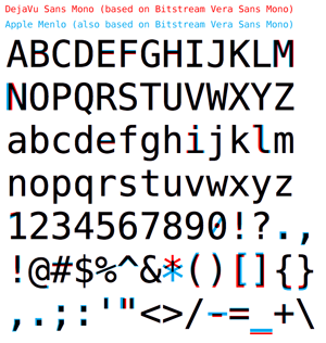
Not a Mac user but I went looking for a preview of the Menlo font.

Here's one:

Menlo vs Sans Mono

Image source:
http://arstechnica.com/apple/news/2009/06/font-changes-coming-to-mac-os-x-snow-leopard.ars
http://typophile.com/files/menlovsdejavusansmono_6131.png

Update:

Upon seeing more comments on Menlo vs Consolas, I found this article which compared both. Here's a visual comparison, courtesy of http://blog.chalitnc.com/2009/09/20/menlo-vs-consolas/

Menlo vs Consolas http://blog.chalitnc.com/wp-content/uploads/2009/09/menlo_vs_consolas.jpg

3
  • 4
    Give credit typophile.com/node/58625
    – Josh Lee
    Commented Mar 11, 2010 at 4:20
  • @jleedev, you got me there. Added :)
    – o.k.w
    Commented Mar 11, 2010 at 4:29
  • 1
    Proven: consolas is magnificent Commented Mar 18, 2010 at 6:53

You must log in to answer this question.

Not the answer you're looking for? Browse other questions tagged .