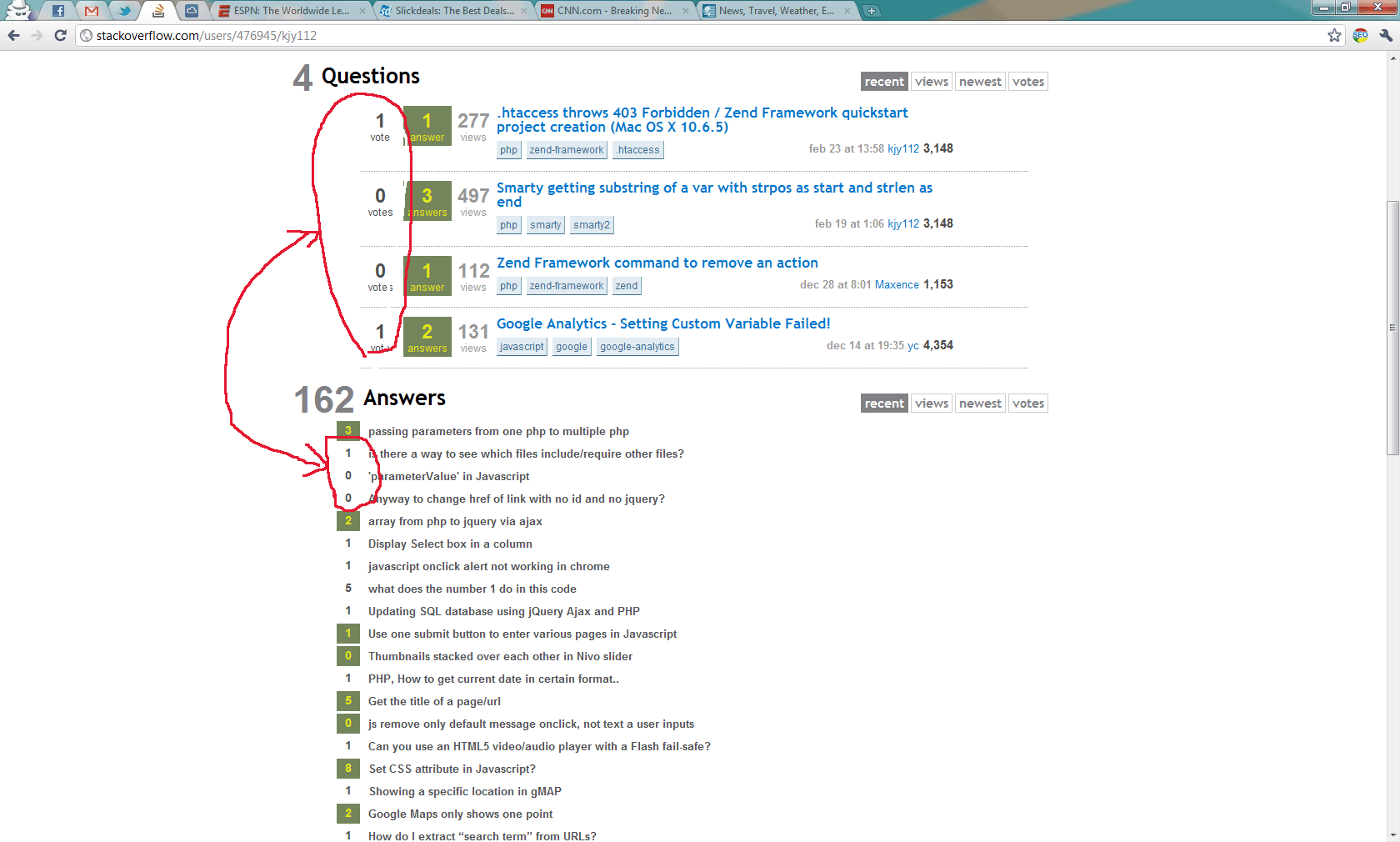
Is it me or SO's answer/question vote display looks different? I remember they used to have dotted borders or grey box background on the non accepted answers of some sort, but now there's nothing

-
Is this the same problem as this - meta.stackexchange.com/questions/82273/…?– ChrisF ModCommented Mar 9, 2011 at 14:24
-
yes and also in profile i believe. on the answer vote used to have brackets i think or maybe it's just me– KJYe.NameCommented Mar 9, 2011 at 14:25
2 Answers
It's by design. we're removing the background color for votes.
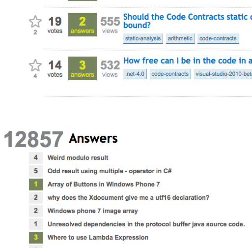
EDIT: to clarify, I'm only removing the bigger vote boxes' bgcolor, not the smaller vote boxes on the user profile page. Once the latest change is deployed it should look like this:

The bgcolor is removed on the bigger vote box because it doesn't add anything of value, except for cluttering up the homepage and question listing pages. But the smaller boxes should have a bgcolor since it adds more definition to the layout.
-
7Its kinda... ugh. When a question has a shaded background (i.e., its interesting), that white block around the vote count is very blurt. Its like derlop. Bleackert, and unpleasing to the eyes. Its fugly.– user1228Commented Mar 9, 2011 at 14:55
-
1
-
-
2Hrm, I'll wait to see how I feel once the fix goes out, but I always felt that the grey vote count boxes served to kind of mute the high contrast of the answer boxes next to them. :/ Commented Mar 9, 2011 at 17:24
-
Since you're working on this, this might be a good time to give Alternative graphic when a question has been answered some thoughts too? (I like the Super User way where the box around the "1 answer" ONLY has a different background color when an answer has been accepted.)– ArjanCommented Mar 9, 2011 at 17:56
-
-
Actually, now it is not so bad. The red background has also been removed from the home page which removes the apparent lack of contrast. This happened within the last 18 hours or so. Commented Mar 18, 2011 at 15:33
Is this by design too?

-
The background colour was supposed to be transparent, so that the votes box would have the same yellow background as the rest of the question. I'm under the impression that'll be fixed in the next build. Commented Mar 9, 2011 at 17:31
