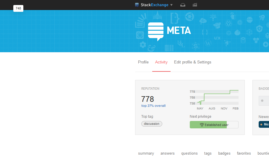
697

We've launched! Please give feedback here.


Today, we're shipping the new "Activity Page" of the Profile here on Meta SE, so you can test it out and hopefully share some feedback and suggestions before we ship it network wide. Hate words? Assuming you're signed in, just click your face up in the top bar, and you can see it right now. Or, keep reading...

Quick Background

You may recall that we're breaking the current "profile" page into two views, to address two use cases:

  • The "Profile Page" - When you click someone else's user card, by default, you'll see a view designed to give a better overall summary of who they are: Their location, their "About me," what tech/tags they're most active in, their top posts, etc. This page has been live on MSE for a while, and you've given us a ton of great feedback, most of which is already live.

  • The "Activity Page" - When you click on your own user card, you should see a page emphasizing your actual activity - what you've done, how big an impact you've had helping others, and what you can go do next, if you're so inclined.

Note that both pages will still be visible to everyone (although some fields aren't, for obvious reasons). So, you can look at other users' "Activity" page, and your own "Profile", that's just not the tab that'll be displayed by default.

The Old Activity Page

Let's think about when you're looking at your own page, and start with what the old page (still live on the rest of the network) was good at. Here's the bottom of the page:
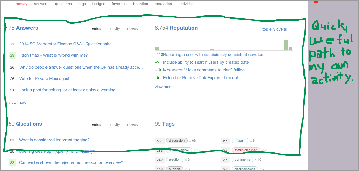
The Old Activity Page Bottom Half

It's efficient, and evolved over time, based on what power users told us they needed.

So, let's change it for change's sake! New Things are SHINY, and lead to a brighter - if poorly thought out and short lived - future! Huh. That's actually a pretty awful idea. So, let's leave the content, and pretty much everything else down there exactly how it was, and not mess up anyone's workflow. With the exception of some minor styling tweaks, the actual activity section you interact with today - both the content and the layout - is unchanged.

Now, lets take a look at the top of the page. Remember that the top part doesn't change when you drill down to different activity tabs; it's always there. Again, think of the case where you're looking at your own profile:

The Old Activity Page User Details

So, personally, I'm not that frequently going to my profile to, say... double check what my name is. Or confirm what city I live in. Or see if my age has changed. (Actually, the last one may feel like a waste most days, but ~0.3% of the time, it reminds me it's my birthday - YAY!)

Now, the point isn't that this was dumb design; it wasn't. When the page had to serve both use cases, this info made sense, but when you're looking at your own profile, there's no reason to always be showing you a bunch of things that A) you know and can't realistically forget, B) almost never change, and C) only do get changed by you.

So, we've replaced them, with a new section designed to better summarize your overall activity and contributions. And we've tossed some totally new features in, too.

The New Activity Page (aka "Top Boxes")
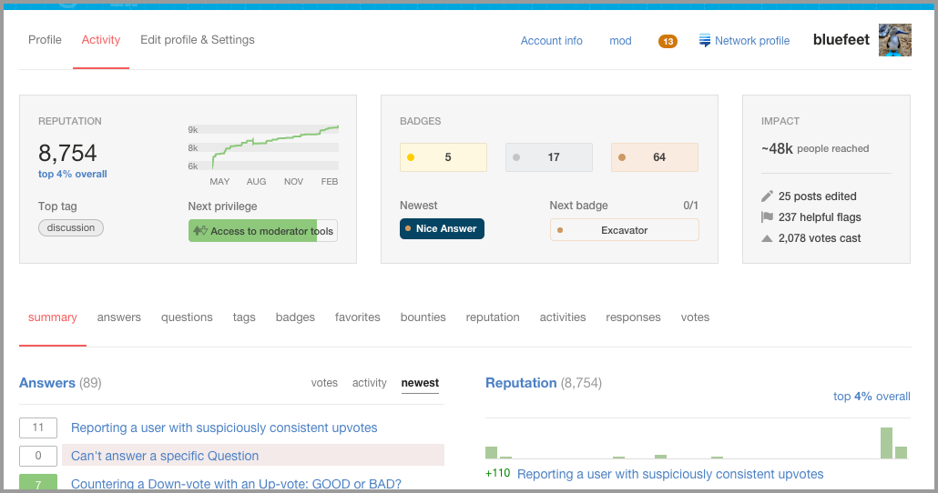
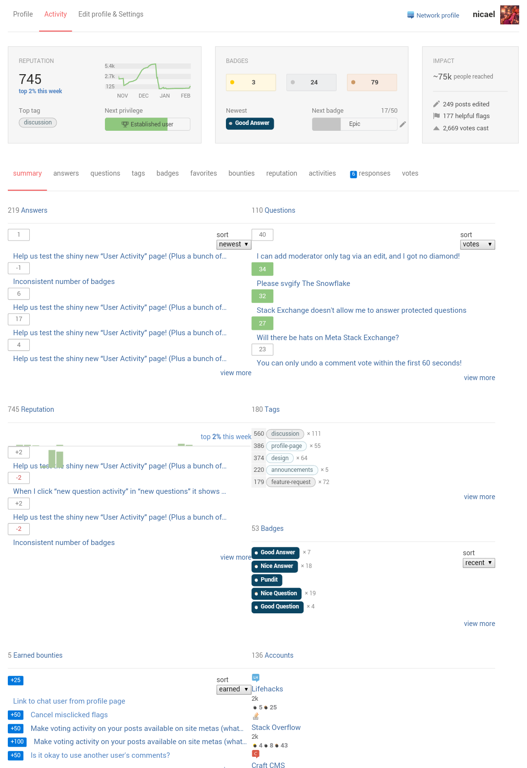
New Activity Page (Redesign of top half)

The basic goals were:

  1. Don't mess up the bottom part that's working, or make the top part any bigger
  2. Replace static, known personal data with dynamic, big-picture summaries of users' contributions
  3. Do more to help users track their contributions beyond rep and badge counts (more prominent stats on edits, flags, votes, and the new "People Reached" stat.
  4. Show users at all levels "what they can do next" and help more new ones learn the ropes gradually
  5. Address power-users needs better

I'm not going to walk through all the changes. I'd rather let you go touch it and share your thoughts, but here are a couple of features worth highlighting:

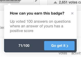
"Progress to next badge" bar automatically selects the badge you're closest to earning (or that's most logical to go for next), and tracks your progress toward earning it. It also helps walk new users through a slightly more guided intro, nudging them to read the "About" page, etc. For most badges, it not only explains how to earn 'em, but also links to a (mostly) logical place to go try to do so:
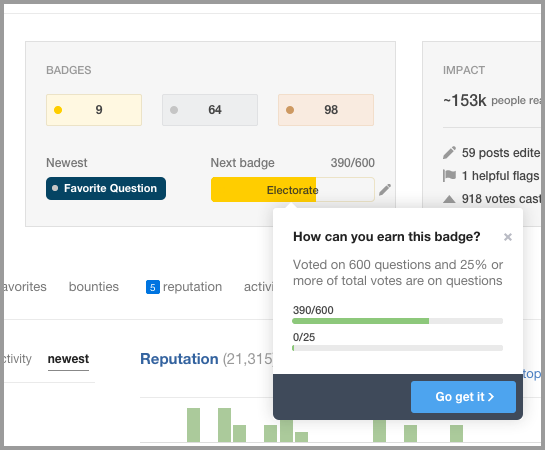
Badge Progress Tool tip

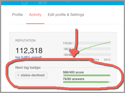
Progress to next privilege better conveys an attainable milestone, so users have a target to work toward that's a little less daunting than "catch Skeet". And it adapts for our most valuable users, too. Once you have earned all the privileges, you should first and foremost take a pause to celebrate how many frigging people you helped. (The "People Reached" stat is a nice rough estimate). Have a drink, maybe. But after that, we want you to be able to track goals, too, so the "next privilege" bar automatically switches to tracking your progress toward your closest tag badge. Plus, you can change it if you want to pick a different one (like this poor soul might want to do):
Badge Progress Loading Bar

The broader context:

As of now, both pages are live here on Meta, so you can try out how they work together. We're rolling out a couple of new features on the "Profile" side as well:

  • Dedicated fields to share your OSS projects or online presence (Dedicated fields for Github, Twitter, etc.) and new fields in the edit page for them. Note that they're totally optional, and leaving them out won't leave weird blank entries.
  • New "Hide a community" from my profile feature, (found on the "Edit & Settings" tab.) This came from community feedback, and helps users who may not want their SO Profile - which their boss might stumble upon - to prominently feature their top questions from, oh, I dunno...The Workplace, say. (It's not a true privacy setting, as the connection between accounts can be made with some work, like through the API, but it lets you control what sites are or are not featured on your profile page.)

Note: If you can, please post any suggestions or feedback on the changes to the "Edit/Settings" or the "Profile" page (the one others see) as a new post here on MSE. Ideally, we want to keep the answers here on this post focused on the activity side ("Top Boxes"), since that bit's brand new, and we want to see what suggestions there are important to the most people.

We LOVE it. But, as Joel keeps telling me, no one cares what I think.

We want to know what you think. Go touch it. Play with it. Tell us what you like (seriously). More importantly, what tweaks or adjustments should we make before we ship it network wide? Anything missing that you use all the time?

There are some places where we know we want to make some changes, but we wanted to wait for feedback to determine what approach makes the most sense. (For example, we're fairly sure more tooltips are needed, but having them everywhere makes a mess, so we did them for the most obvious places, but waited for your feedback before adding more, to see where they may be needed most.)

As always, thanks in advance for your feedback - it always helps us ship something better than whatever we started with.

94
  • 100
    The new badge progress page is awesome! But I fear it might lead to a lot of actions just for the sake of gettng the badge and not to improve the site.
    – juergen d
    Commented Feb 23, 2015 at 13:18
  • 106
    I love how Balpha's next tag badge goal is for the status-declined badge. Way to encourage him! :-P Commented Feb 23, 2015 at 13:25
  • 15
    This is really minor, but the tooltip for "1,760 votes cast" says it includes accept votes, but I added my up & downvotes together, and it equaled 1,760, so I have a feeling it doesn't include accept votes.
    – hichris123
    Commented Feb 23, 2015 at 13:45
  • 11
    This isn't that bad.. From all the old designs I thought it would be terrible, but it's not that bad.. Now can I have the old design back please?
    – ɥʇǝS
    Commented Feb 23, 2015 at 15:28
  • 11
    @ɥʇǝS, we'll accept that as the absolute best compliment we possibly could have received from you. And it's appreciated (for real).
    – Jaydles Staff
    Commented Feb 23, 2015 at 15:29
  • 24
    @Oded did you see how many words there are in this question??? Did you expect me to read them all? I just wanted clicky and oooo shiny. Is that too much to ask?
    – user1228
    Commented Feb 23, 2015 at 15:35
  • 10
    @Won't - I'm with you. If only that was mentioned at the start of the wall of text.
    – Oded StaffMod
    Commented Feb 23, 2015 at 15:36
  • 19
    @Bigood, I know, right? (Everytime I draw anything in public, Jin, our Creative Director files a "hostile workplace" complaint with HR.)
    – Jaydles Staff
    Commented Feb 23, 2015 at 16:42
  • 10
    Tracking progress of every single badge: something that should have been in since version 1. So glad it is added now, and I can't wait until it's network-wide.
    – TylerH
    Commented Feb 23, 2015 at 17:16
  • 15
    Don't have very interesting numbers on Meta... excited to see what the SO one looks like (and to know what my "next" badge is).
    – Hogan
    Commented Feb 23, 2015 at 19:41
  • 60
    I can't really judge this based on my (tiny level of) meta.SE activity (I really don't care that it thinks my next most achievable badge here is Critic for example). I'd need to look at how it works on my most active SE site(s). I think it might be good, but how could I really tell, unless I can see how it would work on the one I deal with every day? If there was a link on my user pages "check out how the new page would look" ... that would let me give real feedback! I can get some idea from other people's pages, ... but it doesn't really show me the things I am actually most familiar with
    – Glen_b
    Commented Feb 24, 2015 at 0:42
  • 21
    can we please have it now its so prettyyyyy Commented Feb 24, 2015 at 8:29
  • 55
    Gimmeeeee on SO now
    – mplungjan
    Commented Feb 24, 2015 at 10:15
  • 11
    @NoviceSEMetaGeek, it's always dangerous to estimate shipping dates, but managing expectations can't hurt: There is some unrelated back-end design work on other sites that needs to happen first, plus we're cranking through changes based on the suggestions here, so I think we're hoping for something like 4 weeks until we can push it network wide. A little faster than that is possible, and a lot longer is always a risk, but we're hoping to come in a little under a month.
    – Jaydles Staff
    Commented Feb 24, 2015 at 19:44
  • 10
    That's a remarkably elegant piece of writing: beautifully poised, and doing a great job of expectations-management and change-management. Kudos to the author(s).
    – 410 gone
    Commented Feb 24, 2015 at 20:51

147 Answers 147

1
2 3 4 5
156

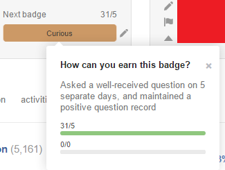
The "next badge" info can be useless

enter image description here

0/0 isn't useful. At all.

17
  • So, (if = 0) {hide()}?
    – Braiam
    Commented Feb 23, 2015 at 14:27
  • 10
    @Braiam That alone would be problematic. If I only saw the top one, there's a chance I'd go crying on meta about why I don't have it.
    – Mooseman
    Commented Feb 23, 2015 at 14:30
  • 27
    Huh? Zero is just a very low value of one. I can't see how that's confusing at all.
    – user50049
    Commented Feb 23, 2015 at 15:01
  • 3
    @TimPost It's not helpful since a boolean value isn't countable.
    – Mooseman
    Commented Feb 23, 2015 at 15:01
  • 79
    I feel like you're missing the whole Zen thing that "0/0" is trying to help you experience. It's the journey, man. Okay, some of these are weird. We'll take a look - thx!
    – Jaydles Staff
    Commented Feb 23, 2015 at 15:21
  • 1
    @Jaydles I thought about it. There are two things: (1) stricly boolean badges: then you don't need to show anything at all; (2) badges like curious: the second information would use some helper text, and it doesn't need a progress bar at all.
    – yo'
    Commented Feb 23, 2015 at 17:04
  • 1
    @Mooseman well it sure isn't uncountable.
    – Yakk
    Commented Feb 23, 2015 at 19:38
  • @Yakk I just meant it isn't countable beyond t/f. There's no trackable progress.
    – Mooseman
    Commented Feb 23, 2015 at 19:40
  • 3
    @Mooseman There is a trackable score. You have positive vs. negative. This is expressible as a progress bar with a tick in the middle, red to the left (negative score) and green to the right (positive score). Advantage: Shows if you make progress. Disadvantage: If your score is really bad, it will be really red in the progress bar.
    – yo'
    Commented Feb 23, 2015 at 22:49
  • 20
    x/x lim x->0 = 1 = 100% so therefore the bar should be green.
    – dav_i
    Commented Feb 24, 2015 at 9:24
  • 18
    Have you tried using L'Hôpital's? ;)
    – Zain Patel
    Commented Feb 24, 2015 at 17:31
  • 16
    @dav_i but: 0/x lim x->0 = 0 = 0% D: Commented Feb 25, 2015 at 13:15
  • 3
    I downvoted this answer, trying to get my "Critic" badge for "first downvote". Commented Feb 27, 2015 at 22:59
  • 5
    @DewiMorgan Couldn't you have found an answer that does deserve a downvote? :o
    – Mooseman
    Commented Feb 28, 2015 at 3:22
  • 3
    @Mooseman: I coulda, and with my current knowledge woulda, but am also kinda glad that I didn't, as that would have failed in a few ways. It wouldn't have illustrated so effectively that this new display encourages gaming the system, and the obvious negative downsides to that; and it wouldn't illustrate the fact that our inability to undo a downvote is unadvertised by the new system. An inability which is dumber than rocks, I should add. Commented Feb 28, 2015 at 5:53
143

- not sure when this was fixed, but looks OK to my eyes right now...

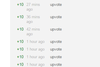
The reputation history page doesn't have a wide enough area for the time to be shown in relative form and causes it to collapse onto a second line:

Reputation History

3
  • 36
    And yet Upvote has masses of space...
    – Tim
    Commented Feb 23, 2015 at 21:08
  • This would be so super aligned with flexbox. :) Commented Feb 24, 2015 at 22:39
  • 3
    Or just not using a width CSS tag, but a min-width tag
    – Cole Tobin
    Commented Feb 26, 2015 at 1:44
134

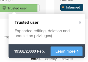
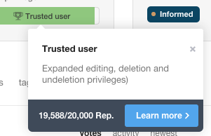
For higher privileges, reputation looks weird without commas:

enter image description here

Can we commaficate it?

enter image description here

30
  • 63
    Here, you go, you dropped these: ((
    – random
    Commented Feb 23, 2015 at 16:21
  • 75
    This form of digit grouping is somewhat specific to certain cultures (most Europeans will wonder about a hundredth or a rep point). Using thin spaces seems to be the more universally accepted solution.
    – Raphael
    Commented Feb 24, 2015 at 7:22
  • 4
    I am from an English speaking EU country and the full stop always initially confuses me when I see it as I only see it very rarely (usually when visiting France) and periods are also usually used in place of decimal points, whereas the comma or thin spaces do not cause confusion. That's just my 2c.
    – Toby
    Commented Feb 24, 2015 at 11:09
  • 2
    @Raphael: I have no difficulty reading English numbers with English thousands separators and numbers in my local languages with our local thousands separators. I'm thinking maybe you just need more experience with multilingual reality.
    – tripleee
    Commented Feb 24, 2015 at 13:16
  • 30
    Maybe I overstated the relevance of the issue, but the fact is that comma is not universally used in this fashion, whereas (thin) spaces can not be confused for anything else. Hence I think thin spaces would be the better typesetting choice here (and everywhere on the site). (cc @tripleee; I don't have an understanding issue myself, but we have now multiple non-English communities in the network. Don't forget that English-speaking countries are in the minority in the world, both in terms of states and speakers.)
    – Raphael
    Commented Feb 24, 2015 at 14:06
  • 5
    @Raphael For SO sites in other languages, certainly, number formatting (and sorting, and other locale conventions) should be set up in accordance with the language of the site. That reasoning does not support using an alternate thousands separator on the English-language site. In fact, it pretty much dictates using the English standard.
    – tripleee
    Commented Feb 24, 2015 at 14:13
  • 20
    @tripleee And that seems to be thin space, according to the style manuals quoted on Wikipedia. The SI system also specifies spaces as delimiters, for precisely my reasons. Especially for the science sites, adhering to SI standards seems obvious.
    – Raphael
    Commented Feb 24, 2015 at 14:22
  • 7
    @Lankymart Probably not, but it's fairly clear what it means. Also, I got the second result for 'commaficate', so it's totally worth it.
    – Undo
    Commented Feb 24, 2015 at 15:17
  • 11
    Just put 19k/20k rep, this is so universal. Commented Feb 25, 2015 at 6:50
  • 3
    @TeemuLeisti I'm just going off what Google says blame them. Commify (12.6K+ results), Commatized (700+ results) and Commaficate (4 results) - All figures accurate at point of writing.
    – user692942
    Commented Feb 25, 2015 at 10:54
  • 10
    @Lankymart At what point does it just become commatose? Commented Feb 25, 2015 at 11:56
  • 5
    I would agree with @Raphael, using spaces in lieu of commas. International English and International Standards are a bit more non-native English speaker friendly, whilst still remaining easily understood by Brits, Aussies, Yanks and other native English speaking nationalities alike. Commented Feb 26, 2015 at 10:16
  • 10
    I'm going to shock you all by pointing out that rep points are imaginary and don't represent anything real. It doesn't matter one English ounce which seperator you use because anyone who misinterprets the value will still get the relative value correct. Use the star of David and nearly everyone would still 'Get It' immediately. The only absolutely incorrect thing you could do is use spaces as a separator when using a variable spaced font because it'd be nearly impossible to see. Anyone who doesn't immediately understand that has no place making typography suggestions.
    – krowe2
    Commented Feb 26, 2015 at 20:39
  • 2
    The comma (or any other separator) looks very strange to me in a fraction. I find the first picture easier to read. The second looks like a list with three numbers in it: 19, 588/20, and 000
    – Paul
    Commented Mar 2, 2015 at 21:16
  • 3
    @krowe2 I use thin spaces in my LaTeX documents (not using fixed-width fonts, obviously) all the time, and they are clearly visible. Just hacked in thin spaces as separators on this very site, they are clearly visible (FF 35, Ubuntu). So maybe you want to tone down you self-assured judgement just a little bit. (Or maybe you are just used to crappy typesetting, or you need glasses, I don't know.)
    – Raphael
    Commented Mar 4, 2015 at 8:37
93

I would like the "Newest badge" to be a link to this specific badge:

The "Next badge" has a different view/design so less important, but having the standard badge view, I was really expecting the Newest badge to be an actual link.

7
  • And isn't it? Maybe it got status-completed in-between...
    – yo'
    Commented Feb 23, 2015 at 22:51
  • 1
    At the moment a click opens a popup describing the badge instead of linking to the badge page.
    – Daniel
    Commented Feb 24, 2015 at 10:03
  • 7
    There's no reason why that popup can't have a link to the actual badge page, though.
    – E.P.
    Commented Feb 24, 2015 at 13:50
  • When you say link to the specific badge, what do you mean? (For specific-post-driven badges, like Nice Answer, I think I'd expect it to indicate or point to the relevant post?)
    – Jaydles Staff
    Commented Feb 24, 2015 at 17:41
  • 3
    @Jaydles no, I mean such link: meta.stackexchange.com/help/badges/23/nice-answer?userid=147336 from there you can reach all relevant posts, if such exists. Commented Feb 24, 2015 at 23:13
  • 3
    @ShadowWizard, first off, thanks for using my ID in the link - nice touch. I see - that puts the post you're looking for (the new one that triggered the award) right at the top, but with the rest below. Makes a lot of sense. I'd kind of also like to see a link to the relevant post in the pop-up - they're often old enough that I want to go there, too. We'll likely do something along these lines, although it might added after it ships network-wide with some other "non-blocker" good ideas.
    – Jaydles Staff
    Commented Feb 24, 2015 at 23:18
  • @Jaydles thanks a bunch! ;-) Commented Feb 24, 2015 at 23:25
88

(with you in the next build)

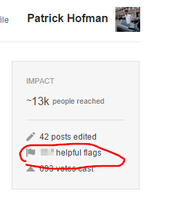
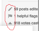
Can we have the helpful flags link on the text too instead of on the number only?

Now you need to click very carefully if you have only a few flags.

enter image description here

11
  • 4
    We are discussing internally whether there is a good reason to hide this value from everyone. If not, it might do a comeback.
    – Oded StaffMod
    Commented Feb 23, 2015 at 15:20
  • You mean: hide it from me too? This is taken from my profile, right? Commented Feb 23, 2015 at 15:21
  • No, I mean show it to everyone.
    – Oded StaffMod
    Commented Feb 23, 2015 at 15:22
  • Ah, okay. So this would become public information? Is it useful to show the declined ratio too? Commented Feb 23, 2015 at 15:22
  • 4
    That's what we are discussing. Any input welcome - we definitely would like to hear from people what they think.
    – Oded StaffMod
    Commented Feb 23, 2015 at 15:23
  • 3
    @Oded Perhaps post a new question to that effect?
    – Scimonster
    Commented Feb 23, 2015 at 15:26
  • 1
    Posted a question about this here: Should the number of helpful flags be public to anyone?. Commented Feb 23, 2015 at 15:49
  • 2
    @Oded, when you view another person's profile there is no space between the number and "helpful flags".
    – gunr2171
    Commented Feb 24, 2015 at 21:47
  • 1
    @gunr2171 - thanks for reporting. Fixed in the next build.
    – Oded StaffMod
    Commented Feb 25, 2015 at 11:49
  • 5
    From my experience as a mod: keep the stat private. The main purpose of flags is to keep the site running properly. But even now, we have users who are hung up enough on numbers to protest not because the declining didn't make sense but because it feels like a negative mark on their record. Making the number public will induce behavior geared towards keeping the record clean even when it interferes with the primary purpose of flag casting and handling, e.g. users not casting when they are unsure, and pressure on mods to never decline.
    – rumtscho
    Commented Feb 25, 2015 at 14:12
  • @PatrickHofman Thanks for that separate post about whether or not this should be public information. I think it should be private, but as with a number of these issues, I think it merits a separate discussion, and I encourage people to make your opinions known. Once the new profile is rolled out network-wide, it will be much more difficult to make changes. This is a huge undertaking, and I appreciate how hard everyone is working to address the concerns of the entire SE community! Thanks all! Commented Mar 5, 2015 at 1:06
76

- not really secret information, as discussed in the related meta post.

If someone's next badge is Deputy (or Marshall, probably), I can see how many flags they have: (balpha's profile)

61/80 flags for balpha

This used to be private information, and pending a decision on Should the number of helpful flags be public to anyone?, might as well be hidden.

8
  • 39
    A good question: why do they hide the number of helpful flags? It's not exactly private or sensitive information, and it's already publicly visible information when a user does receive the Deputy or Marshal badge. So, why not always display the number and only link it for that user and moderators? If there's a line specifically dedicated to that statistic in that right box that will otherwise always be empty, just show it.
    – animuson StaffMod
    Commented Feb 23, 2015 at 14:41
  • 13
    @animuson - we are thinking this over. There might not be a good reason to hide it.
    – Oded StaffMod
    Commented Feb 23, 2015 at 14:55
  • 1
    I agree with @Oded that showing the precise number of flags can have problems. Knowing that someone is a "flagger" is not that much a problem. But the precise number can allow for some reverse engineering of their behaviour.
    – yo'
    Commented Feb 23, 2015 at 15:48
  • 12
    MSE question for this issue: meta.stackexchange.com/questions/249981/…
    – Oded StaffMod
    Commented Feb 23, 2015 at 15:51
  • @yo' What reverse behavioral reverse engineering can be done?
    – skrrgwasme
    Commented Feb 23, 2015 at 20:12
  • @skrrgwasme IMHO flags are confidential (much more than votes), and from precise number of them, you can know when the user flagged something. I don't consider it good.
    – yo'
    Commented Feb 23, 2015 at 20:23
  • @yo' I agree that you can see when a user flagged something, but not what. If I downvote and flag a post without leaving a comment, there is no way the author of that post can know it was me that did so. Do you see a way to for visible flag counts to allow a post's author to associate flags with an account if the flagger doesn't leave a comment?
    – skrrgwasme
    Commented Feb 23, 2015 at 20:30
  • 1
    Flagging isn't always bad like downvoting, which also isn't always bad. Downvoting is arguably worse since it lowers rep, which is important to newbies. Flagging to close only hurts visitors when the reason is bad (like Ubuntu questions that mention the version being closed due to a new version being out despite the issue persisting in that new version). Commented Mar 6, 2015 at 11:29
70

inconsistent accept colour

Inconsistent accept background greens make kittens cry.

9
  • 48
    Inconsistent how? "95" is 26% higher than 76, so it's 26% deeper green, as it should be. (Okay, so applying numeric measures to terms like "deeper color" MAY give away that I'm just making crap up at this point.)
    – Jaydles Staff
    Commented Feb 23, 2015 at 16:56
  • 14
    You just wanted the kittens to stop crying, it's understandable! And don't listen to Joel, we care what you think. Unless we disagree, then I make no promises.
    – Tim Stone
    Commented Feb 23, 2015 at 16:57
  • 60
    I'm not crying! I'm just parsing onions with regex. Commented Feb 24, 2015 at 1:44
  • 2
    @SomeKittens, do you have a formula for dicing? [I know I should ask this on SO, or Seasoned Advice, but I've no time for research]
    – TLama
    Commented Feb 24, 2015 at 8:00
  • Just completed... But I loved the previous accept color!
    – nicael
    Commented Feb 25, 2015 at 16:08
  • 1
    @nicael Well that's a separate issue, I just wanted them to be consistent, whatever colour they were :P
    – Tim Stone
    Commented Feb 25, 2015 at 16:09
  • Ok. Then I request there that those both colors should be old dark green.
    – nicael
    Commented Feb 25, 2015 at 16:14
  • 2
    @nicael -1 I actually like the lighter color
    – Cole Tobin
    Commented Feb 26, 2015 at 1:43
  • 1
    @Tim I disagree. Does it not make sense that the smaller box should be a more compressed, concentrated green?
    – GKFX
    Commented Feb 28, 2015 at 14:21
63

Yay, I can hide communities now! I've just tested it with my Lifehacks account - added it to hidden communities.

However: It's properly hidden in the "Profile" tab:

...but it can be seen in the new "Activity" tab:

enter image description here

1
  • 13
    Excellent catch!
    – hairboat Staff
    Commented Feb 24, 2015 at 18:26
48

Please add a more useful tooltip for helpful flags.

enter image description here

The "posts edited" tooltip is good:

Total number of edits made to improve existing posts

The "votes cast" tooltip is good:

Total number of up, down, or accept votes cast

But the helpful flags tooltip is just

Helpful flags

I propose it be changed to

Total number of raised flags marked useful


Also:

if(flags == 1) str = "helpful flag"; else str = "helpful flags";
7
  • 19
    I see pluralization bug!
    – nicael
    Commented Feb 23, 2015 at 14:35
  • +1 for good documentation
    – Unihedron
    Commented Feb 23, 2015 at 14:36
  • @nicael The screenshot was taken from the original post, but I appended a note of that here.
    – Mooseman
    Commented Feb 23, 2015 at 14:36
  • 1
    It was agreed somewhere that SE doesn't use singular for the case when a counter happens to be equal to one. I don't like it either, but I understand the decision.
    – yo'
    Commented Feb 23, 2015 at 15:50
  • 14
    So... 0 flag but 1 flags?
    – KRyan
    Commented Feb 23, 2015 at 16:33
  • 1
    @KRyan [status-fixed-typo]
    – Mooseman
    Commented Feb 23, 2015 at 16:36
  • 4
    [status-fifteen-char-smiley-face] :)
    – KRyan
    Commented Feb 23, 2015 at 16:37
45

Please make "posts edited" and "votes cast" links to the relevant pages:

  1. "posts edited" would link to activity → revisions

  2. "votes cast" would link, only when viewing own profile of course, to my votes tab.

3
  • Helpful flags, also.
    – Frank
    Commented Feb 25, 2015 at 22:00
  • @Frank It is already a link.
    – nicael
    Commented Feb 26, 2015 at 21:50
  • Oh. Right.‍‍‍‍‍‍‍‍‍‍
    – Frank
    Commented Feb 26, 2015 at 22:00
43

Doesn't "Go get it" encourage people to do bad things?

E.g. for "Sportsmanship":

When I click it, it brings me to my answers. So is it supposed that now I'll start clicking each of my answers and up voting other answers on that page? That's not the purpose of voting... I thought our votes should be based on the contents of the post.

15
  • 16
    Don't do badges that in general? I think there is not much harm in it (opposed to the current situation). Commented Feb 23, 2015 at 14:24
  • @Pat Yes, but, as for me, I often vote without thinking about getting this badge...
    – nicael
    Commented Feb 23, 2015 at 14:25
  • 1
    If you are searching for badges, you won't need the button. If not, I think it is a useful way to encouraging good behavior by pointing people to the way how to get something. Commented Feb 23, 2015 at 14:26
  • 6
    I agree with @nicael. Although it may not affect established users, new users who see this type of prompt are more likely to upvote garbage.
    – Mooseman
    Commented Feb 23, 2015 at 14:27
  • 31
    We've never had this type of prompt before...so let's see what happens rather than assuming what will happen.
    – Laura StaffMod
    Commented Feb 23, 2015 at 14:29
  • 1
    @Laura Okay, but only if you track actions taken shortly after clicking the go-get-it button, so we have data to make an informed conclusion. (e.g., are users more likely to upvote bad posts (downvoted by other users) after clicking the button?) Commented Feb 23, 2015 at 16:42
  • @PatrickHofman But so far, they were "little surprises", like your company giving you golden watch after you work there hard for 50 years. You don't hunt for golden watches, but they make you happy. SE should not encourage people to hunt for badges.
    – yo'
    Commented Feb 23, 2015 at 17:08
  • @yo' then there shouldn't be badges in the first place. Commented Feb 23, 2015 at 17:31
  • @PatrickHofman There should IMHO, similarly as there should be golden watches to very good employees. But it shouldn't be something you hunt for.
    – yo'
    Commented Feb 23, 2015 at 17:32
  • @yo' I thought employees hunted for golden watches by not taking jobs with other employers? Seriously though, what is "bad" about upvoting other answers, or any other "badge-earning" behavior? Badges are, I think, designed to encourage good behavior. Commented Feb 23, 2015 at 21:53
  • 3
    @yo' they weren't "little surprises" if you were a badge hunter... there was already a page that shows them all and explains how to get them. So if you were a badge hunter before then you already probably found out how to get them all and so this changes nothing. The only thing that remains to be seen is if it encourages people who weren't badge hunters to become badge hunters.
    – Klors
    Commented Feb 26, 2015 at 14:11
  • Personally, I've kind of been in limbo on this site for a while, not moving ahead on many fronts. As such I would love this feedback. But then, I'm an adult and rational person and would get not much kick from badge hunting, so maybe that's just me!
    – Raydot
    Commented Feb 26, 2015 at 19:24
  • @Laura: Review queues have the progress bars for badges and such integrated in the UI. Until now that was the place in the UI where most focus was put on getting badges, on artificial incentives. Bad and robo reviews have been big problems. I think that's not surprising. When you put all the focus on the badges/..., that's where people's focus will be. People do stuff for badges and you hope that it happens to be good for the site. Previously they did stuff that was good for the site and maybe happened to get a badge for it.
    – sth
    Commented Mar 7, 2015 at 21:46
  • The next badge prompt for me here on Meta is "Citizen Patrol". It's no fun knowing I have to go out looking for something I can downvote just so I can get a new badge to show up in that section. (Oops, I meant flag, thanks nicael!)
    – Jan Murphy
    Commented Mar 14, 2015 at 21:06
  • 1
    @Jan it's awarded for flagging, not downvoting btw :)
    – nicael
    Commented Mar 14, 2015 at 21:06
43

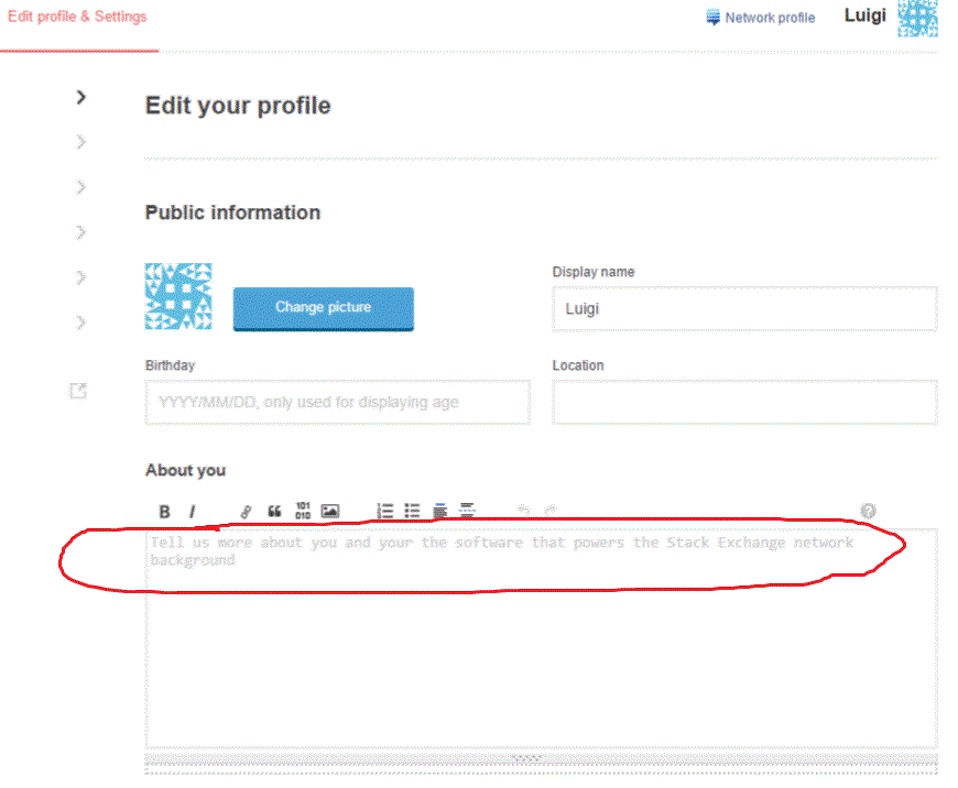
This text in the edit profile "About you" box is confusing and I'm not quite sure what it's trying to say:

confusing sentence

"Tell us more about you and your the software that powers the Stack Exchange network background"

Markov chain?

5
  • 1
    Yeah, I saw that too and my the wondered what the hell.
    – mattdm
    Commented Feb 24, 2015 at 22:59
  • 5
    In seriousness, I assume it's supposed to just say "Tell us more about you and your background", and "the software that powers the Stack Exchange Network" got pasted in by accident somehow.
    – mattdm
    Commented Feb 24, 2015 at 23:09
  • Lol! That's hilarious :D
    – nicael
    Commented Feb 25, 2015 at 12:36
  • 13
    The idea behind this was to just steal the "what is this site about" text and insert it directly into that space. So on Stack Overflow, for example, it would read as "Tell us more about you and your programming background." It obviously doesn't work with Meta's on-topic text.
    – animuson StaffMod
    Commented Feb 26, 2015 at 17:37
  • 2
    @animuson I think Meta is a special case.
    – tbodt
    Commented Feb 27, 2015 at 22:33
41

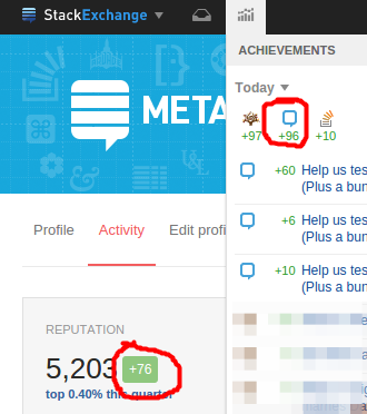
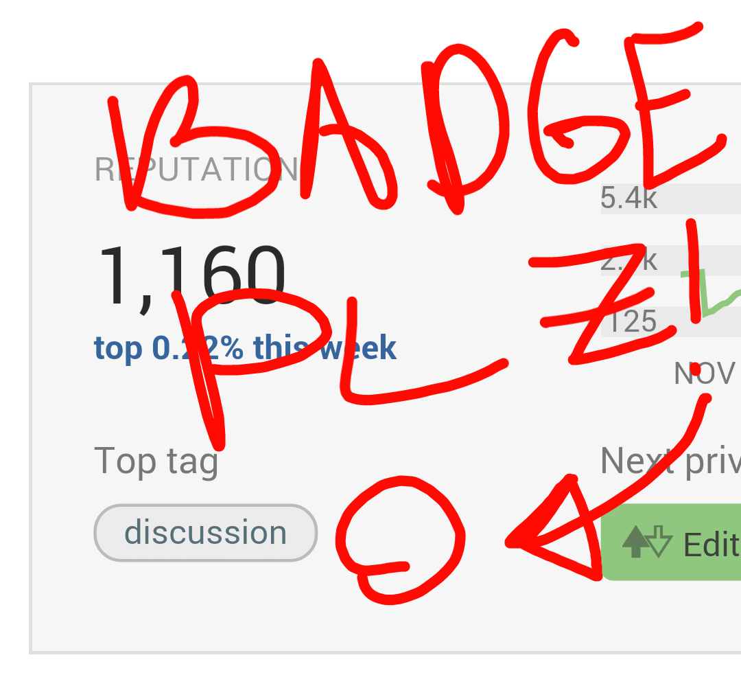
There's a green number next to my rep in the activity view. It looks like it should be how much rep i got today, but it's been consistently off by 20.

enter image description here

And i can't just blame caching here, because it's always off by 20.


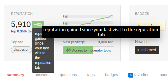
Update: Upon clarification from Oded, it's the amount of reputation earned since visiting the rep tab in the profile (activity). OK then, that makes sense. How about a tooltip explaining that?


Update: This has now been added, but i'm seeing the tooltip twice. One the default, and one a custom SE one:

double tooltip

6
  • 5
    It is the value since you visited the reputation tab of the activity page.
    – Oded StaffMod
    Commented Feb 23, 2015 at 14:12
  • 12
    @Oded Ah, OK. Now can you add a tooltip explaining that?
    – Scimonster
    Commented Feb 23, 2015 at 14:13
  • 6
    This confused me the first time I saw it too Commented Feb 23, 2015 at 14:57
  • 2
    Reminds me of the number in favorites tab and highlighted posts when I visit it. Although I read what they mean several times, I keep forgetting. A tooltip would be really great everywhere “since last visit to a specific page” stats are displayed.
    – Palec
    Commented Feb 23, 2015 at 22:45
  • +! for the tooltip then...
    – 7ochem
    Commented Feb 26, 2015 at 15:01
  • Yeah, noticed the double tooltip. That's fixed for the next build.
    – Oded StaffMod
    Commented Mar 6, 2015 at 12:11
39

, but strangely, the preview isn't shown if browsing from mobile (From Galaxy S5 in Chrome in my case) (please comment if you can repro this strange behaviour).

As you are modifying profile editor anyway, can "About me" preview be added please?

37
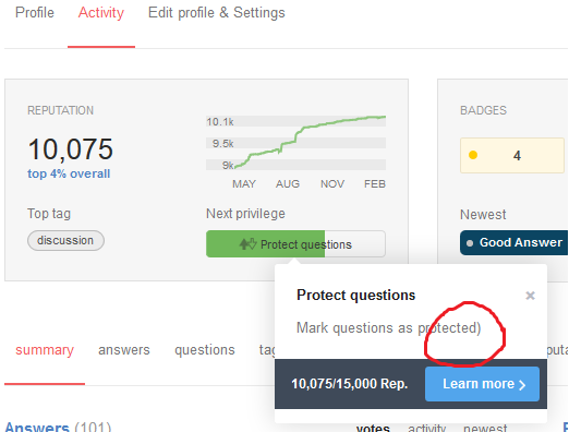
  1. The text used for the "Protect Questions" privilege has a lonely bracket;

    enter image description here

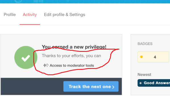
  2. The text used to congratulate me I'd surpassed 10k didn't read right;

    enter image description here

    Either "Thanks to your efforts, you have... Access to moderator tools", or "Thanks to your efforts, you can... Access to moderator tools"

5
  • 1
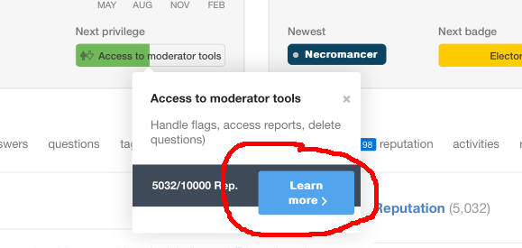
    I've lost the pop-up on my own one, but the recently-earned privilege needs to be linked to the appropriate description. I.e. currently the Access to moderator tools on that second screenshot does not link anywhere.
    – E.P.
    Commented Feb 23, 2015 at 18:13
  • 3
    The lost parenthesis actually exists on other badge descriptions as well.
    – Werner
    Commented Feb 23, 2015 at 18:21
  • 8
    "Thanks to your efforts, you can... Established user" <-- This did make soo little sense that I did not realize it should be read as 1 phrase, with a descriptive privilege, until reading this answer. imgur.com/7yF8COJ
    – Sumurai8
    Commented Feb 23, 2015 at 22:49
  • 3
    Maybe “can” → “gained” improves the situation. But “…, you gained Established user” still sounds bad. Better avoid incorporating privilege names into a sentence, or rename them for this purpose.
    – Palec
    Commented Feb 23, 2015 at 22:53
  • If it's a generic phrase for all privileges, Thanks to your efforts, you earned is probably a lot better. Otherwise, why not craft individual lead-up sentences for each?
    – E.P.
    Commented Feb 24, 2015 at 13:57
36

as I see, but another problem came up

Can my top tag have the tag badge shown (silver in my case) if I have it (as it's done in the "profile" tab for "top tags")?

0
33

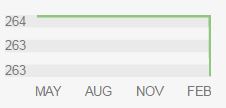
by changes of just 1 reputation you show the same number (263 below) twice. Looks a bit incorrect having the same value two times on different positions in a graph.

enter image description here

The same number can be repeated three times if there were no reputation changes in the period:

enter image description here

3
  • 3
    I would assume that it's 263.5 rounded down, and I agree it's a bug then. Commented Feb 24, 2015 at 17:53
  • 3
    but two times 264 also wouldn't be nice. I would leave the middle blank in this case.
    – Simulant
    Commented Feb 25, 2015 at 8:09
  • 10
    Easy fix: post a bug report, get upvotes that change the scaling of the graph. It's a self-fixing bug.
    – user259867
    Commented Feb 26, 2015 at 2:00
30

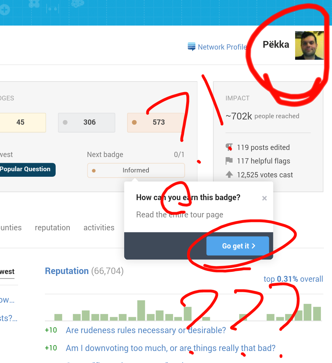
The badge progress popup shouldn't say "how do you get it" and "go get it" shouldn't be displayed if the profile in which I open this popup isn't mine (I mean, eh, I am not Pëkka but nicael, but Pëkka's profile says I can get this badge):

Moreover, I have this badge already :) Also I tried getting this badge for Pëkka, as the popup says, but failed :D

1
  • 6
    even if it would not be a sensible bug report (which it is), I would upvote for "I tried getting this badge for Pëkka, as the popup says". Would be funny if system indeed worked that way (it probably does to some extent - eg, other users can help one get tag badges by voting up posts in respective tags)
    – gnat
    Commented Feb 27, 2015 at 8:28
29

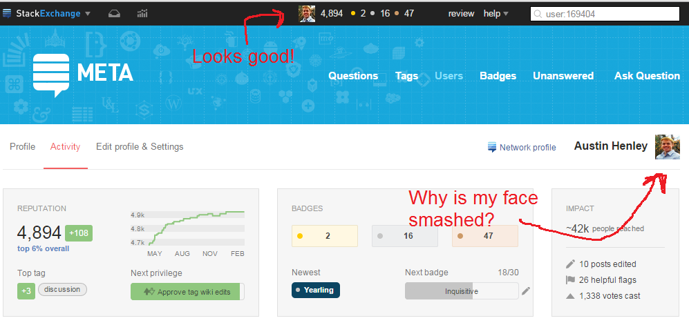
- we are now using an image size the is supported by imgur, so it gets properly cropped.

My face is being smashed.

Profile pic is being resized weird.

5
  • Whoa that's weird. It links to i.sstatic.net/RUyLX.jpg?s=36&g=1 instead of i.sstatic.net/RUyLX.jpg?s=164&g=1. Did you upload a non-square avatar?
    – Bergi
    Commented Feb 25, 2015 at 1:10
  • @Bergi I'm not sure. It looks correct everywhere else though, including the new profile's Edit Profile page. Something is amiss! Commented Feb 25, 2015 at 1:22
  • Can confirm this (screenshot). I uploaded a non-square picture. It gets cropped correctly everywhere but on the top-right of the tabs Activity and Edit profile & Settings. Commented Feb 25, 2015 at 13:51
  • This appears to have been fixed? Commented Feb 25, 2015 at 22:03
  • @AustinHenley It works correctly for me Commented Feb 26, 2015 at 9:47
27

When I hover my mouse on the graph, labels are shown on the top left of the page...

Graph bug

See the label on the black sidebar? My cursor was somewhere at the beginning of the green line. I guess it is just a problem of relative/absolute position of elements, the label is moving the same way I move my mouse over the graph :)

On Firefox 36.0, Windows 8.1

5
  • Same here: Firefox and Windows, also adblock and Ghostery if that's relevant.
    – Kobi
    Commented Feb 23, 2015 at 18:09
  • 1
    FF 35.0.1, Win 7. Same
    – Brad
    Commented Feb 23, 2015 at 18:45
  • 4
    This was posted already: meta.stackexchange.com/a/249964/202832
    – Mooseman
    Commented Feb 23, 2015 at 18:46
  • @Mooseman Oh, didn't see it. Actually I looked at captures to see if it was reported... Commented Feb 23, 2015 at 19:10
  • Also on Ubuntu, FF 37.0a2
    – topher
    Commented Feb 24, 2015 at 8:43
26

The Hide Communities section shows 12 communities, but I can't tell how those 12 were selected. It includes many communities that I have joined but have gained zero rep. I suggest it display your top 12 communities in terms of rep. It'd also be nice to show the rep (and possibly your number of questions and answers) next to each community.

6
  • 3
    Totally agree, better yet take it initially from the customized "your communities" list in the top bar, then complete to 12 if needed sorting by reputation. Commented Feb 23, 2015 at 15:51
  • 10
    Yeah, this page behaves super-weird if you have more than 12 sites. We'll definitely make some changes to this UI to address what you're describing.
    – Jaydles Staff
    Commented Feb 23, 2015 at 15:52
  • @Jaydles, I'd rather it just listed all sites, rather than making me go somewhere else to remember which sites I'm on. Also, what happens if I choose to hide the site I'm currently on? (I haven't dared try)
    – Benjol
    Commented Feb 24, 2015 at 9:44
  • @Jaydles any updates a month later? Commented Mar 24, 2015 at 0:09
  • 1
    @ShadowWizard, we're cranking to ship the page network-wide, probably this week. This update will probably come in a second pass a bit later.
    – Jaydles Staff
    Commented Mar 24, 2015 at 3:46
  • @Jaydles thanks, fair enough. :) Commented Mar 24, 2015 at 5:42
26

- I appreciate the thought, but the graph on this page is not meant to be a fully detailed graph, that's why we have the reputation sub tab...

These tool-tips are really cool:

enter image description here

But given that the graph is super-small (and the tooltip often covers the axis labels), it would be cool to have the month/year in the tooltip too, so instead of "2,464" it would read "Jun '14 2,464".

4
  • @oded then why have tooltips to begin with? :)
    – badp
    Commented Mar 6, 2015 at 7:00
  • @badp - adding the date would make it overly busy. Just rep strikes a good balance, I think.
    – Oded StaffMod
    Commented Mar 6, 2015 at 9:38
  • @oded I agree both can't work but in general what would be more useful is being able to click on the small graph to open the reputation audit page of your profile in its entire glory
    – badp
    Commented Mar 6, 2015 at 10:47
  • @badp - you mean like it does already?
    – Oded StaffMod
    Commented Mar 6, 2015 at 10:59
26

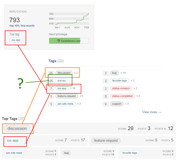
- There was some inconsistency in selection and ordering of tags - between Top Tags and the selected top tag in the activity page.

enter image description here

There seems to be an inconsistency between what different parts of my profile think my 'top tag' is. I presume the actual 'Top tag' is the most intelligent measure, but the inconsistency is a bit odd.

(N.B. Third variation edited in later.)

And to sneak a second one in - is there a way to set a tag-badge as your next target that I've missed? That's what I'd want to do on my SO profile!

4
  • 4
    The Top tag counts the score on both questions and answers, while the the Tags section only show score from answers. (in your case, your ios-app has total score of 47, and 7 from answers only, you can hover the tag score for this info). Commented Feb 24, 2015 at 11:25
  • Thanks @AndrewT - I'd assumed something like that, but the inconsistency is odd. (With the third variation as well!) All these lists of "Top Tags" should be ordered in the same way - or clearly NOT in "Top Tag" order: e.g. Alphabetical.
    – Chris
    Commented Feb 24, 2015 at 22:08
  • 1
    Would also like to track a tag badge for my next target. Probably closer to one of those than any of the others I can track.
    – Troyen
    Commented Feb 24, 2015 at 23:10
  • 2
    There was some inconsistency in selection and ordering of tags - between Top Tags and the selected top tag in the activity page. That is now resolved.
    – Oded StaffMod
    Commented Mar 3, 2015 at 21:14
26

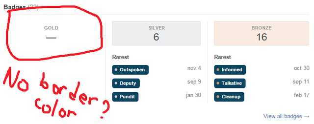
The new "Badges" section is more colorful and I like it, but is there a reason why there is no background color and border if there are no badges for particular rank?

Aside of that, I personally prefer "0" or "-" (dash) instead of "—" (notice the length) when there are no badges. As of current, without color and border, I thought that as horizontal line at first and was confused.

Jaydles's badges

Jaydles's badges on Scimonter's feedback

my badges

My badges

1
  • 7
    +1, side-by-side, the two designs make sense, but looking at my own profile, it took a moment to work out why "GOLD" was badly underlined...
    – Chris
    Commented Feb 24, 2015 at 22:35
26

The Learn more button runs over the dialog bounds when running from a iPad:

enter image description here

6
  • 1
    happens in my desktop browser (Opera 12) as well
    – Bergi
    Commented Feb 23, 2015 at 17:35
  • 5
    I like the way that looks.
    – James
    Commented Feb 23, 2015 at 20:10
  • 1
    It must be tempting to mark that as status-bydesign
    – SeinopSys
    Commented Feb 24, 2015 at 17:42
  • 2
    I think it would look better shoved down a few pixels
    – Cole Tobin
    Commented Feb 26, 2015 at 1:38
  • So if we like the way it looks, should be we downvoting, not upvoting?
    – Cole Tobin
    Commented Feb 27, 2015 at 20:29
  • @Cole: You should definitely up vote ;). Whether we like it or not is not important. It's just a bug. Commented Feb 27, 2015 at 20:30
25

- The bug has been fixed. The percentage will display properly now.

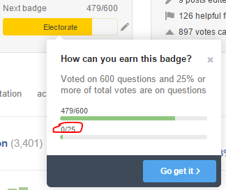
The hoverbox for the Electorate badge doesn't have the progress bar for the %-of-votes-on-questions working correctly:

At the moment, 54% of my votes are on questions. Not 0%.

Either the % bar should be hidden (which makes some sense, since %-of-votes-on-questions is a value that can fluctuate both up and down), or it should actually show the % of votes on questions (or maybe max(25%, %-of-votes-on-questions)).

4
  • 10
    Hmm - it's looking like some badges where the second bar is not a "standard" count (percents, "positive record", etc.) are displaying incorrectly - we'll check it out.
    – Jaydles Staff
    Commented Feb 23, 2015 at 16:53
  • I wonder if this is being counted as 0.54 / 25, rounded down. Commented Mar 5, 2015 at 4:26
  • @doppelgreener, it's 54/25 not 0.54/25... Commented Apr 15, 2015 at 22:39
  • @PythonMaster I know it is. We're talking about a bug though, and a percentage. Percentages are usually most conveniently stored as a decimal: 0.54 to represent 54%. If they didn't convert it back to an integer form we'd get the above bug Commented Apr 15, 2015 at 23:04
21

- we've done a bunch of work on this, though the mobile pages are still a work in progress.

Currently it's kinda difficult to explore profile pages using mobile web (click "mobile" link in the bottom and check the profile page) , please don't forget to fix it :)

E.g.: Summary:

Questions:

3
  • I think the lack of responsiveness is expected for the moment.
    – Mooseman
    Commented Feb 24, 2015 at 20:21
  • +1 so it will not be forgotten. Accessing the profile page from my mobile gave me the tiny-font zoomed-out view.
    – aff
    Commented Feb 28, 2015 at 3:25
  • We've put in a bunch of work into the mobile view (and dropped some features that are in the full site view - both in consideration of low bandwidth on mobile networks and to do with the page aesthetics on a mobile device).
    – Oded StaffMod
    Commented Mar 3, 2015 at 20:58
21

- given that you already have the reputation in a big black font, adding it again is redundant. So we put the actual rep required.

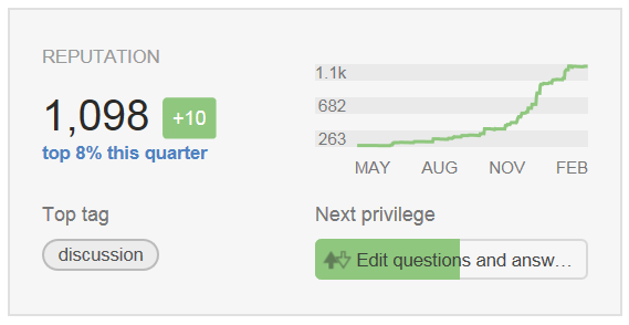
I would like to see the progress (1,098/2,000) text added next to Next Privilege

enter image description here

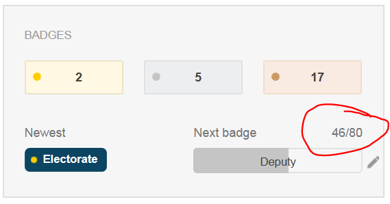
in the same way that progress (46/80) text already appears next to Next Badge enter image description here

I know that I can already see it by hovering my mouse over the next privilege but if progress count is there for Badges why not Privileges too.

20

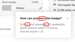
The text of how can I earn the badge is taken directly from the badge description, but it sounds incorrect under the heading "How can you earn the badge". E.g.: "Edited and answered".

Should be "Edit and answer" in this case.

19

- I appreciate the sentiment. At least visually speaking, this view just don't fit anywhere on the activity page. We might do that in the future, but this doesn't change often enough for one to keep seeing on ones own profile.

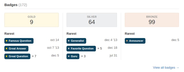
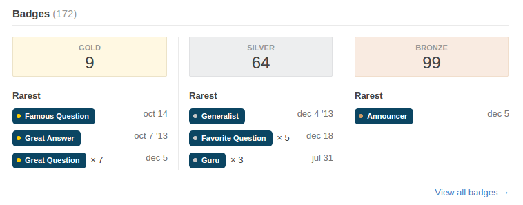
The rarest badges list on the profile view is nice. It would be cool to have that on the activity view as well. (Image of Jaydles's badges.)

Rarest badges

3
  • 4
    Agreed that it's cool, but I don't think this changes frequently enough to be on the activity page.
    – Jim
    Commented Feb 23, 2015 at 17:34
  • 3
    Instead of / as well as the data achieved, could we have the number of other people who have it?
    – Tim
    Commented Feb 23, 2015 at 20:42
  • 1
    FWIW, Data Explorer query for rarest badges overall for a given site.
    – mattdm
    Commented Feb 25, 2015 at 19:36
1
2 3 4 5

Not the answer you're looking for? Browse other questions tagged .