67

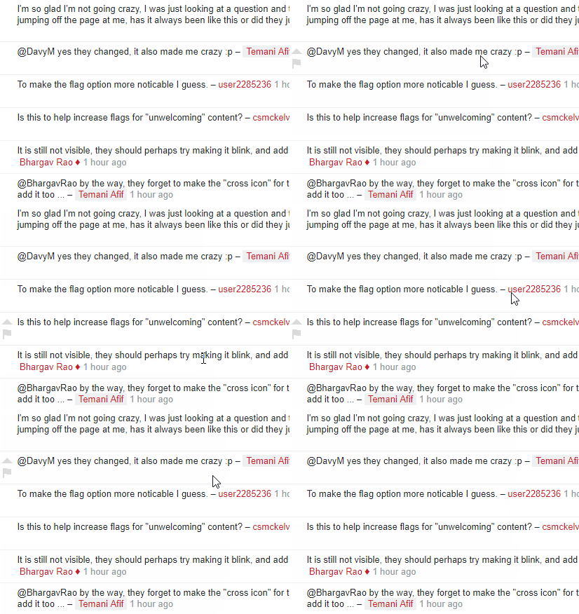
I just saw now that a new build had rolled out in which the comment upvote and flag options are always visible. Previously, one had to mouse over the area in order to see them.

Why was this just changed? Is it to support touch screens? I'll admit, it was difficult to find the flag button using my touchscreen laptop running Microsoft Edge.

Cross-site duplicate on MSO: Comment icons always visible, a new feature or a bug?

11
  • 11
    This is an example comment to see the change. Commented Jul 18, 2018 at 21:25
  • 3
    It's to make the fact you can flag comments more obvious.
    – Catija
    Commented Jul 18, 2018 at 21:26
  • 15
    @Catija In that case they should really make it blink too. Maybe some sound effects? on-mouseover:play_audio('FlagMeScreamingVoice.wav');
    – Davy M
    Commented Jul 18, 2018 at 21:40
  • 2
    @DavyM, i agree. Flashing red sounds like a good way of alerting people that this is what you click when you dont like the comment
    – Dragonrage
    Commented Jul 18, 2018 at 21:41
  • @DavyM Bhargav already said that on the MSO version of this post. ;)
    – Catija
    Commented Jul 18, 2018 at 21:42
  • 2
    @Catija maybe he missed it. I propose making the comments also flash so it is more obvious that they are there so that this doesnt happen.
    – Dragonrage
    Commented Jul 18, 2018 at 21:43
  • 4
    Well... there is one up side... It makes it really obvious which comments I wrote myself.
    – Catija
    Commented Jul 18, 2018 at 21:47
  • @SonictheInclusiveHedgehog whoops, missed it! My bad. I skimmed too fast. :) Commented Jul 19, 2018 at 4:42
  • 1
    Adding the following CSS will restore the original functionality (corrected): .comment:not(:hover) .comment-up-off, .comment:not(:hover) .comment-flag:not(.flag-on) { visibility: hidden; } Probably more convenient, is Samuel Liew's userscript.
    – Makyen
    Commented Jul 19, 2018 at 14:23
  • 2
    I would like to say thanks to the design team for making the upvote and comment buttons proper <a>s. Makes the site significantly more friendly for keyboard-only browsing (Vim-Vixen in my case). Commented Jul 19, 2018 at 15:42
  • 1
    @Mari-LouA I looked at your suggested edit carefully before reviewing. I know exactly what I was doing. Your rewording of the title changed its meaning to something else, and your edits to the question body altered the flow sufficiently enough that it no longer carried the same style of language. Commented Oct 9, 2018 at 7:10

4 Answers 4

8

My bad, we should have posted something on this when we rolled it out.

As mentioned by Monica, this is an intentional change to make flagging more discoverable. We can all agree it definitely does that.

This is a work in progress and we are working on some additional changes to improve the layout of comments. These changes will build on the changes we made to make comments responsive and will use our Stacks design library. As you can imagine and as this post proves, changes to comments layout can be controversial, so I'll post more as we rollout additional changes.

3
  • 19
    While I understand the reason behind it, I don't think the current implementation is a good solution. The old design had problems as well, putting two entirely opposed actions that close together is problematic in any case, and you're currently still cheating the mobile use case by hiding the flag option entirely. But the new design is incredibly busy, and still has the same major flaw that requires almost pixel-perfect precision to actually use those UI elements. Commented Jul 19, 2018 at 22:21
  • 8
    @MadScientist I'm using a mobile device and I had to zoom in to make sure I upvoted your comment instead of flagging it. Commented Jul 19, 2018 at 23:12
  • 3
    @KodosJohnson The real problem is upvoting it when you intended to flag. If you accidentally tap the flag button, you can simply close the dialog, while you may not be able to change the vote. Commented Jul 20, 2018 at 8:50
35

While we are discussing this change, this feature could be better applied only to lower-rep users instead of everyone (but this should probably be a feature-request).

In the meantime, I have created a temporary fix for those who are already familiar with the comment action icons and wish for them to remain hidden until the comment is hovered upon:

Userscript Source (install)

enter image description here

This also fixes the newer issue Comments no longer indicate whether or not they've been edited

7
27

The DAG team says it's an intentional change, to make it more obvious especially to new users that they can flag comments. I expect it will also help with touch interfaces.

From the DAG team announcement for July:

Comment flagging improvements: To align with the new CoC we will be making various changes in how comment flagging works.

  • Allowing new users to flag comments on their post
  • Updating flagging options to match CoC
  • Updating commenting UI to make flagging more discoverable
  • Provide better feedback on flag submission

Before you comment: This question is tagged and asks what this is. I encourage you to consider better places than the comments of this answer to discuss the merits of the change.

7
  • 32
    There should be a option in the settings to turn it off. Something like a check box that says "Hide Visual Clutter"
    – Dragonrage
    Commented Jul 18, 2018 at 21:46
  • 4
    @Dragonrage I'm just reporting what they changed. i doubt the DAG folks will see your comment here; if you want to provide feedback I suggest doing something they're more likely to notice. (Maybe a comment there or a feature request?) Commented Jul 18, 2018 at 21:48
  • adblock can turn it off. As can userscripts.
    – Kevin B
    Commented Jul 18, 2018 at 21:48
  • 19
    New User: Posts question. High-rep User: Posts comment, "the premise of the question is wrong because you have a typo in ...". New User: Gets mad. Oh what's this flag button? Flags it as, "This user is being rude and unwelcoming because he's nitpicking instead of answering my question. Can you ban him?"
    – Mysticial
    Commented Jul 18, 2018 at 21:50
  • 22
    @Mysticial Mod: declined.
    – Catija
    Commented Jul 18, 2018 at 21:51
  • 3
    If all the mods complains about they getting more busy for the situation above, will this be reversed?
    – user202729
    Commented Jul 19, 2018 at 2:32
  • 9
    I do hope it's just because it's new and I'm noticing it more, but right now I'm finding it incredibly distracting. I'm going to give it a week or so and then I might userscript-ify it.
    – DavidG
    Commented Jul 19, 2018 at 9:52
4

For Stylish or Stylus users, I have a style available. It is simply extracted from Samuel Liew’s code.

4
  • Stylish seems not available on Chrome Store for some reason. Commented Jul 21, 2018 at 4:57
  • 3
    It was removed because it was found to track users. Commented Jul 21, 2018 at 5:22
  • @SonictheInclusiveHedgehog But userstyles.org survives somehow? Commented Jul 21, 2018 at 18:45
  • I read more about the removal in this tweet and these posts and I think Stylish deserves it. I have switched to Stylus for long hand have never cared about Stylish itself (besides stealing styles from there). Guess I should host this style on my GitHub as well, possibly as a user style. Commented Jul 21, 2018 at 19:45

You must log in to answer this question.

Not the answer you're looking for? Browse other questions tagged .