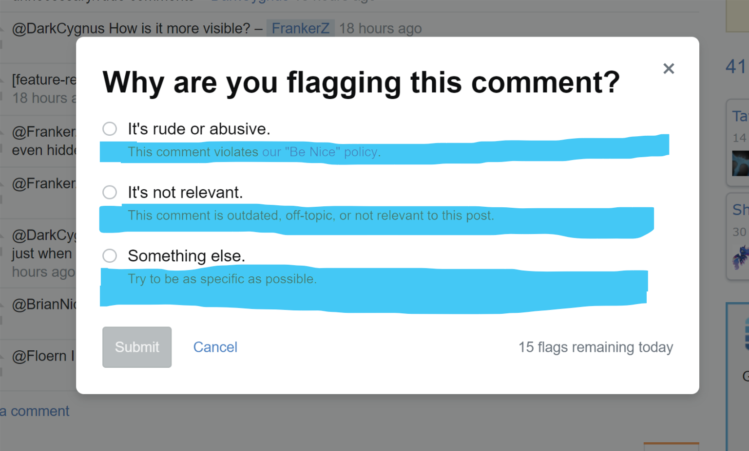
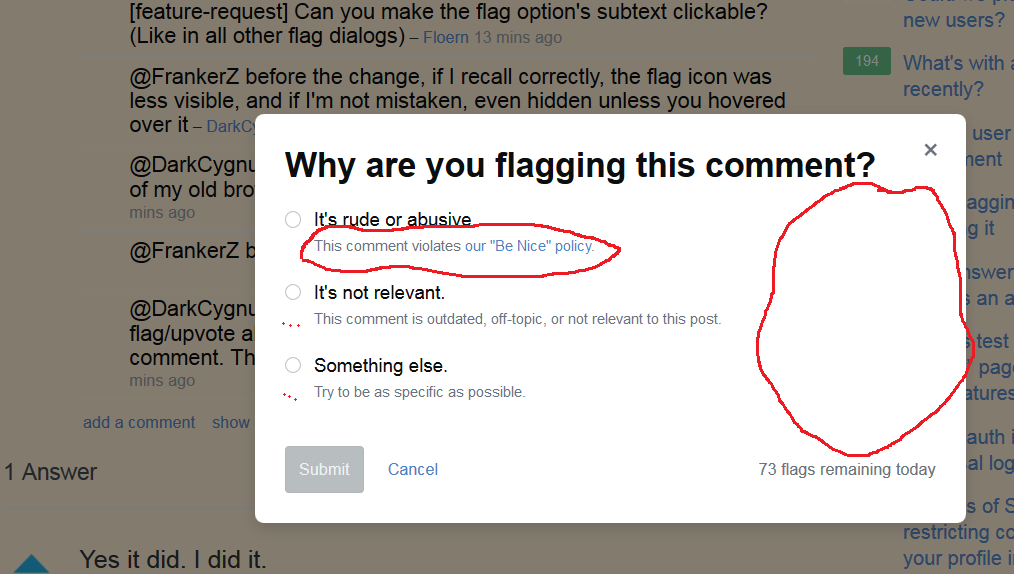
I've now noticed when clicking the flagging dialog for comments that a new animated popup appears now. Is this going to change in the future for the other flagging dialogs such as questions/answers? I don't see a changelog anywhere.
-
Don't know if there will be future changes (most likely they will I guess...) but it seems to me that now the flag a comment feature is more visible, perhaps it was intended so users started flagging more unnecessary/rude comments– DarkCygnusCommented Jul 31, 2018 at 21:26
-
@DarkCygnus How is it more visible?– BlueCommented Jul 31, 2018 at 21:27
-
10[feature-request] Can you make the flag option's subtext clickable? (Like in all other flag dialogs)– FloernCommented Jul 31, 2018 at 21:27
-
3@FrankerZ before the change, if I recall correctly, the flag icon was less visible, and if I'm not mistaken, even hidden unless you hovered over it– DarkCygnusCommented Jul 31, 2018 at 21:29
-
@FrankerZ because that already had votes on it– DarkCygnusCommented Jul 31, 2018 at 21:32
-
2@DarkCygnus Maybe 1 or 2 weeks ago, there was a change to make flag/upvote always visible, rather than just when hovering over the comment. The goal there was to improve discoverability.– Brian Nickel StaffModCommented Jul 31, 2018 at 21:36
-
@BrianNickel definitely more discoverable now– DarkCygnusCommented Jul 31, 2018 at 21:38
-
1@Floern I posted this as a feature request before I saw your comment.– Sebastian SimonCommented Aug 1, 2018 at 9:33
4 Answers
Yes it did. I did it.
When the Code of Conduct ships, we're replacing "rude or abusive" with two new categories which you could describe as "rude" and "abusive". As part of that change, we also:
- Updated the dialog to use our new "Stacks" design system.
- Restructured the language so it's answering a question rather than completing a sentence.
- Added a "Thank you" message when you flag.
I don't believe there are plans for the other dialogs at this point, there's nothing on the August plan, but I would love to see the other dialogs use Stacks.
-
4Does the "Thanks" dialog behave similarly to other dialogs on site (in that it doesn't appear every time), or will there always be a thank you? Commented Jul 31, 2018 at 21:39
-
1+1 I think it looks much nicer. Is It's not relevant new wording? I seem to recall it being something like No longer needed. I like this version more. Commented Jul 31, 2018 at 21:40
-
3It's still called "no longer needed" in the API and mobile apps, will this change too?– FloernCommented Jul 31, 2018 at 21:44
-
I was going to make a separate post with this request, but since you're here... could you take a look? Thanks! Commented Jul 31, 2018 at 21:46
-
@JasonBassford It is. I'm not exactly sure why it changed but the use and descriptions below it are similar. Commented Jul 31, 2018 at 21:47
-
@Floern It looks like it's just missing an API build, but at least for the iOS app the title is going to be broken because the old title is hardcoded in rather than consuming
flag_options.dialog_title. Maybe so we could display the title before the request loaded? Commented Jul 31, 2018 at 22:07 -
3I especially like changing "no longer needed" to "not relevant", because "no longer needed" makes it sound like it's only for comments that were needed before but aren't needed anymore, even though that flag is also supposed to be used on comments that aren't needed at all. Commented Jul 31, 2018 at 23:44
-
Not a native speaker, but these "It's ..." don't sound too good in my eyes and ears. Maybe because the first letter of the next word is always a consonant? Wouldn't "It is ..." be more appropriate in this case?– KaiidoCommented Aug 1, 2018 at 1:30
-
2I've asked this here meta.stackexchange.com/questions/313446/…– user310756Commented Aug 1, 2018 at 2:39
-
10"Not relevant" seem like a problematic phrasing - every comment I've ever left has been relevant to the post (despite plenty of them ending up getting deleted), and most comments I flag are also relevant (they're just not constructive or too chatty). Am I even still supposed to flag like before or did the rules about this change too? Commented Aug 1, 2018 at 9:51
-
2@Kaiido There's nothing wrong with "It's" followed by a consonant. Commented Aug 1, 2018 at 9:53
-
6"Added a "Thank you" message when you flag." Why? That message may be relevant for the first flag you raise, but I don't want to see it every time I flag a comment. Commented Aug 1, 2018 at 12:25
-
@Dukeling As you may have seen I mentioned that in a request myself - meta.stackexchange.com/questions/313438/…– TylerHCommented Aug 1, 2018 at 15:02
-
1@DaveJarvis according to the "comment everywhere" privilege, "thank you" comment is considered as "compliments which do not add new information", which shouldn't be posted in the first place, thus off-topic/irrelevant. Anyway, I don't really care about the change in the wording as long as the underlying system is the same: to get it rid. Commented Aug 1, 2018 at 16:25
-
From a moderation perspective I find the "not relevant" change to be bordering on the side of rude. "No longer needed" had a softness to it that implied it was useful at some point and, for whatever reason, it no longer is useful and should now be deleted. "Not relevant" (which is the only text we see on a mod flag) implies that whatever is flagged was never useful at all. That this change happened without warning makes it worse, I had to actually go out and flag a comment myself to find whether the new text of this altered reason still meant that we did want outdated comments removed.– MokubaiCommented Aug 6, 2018 at 16:37
The new flagging dialog has a vastly reduced clickable area
and, not to put too fine a point on it, that sucks.
In most other similar prompts on the site (e.g. the previous flagging prompt, if I remember correctly, or the vote-to-close prompt) the text below the headers is clickable, i.e. the area in blue:
Not so in this incarnation as currently implemented (where only the headers are clickable), turning flagging into a precision-pointing job that it absolutely does not need to be.
I'm also rather miffed by the move of the flag button from the right to the left, which is inconsistent with the action buttons on other prompts (again, the vote-to-close prompt). If there is an upcoming overhaul of all action prompts to move action buttons to the left then I guess that could make sense, but honestly... why? Actions move from left to right, and this prompt is backwards.
And I'm also not a huge fan of "Not relevant" versus the previous "No longer needed", which I feel was a bit better, but that was also a weird compromise to begin with, so hey, why not.
-
If they made the sub-labels part of the hit area, they couldn't contain links like the "Be Nice" policy link, presumably...? Commented Aug 3, 2018 at 5:28
-
2
-
1
-
-
1To be clear, this relates to the clickable area. The not relevant has been addressed already. I don't have any information on the button placement but I'm guessing that we're redesigning all of these dialogues and they will eventually be consistent.– Catija StaffCommented Aug 28, 2018 at 17:40
-
@Catija yeah, I figured as much, but for the sake of a clear record the precision is welcome =).– E.P.Commented Aug 28, 2018 at 18:25
It did change, as already noted.
One request: can we make the font used for the explanations a little bigger? We have room, and this is hard to see (for some people on some devices, at least):
We've got plenty of width, and enough spare height that bumping that up a couple points won't overflow anything. Can we make it bigger?
Or, at least, black? I can't tell, but this kind of looks like that gray-on-white trend that's lately been popular among designers with good vision. Could you help the less-fortunate a bit?
The (current) corresponding text on post flags is easier to read.
-
3This text is part of the Stack design system so I would refer you to their GitHub Issues page to discuss accessibility concerns with description labels (
.s-description). One goal of Stacks is to improve the overall accessibility of the site, so they're trying to get this right. Commented Jul 31, 2018 at 23:31 -
2
-
Although it looks very pretty for those of us with good vision, and in a way I'd be sorry to see it change, it's hard to disagree with Monica's concerns when it really comes down to it. Usefulness and accessibility has to come first. Thanks for reporting it on GH. I would say it's a bit of a shame that responsibility has been completely shifted off to the third-party developers here when ultimately providing an accessible interface on Stack Exchange is Stack Exchange's job. So at the very least Stack Exchange should be following it up! Commented Aug 1, 2018 at 11:30
-
2@LightnessRacesinOrbit tl;dr Stacks is ours and we are responsible for accessibility. Long version: Stacks is our internal design system. Currently all contributors are Stack Overflow employees. That said, it has been released as an open source project. Others could use it and contribute. A key goal of the effort is accessibility, but as anyone who's worked on accessibility knows it's hard. There is always a tension between aesthetic and accessibility. Plus some of the standards are in flux. That said, we'll keep plugging away to make it great. And, Monica is a huge help in keeping us honest. Commented Aug 1, 2018 at 15:26
-
2Aw thanks, @Joe. Accessibility is hard, and probably harder than it used to be because of the explosion of device types. So things need to be adaptive; one size doesn't fit all no matter what size you choose. And even so, users are different, so you need to be able to respond to that somehow. I don't know all the possible technical approaches, but I definitely appreciate the complexity of the problem. (This reminds me that, demonstrably, a lot of text on web sites doesn't seem to be bound by the browser's minimum font size; I wonder if that's part of the problem.) Commented Aug 1, 2018 at 15:33
-
@JoeFriend Hah, in that case everything is as it should be here :) Commented Aug 1, 2018 at 15:40
Flagging box appears off-center
Free hand circle over the flag that I clicked on with indicated bounds of the center content div.
Firefox 50.1.0
Screen resolution: 1600x900.
This is so far off-center I feel like I have to turn my head in order to engage with the dialog box. I can understand not wanting it to appear on top of the comment being flagged, but this is...excessive.
-
9And I would like to be able to drag the dialog box as I used to be.– PangCommented Aug 2, 2018 at 0:33
-
2Off-centre? Mine's so far off-centre that I can only see the "flags remaining today" - the rest is off the viewport (browser window is 1643x1918 px, so it should fit). Commented Aug 2, 2018 at 10:04
-


