11

As you may have seen, we have been working on several accessibility initiatives (1, 2, 3) that touch various parts of the Stack Exchange network and the Teams business. As part of this initiative, we also developed a public-facing accessibility dashboard. The dashboard provides an accessibility score for our different business focuses: Stacks (Design Library), PubPlat (Stack Overflow and all Stack Exchange sites), Teams, and enterprise products. We calculate this score by running automated nightly checks that generate a list of successes and failures. The score is derived from finding the percentage of successes against the total number of tests. If you would like to learn more about the automated ruleset, you can find the resources in the GitHub repo for the tool.

We originally planned for the dashboard to be used internally (we’ll speak about the lock icons shortly), giving our engineers, designers, and product managers insights into how well we’re doing when it comes to accessibility. Our goal is to consistently improve this score over time as a commitment to the community and customers. As our accessibility work continues, we will continue to track more pages and do further testing, this score could drop as a result, but we will commit to working towards bringing the score back up.

After some iterations of the dashboard, it was clear to us that the community would benefit from being able to observe and monitor the metrics as time goes on. Providing transparent, public access to the tool we use internally gives the community the ability to provide feedback on our adherence to WCAG standards, a11y compliance, and for colors specifically, we test against APCA. With this tool, we want the community to know that our commitment isn’t just talk but is backed with metrics that can gauge if we are getting better or trending backward.

This is intended to be a public-facing tool, but there are a few locked links that are not accessible to the community. Since these links provide informational resources for our team members to internal documents, you will see a few links here and there with a lock icon that points back to some of those resources.

As we continue to do accessibility work across the network, we wanted to share this as something you could reference to track ongoing progress on Stack Overflow’s commitment to accessibility. Our work is far from over, and we still have different initiatives around accessibility that we are working on, and will continue to update as there are updates. Speaking of other initiatives, we plan to release an improvement for the visited link state color and links within paragraphs in much less than 6 to 8 weeks, possibly even three! We will share more on that as we get closer to that release. For other initiatives, we will continue to update those as we work on them.

If you have any questions or feedback about the dashboard, let us know. We will be keeping an eye on this post for feedback till August 21st, 2024.

16
  • 6
    I'm not sure if this is the right place for such a request, but can you expand a little on "We calculate this score by running automated nightly checks that generate a list of successes and failures"? Successes and failures of what, exactly? In other words: how is (human) accessibility calculated automatically? (I see now it also checks, for example, if every form element has a 'label'; so are these just automated checks of the code?)
    – Joachim
    Commented Aug 7 at 15:18
  • 14
    This misses the mark. I mean, good that you're monitoring, but those missing percent are usually severe accessibility problems in plain sight. This dashboard feels like whatever the greenwashing equivalent of accessibility claims are. Do rather than brag - multiple parts of the site have severe accessibility problems in plain sight, and people struggling because of them aren't helped by 93% of the site being okay. Might only account for a few percent of the site's overall features, but I guarantee you they account for a disproportionate amount of interactions Commented Aug 7 at 15:49
  • 4
    As an aside, how much time was spent setting up a public-facing dashboard bragging about accessibility that could've been spent working on the remaining (and often major) accessibility problems? Commented Aug 7 at 15:53
  • 7
    @Joachim For automated checks we used a tool called Axe. This scans for programmatically detectable accessibility issues. Success is when a given element has no detectable accessibility issues, and a failure issue is detected.
    – SpencerG StaffMod
    Commented Aug 7 at 15:56
  • 2
    @Joachim This blog post in the "measuring progress" section goves over these checks in a little more detail that might clarify how some of that works.
    – SpencerG StaffMod
    Commented Aug 7 at 15:57
  • 16
    @Zoe-Savethedatadump This dashboard is in no way us saying the job is done. We know there are still improvements to be made, and we plan to keep improving things. This tool is intended so the community and our Teams customers can keep an eye on where things are at. And for us to measure how we are doing in a quantifiable way. Improving accessibility on the platform, where we are currently lacking and new work we have yet to do. Accessibility improvement is still very much one of our goals, and I am happy to say that we are committed to making continued improvements across the platform.
    – SpencerG StaffMod
    Commented Aug 7 at 16:05
  • 13
    A good step toward making things better is measuring where you're at. I think it's a good idea to make these metrics public and increase the visibility of work that's easy to miss. I know it's a bit scary to do that with a work in progress.
    – ColleenV
    Commented Aug 7 at 16:24
  • 2
    @SpencerG that's not what I'm saying either. When companies do this, it almost always becomes a "we'll do a little every quarter to make it look like we're trying", but without putting in an extended long-term effort. Microsoft, for example, brags about being environmentally friendly - while doing genAI that's fundamentally anti-environment no matter how much you carbon compensate. Monitoring is good, bragging about said monitoring is usually a sign stuff is about to go massively downhill when it isn't accompanied by a concrete strategy for betterment - which this announcement isn't Commented Aug 7 at 16:33
  • 3
    Alternatively phrased: dashboards are where these initiatives go to die by the hands of shareholders - not to flourish for its end-users Commented Aug 7 at 16:53
  • 8
    Also: "Accessibility improvement is still very much one of our goals, and I am happy to say that we are committed to making continued improvements across the platform" - why not share those plans publicly? What is your [SE's] strategy for dealing with accessibility? How does accessibility fit into your [SE's] roadmap? Or more generally: how do you [SE] plan to make sure the dashboard actually provides value, and doesn't only turn into a meaningless talking point at shareholder meetings that's maintained for the sake of public perception, and not because accessibility matters? Commented Aug 7 at 17:11
  • 4
    Just to be clear, I'm asking these questions because I care about accessibility. Losing an accessibility initiative would be a devastating loss for the community. But most other initiatives you [SE] have pushed that go public die. See the editor, the wizard, and the continuously increasingly important outdated answers initiative that was dumped after one or two feature announcements. There are more, but I've already listed them somewhere on MSE already. Finding that answer is left as an exercise to the reader. Commented Aug 7 at 17:20
  • 1
    I've added it to the list of SE domains.
    – cocomac
    Commented Aug 7 at 17:23
  • 5
    On top of that, when for-profit companies (generally speaking) make charts and graphs bragging about Some Initiative:tm: without a public, concrete long-term plan to follow through, that's often a sign that the initiative is about to lose priority within a few months at most, and die. If you [SE] don't have a concrete plan, that's a problem, and makes this announcement another in a series of bad news. My goal here isn't to say "dashboard bad", but to question the motive to make sure there's an actual plan to follow through, and to use the dashboard for something that isn't just bragging Commented Aug 7 at 17:23
  • 3
    @Zoe-Savethedatadump that is basically the sentiment my answer was going for. This dashboard is just some cool automated numbers that don't do much beyond being something that can be shown to user to cover up the actual bigger issues you can only see discussed on meta. I wonder if this chart will be the next selling point of some CEO at some closed door meeting. .. It is a pity we always get to know about those after they happened. Commented Aug 7 at 18:09
  • 1
    It feels a bit disingenuous to display the stacks as the default tab with your highest scores, but then the "pubplat" which is what everyone actually sees has lower scores
    – Sayse
    Commented Aug 8 at 8:37

7 Answers 7

35

It is a good starting point and I appreciate it.

That said, I can't help but wonder how useful a metric is that seems to be just an automated score based on some design rules, when some of your recent efforts to make the site more readable have been met with negative feedback and requests to revert the changes that were mostly ignored.

When you changed the voting buttons' appearance, people told you that the old design was clearer and more readable. That was ignored, and now I use a Greasemonkey script to undo your change instead.
To put this into context: your announcement post currently stands at -564, making it one of the most downvoted posts on Meta. By comparison, this request to fix the new style gathered 96 upvotes. I would also point out that whilst said request is marked completed, what I see on Meta.SE is not at all what was requested—but that may be a further change down the line, so I am probably missing some context there.

When asking for feedback on the new tags design, most users seemed to like the fourth proposal. Sadly, someone must have been very fond of their third design instead because bold tags were what we got, for the enjoyment of those users that told you they have issue reading the new design.

Now, this announcement was posted on SO Meta... and as usual it was poorly received. "Everything about this is backwards." - those aren't just my words - that is the feedback you got.

So, my question is simple: do you just resort to automatic metrics that are probably limited to things like color contrast, font size and so on? To what degree does user feedback fall in the figure? Had I to guess, your more visible "accessibility effort" too often seem to follow the misguided, prideful, "I know better than them" wild guessing of some consultant/developer that probably doesn't even use the site that much.

To put it simply: what effect would 560 users strongly disagreeing with one of your accessibility/design changes produce on that page? None. So why should the user care about such in depth details when the blatant issues under everyone eyes get ignored... or even artificially created by a random change someone decides to implement just because?
Are we sure this is not just an empty useless metric which only purpose is to look good and advertise the site, when the real design issues remain hidden (and ignored) on Meta.SE?
I mean... it seems pretty convenient to have everyone see that Stack has a 98.26 /100 unicorn accessibility score, while only the few Meta affectionates will know about the -560 score changes.

11
  • 2
    This would have been my follow-up question to the ones asked in the comments as well, if those automated metrics indeed only find code-related accessibility issues, but obviously don't visit a site with human sensibilities.
    – Joachim
    Commented Aug 7 at 17:47
  • 2
    @Joachim "but obviously don't visit a site with human sensibilities." Ah, so on-par with SE employees, then.
    – VLAZ
    Commented Aug 7 at 17:48
  • 2
    I definitely agree with the overall sentiment; metrics are useful until [they aren't anymore](en.wikipedia.org/wiki/Goodhart's_law). I still don't completely understand the hubbub over the voting buttons though, and I'm not sure it's the best example here; I don't want to discount folks' honest reactions, but it seemed to me to be much more about "change is bad" than material criticisms– once the initial problems were largely addressed, that is. The community response to change can just be misguided sometimes, and we're often a stubborn bunch. That said, the tag emboldening is pretty bad.
    – zcoop98
    Commented Aug 7 at 17:57
  • @zcoop98 see the linked second post there. The original design that was implemented in the announcement greatly reduced the readability of the votes - at least on some sites. I think they did improve the design a little after that, but the improvements were still based on their view instead of just listening to people. Alas another reasons I like the original buttons more is because they were smaller. Commented Aug 7 at 18:03
  • @SPArcheon-onstrike also, amusingly, now the buttons are less sharp. I can't remember the exact change that brought it but I think one of the colour updates. When there is more light in the room (and on my monitors) it's getting hard to see the circle. Some times it's downright impossible and literally only the tiny triangle is visible.
    – VLAZ
    Commented Aug 7 at 18:06
  • @VLAZ as I said, I undid their changes soon after they were made, so I kinda lost track about other refinements along the way. Commented Aug 7 at 18:12
  • 3
    We don't rely exclusively on automatic metrics. The dashboard itself is an average of automatic and manually weighted metrics. The manually weighted ones come from internally flagged issues that need improving that are not on pages that are included in the automated testing.
    – SpencerG StaffMod
    Commented Aug 7 at 20:31
  • 2
    That being said, community sentiment doesn't go into accessibility scoring. That's a separate thing entirely; ideally, we put something out like the vote buttons, that is, a liked design that meets both user expectations and acceptable levels of accessibility adherence. However, we know that obviously isn't always the case. The problem you point out is really a larger one that can't exclusively be solved by accessibility scoring by automated or manual testing and instead is how we are making changes and including the community to provide feedback.
    – SpencerG StaffMod
    Commented Aug 7 at 20:33
  • 4
    To be frank, and in my mind, something that is not quite related to this dashboard, we need to be better at positioning accessibility needs with our communications and requests for feedback on specific initiatives. So that those needs are more obvious to the community as parameters we need to keep in mind. Of course that ultimately falls on us. I would like to think we are making improvements in getting feedback at the right time and alleviating those issues, but obviously, it's still a work in progress.
    – SpencerG StaffMod
    Commented Aug 7 at 20:38
  • 3
    @SpencerG probably the length of the message diluted the intended meaning. This is not contesting the use of automated checks (yet I suggest you have a look at wizzwizz4 suggestions). What I am pointing out is that I feel the focus should be on the users feedback, not a percentage score. It is pretty cool you have a tool that helps you catch repeated mistakes as you work your way in learning accessibility by design, but.. that isn't exactly something that I would consider a selling point for the site. So, nice you know you have that but as an user the number itself is a little plain to me. Commented Aug 8 at 8:34
  • 2
    @SpencerG this is also why I sarcastically asked if the score was just something to brag about at the next public speech the company will give. For users of the site, it isn't that informative that the network has reached 98.48928582498673% while yesterday it was still at 98.48928582498672% - that would work better to impress some "out-of-the-game" viewers. So... thanks for letting us know the tool exists and thanks for the transparency but I don't see myself checking the score too often. Commented Aug 8 at 8:38
16

What is the plan for non-automated testing?

This dashboard is a step in the right direction, but your non-automated testing is still not up to snuff, not even for the basics (i.e., level A WCAG). For example, a recent update requires that users know the difference in meaning between a) blue and grey; b) orange and grey, thus failing 1.4.1 Use of Color. For context, this was the update that added grey mod/staff indicators. Another example of a new accessibility problem is that on the accessibility dashboard itself, the lock icon is completely invisible to screen readers (HT wizzwizz4). Neither of these problems can be detected via automated testing because it has no way of knowing that a color or icon is more than decorative.

What is being done to prevent accessibility issues in new features? And what about fixing the problems that predate these accessibility initiatives? Some of these older problems are significant enough that they prevent users from being able to do important but basic tasks, like format a post properly (e.g., the non-Stacks editor toolbar cannot be accessed with a keyboard).

14

I'm pleased you've made this accessibility dashboard public. Thank you for that. However, the existence of this dashboard, and the text of today's blog post, strongly suggest you're playing accessibility whack-a-mole: your processes are systematically generating the same accessibility issues repeatedly, which then have to be fixed.

It looks to me like you're doing the wrong thing. Accessibility should not be an after-the-fact process: your other processes should be designed with web accessibility in mind. (Spreading the whack-a-mole burden doesn't count.) No matter how amazing your accessibility-issue-fixing processes are, if you're still introducing these issues with any regularity, you're still doing it wrong. Recommended reading:

The rest of this answer is just consequences of the above.


Since these links provide informational resources for our team members to internal documents, you will see a few links here and there with a lock icon that points back to some of those resources.

You have used <svg> tags for this, but they're aria-hidden="true" and missing the <title> tag. If this distinction is important enough to comment on (twice!), why is its only signifier marked aria-hidden (preventing it from being exposed to accessibility APIs)?

Maybe you should put your accessibility dashboard on your accessibility dashboard.

(Aside: this inline SVG is also duplicated, which is completely unnecessary. Either use an external <img>, or SVG's <use> tag. Page bloat is also an access concern: not everyone has a high-bandwidth, unlimited-traffic internet connection and the latest versions of the Supported Browsers. See: How web bloat impacts users with slow connections and slow devices.)


The dashboard provides an accessibility score for our different business focuses: Stacks (Design Library)

Stacks is built around describing the visual aspects of a page using unsemantic classes, so by design, Stacks is fundamentally inaccessible.

Example:

<div class="fc-black-400 fs-caption fs-italic">recorded Aug 7, 2024</div>

This should use a <time> annotated with a dcterms:modified or schema:dateModified (ideally via RDFa, though the inferior microdata would be fine too). Do you have a way of catching these issues at a glance? I can only catch them by going "I know Stack Exchange doesn't do… *checks* yup, they didn't do it there, either", which is whack-a-mole and not sustainable.

You're just going to keep having problems like this until your design process gets more semantic. (I suspect the current design of Stacks is holding you back, but this may not be true.)


I don't think you have much accessibility expertise, but you do clearly care, and you are making improvements. Given the sorry state of the industry, that's almost better. It is possible that, in five years, you'll be up there with the Adrian Rosellis and the British Home Offices of the world, and I'll be citing your blog posts at the people who're Doing It Wrong. You're not there yet, but I don't want to discourage you.

3
  • 2
    If anyone knows what's wrong with this answer, please let me know.
    – wizzwizz4
    Commented Aug 7 at 22:13
  • 2
    nothing, really. If you notice all the answers that showed some criticism have been downvoted, so you should just thank some diligent knight. Commented Aug 8 at 7:49
  • 1
    Someone retracted a downvote, so there was something wrong that I have now fixed… Either that, or Tim Post lost his keys again.
    – wizzwizz4
    Commented Aug 8 at 20:36
10

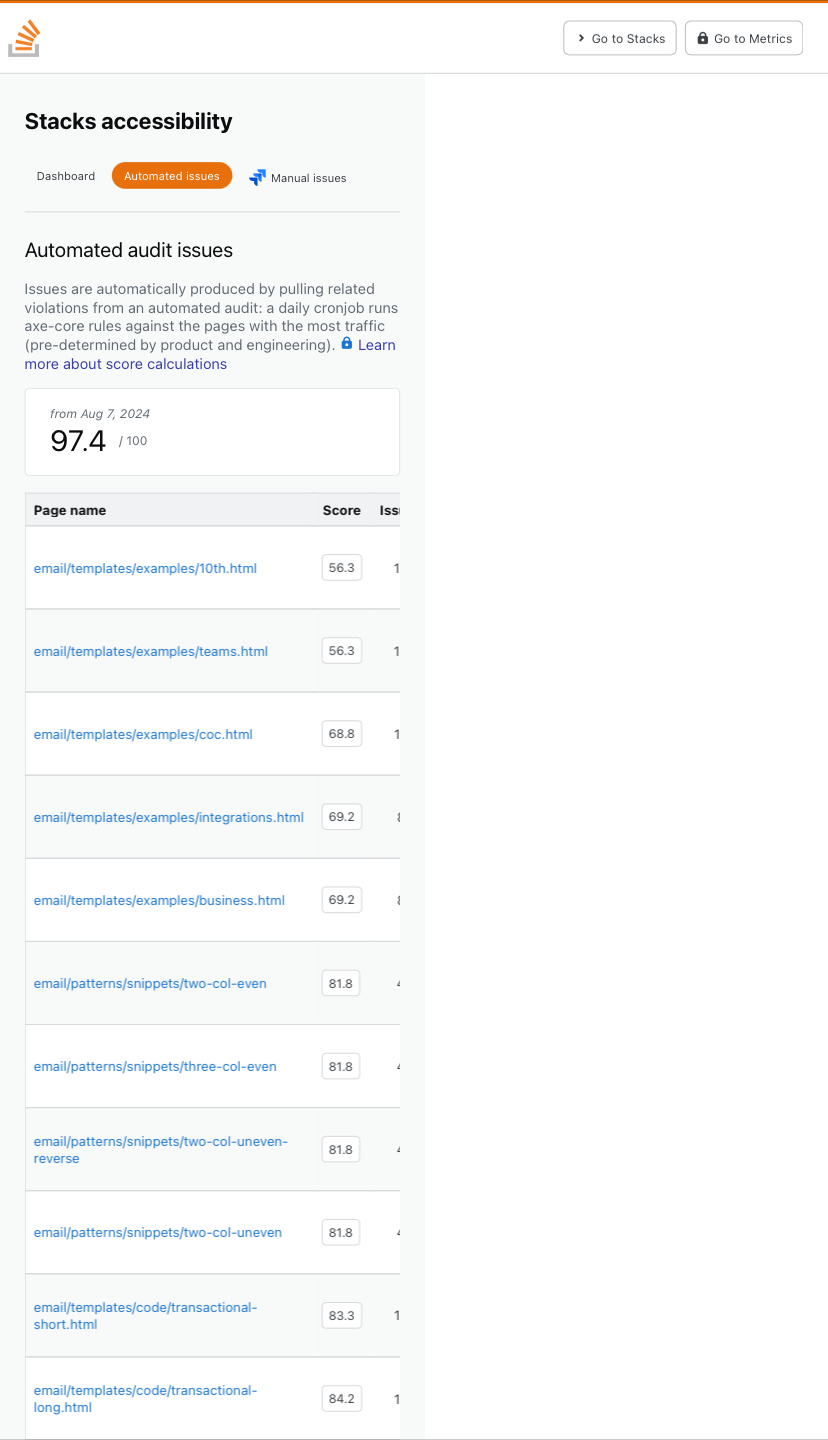
The Automated audit issues page is not very accessible on mobile/narrow screens due to weird scrolling:

Screenshot of page

The full page should not have a scroll bar because the table already has a scroll bar.

2
  • 3
    Admittedly, and I am aware of the irony here, the dashboard was designed to be used as an internal tool, so it was optimized for that experience. For that purpose, I feel pretty confident that its staff are exclusively visiting desktops, so the mobile view isn't particularly great or accessible. Since we decided to make this a public tool it is back on the table to be optimized for a better mobile view, but I don't have a timeline as to when that will take place. So this is a known issue for the time being.
    – SpencerG StaffMod
    Commented Aug 8 at 20:03
  • @SpencerG This is an issue I encountered on desktop, when I made the screen narrower (you might want space to cross reference the page with something else beside it). And even if your argument does fly because there are no staff that use non-desktops, it certainly can't excuse the other issues with the page, such as with screen reader accessibility (I hope for obvious reasons).
    – Laurel
    Commented Aug 11 at 18:46
5

I think this is a cool feature and I'm glad to see it. Users with acessability problems stand to be the most benefited.

Can someone explain, in short, how code coverage is handled by those tools and if we can expect all visible HTML/CSS parts of a site to be tested?

3
  • 5
    We don't currently have 100% coverage with these. Right now this is covering the list of pages we have started to optimize, which is largely based on being the most visited pages. We want to expand the list of pages over time, but there is a lot of work to be done in that area. In the past, it used to be one team that was focusing on improving accessibility.
    – SpencerG StaffMod
    Commented Aug 7 at 19:52
  • 4
    Recently, and as a part of this dashboard initiative, we have started moving towards a framework where it becomes part of each individual team to keep accessibility in mind. We kinda talk about this in the blog. In addition, there is manual testing going on that is caught, assessed and flagged manually on some of our internal Jira board.
    – SpencerG StaffMod
    Commented Aug 7 at 19:53
  • 1
    @SpencerG thanks for explaining that! I remember several announcements about testing being integrated into SE and I was looking forward to the follow ups.
    – bad_coder
    Commented Aug 7 at 20:33
4

enter image description here

The link to manual issues has a set of arrows, not a lock and links to a private jira

The metrics link leads to a private github repo - it looks identical to the other link to stacks . This needs a lock too

2
  • 1
    Since this is a tool that staff use regularly, we opted to include the Manual Issues link with the Jira icon instead of the lock, which is a bit confusing. But we wanted it to be clear to staff where they could find those. Given that it's behind a login, we figured that would be evident. As far as the metrics link goes, we missed that one and will update it.
    – SpencerG StaffMod
    Commented Aug 7 at 14:52
  • 5
    Maybe have both on the manual issues link if its an option? That way staff will know its staff only too. Commented Aug 7 at 14:54
3

Can dark mode be added?

Could something like this be added to that dashboard so users can have dark mode for it? (screenshot taken from the blog).

Screenshot of color mode selector with options Light, Dark, and Auto

Adding class="theme-dark" to the <body> tag seems to be sufficient to get dark mode functional (trick from this post on Sound Design Meta).

1
  • 2
    Since the tool was originally designed for staff, dark mode was not super high on the list, as we focused more on usability from that perspective. That being said, we would like to get to it eventually. There is no timeline at the moment, though.
    – SpencerG StaffMod
    Commented Aug 8 at 20:08

You must log in to answer this question.

Not the answer you're looking for? Browse other questions tagged .