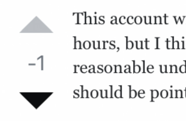
99

enter image description here

The only indication of how I have voted on a post is the thin black circle around the vote I have selected.

Whereas before, it was much more clear:

enter image description here

Please make the unselected vote button arrows the light grey, instead of matching the black used for the selected vote button.

16
  • 13
    This is also a problem when using the "Bedtime mode" on Android, which enables Grayscale display. The shading is very subtle, and at a quick glance I might ignore the difference thinking it an artefact of lighting or angle of view.
    – muru
    Commented May 30, 2023 at 15:15
  • 2
    Hey, at least your Upvote turns blue. We don't even get that on the math.se meta.
    – JonathanZ
    Commented May 30, 2023 at 15:33
  • 2
    @JonathanZsupportsMonicaC Oof, that’s bad. If you zoom way in, a selected vote button on math.se is actually the dark navy of the site’s theme. But totally indistinguishable from the unselected button. Commented May 30, 2023 at 15:36
  • 13
    Wow, changing things that nobody asked for isn't enough, they also have to do it in a sloppy way...
    – hkotsubo
    Commented May 30, 2023 at 15:37
  • 26
    Funny how this is the case and yet the original claim was that they were doing it "in order to improve accessibility". Commented May 30, 2023 at 15:40
  • 6
    @NickstandswithUkraine It really begs the question, “did you even check meta sites before shipping this?” Commented May 30, 2023 at 16:59
  • 13
    The new voting buttons are objectively worse. I don't understand why this was done.
    – paradroid
    Commented May 30, 2023 at 17:51
  • @paradroid To be frank, I dislike them everywhere, but they’re especially terrible on meta sites. Commented May 30, 2023 at 18:11
  • Isn't grey meant for disabled buttons? The button is not disabled: you can click it again to undo the vote. (And I think the only reason the circle border goes darker is because it would disappear against the grey.) Commented May 30, 2023 at 18:22
  • @AndrewMorton See the image of how it was before. Commented May 30, 2023 at 18:26
  • @ThomasMarkov I'm not saying it was great before (although on SO we got orange for the vote we'd used where applicable), but if they're trying to make an improvement, greying out what is now the background of the button is diametrically opposed to that. At least here it went blue. Commented May 30, 2023 at 18:30
  • There is a user-script/style workaround if you are so inclined meta.stackexchange.com/questions/389564/…
    – Timothy G.
    Commented May 30, 2023 at 19:13
  • 9
    Thanks for bringing this to our attention. This is not by design - we'll work on a solution in the near future and update the post here once we've addressed it.
    – Catija StaffMod
    Commented May 30, 2023 at 20:31
  • @Catija yeah, destroy the working one ( that was only need more padding on the mobile applications where it is hard to click correctly) and try to solve the new issues. Do you think that circle button solves the issue, then continue to bookmark, activity, Share, Edit, Follow, Flag, etc. they are all waiting
    – kelalaka
    Commented May 31, 2023 at 9:33
  • @Catija The by-design version is also hard to see, as many people have pointed out here: meta.stackexchange.com/questions/389359/… Commented May 31, 2023 at 19:10

1 Answer 1

21

Posting the same answer here I put on the update post about this.

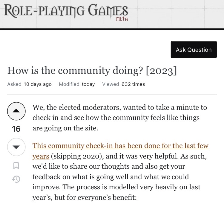
I want to acknowledge everyone who has indicated that with the new buttons it is harder to tell whether you have already voted on something or not. This is an issue that makes it harder to engage on the platform, which we take seriously. We saw that this problem was especially prevalent on the Meta sites because they use grayscale.

We just rolled out a change across Meta sites on the network, making it much more obvious to see that you have voted on a question or answer. Now, after you have voted the whole button should appear dark, rather than just the outer ring, with the arrow inside appearing lighter.

Before After
enter image description here enter image description here

If you find a Meta site where the updated style is not live, please let us know so we can address it.

On the network sites (excluding Meta) the coloration of the voting buttons varies based on the theme of the site, so they don’t look the same everywhere. If there are specific sites where you are finding the same problem of visibility after voting, please let us know in the comments here.

7
  • It looks really nice! Here on this site, it looks much closer to how the buttons used to appear before the 2018 design changes Commented Jun 2, 2023 at 21:02
  • 15
    Thanks. I believe math.stackexchange needs this change also.
    – littleO
    Commented Jun 2, 2023 at 21:18
  • 8
    Yup, looks much better. Commenting, as requested, to echo that math.se has a similar problem on the main site. I don't know if this fix or some other approach is appropriate, but I think it needs something.
    – JonathanZ
    Commented Jun 2, 2023 at 23:22
  • 5
    I will add a link to the relevant post on Mathematics Meta: It’s become difficult to see visually if I’ve upvoted a post. (This site was mentioned in the previous comments.)
    – Martin
    Commented Jun 3, 2023 at 7:03
  • 4
    This is so bad on the mathematics main site. I don't understand why this hasn't been fixed yet
    – Nick Alger
    Commented Jun 8, 2023 at 19:45
  • Still not fixed for main sites Commented Dec 19, 2023 at 13:31
  • @ShadowWizardLoveZelda its on our radar. I'm sorry that it is taking so long, but we do plan to address it in the first half of 2024, which I also noted on that post.
    – Sasha StaffMod
    Commented Dec 20, 2023 at 15:50

You must log in to answer this question.

Not the answer you're looking for? Browse other questions tagged .