44

I figured I could visit Server Fault to vote for the new moderators. But there is a lot of text on this page – so meh, I'm gonna scroll to the candidates and start voting. But it's not possible. So, I try to read the text again. It has a couple of instructions on what to do, including:

  • Please participate in the moderator elections by voting
  • Each community member has 3 votes. Please cast your votes in order of preference, starting with the most desirable candidate first.

Well, the page has no vote buttons for me. Where are they?! So, I scroll up and down, skim through the whole page again, to finally see this text crammed into the sidebar:
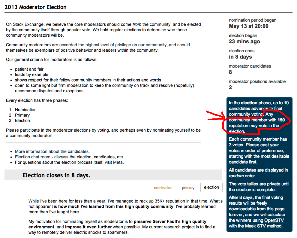
And the best part, which is at the bottom of the page, right before the footer:

So basically, it says: Please vote! But you can't vote. Sorry 'bout that.

It is well known that users scan instead of reading and focus more on the left parts of a page than the right.

Would it be possible to make that fact a little more obvious to users who don't have the required privileges? In fact, if the elections aren't really actionable for users with less than 150 reputation, why even show the page with that amount of detail?

What would be the best way to convey that message earlier and more clearly?

5
  • 9
    To make it behave same way like voting on posts I suggest to always show the vote arrows and when clicking them showing proper message i.e. "150 reputation are required to vote here" Commented May 20, 2013 at 20:52
  • 5
    Lol: "Welcome to the election page! Please vote! You can't vote! Enjoy!"
    – Doorknob
    Commented May 21, 2013 at 2:12
  • @ShaWizDowArd: Except that is a trolling mechanism. Commented Aug 28, 2013 at 16:56
  • @Light hmm? Not sure I follow. Commented Aug 28, 2013 at 17:37
  • @ShaWizDowArd: The way the vote arrows appear clickable, inviting you to perform an action, only to jeer at you at the last minute, chanting "ha ha! oh no u dont!" It's trolling. We don't need more parts of the SO user interface doing that. :) Commented Aug 28, 2013 at 19:57

1 Answer 1

10

We've made some changes that should make this experience a little more consistent with the way the rest of the site works when you try to do something without sufficient reputation.

There is no longer a call to action to vote if you don't have sufficient reputation.

There's a little less "Do this thing! Wait, you can't do it!" now (because that was mean of us). It is important for everyone who visits the election page to get all of the information about elections; the only place you really learn about elections is from that page, so we want to include the explanation of the phases, info about how long it's running, etc. for everyone.


Vote buttons are displayed for everyone, with error messages if you don't have enough rep to vote.

I realized that a user who can't vote actually didn't even see the voting buttons on the election page. Not only were we telling people to do something they couldn't, but we didn't even show them how to do that thing! So users will now be shown the "1st choice" / "second choice" / "3rd choice" buttons that eligible voters see next to each candidate, and will receive an error message if they attempt to cast a vote ("Voting in an election requires [x] reputation."). This is consistent with our other voting UI, where we show up- and down-vote buttons even if you haven't yet earned those privileges, with error messages if you try to perform the action.


There is probably more that we can do around election UI and instructions, but these were a couple of easy steps that I think take us in the right direction. If anyone has additional ideas for ways to improve this experience, feel free to post new answers here.

1

You must log in to answer this question.

Not the answer you're looking for? Browse other questions tagged .