225

Update: this change is now live across the network. You'll still see some narrow 220px ads because it's going to take us a good while to update all of the old ads, but if you see any other style issues, please report here on meta.

Stack Exchange sites are ad-supported. We run relevant, unintrusive ads that don't get in your way--but they help us keep the lights on. Even sites that don't have paid external ads usually have a few internal ones, used to promote other sites on the network and whatever else each community feels is important. We don't run a lot of ads, and folks who've earned a nominal amount of rep see even fewer, but the ones we do run have one crippling problem:

The sidebar ads are currently a weird non-standard size. Yes, standardized ad sizes are a thing. And apparently if you ignore them, folks are more reluctant to advertise and have a tendency to make uglier ads. We don't like ugly ads, and we do like selling ad space. So starting next week, we will switch to the industry-standard size for sidebar ads. The new ad units will be 300x250 and the sidebar will be expanded to 300px wide to accommodate them. We won't be reducing content size or doing any sort of weird overlay; the ads and other sidebar content will just extend an additional 80 pixels to the right.

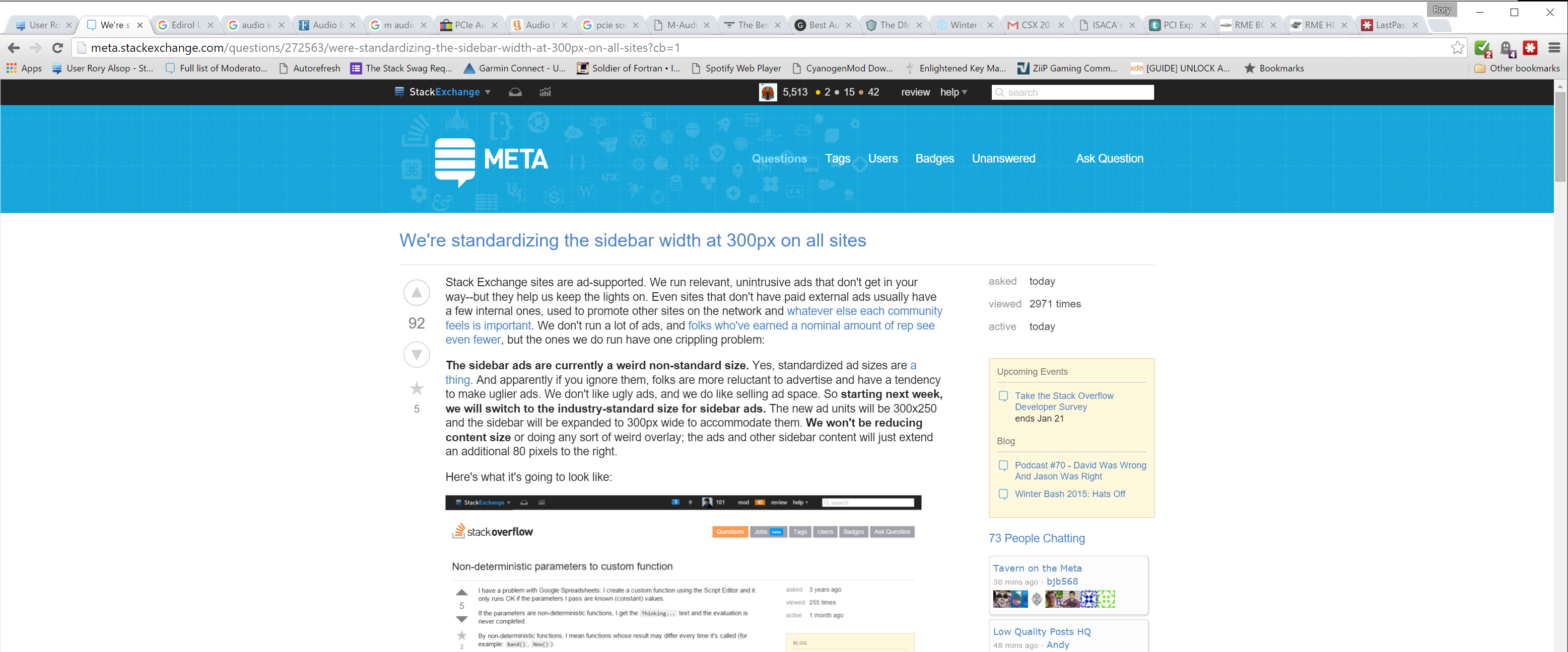
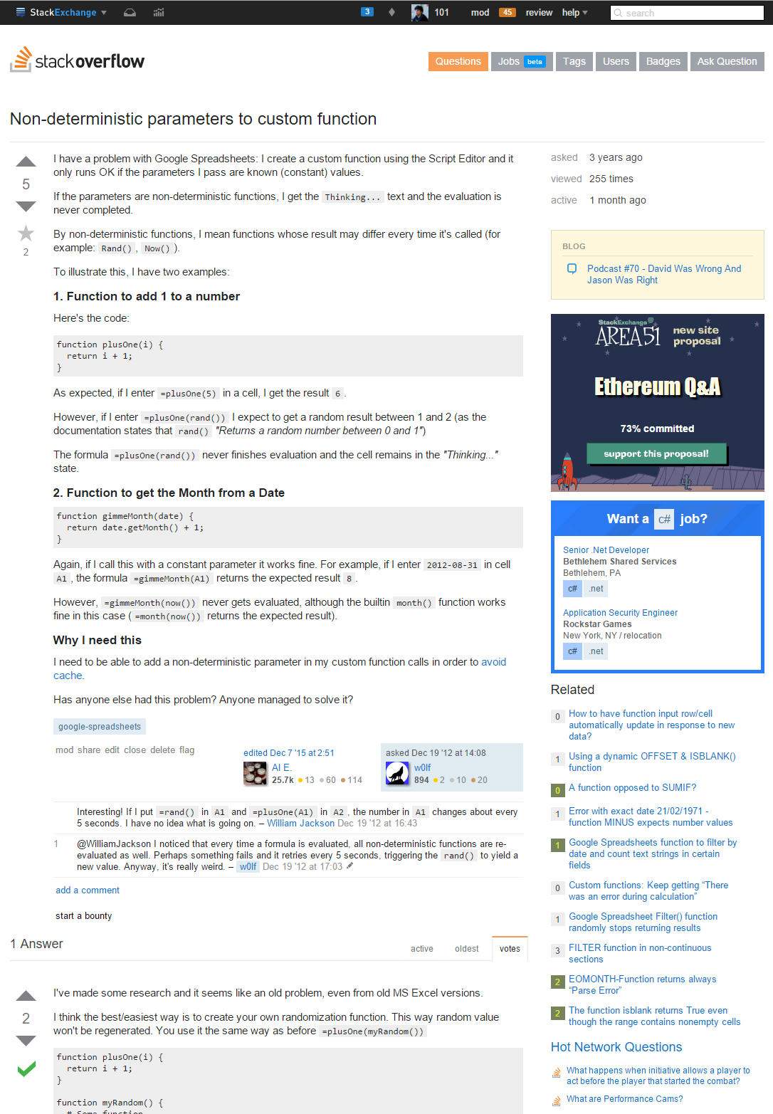
However, even though the sidebar is growing by 80 pixels, by reclaiming some margin space, the overall page width is only increasing by 60px. Here's what it's going to look like:

enter image description here

Over 98% of Stack Exchange users won't be affected by this change. Either they already use a viewport big enough to accommodate the new width, or they already use a viewport too small to accommodate the existing width. (And those who do find themselves affected won't be losing any content, the juicy stuff we all come here to look at. They'll just see a bit of the sidebar cut off unless they scroll.)

We're planning to roll this out on Tuesday, January 12. (There will be a transition period after that date while we work on getting all ad types swapped over; you'll still see some of the old size ads during that time.) In the meantime, let us know your thoughts.

79
  • 22
    @HDE226868 Legacy 220x250 ads will be replaced with 300x250 versions; any ads still running that haven't had updated creatives yet will just run as-is with extra whitespace around them.
    – hairboat StaffMod
    Commented Jan 7, 2016 at 23:05
  • 30
    Will Community ad submissions need to comply to this new size?
    – Catija
    Commented Jan 7, 2016 at 23:08
  • 26
    The most important piece of information (and oddly apt): english.stackexchange.com/questions/298312/… Commented Jan 7, 2016 at 23:17
  • 15
    While I can't upvote this, because when you increase ad space, the terrorists^h^h^h^h^h^h^h^h^h^hcapitalists win, I'm very grateful you didn't decrease the main content width, and you have the horizontal set up correctly so the main content stays centered and doesn't shrink when the overall width changes. Cutting off the sidebar is much better on smaller displays. Can you comment or screenshot on how this will look in mobile browsers?
    – Pollyanna
    Commented Jan 7, 2016 at 23:39
  • 18
    Does this mean I'm going to lose the mod tools in the left gutter on my 1280 wide window? Changing the window size to 1200 to simulate this causes it to collapse into a little asterisk I have to hover over to get the information I want, which is not really a tradeoff I want to make to get standard size ads.
    – Undo
    Commented Jan 8, 2016 at 0:29
  • 10
    @TylerH Through black magic and trickery (and dev instances with interchangeable skins).
    – hairboat StaffMod
    Commented Jan 8, 2016 at 1:18
  • 14
    Abby, while you're considering @Undo's question about that mod widget, please think about this related problem. Y'all are gradually making SE wider and wider and it breaks things sometimes. That widget is really important and even though the "official" minimum was 1024px wide when it was rolled out (still true?) it doesn't work at that width. Are we now looking at a de-facto minimum width of 1280 or higher? That would be bad. I don't care if ads are cut off on the right, but please try to avoid making that widget even harder to reach. Commented Jan 8, 2016 at 3:28
  • 118
    I'm just going to put this out here - pejorative jabs at us doing minimally intrusive things to ensure that we succeed as a company and continue to provide these sites absolutely free have the strange side effect of us tending not to bother listening to constant sources of noise. If you don't want to be left talking only to yourself, try to have some constructive things breaking the monotony of complaint, or try thinking just a little before slamming rubbish into text input boxes - (posted after removing certain comments). That is all.
    – user50049
    Commented Jan 8, 2016 at 5:39
  • 11
    @TimPost in case you're interested (you did tell us to think a little before posting stuff) there's some great reports like atkearney.com/documents/10192/760890/… combined with epa.gov/cleanenergy/energy-resources/refs.html and epa.gov/cleanenergy/energy-resources/calculator.html that can show you the immense energy waste and environmental cost of delivering garbage over the internet.
    – user159773
    Commented Jan 8, 2016 at 5:55
  • 16
    Haven't you heard of responsive design? Why does a horizontal scrollbar appear when something smarter could be done instead? (Sorry if I sound annoyed, but vertical space, which a horizontal scrollbar takes, is even more valuable than horizontal.)
    – otus
    Commented Jan 8, 2016 at 10:15
  • 13
    @Sabuncu If you don't like a particular paid ad, you can downvote it and give a reason why you don't like it. Then you will not be shown that ad again within that targeted placement. You may, however, see it again if it is part of a placement that has different targeting (can downvote again). I'm not sure of any other site that offers that ability.
    – Danny Miller Staff
    Commented Jan 8, 2016 at 15:37
  • 72
    @TechnikEmpire Stack Exchange has some of the least intrusive ads on the web. Pretty much all their ads are just static images. I've never once seen an animated ad on an SE site. Would you rather SE was a subscription service like that hyphen site used to be? Complaints like yours are exactly what Tim is talking about. If you don't like this free service, don't use it.
    – nhinkle
    Commented Jan 8, 2016 at 18:46
  • 29
    @TechnikEmpire I view it as a mutually beneficial relationship. I've learned a lot from Stack Exchange, both in reading others' content and contributing my own. Stack Exchange as a company benefits, I benefit, and millions of people on the internet benefit. They need ad revenue to be profitable, and we need them to be profitable to provide the service. If you dislike that arrangement, you are here by choice. I stand by my statement. I don't always agree with Stack Exchange's decisions, but your complaints about their advertising aren't grounded in reality. I wish more sites did ads like SE.
    – nhinkle
    Commented Jan 8, 2016 at 18:59
  • 14
    I can see absolutely no problem with this. I don't see how anyone benefiting from SE can begrudge them keeping on the lights. Stack Exchange has always been limited and thoughtful in their advertising. Ads are relevant, unanimated, don't slow things down, are even removed for higher rep users, and SE even gives you the ability to get rid of ads you don't like!. I don't see how anyone can really complain. Especially when you compare SE's ads to the insidious awfulness of everyone else's.
    – Linuxios
    Commented Jan 8, 2016 at 19:00
  • 19
    I complain about a lot, but this is one change that's totally fine by me. And, by the way, thanks for writing a clear, concise, focused question documenting it, without the several paragraphs of non-sequitur preamble that sometimes appear in these posts. Commented Jan 9, 2016 at 3:18

33 Answers 33

183

Go ahead and do it!

I'm one of those who probably wouldn't even notice the change, since the smallest monitor I'm using is a 1680x1050 one. And on my 1920x1200 monitor I have even configured Chrome to zoom to 125% on the SE sites that I use, because I have a lot of unused space. So I know it's easy for me to say to do it, since I am substantially unaffected by this, but I really think you should just do it. The reason behind the change makes sense, and SE has to make money after all.

While I understand the concerns of those that, for any reason, have a small monitor/window, I would like to address the concerns of those that think this will be just one step towards an advertising hell, with animated GIFs, videos with sound that start playing automatically, popups, and whatever you can think of. Remember, these sites have been around for years. They have never used annoying advertisements. There's no reason to start yelling at them. They have explained why they want to make this change, and it makes sense.

Let's be pessimistic, and imagine that one day they really switch to intrusive, pervasive, annoying advertisements. What exactly prevents you from abandoning SE? We are the users, we have a power: the power to choose whether we visit these sites. If we decide we don't like the sites anymore, we can just go away. The staff will notice the drop in number of visitors, questions, answers, impressions, clicks, and so on, and do something (go back?). But I think it's safe to say they know this perfectly well, and they will do their best to prevent this situation. So I'm confident that this will not be the beginning of annoying ads.

3
  • On Opera, when trying to zoom in on Stack Exchange, the vote buttons break. (It looks fine on Chromium, though.) Commented Jan 9, 2016 at 21:32
  • Omg, I haven't thought yet (almost 3 years as StackOverflow user) to zoom this thing and to have less diopter/month to loose. Thanks for an idea!
    – Sinatr
    Commented Jan 13, 2016 at 13:58
  • If we decide we don't like the sites anymore, we can just go away. That is an invalid argument, it is like saying if you do not like your parents, you can just cut them out of your life.
    – hlovdal
    Commented Dec 8, 2018 at 9:59
111

People are asking for specifics about the browser width data we collected, what the numbers are, and how we collected them. So I'll try to answer those.

How did we collect them?

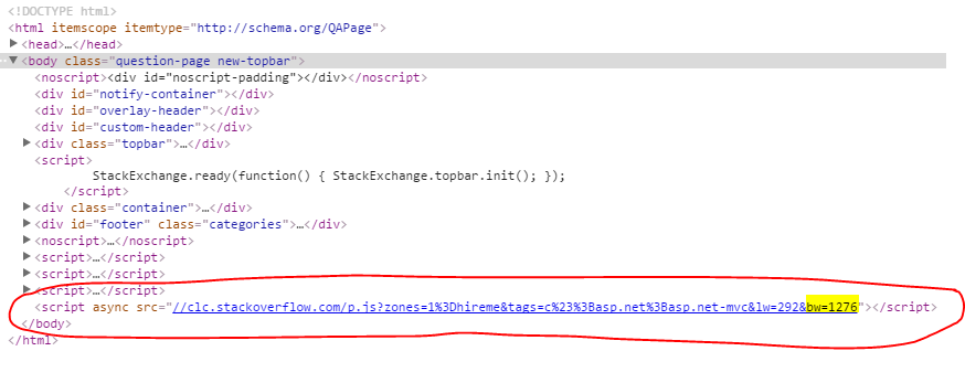
We simply measured window.innerWidth at the time of the ad request, and included it in the query string. The query string is captured in our traffic logs, so we can go back and scrape the data.

enter image description here

Fun fact: "clc" is our weird nonsensical, but short and easy to type, abbreviation for Calculon, the internal code-name for our ad server, and everything on the project is Futurama-themed.

We're not actively using this for anything other than learning about the popularity of various browser widths, in order to make informed decisions. It doesn't go to any third parties, it doesn't go into ad serving decisions, we don't use it for deciding whether to close your questions, or even link it to your account in any way.

Of course, anyone who has ads blocked won't be included in the report, which isn't perfect because everyone is affected by a new sidebar width, but it does give us a better sense of who currently sees, or will see, cut-off ads, which was also part of the goal.

What are the numbers?

I think we can safely release the percentages for each resolution. There certainly isn't any personally identifiable information in them, so here you go. Some notes about the data though:

  • The percentages are technically a percentage of page-views, not a percentage of users, but it's a close enough approximation.
  • I scraped the data a few different times, but what's included in the spreadsheet is from a couple weeks in October.
  • I didn't individually aggregate resolutions above 2000px.
  • There was a small amount of 0px traffic, but it was almost certainly bots, and therefore isn't included.

I've highlighted in the spreadsheet all of the resolutions which represent at least 1% of traffic. They are:

  • 1024px ≈ 1.1%
  • 1280px ≈ 9%
  • 1366px ≈ 14.8%
  • 1440px ≈ 5.2%
  • 1536px ≈ 1.5%
  • 1600px ≈ 4.9%
  • 1680px ≈ 3.5%
  • 1920px ≈ 19.3%

The results really aren't surprising given that they correspond to standard screen sizes. The only one of those which is smaller than the new width is 1024, which was actually a little bit too small for the old page width as well.

Where did the 98% number come from?

There's several different numbers you could pick as the number of people who will be affected. You could say that, in order to not cut off anything, you need a width of 1032 (although you still have a horizontal scroll until 1047). Then the people affected are in the range between 1032 and 1111px, which is 2.39% of traffic. EDIT: It looks like the overall increase is only going to be about 60 pixels (even less than we thought), which means the people affected are in the 1032 through 1091px range (approximately 1.6% of page views).

However, we're not quite done with the design yet, and we're trying to shave a few pixels off so that the overall page width increase would be less than 80px. If we could get it down to 65px overall increase, then it'd be 1.9% of traffic affected.

So, basically, we're targeting in the range of 2%, and 100% total - 2% affected = 98% unaffected.

Hopefully that answers your questions about the data.

35
  • 7
    You must have excluded the 0px users because they are leading and exactly ones who will be desperately in need of space ;)
    – nicael
    Commented Jan 8, 2016 at 21:25
  • 18
    For anyone curious, here's a histogram of the widths
    – David Robinson Staff
    Commented Jan 8, 2016 at 21:47
  • 10
    Yep, that's me at 1024px resolution (on my rotated work monitor), where your site already looks wonky. Another 80px won't make it too much worse, I guess.
    – Frank
    Commented Jan 8, 2016 at 22:10
  • 6
    :( sorry @Frank
    – Bret Copeland StaffMod
    Commented Jan 8, 2016 at 22:11
  • 1
    Wow, this is a really good writeup. Thanks for sharing Bret! I am also in the 1024px resolution on some of my devices as well (I can relate to Frank). The reason it is 1024 is that I use a projector, as it is easier on my eyes. Anyway, really appreciate seeing the data in one place like this, and the approach of including a sort of dead end request was interesting as well.
    – Travis J
    Commented Jan 8, 2016 at 22:20
  • @TravisJ it's not a dead end request. p.js is the "placer" route which actually returns the ad content and the script which places the content in the DOM. We simply don't use that particular query param during the request.
    – Bret Copeland StaffMod
    Commented Jan 8, 2016 at 22:22
  • @BretCopeland - Ah, I see. Thanks for the clarification, that is a good use of an existing request then.
    – Travis J
    Commented Jan 8, 2016 at 22:26
  • 3
    But seriously, so much traffic from 1300+px? This doesn't make sense to use such wide windows...
    – nicael
    Commented Jan 9, 2016 at 7:47
  • 2
    @otus yes, it does include the vertical scroll, and that's taken into account in the analysis. Mobile users aren't particularly applicable because most of them are seeing the mobile view or using one of the apps anyway.
    – Bret Copeland StaffMod
    Commented Jan 9, 2016 at 9:04
  • 9
    One thing these numbers suggest is that there is a split between browsers that are just wide enough to consume what is being force-fed and browsers that are wastefully wide. These numbers show a lot of people would stand to benefit from a responsive layout system that did something useful with the extra space or made better use of even less space.
    – Caleb
    Commented Jan 9, 2016 at 11:03
  • 9
    @BretCopeland Of course super wide content is harder to read (my day job curently has me typesetting books!) but I wasn't suggesting just making the existing content areas wider. A responsive design might decide that past 2x the normal width to change to a two column layout with the question and its answers side by side at their existing width, or it might have a question list/search results side by side with questions. It would know when to have the input textarea and the markdown preview stacked and when to be side by side. There are lots of ways to use space without sacrificing readability.
    – Caleb
    Commented Jan 9, 2016 at 19:07
  • 2
    Thanks for all your work on this. Out of curiosity, do you track (or even have access to) data about page zoom level? Window size tells most of the story, but if users need to zoom a couple notches in order to be able to read the site, they're seeing less than you think they are. Commented Jan 10, 2016 at 2:51
  • 3
    But, you know, the mobile sites are lacking functionality, so in 99% of times I use the desktop site.
    – nicael
    Commented Jan 10, 2016 at 18:09
  • 1
    Then best of luck to you.
    – Bret Copeland StaffMod
    Commented Jan 10, 2016 at 18:10
  • 1
    Something is wrong now that it has been rolled out. I have 1080 width and have a horizontal scroll. I thought that horizontal scroll wouldn't kick in bigger than 1047? Commented Jan 13, 2016 at 15:40
104

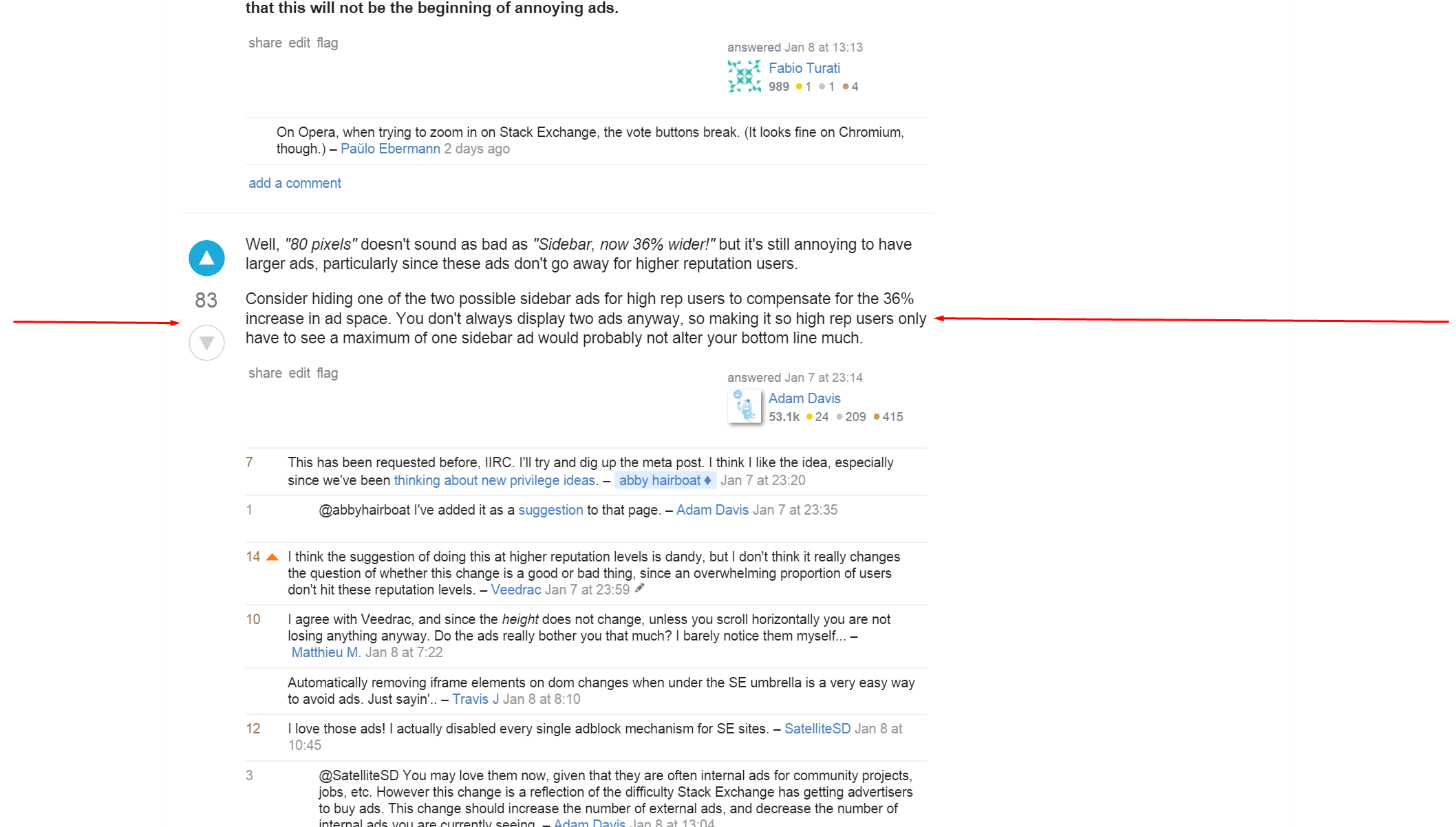
Well, "80 pixels" doesn't sound as bad as "Sidebar, now 36% wider!" but it's still annoying to have larger ads, particularly since these ads don't go away for higher reputation users.

Consider hiding one of the two possible sidebar ads for high rep users to compensate for the 36% increase in ad space. You don't always display two ads anyway, so making it so high rep users only have to see a maximum of one sidebar ad would probably not alter your bottom line much.

12
  • 9
    This has been requested before, IIRC. I'll try and dig up the meta post. I think I like the idea, especially since we've been thinking about new privilege ideas.
    – hairboat StaffMod
    Commented Jan 7, 2016 at 23:20
  • 1
    @abbyhairboat I've added it as a suggestion to that page.
    – Pollyanna
    Commented Jan 7, 2016 at 23:35
  • 19
    I think the suggestion of doing this at higher reputation levels is dandy, but I don't think it really changes the question of whether this change is a good or bad thing, since an overwhelming proportion of users don't hit these reputation levels.
    – Veedrac
    Commented Jan 7, 2016 at 23:59
  • 13
    I agree with Veedrac, and since the height does not change, unless you scroll horizontally you are not losing anything anyway. Do the ads really bother you that much? I barely notice them myself... Commented Jan 8, 2016 at 7:22
  • Automatically removing iframe elements on dom changes when under the SE umbrella is a very easy way to avoid ads. Just sayin'..
    – Travis J
    Commented Jan 8, 2016 at 8:10
  • 18
    I love those ads! I actually disabled every single adblock mechanism for SE sites.
    – sschrass
    Commented Jan 8, 2016 at 10:45
  • 3
    @SatelliteSD You may love them now, given that they are often internal ads for community projects, jobs, etc. However this change is a reflection of the difficulty Stack Exchange has getting advertisers to buy ads. This change should increase the number of external ads, and decrease the number of internal ads you are currently seeing.
    – Pollyanna
    Commented Jan 8, 2016 at 13:04
  • 4
    @AdamDavis One more reason to disable adblocking on SE, in order to get ads viewed and therefore attract advertisiers. Remember, you do want to get payed too, this is more difficult for a free-to-use website.
    – sschrass
    Commented Jan 8, 2016 at 13:49
  • What defines high rep? 5k+? Commented Jan 8, 2016 at 20:35
  • @FlagAsSpam check out the request and comment your thoughts here: meta.stackexchange.com/questions/253668/…
    – Pollyanna
    Commented Jan 8, 2016 at 20:37
  • 8
    @AdamDavis The quality of the ad has nothing to do with this change. It has everything to do with the fact that our ad team vets every single ad appearing and that we have very strict rules built around protecting our community. We will continue vetting the ads as we do today after this change and in the foreseeable future.
    – Sklivvz Mod
    Commented Jan 8, 2016 at 23:53
  • I'm not sure if its against terms of use, but if the ads are distracting, there is software to make them optional. The larger ads make me not want to see them.
    – Will
    Commented Jan 17, 2016 at 3:11
78

What? I already very reluctantly made my browser window wider to accommodate Stack Exchange's current width. It's already too wide for comfort, it doesn't leave enough room for a decent-width window on the side. And now you want to make it even wider?

Ok. Time to learn more about CSS and get rid of all that right margin junk.

I'm disappointed that you don't consider user-friendliness to be a goal. The whole reason you have ads to sell is that we're writing all this content for free!

26
  • 20
    Sorry about that. This is a change we're making to fix a longstanding problem, one where the longer we put it off, the harder it was to make it right. Aside from the ads question, I personally think the related questions, community bulletin, HNQ etc look much better with the bigger sidebar - less crowded and easier to read. But as with any UI/layout decision, there's a tradeoff, unfortunately, and here it's the wider window.
    – hairboat StaffMod
    Commented Jan 8, 2016 at 0:39
  • 16
    As Abby said, sorry about that. Like we said, about 98% of users won't have this problem. Sadly, there wasn't a good way around this trade-off. However, if using a css-editing browser extension makes the site more usable for you in any way (not just the sidebar), then by all means, go for it! You could even share your styles with other users.
    – Bret Copeland StaffMod
    Commented Jan 8, 2016 at 0:41
  • 18
    @BretCopeland “98% of users won't have this problem” No, that's wrong. I'm part of the 98% since I enlarged my browser window specifically because I was tired of having the window cut off in SE. But I'm not going to widen it even more. Commented Jan 8, 2016 at 0:45
  • 8
    @Gilles: if you are part of the 98%, then you have already enlarged your browser sufficiently to make the new display work -- at least as I understand their number.
    – jmoreno
    Commented Jan 8, 2016 at 2:13
  • 14
    @jmoreno is correct. You are explicitly not in the 98% if your current width is sufficient, but won't be after the change.
    – Bret Copeland StaffMod
    Commented Jan 8, 2016 at 2:48
  • 42
    @BretCopeland I understand that you're going for numbers here and some minority of users will just lose. But, like Gilles, I find a super-wide window to be very uncomfortable. I just can't read text that wide. I'm just one user, but I'm one user with some vision problems, a carefully-balanced environment, & long-term dedication to SE; I really hope people in my boat still matter. Already I can't do parts of my job as a moderator because of design decisions that assume humongous windows & 20/20 vision. I have more userscripts for SE than everything else put together! But it's not enough. Commented Jan 8, 2016 at 3:50
  • 2
    @Gilles - maybe you can request the Mobile site? or use Greasemonkey. Btw, the main window has to be ONLY 760px wide to be usable.
    – kumarharsh
    Commented Jan 8, 2016 at 8:10
  • 11
    @BretCopeland - 98%? I think you made that up, although I could be wrong. If it is an actual number, can we please see a breakdown by percent of screen sizes that browse the exchange, because that would be actually very interesting.
    – Travis J
    Commented Jan 8, 2016 at 8:12
  • 15
    It is funny that you say that "98% of users won't have this problem." I truly wonder where you got this from? (Some suggestions would follow here, but the comment would then me flagged as offensive.) Also, please note that having a wide enough screen isn't the same as "not having a problem".
    – yo'
    Commented Jan 8, 2016 at 9:00
  • 6
    @yo It's incredibly simple to get the viewport of your site for exactly things like this, so there's really no mystery. So presumably it goes like currentViewPort.x > currentSize.x + 80 then no problem. And screen != viewport, those two things are totally different.
    – Voo
    Commented Jan 8, 2016 at 10:36
  • 18
    @RubyJunk those ads pay for sites I use heavily and rely on that would otherwise not draw enough income to support themselves. I have no problem with SE running sidebar ads, and I think you're catastrophising by jumping to intrusive pop-ups and the like. Commented Jan 8, 2016 at 14:25
  • 6
    @kumar_harsh Gilles is a moderator, and the mobile site does not support some important basics like flag-handling. Some moderators have to resort to using the full site on their phones when away from larger devices; that's dedication. But no, mobile site does not work for everybody, and you really do want the moderators to be able to moderate. Commented Jan 8, 2016 at 14:27
  • 56
    @RubyJunk There's a enormous philosophical difference between changing our sidebar ad size to be consistent with the industry standard and greeting you with pop-ups and putting "ads everywhere". At least do us the courtesy of complaining about the changes we're actually making rather than speculating on things we have no plans to do.
    – Laura StaffMod
    Commented Jan 8, 2016 at 14:27
  • 46
    I understand being frustrated about a bigger ad unit, but let's be perfectly clear about something: We will never have animated ads or popups or popunders or layovers or anything like that. The day we do that is the day I quit working here, and I don't think I'd be the first or only one to do so. That's not who we are, and it won't be.
    – hairboat StaffMod
    Commented Jan 8, 2016 at 16:11
  • 7
    @abbyhairboat I love how you take personal pride in this! "The day we do that is the day I quit working here". Now that is a moral awareness that more people in other companies should have! (Volkswagen engineers, are you listening?) Commented Jan 11, 2016 at 21:23
32

About 98% of Stack Exchange users won't be affected by this change. Either they already use a viewport big enough to accommodate the new width[1]

For what viewport width is this change designed? I can think of a few cases with a roughly 1000px-wide viewport, taking the right scroll bar into account:

  • Maximized window on a 1024x600 pixel netbook monitor
  • Maximized window on a 1024x768 pixel XGA monitor
  • Maximized window on a 1366x768 pixel WXGA monitor connected to a Windows 8.1/10 PC with a UWP app snapped to the side

And one with a roughly 930px-wide viewport:

  • Window occupying half the width of a 1920x1080 or 1920x1200 pixel monitor. Ways of getting a half-width window include Snap under Windows 7 and later, Tile Vertically under previous versions of Windows, and analogous operations on other GUIs.

So you might want to add an feature letting (at least desktop) users hover over Linked, Related, or Hot Network Questions to make them temporarily slide over the question. And you might want to clarify to advertisers how many impressions get cut off on the right side, and whether being cut off affects the click-through rate.

10
  • 50
    We didn't just make up that 98% number. We measured it for weeks. I don't disagree that a few more ads will be cut-off, but it's small. The other options were 1. shrink the content (which was never going to happen), or 2. don't go to the standard ad-size, which is a larger detriment to our ability to sell ads than a negligible increase in the number of partially obscured ads.
    – Bret Copeland StaffMod
    Commented Jan 7, 2016 at 23:53
  • 9
    Keep in mind that this 98% number is a lot higher than some other terrible numbers, so the 2% that don't get to see all the advertisements who currently do see all the advertisement probably aren't going to miss them. What they will miss, and be annoyed by, is that the related questions and hot network questions will be cut off.
    – Pollyanna
    Commented Jan 8, 2016 at 0:03
  • 2
    @BretCopeland, out of curiosity, what part of the 98% is "already too small"? Also, I use 90% zoom to just fit the whole width on my laptop, I wonder if that counts as "already too small" or in the 2%?
    – otus
    Commented Jan 8, 2016 at 15:38
  • @otus If you've zoomed in so far that a horizontal scrollbar is visible, then you're in the 98%. If you only zoomed in enough so that there is currently no horizontal scrollbar, but an extra 80 pixels added to the page width would cause one to appear, then you're in the 2%.
    – Ajedi32
    Commented Jan 8, 2016 at 19:10
  • 2
    @Ajedi32, I've zoomed out so I (barely) don't get a scrollbar.
    – otus
    Commented Jan 8, 2016 at 19:17
  • Another case: 1920x1080 in portrait orientation. Currently, it juuuust fits.
    – Blorgbeard
    Commented Jan 12, 2016 at 0:11
  • 1
    @BretCopland No, the other option was to create a div for the sidebar text so that it didn't expand with the ads. Ideally, it could expand if there's enough room. I do not understand why you keep focusing on the ads. No one cares if the ads go partially offscreen, because we won't be interacting with them 99% of the time. But people use the hot questions and related questions links all the time! That's what the new layout changes.
    – trlkly
    Commented Jan 13, 2016 at 15:53
  • @trlkly Good point about related and HNQ being more important than ads. Commented Jan 13, 2016 at 15:57
  • @tepples And I hope it doesn't come off ruder than I meant. It's just frustrating all the focus on the ads, and the fact that everything went through without any comment to the people coming up with other ideas that might work better.
    – trlkly
    Commented Jan 13, 2016 at 16:06
  • "No one cares if the ads go partially offscreen" I imagine the folks who paid for the ads care. Commented Jan 14, 2016 at 21:17
28

The thing that would annoy me is not the ads getting cut off, but that the related questions and hot network questions would get cut off for 2% of the site's users.

I'm not in that boat, fortunately, but I'd hate to be one of the 760+ thousand people that visit per month and are affected by it, assuming quantcast's 38 million uniques per month is correct.

I would be interested to see the percentage of people who are already getting it cut off (who are included in your 98%). While you are saying that the change doesn't alter their experience, what you are really doing is increasing their numbers - so how big is that group now, and how big is it once you make the change - by what percentage are you increasing that group?

18
  • 27
    One might argue that Hot Network Questions becoming less visible is no sad thing. Commented Jan 8, 2016 at 0:15
  • 3
    About 6% of our current page views are using a browser width which cuts off some or all of the sidebar, and some aren't even wide enough to view the whole content. Although, we don't measure whether any of these people resize their window after loading. It's likely that at least some do.
    – Bret Copeland StaffMod
    Commented Jan 8, 2016 at 0:15
  • 2
    @LightnessRacesinOrbit ha!
    – Pollyanna
    Commented Jan 8, 2016 at 0:20
  • 1
    @BretCopeland so this change increases the cut-off group by some 33%.
    – Pollyanna
    Commented Jan 8, 2016 at 0:22
  • 1
    Sure, if that's how you want to see it. It's not a particularly meaningful number to us though because there's nothing we ever could or would do about that 6%. So 33% of a number we don't care about isn't a great way to present a metric.
    – Bret Copeland StaffMod
    Commented Jan 8, 2016 at 0:32
  • 13
    @BretCopeland You could do something for us: write a site that works well at different window widths. Commented Jan 8, 2016 at 1:09
  • 6
    @Gilles adaptive width is something we considered, but was too big of a project for our current staffing of designers to accomplish in the time we had. It's still something we would still like to do.
    – Bret Copeland StaffMod
    Commented Jan 8, 2016 at 2:40
  • 9
    @BretCopeland What about an adaptive-width sidebar only? Make it flexible between the current size and the new size, and nothing more. Most of the sidebar is text and works at the smaller size already, and scaling the images is certainly better than cutting them off. Commented Jan 8, 2016 at 7:21
  • 5
    @LightnessRacesinOrbit For the worldbuilding blog (medium.com/universe-factory) I've interviewed a few worldbuilding users, including some of our most active ones. A substantial proportion of them first found the site through a Hot Network Question, for example medium.com/universe-factory/…
    – Tim B
    Commented Jan 8, 2016 at 10:10
  • 5
    @TimB: It was a joke. Indeed, practically every time I land on a WB question it was through HNQ. Commented Jan 8, 2016 at 10:34
  • @LightnessRacesinOrbit I thought it might be. I've seen people saying similar things not in jest though so figured it was worth replying.
    – Tim B
    Commented Jan 8, 2016 at 10:49
  • 1
    We've switched numbers for people in @BretCopeland's post. Let's see if anyone notices the difference! "It's not a particularly meaningful group of people to us though because there's nothing we ever could or would do to help them experience our site better. So a 33% increase of people we don't care about isn't a great way to present a metric"
    – Pollyanna
    Commented Jan 8, 2016 at 13:01
  • 24
    @AdamDavis thank you for clarifying what I meant. I, of course, didn't mean that we simply wouldn't ever take spammy actions to try to get that 6% to see our ads, the same way we don't make any attempt to circumvent adblock. Obviously what I meant is that we don't care about people. To that end, we'll soon be re-branding to the "Sauron Exchange Network" to better reflect how evil and power obsessed we really are.
    – Bret Copeland StaffMod
    Commented Jan 8, 2016 at 18:16
  • 2
    @BretCopeland i.sstatic.net/MFtEU.jpg
    – Pollyanna
    Commented Jan 8, 2016 at 18:37
  • 2
    @BretCopeland: +1 for many reasons :).
    – Linuxios
    Commented Jan 8, 2016 at 22:50
27

This site is 1030px wide - just enough to cut off a little content and make the horizontal scrollbar appear - so you're already selling yourself short on netbooks and non-maximized windows. Support 1024px (content around 980px), or target a larger size and hide the sidebar on smaller screens.

7
  • 2
    Your window width is smaller than other people's, not the site's fault! (I think) Commented Jan 8, 2016 at 5:59
  • 18
    I have two large monitors at work. Development IDE on one monitor, browser on the other, with the developer tools panel open on the right and the viewport sized to 1024px. At home, I'm usually on a laptop with a single screen, and since I have to fit the browser and IDE (manually switching windows defeats the purpose of live preview), both are 1024px. I think these are very typical developer layouts.
    – Golphy
    Commented Jan 8, 2016 at 6:46
  • 3
    I'll leave this comment here even though it responds to several people: get a decent operating system/windows manager that supports multiple (virtual) desktops. There's really no need to cramp multiple windows onto a single screen.
    – Raphael
    Commented Jan 8, 2016 at 11:44
  • 20
    @Raphael: Sure there is, if you want to see both at the same time. Anyway, if your windows are full-size anyway, there's really no difference between switching desktops and switching windows. Either way, you have to defocus and hide one window whenever you want to look at the other. The only way you can have two full-screen windows visible at the same time is to get a second monitor (and those are expensive, not to mention impractical to lug around if you're using a laptop). Commented Jan 8, 2016 at 12:16
  • 19
    @ʇolɐǝzǝɥʇqoq It's not the site fault that Golphy uses a particular window width. It is the site's fault that it doesn't offer a good experience at Golphy's window width. Commented Jan 8, 2016 at 15:50
  • 11
    @Raphael What are you on? This has nothing to do with multiple desktops. I have 26 virtual desktops in my standard configuration, which is more than most people. I want to see multiple windows at the same time. My most common monitor width is 1600px, and I want to fit two windows side by side, hence my preferred window width of 800px. But of course I also use computers with different monitor widths and I have different window widths there. Commented Jan 8, 2016 at 15:53
  • Remember, px != pixels. Commented Jan 14, 2016 at 21:01
16

After reading through all the rants answers and comments, I felt compelled to write this.

SE is changing the side bar to make it more lucrative to run ads. So? Who are we to complain, and about such a small change?
SE is a business, business exist to make money. I don't mind, at all, the ads SE runs. SE has said they will never run any animated ads.

A side point
(Now supposing on the 12th SE rolled out some hideous flash ads, would that stop you from using the site? Or would it be just like when you abandoned youtube because of their preroll ads...)

What is the big deal with difference between a 220x250 image (which is already on SE pages) and the new 300x250 image we will have? get over it and move on
The main content is not changing, period.
Thumbs up to SE for growing the site size, and keeping the content the same.

I feel that SE has gone above and beyond what they needed to do.
(Has yahoo or weather ever asked you if you think their Leaderboard ads are ok with you? What about youtube's ads in nearly every video, or facebook? Has any of them, before making an ad change, discussed it with you?)


Finally, I suggest (all in jest) to placate all the naysayers here, SE adds an option: either you get the new 300px side bar, or pay $10 a month and get it all ad free.

6
  • 15
    I'll pay $10/mo as soon as SE pays me a comparable rate for my answers. I'm pretty sure I'll come up ahead. Commented Jan 8, 2016 at 23:24
  • 7
    Who are we to complain? Well... SE would not exist as a business without the free volunteering of everyone who writes answers, participates in moderation, etc. That seems like a pretty compelling reason to me to complain. (yes, SE could just remove all of SE from the internet. yes, we could stop using it).
    – enderland
    Commented Jan 8, 2016 at 23:24
  • 4
    @enderland youtube would not exist as a business without the community made and freely uploaded videos.
    – David
    Commented Jan 8, 2016 at 23:27
  • 10
    This is a strawman argument. My complaint, and that of many (most, I think) others here, is not that SE is serving ads. My complaint is that SE is imposing a bad user experience on me. They want to take all my screen real estate. I want to have things other than Stack Exchange on my screen. Commented Jan 8, 2016 at 23:28
  • 15
    Paying for ad-free is kind of a rip-off for us and anyone who'd pay. We try to keep ads as classy as possible, and quite honestly if they still bother you then you should install and use an ad-blocker or abandon the site entirely. After all, our job is to make the site something you enjoy using, ads and all.
    – Shog9 Mod
    Commented Jan 8, 2016 at 23:37
  • No user pays for Stac Kex Change, unlike Expert S-ex Change. (Unless you need to start subscribing to two ISPs because too many other users of a Stack Exchange are behind the same carrier-grade NAT, triggering a bunch of 90-minute blocks.) Commented Jan 15, 2016 at 20:34
16

Just noticed this change has gone live. I have to say I hate it. I, like many others, don't have my browser window maximised. On my laptop I set my browser to about 70% the width and use the other 30% for an iPhone simulator. So when i'm writing code on my external monitor I have everything else I need on the other screen. Stackoverflow was already the reason why I had to make it 70%, the rest of the sites I use are much smaller.

Now its too big to fit. I'm left with a decision to either cut off the right side, or not have all my windows open at the same time.

Coming from the site I go to for programming advice, I find this pretty disappointing. I know many sites that don't force a margin width. My personal opinion on the style, is that its ugly. The amount of wasted whitespace has increased dramatically, not just from ad's.

I find it funny that the argument to do this is so ad's become more standardized and more people will advertise. As it currently stands, now I can't see a large chunk of them because they are cut off ... who does that help?

You need a much better solution than this.

13

First, I believe the percentage of page-views affected was underestimated.

My 30-inch monitor sports 2560×1600 resolution. Using Windows desktop magic to tile the browser on the left or right half of the screen (so that I can see two apps at once) gives a window 1280 pixels wide, which now results in a horizontal scrollbar on every Stack Overflow site. But since window.innerWidth reports 1220 pixels, my page views were likely counted as not affected. The problem is the pixels are a different unit than px, which is what the CSS uses to set the width of the content pane and the sidebar.

Second, for those affected, the change pushes the search box and the "Ask Question" link off screen. Since those elements are at the top of the page and the horizontal scrollbar is typically at the bottom, that seems especially unfortunate.

While it's true that the juiciest content is on the left, I find, more and more, that I'm drawn to the "Related," "Linked," and "Hot Network Questions" listed in the side bar, but now I can't read their titles without horizontal scrolling.

Third, the change affects how we view other sites in tabbed browsers. Making the browser wider to accommodate Stack Overflow's new width affects the layout in all the tabs, making many sites display blocks of text with lines far too wide to easily read.

The best websites reflow to accommodate any reasonable window size. Half of a 30-inch monitor seems pretty frickin' reasonable.

I understand the need to accommodate the standard advertisement widths, so I'd propose that you allow the main content on the left reflow narrower to make up for the lost pixels.

11

This sounds fine, and gives more room for related questions, I hope, but I have 2 related questions:

  • Can we please make the main content section scaleable by window size? I usually run browser windows about 3200 pixels wide so when I open a Stack Exchange window there are acres of white space.

  • Do we need to revise our community adverts to the new size? Or will you just scale them up?

enter image description here

6
  • 8
    Just speaking as a designer, but making the contents width change depending on the screen width is a layout nightmare. It is very hard to keep the page's content looking good if it changes. I would assume that is why they already have a fixed width.
    – Jacob G
    Commented Jan 8, 2016 at 20:18
  • Your first suggestion was already suggested 6 years ago and declined three years later, I don't think that changing the sidebar width will have any effect of the decision, as it's still fixed width. Commented Jan 8, 2016 at 20:35
  • Ahh - makes sense I guess. I'm not a designer.
    – Rory Alsop
    Commented Jan 8, 2016 at 21:10
  • 4
    As I wrote in another comment, we did in fact consider a responsive design, but as @JacobGray suggests, it is a lot of work. That being said, we haven't ruled it out. We simply don't have the design resources at this moment. All of the new features and the backlog of graduated sites which need a design takes priority.
    – Bret Copeland StaffMod
    Commented Jan 8, 2016 at 21:26
  • 6
    Out of curiosity, can you actually read the super-wide lines that such a browser gives you (if a site doesn't hard-code its page widths like SE currently does)? I've never understood how people can use full-screen browsers on large monitors; don't you have trouble transitioning from the end of one line of text to the beginning of the next? Commented Jan 10, 2016 at 2:54
  • Monica - yep, no problems with it at all. My current setup has two 4k monitors and I usually user large browser window on one and documents/terms/etc on the other
    – Rory Alsop
    Commented Jan 10, 2016 at 9:05
11

Bret Copeland responded to otus in the comments that responsive design wasn't a priority, because the focus of the site was not on mobile users. However, I feel especially a lot of programmers use split screen to code on one side, and access documentation/Stack Overflow on the other side of their screen. That is why responsive desgin (and not just a horizontal scrollbar) is vital in my opinion.

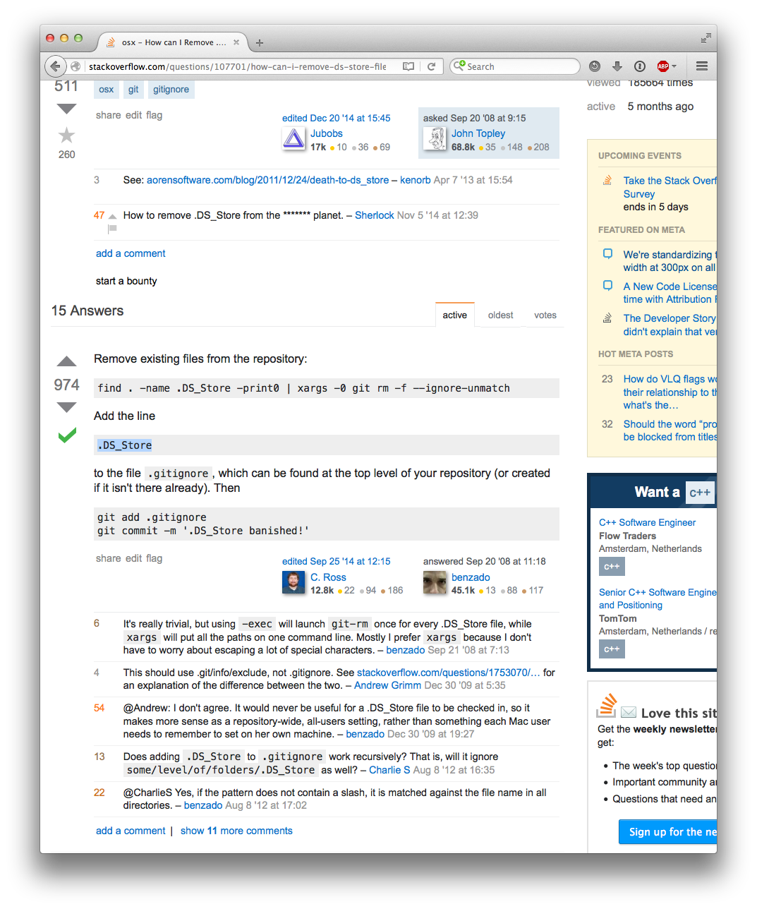
Here is what Stack Overflow looks like on my 1920x1200 screen now, occupying 50% of its width:

enter image description here

11

I don't mind the adverts, but please consider the fact that ~8-9% of your users will see a horizontal scrollbar as a bug to be fixed in the future.

Personally, I'd even prefer seeing slightly less content rather than a horizontal scrollbar, but there is probably a balance to be struck. For example, a narrower sidebar if the screen width is too low, with ads and other wide content moved somewhere else in the layout.

I'm sure your designers can find a reasonable way to present the information more cleanly.


With the smaller change that went live I just avoided regressions – 90% zoom, which I was already using, still fits the wider sidebar on my screen. While I'm personally not affected any more than I was, I still hope this is something that will be improved in the future. Having an alternative layout to handle at least the ~1000px width you get with various 1024px and 1080px wide screens and hopefully even ~900px width would be great.

I don't think the range of resolutions in use will grow smaller any time soon, so a static sized design is suboptimal even if you ignore the very smallest resolutions.

5
  • 6
    Reducing content width is kind of a huge deal. Unless and until we're moving to a fully-adaptable layout, that just penalizes the majority of folks with plenty of horizontal space. As someone who spends a significant amount of time using the full site on mobile devices, I'm pretty comfortable scrolling to see secondary parts of the UI... But I'd really hate to have to scroll to see more of the primary content area.
    – Shog9 Mod
    Commented Jan 9, 2016 at 20:09
  • 1
    @Shog9, it depends on device what is best I guess, and I completely understand wanting to avoid that. However, a horizontal scrollbar is very annoying, among other things due to how it interacts with auto-scrolling.
    – otus
    Commented Jan 9, 2016 at 20:12
  • 4
    About half of the sidebar is off-screen for me and I have a scrollbar, and that's fine -- if I want to see it I can go look, and I see enough to get the hints of what's there. Reducing the width of the primary content, on the other hand, would be a major drop in functionality as far as I'm concerned -- that's what I'm here for, and its width should not be reduced. Having to scroll to see primary content, or having that area reduced because the site decides the full sidebar + no scrollbar is more important (so it squishes the primary content), would be a big problem. Commented Jan 10, 2016 at 3:02
  • 3
    On smaller screens I would much rather see a smaller content section than have a horizontal scroll. 300px for a right sidebar is not unreasonable, but letting it scroll right rather than reducing the content size is far less than ideal. +1 for moving to responsive design. Commented Jan 13, 2016 at 15:22
  • 1
    I'm here for the west content as well, but I'd rather have it a little narrower than have a horizontal scroll bar. Commented Jan 14, 2016 at 19:41
11

Unintended consequence: topbar, header buttons

I've got no problem with wider ads. If it helps SE pay the bills, go for it! It'd be nice if we had some tooltips for sidebar items, but if not, those of us using smaller windows can just tune out those links -- not much harm done.

However, when I read in the announcement that the main content wouldn't be harmed, I understood that to mean (perhaps incorrectly) that the main functionality of the site wouldn't be affected. However, the whole page got wider, meaning the topbar and the header got wider, and since UI elements there are pinned to the right side of the rightmost pane, that means things that previously were visible are now not. On most sites I now have to scroll to get to the "ask question" button (previously it was partially available), and the search box is only barely there. This also badly affects certain moderator tools.

I'd like to see the essential functions of the site continue to be available in the 1030px width that is, I understand, the intended minimum size. If I lose most of the sidebar on my tablet or while editing side-by-side with my browser then, well, that's sad but oh well. But can you please find a way to make core functions continue to fit?

At least two sites center the set of buttons instead of moving them off to the right, and on those sites they all remain available with the recent change. Maybe this approach could be taken with other sites?

EL&U

Mi Yodeya

Compare those to what I now see on most sites:

MSE

10

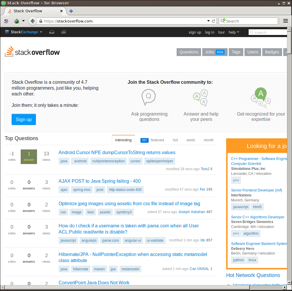
I understand you had good reasons for this change and I don't object it. Sure, most of us have large enough monitors these days to fit the wider site on it. Unfortunately, this isn't true for those of us who use the Tor Browser with the default window size (which shouldn't be changed for privacy reasons). Using this setup, the new site looks like this.

enter image description here

I'm okay with this. It doesn't affect usability a lot. However, you might be interested in the fact that for users on Tor Browser, the change will actually make the ads less visible as they're now cut off vertically.

What is way more annoying to Tor users are the undecipherable CloudFlare CAPTCHAs you force us to solve and the fact that over some relays, the site markup is not sent properly. But this is subject of an unrelated debate.

1
  • +1. It also cuts off the "Ask Question" button (and part of the search box). Commented Jan 18, 2016 at 15:47
8

Here's a style for Stylish (a Firefox addon) that shrinks the sidebar to 200px so that most Stack Exchange sites fit in a 1024px window, though there are some problems:

  • Some sites (such as askubuntu, photo, and tex) still have something hanging off to the right, causing a horizontal scrollbar
  • Sometimes the buttons at the top of the page ("Questions", "Tags", etc.) overlap with the site name graphic (such as gamedev and gis)
  • codereview and tex get broken badly enough that I've omitted them from the list of sites that this style applies to (codereview's sidebar gets pushed below the content, and tex loses its "Questions" button)

Also, this doesn't do anything with the ads in the sidebar. They're still there (unless you're already adblocking them), and end up getting cropped to fit the 200px.

@namespace url(http://www.w3.org/1999/xhtml);

@-moz-document
  regexp('https?://(?!codereview|tex).*\.stackexchange\.com.*'),
  domain("stackoverflow.com"),
  domain("serverfault.com"),
  domain("superuser.com"),
  domain("stackapps.com"),
  domain("mathoverflow.net"),
  domain("askubuntu.com")
{
  html
  {
    min-width: 960px;
  }
  body
  {
    min-width: 975px;
  }
  #sidebar
  {
    width: 200px;
  }
  #header,
  #content,
  #footer #footer-sites,
  .topbar .topbar-wrapper,
  .footerwrap
  {
    width: 960px;
  }
}
7

As a user (and fan) of Google Contributor, if this change means that a standard ad network like DoubleClick could be used (and thus that my Contributor subscription could apply to Stack Overflow) I would be very happy and excited.

If not via Google Contributor, I would gladly support some other micropayment solution for Stack Overflow. That would be the best of both worlds: Stack Overflow would be funded and I wouldn't have to look at ads while I'm using it.

8
  • 1
    I really respect that sentiment. In a sense, we already have reduced advertising for contributors (200+ rep users don't see banner ads); it just doesn't affect the sidebar. We're not going to be switching to DoubleClick, but that doesn't mean there aren't further ways that we'll reduce ads for users who want reduced ads in the future. We're just barely getting started on a very long list of improvements, and we're always open to ideas. Even if we don't implement it, that doesn't mean we won't ever or that the ideas won't influence other things we do build.
    – Bret Copeland StaffMod
    Commented Jan 9, 2016 at 1:14
  • 1
    @BretCopeland: Would it be worthwhile to file a feature request for a micropayment-based alternative to ads across the whole StackExchange network? I would gladly pay for such a thing if it existed. Commented Jan 9, 2016 at 5:12
  • 2
    Depends on what your goal is. If you're just trying to get the attention of the right person at Stack Overflow, I'm the Ad Server Team Lead, so that's a good start. If you're trying to drum up support for the idea among other meta users, then feel free. My gut feeling is that we probably don't have a large enough user base to make your specific suggestion worth the implementation. I have a hard time imagining more than a tiny percentage of users would do it. At Google's scale, that makes sense. At ours, it might not.
    – Bret Copeland StaffMod
    Commented Jan 9, 2016 at 5:57
  • 2
    Also see Shog's comment. I more or less agree with him. It would probably cost us more to implement and maintain the system than we'd get back out of it, so at that point you might as well just use adblock if you don't want to see ads. What we are going to prioritize going forward is increasing the control users have over the ads, which in some cases may mean reduced advertising.
    – Bret Copeland StaffMod
    Commented Jan 9, 2016 at 6:05
  • @BretCopeland: The whole point of Contributor is that it doesn't require extra effort, since it's implemented at the ad network level. Basically, the users are allowed to bid on ad spaces for their own page views, and pay the corresponding cost that the network would have paid for the same impressions. I do find it very ironic that the team lead of advertising for Stack Overflow is specifically advising me to use an ad blocker. :-) Commented Jan 12, 2016 at 1:31
  • Also, to be clear: I'm not upset about the ads currently on Stack Overflow. I passed 200 rep a looong time ago, and I'm always surprised when I click through to other SE sites and remember that there are banner ads in the first place. There are many more sites on the internet with far more intrusive ads. Mainly, I just prefer to spend my own money to support a site rather than spending advertiser money by proxy, especially since it means a less cluttered and less distracting experience for me. Commented Jan 12, 2016 at 1:33
  • 1
    I'm not advising you to use it, but the reality is that people like you, who have written hundreds of answers, have already paid us more than we could ask for. It is our hope that the advertising is useful in some way, such as by introducing you to new interesting products. If you don't find them useful, and you'll never click on them, then it wouldn't hurt my feelings if you were using ad block. Either way, I think we're still benefiting from your site interactions.
    – Bret Copeland StaffMod
    Commented Jan 12, 2016 at 2:36
  • @DanielPryden I'll second Bret's comments. If you are never going to click on an ad that you may actually find useful, it does not make sense for us to serve you ads as you are just lowering every metric by which a client measures an ad campaign. We are very selective in the advertisers we work with and the types of ads we accept. We regularly walk away from business to try and ensure a positive user experience.
    – Danny Miller Staff
    Commented Jan 12, 2016 at 16:13
7

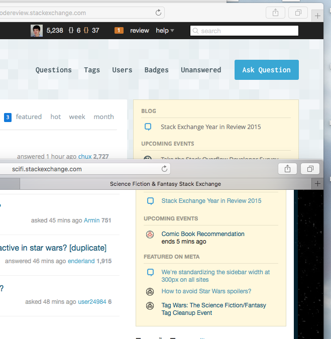
The change seems to have been rolled out inconsistently: Code Review’s sidebar is even wider than the rest of the network. According to my web inspector, it’s a whopping 330 pixels.

Checked in the latest versions of Safari and Chrome on OS X. UK IP address.

Here’s a screenshot of Code Review against Sci-Fi and Fantasy. The difference in sidebar widths is noticeable.

enter image description here

[I wasn’t sure where to post this; happy to move to a different thread/Meta if that’s more convenient.]

4
  • 2
    Code Review has slightly different layout than other pages, that's why it is bigger. but i will take a closer look at this and try to update it somehow.
    – Paweł Staff
    Commented Jan 12, 2016 at 19:45
  • @Paweł Actually... it seems that many sites are having a variation of this issue. If I make the page just wide enough that it doesn't sidescroll on M&TV, it does sidescroll on other sites... so it seems that M&TV is slightly narrower... and when I set it slightly wider for Meta.SE (and default sites), Seasoned Advice and SFF.SE still sidescroll.
    – Catija
    Commented Jan 12, 2016 at 20:06
  • @Catija actually it's been like that before. some of the pages use slightly different layout (wider by couple pixels). basically we have two widths we use across (almost) all sites. but the width is very similar. Code Review is one of the sites that doesn't follow that rule :)
    – Paweł Staff
    Commented Jan 12, 2016 at 20:19
  • @Paweł Ah! Good to know! I guess I just missed it before somehow... but being just a few pixels, it's not that big of a surprise.
    – Catija
    Commented Jan 12, 2016 at 20:20
7

Here's the CSS for the adaptive StackExchange layout that works for screens from 1024px

html, body { min-width: 1000px; }

.topbar .topbar-wrapper, #system-message, #header, #content, .footerwrap, #footer #footer-sites
{ max-width: 1060px; width: auto; }

#sidebar { max-width: 300px; width: calc(100% - 760px); }

.topbar .topbar-links { right: -8px; margin-right: 8px; }

It doesn't change the appearance for big screens, but adapts the sidebar size for small ones.

I suggest the StackExchange team use it officially. All you'll have to do to support this code in future is write adaptive side menu blocks that look ok from 240px to 300px. The ads (images) can be scaled via width: 100%, that shouldn't bother anyone since they will be reduced max to 80% of their initial size and only for 2% of users. And that's the only way to make the site usage comfortable for these users anyway.

And I suggest you, user with a horizontal scrollbar, use this code right now via Stylish.

4
  • I have no idea why you are getting downvotes either. I was actually coming her to post some CSS that people could use.
    – trlkly
    Commented Jan 13, 2016 at 15:38
  • Thanks for this, installed in stylish. It doesn't quite work with the topbar, though.. the search bar has no padding on the right in 1024-width.. Not sure how to fix it properly.
    – Blorgbeard
    Commented Jan 13, 2016 at 21:06
  • @Blorgbeard, here's the fix: .topbar .topbar-links { right: -8px; margin-right: 8px; }. I've added it to the post.
    – user
    Commented Jan 14, 2016 at 1:53
  • Absolutely amazing. Thank you v.much, I've Greasemonkeyed your CSS. Commented Jan 15, 2016 at 20:53
5

In case you want to see it earlier, or perhaps get back once the new version rolls out1, the CSS change is fairly trivial, at least for the most part:

div#content { width: 1100px; }
div#sidebar { width: 300px; }

Some other changes that could be made:

 /* to align the logo properly */
div#header { width: 1100px; }

/* to make the question links take all of the space */
.show-votes .sidebar-linked .question-hyperlink,
.show-votes .sidebar-related .question-hyperlink {
    width: 250px;
}

1And yes, I'm aware of the fact that image ads can't just be squeezed.

5

Here is my Stylus [1] to fix this travesty:

@-moz-document
domain(stackexchange.com),
domain(stackoverflow.com),
domain(superuser.com) {
   #sidebar {
      width: 250px !important
   }
   .post-text {
      width: 710px !important
   }
}

I chose 250 because it factors cleanly: 2 * 5 * 5 * 5

  1. https://github.com/openstyles/stylus
4

You mention a 98% figure that includes those whose viewports are already too small. But does that take into account that the site has a functional viewport width of about 990px? With that viewport size, a user does not have to scroll to read anything on the sidebar.

I think those should count as people who do not have to scroll now, but would with the update (with an effective viewport width of 1063px). Given numbers I've seen elsewhere, I'd expect around 4-5% of users to have 1024px width screens. And all of those users would now have a degraded experience.

Full disclosure: I use a 1024px screen, and thus would be one of those affected. I would much prefer that the text of the sidebar not become wider.

6
  • 1
    While traveling, I use a 1024 px screen. While the main window can be scrolled horizontally (and often necessary), the sidebar cannot, and overprints the main window if that portion is magnified. Increasing the sidebar by any amount will greatly decrease the usability of the main window for me. Has any thought been given to providing a horizontal scrollbar for the sidebar? Commented Jan 8, 2016 at 14:49
  • 2
    Are you talking about chat, @barbarabeeton? That's a known issue there, I'm afraid - although fortunately, we've no plans of making the sidebar there any bigger.
    – Shog9 Mod
    Commented Jan 8, 2016 at 18:14
  • @Shog9 -- this definitely happens with chat; i'll have to check to see if it happens on the main site, but don't have the ipad with me at the moment. (at least i'm not reduced to trying to read things on a smartphone, as my husband prefers to do.} Commented Jan 8, 2016 at 18:23
  • Ironically, there's a snazzy new mobile theme for chat in alpha testing right now... So your husband may find himself at an advantage there soon. But yeah, using the full theme on a phone can be painful (and yet I too do just that for hours every day).
    – Shog9 Mod
    Commented Jan 8, 2016 at 18:42
  • Snazzy new theme for chat on mobile ? I want that .. When will it come out @Shog9 ? Commented Jan 13, 2016 at 14:31
  • That's up to balpha, @Jonas. If you hang out in The Tavern, you might get an early preview...
    – Shog9 Mod
    Commented Jan 13, 2016 at 15:06
4

The content on the screen is very much shifted to the side, and is shrunk now, at least on my screen. 65% of the page is whitespace now, and one side has ~2.5x more whitespace than the other.

I realize it's a small thing, but it still looks bad.

enter image description here

12
  • 4
    Clearly other comments are needed... I have no idea what you're trying to say. I can't tell if you're complaining about white space or if you're happy that the entire page fits on your screen...
    – Catija
    Commented Jan 12, 2016 at 17:15
  • 1
    Yeah. I use a super-wide window and nothing really changed on that front.
    – Jon Ericson StaffMod
    Commented Jan 12, 2016 at 17:16
  • @JonEricson I don't have a comparison image, but I could swear it looks a whole lot more shifted and cramped now.
    – user206222
    Commented Jan 12, 2016 at 17:18
  • 1
    I normally use a full-screen window at 1440, and the main content's always been off-center. Slightly more exaggerated now, perhaps.
    – Kevin
    Commented Jan 12, 2016 at 17:18
  • 1
    If you need a comparison image go looking for blog posts talking about overzealous moderation. Pretty sure they have chunks of screenshots to float their shaky bias
    – random
    Commented Jan 12, 2016 at 17:19
  • 1
    Well, if the sidebar is now 80 px wider, when the entire page is centered, that means that the left edge is going to be about 40 px farther to the left... that's just how centering works.
    – Catija
    Commented Jan 12, 2016 at 17:21
  • 1
    Um, more comments please. What is the actual issue you're talking about here? Commented Jan 12, 2016 at 17:21
  • 3
    @ChristianRau That it looks bad.
    – user206222
    Commented Jan 12, 2016 at 17:21
  • Hey, how about making the answers and stuff that is below the sidebar actually go under the side bar? In other words, like word's box wrapping.
    – Maxwell175
    Commented Jan 12, 2016 at 17:23
  • @MDTech.us_MAN Please don't. That'd screw up a whole bunch of posts designed for proper reading. I was glad they didn't shrink the content area with this update. Commented Jan 12, 2016 at 17:28
  • +1 The site is almost only on the left. For me, the ratio is similar to you, between 1:2 and 1:3.
    – yo'
    Commented Jan 18, 2016 at 7:27
  • @MDTech.us_MAN Impossible without adaptive design. Even with adaptive design, this would easily become hell tricky.
    – yo'
    Commented Jan 18, 2016 at 7:28
4

Sadly, I must be in the 2%. My StackOverflow content has become smaller, and the ad space larger. I work on a 1024px small monitor provided by my client. Time to go shopping, I suppose.

2
  • 3
    You didn't consider looking for a new client? Sorry, your monitor is no longer up to the standard my favorite website requires
    – rene Mod
    Commented Jan 12, 2016 at 21:58
  • 4
    It's cheaper to get a new monitor than a new client :)
    – Marcie
    Commented Jan 14, 2016 at 13:43
3

I currently don't mind the ads that are on display these days, but I recognize that's because they are about community projects, community building within the network, and jobs. This change should alter that situation, so I'm wondering:

How much of the current ad impressions is internal advertising, such as jobs/careers, community building, community supported ads, etc? Let's just restrict this to Stack Overflow for now.

How much is this expected to change once this new unit comes into play?

How do internal ads, again - community building, community supported projects, and jobs/careers - compete with advertising now, and how would they compete once external advertising increases in volume?

3

Just noticed the change. All in all, I like it. But I found an oopsie:

enter image description here

Using Firefox 42 on Windows.

3
  • I'll ask a designer to check on it. Thanks.
    – Bret Copeland StaffMod
    Commented Jan 13, 2016 at 6:46
  • 1
    thanks for reporting that! fix for this is waiting in repo so should be on production very soon.
    – Paweł Staff
    Commented Jan 13, 2016 at 11:22
  • You're welcome, and thank you! Commented Jan 13, 2016 at 14:27
3

Apparently being among the 2%, I find that the toolbars have increased in width is more annoying than issues with the sidebar per se. It is only particularly annoying in the review queue, which is the only place I've noticed that some buttons are entirely off my screen. Well, it's no big deal: If the review queue is inconvenient, I'll just skip it and move on to something more pleasant. Or increase my browser window widths.

Technology moves on all the time, and many times I have had a workflow I am comfortable with disrupted by some change such as this. This is one of the more minor changes. And despite it being personally aggravating, it is one of the more well-supported and better explained ones, too.

2

You said (bold in original)

We won't be reducing content size

Well, before I read the announcement that the changeover had gone live, I noticed that the content size was smaller. Or at the very least, looks smaller - I can't get out a ruler and compare the before and after.

Can I please have ugly ads instead?

5
  • Where did you see smaller content? I compared pages loaded before and after the change, the content width was the same, but the distance between the content and the sidebar was reduced. Commented Jan 13, 2016 at 10:19
  • Width of content section hasn't changed.
    – Paweł Staff
    Commented Jan 13, 2016 at 11:27
  • We should allow the content size to reflow narrower to keep the pages working well for people with narrower browser windows. Commented Jan 13, 2016 at 18:19
  • @AdrianMcCarthy This has been asked zillion times and it has been responded by SE that this is not a priority. I really don't understand why to speak about it for zillion-first time.
    – yo'
    Commented Jan 18, 2016 at 7:29
  • @yo': Perhaps, given that this latest change pushes the page width to an unreasonable size, it's time to reassess the priorities, especially since there's evidence that the number of people affected was underestimated. Commented Jan 18, 2016 at 15:14
1

Oh, don't worry about that. Every man who have ever cared for the ads' sizes have already enabled Adblock and won't have any problems. (Except for frontend developers that cannot use Adblock, but still are using Stack Overflow on a daily basis). Disclosure: I love Adblock.

Didn't you think that there're users with sidewise taskbars (most of Ubuntu users and a lot of Windows users) and Firefox with Tree Style Tabs that take some horizontal space of the screen? How did you measure the screen width: from the headers or from a JS? Of course, the latter was the only viable option. But there're users who don't like when someone spies on them, because such a number is a very unique thing. Tor Browser even has an alert for that. Disclosure: I don't like when someone does such thing without a consent.

Didn't you think you could have used that narrow band of space for a bar that scrolls the page to the top? This is much more handy than an advertisment.

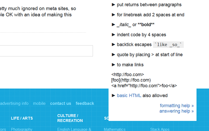
And the funniest part is that the real issues with CSS are pretty much ignored on meta sites, so such a message seems like a hypocritic attempt to get people OK with an idea of making this website worse.

Hypocrisy

8
  • 9
    This particular issue only shows up when you don't write enough in your questions. Just sayin'...
    – Shog9 Mod
    Commented Jan 8, 2016 at 23:34
  • 5
    I just want to upvote the answer that says, this doesn't matter to me in the slightest because I use adblock. So plus one I guess.
    – Mazura
    Commented Jan 9, 2016 at 4:05
  • 2
    @Shog9 Yeah, and this issue only shows up when the user is not logged in. Should everyone register on RPG@SE? Commented Jan 11, 2016 at 11:29
  • @Mazura oh I can feel the burn there. +1 as well!
    – Michal
    Commented Jan 12, 2016 at 9:48
  • Actually it does matter. The ads still aren't there but on my 1024 now I have to scroll to see the HNQ, where it used to cut off short or small words that I could infer, now it's missing one or two entire words. Not that I'm complaining; it's about time to forget about pandering to 1024.
    – Mazura
    Commented Jan 12, 2016 at 22:02
  • @Mazura enjoying adblock as well, eh? :) Commented Jan 17, 2016 at 2:17
  • -1 for every MF who uses AdBlock on sites where ads are clearly the only profit. Nobody forces you to use SE if you don't wish to see its ads.
    – yo'
    Commented Jan 18, 2016 at 7:31
  • @yo' I would eagerly opt in subscription rates if there were such thing on Stack Overflow. You just don't realize that people with AdBlock do hate ads. Commented Jan 18, 2016 at 9:48
1

THIS UPDATE SUX !

For some reason, I can't get my 100% attention to the left side when starting StackOverflow. This sidebar width is stealing 10% to 90% of my attention which is annoying. I rarely use this sidebar based on my experience.

You must log in to answer this question.

Not the answer you're looking for? Browse other questions tagged .