232

Update: Custom question lists is available for testing

Once upon a time there was a feature called new navigation. Its goal was to help our most active users find the questions they can answer. "New nav" never made it out of beta and that beta only ever made it to Stack Overflow users. Several months ago we gave new nav a sad, but overdue burial.

As we promised, we've been working on a replacement for new nav, and now it's time for us to start rolling it out. We're calling it custom question lists and we are really excited about its potential to help all users get at the questions that are most interesting to them.

While we hope what we've built hits the mark for many of you who have requested a feature like this (e.g., 1, 2, 3, 4, 5, 6), we know how difficult it is to make something complex simple. So, we are rolling this out in beta to gather feedback from you and iterate on it. (Don't worry, we promise to actually release it this time.) When it's live later you'll be able to opt-in to the beta by turning on a new account preference. This will enable the feature for Stack Overflow, Meta Stack Overflow, and Meta Stack Exchange. It will be available for all network sites when the beta period is over.

Schedule for future improvements

This feature will roll out in four phases:

  • Phase I: Filter and sort controls to let you modify a question list view (Julyish)
  • Phase II: Saved custom lists (In progress, ETA November 2018)
  • Phase III: Notifications on custom lists (December 2018)
  • Phase IV: Final fixes and official release (January 2019)

Sneak peak

Phase I: Filter and sorts

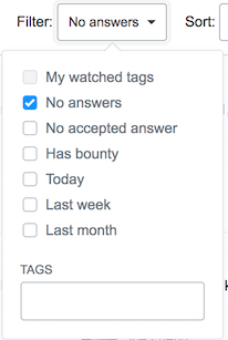
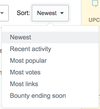
We'll add filter and sort controls to question lists. This does two things:

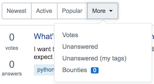
  • Clarifies the definition of built-in views - Naming is hard and short names can't always describe what a view is showing you. By exposing the filter and sort controls it is more obvious.
  • Introduces the ability to create new custom views - This won't be super useful until we add the ability to save the views to the UI (phase II). Until then you can bookmark the URL and get back to your views.

Question list with new controls

Question list with new controls


Views drop down

Views drop down


Filter

Filter


Sort

enter image description here


Phase II: Saved custom question lists

In this phase we will add the ability to save your custom questions lists.

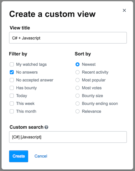
Create custom list

In our current design, a dialog will be pre-populated based on the filters and sorts you're currently using. Give it a name, confirm your options, and click save.

Create custom list dialog

Accessing your saved lists

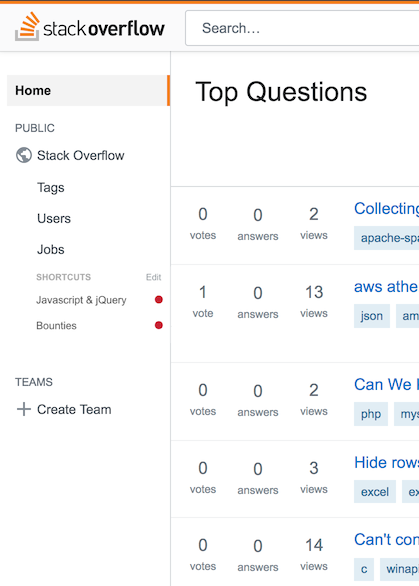
When you save your custom lists they will show up in the "More" drop down for question list views. Additionally, you can add them to the left navigation bar for easy access (see image below).


Phase III: Notifications

For phase III we'll enable indicators for when new items are available in a custom question list. When you pin a question list to the left nav you can see a dot on any list with new items.

Custom list in left nav with notifications

Feedback welcome

As usual, we're interested in your constructive feedback. This is a work in progress and, as mentioned, will be rolled out in phases. You can provide feedback on the concepts now based on the information in this post and provide feedback based on the working elements as they are released.

21
  • 48
    Thank you!! This looks like a good solution. The left nav spot is exactly what I'd hoped for!
    – Joe
    Commented Jul 18, 2018 at 18:39
  • 19
    Will the notifications be visible in any way for the users that have the left nav collapsed? Commented Jul 18, 2018 at 19:38
  • 13
    @JoeFriend make it play better in smaller viewports and we'll talk. :-) Commented Jul 19, 2018 at 0:16
  • 7
    Does the "Custom search" field in Phase II allow input of any currently allowed search string, like is:q closed:no wiki:no score:1..3 javascript -jquery? Does it ignore is:a and other keywords that search for answers? Commented Jul 19, 2018 at 0:40
  • 3
    do you expect triaged questions to show in custom lists? I ask because one of primary motivations of triage was to decrease question visibility and I wonder if it applies here
    – gnat
    Commented Jul 19, 2018 at 7:37
  • But this was already there in the New navigation V1.0 (SO only) which you removed few months ago. Commented Jul 19, 2018 at 12:50
  • 1
    Whee, finally some use for the Left Navigation! But could we get them as not some "shortcuts" thing, just add all of them, and on the top. The Home/questions/etc things in left navi are still useless for me, and what I've seen to many others, so putting these first would be usable. Commented Jul 19, 2018 at 13:10
  • 3
    Wow, how not helpful. A UI for the current search parameters. This doesn't make the search results any better. The search engine on SE sites is useless anyway and I bet nobody ever uses it. Commented Jul 19, 2018 at 16:55
  • 9
    @shiny-metal Actually, I for one use the Stack Exchange site-specific search engine quite a lot and find it to be rather useful. Maybe you aren't using it correctly?
    – user
    Commented Jul 19, 2018 at 19:29
  • Is a views sort possible?
    – Travis J
    Commented Jul 19, 2018 at 21:53
  • 2
    Please remember to add NOT to the filters - especially NOT in my ignored list`. Commented Jul 23, 2018 at 9:17
  • 2
    I still find it annoying that I have to stop and think to work out when "fall" is just because I don't live in the northern hemisphere. Local seasons are really not a good way to approximate a date.
    – Clonkex
    Commented Jul 23, 2018 at 23:52
  • 1
    @Clonkex It's not even that useful for us in the United States; a lot of people consider "Fall" to include August, and definitely September, but Phase IV in "Fall" comes after August and September in the timeline above. It's unhelpfully vague. I think it'd be better if they just stick to quarters like Q1, Q2, etc.
    – TylerH
    Commented Jul 25, 2018 at 14:36
  • 2
    @TylerH We're aiming to make good on that timeframe. Updates soon!
    – Jon Chan StaffMod
    Commented Jul 25, 2018 at 17:42
  • 1
    @ChrisRogers: The search functionality is not new. It's just a new UI wrapper to expose the functionality better. Commented Aug 2, 2018 at 8:24

14 Answers 14

176

If you're open to additional options, there's one filter option that would be a big help for power users on some sites that is not currently implementable via site search: not answered by me.

Not infrequently, I go looking in specific tags for questions where my expertise might be helpful. And when I do this, I keep bumping into questions I've already answered, especially on smaller sites. I want to skip those. Could we have that option, or a way to build it?

Right now, often enough to be frustrating, I start reading an answer, nod in agreement, try to upvote it, and then notice the problem. Or I see a question, say "ooh I can answer that!", start mentally composing an answer while reviewing existing answers before posting -- and oops, turns out I've been there already. SO is almost 10 years old; I personally have answers that are more than 7 years old. Relying on memory to filter out those questions isn't working. Please help us more effectively get to questions we should try to answer.

6
  • 17
    For now we are focused on creating an experience that unlocks all the existing goodness, but this is a great addition we could make once this is up and running.
    – Joe Friend StaffMod
    Commented Jul 18, 2018 at 20:14
  • 33
    @JoeFriend I know Monica's request will probably get forgotten about after the main system is implemented, but please, please do this. It would be so useful!
    – Ben I.
    Commented Jul 19, 2018 at 4:25
  • 6
    Yes, yes, yes! "No answers by me" would make a perfect addition alongside "no answers" and "no accepted answer". I suspect it wouldn't fare well with caching, as whether any given question meets that criteria would need to be somehow recomputed for each user, but it would definitely be a useful addition; even more so for power users on smaller sites.
    – user
    Commented Jul 19, 2018 at 16:46
  • 3
    It also helps with the "OOOH I KNOW THIS! OH WAIT, I ANSWERED THIS YEARS AGO" effect on bigger sites ._. Commented Aug 1, 2018 at 6:33
  • 2
    Perhaps "no answer by me and also no answer that I upvoted" would be even more useful for this purpose? (and also no downvote on the question from me) Commented Aug 12, 2018 at 10:24
  • @HenningMakholm dunno. The question might have been fixed (but I haven't noticed and retracted my downvote), or I might have upvoted an ok answer even though I didn't have time to write a better one at the time. Commented Aug 12, 2018 at 16:28
56

As André mentioned, it would be really helpful to be able to see some indication of new activity even when the left nav is collapsed. Something like what is currently done for the review queue, maybe?

Mockup of notification dot on collapsed left nav.

No freehand red circle, in order to avoid confusion. Sorry folks.

For me personally, this might be worth expanding the left nav for (as Joe mentioned).
Kudos, this planned change makes me very positive about the left nav :-)

2
  • 17
    Maybe a color that matches the theme of the site? Like orange for SO, blue for SE, etc.? The red seems kind of alarming (as it should for review queues), at least to this non-colorblind, Western dude, and I think new questions are a good, inviting thing than alarming. Definitely like the idea though. Commented Jul 19, 2018 at 12:53
  • Please no... there's a reason i hide the review button.
    – Kevin B
    Commented Jul 25, 2018 at 18:17
30

Hooray. I miss the old new nav.

One thing I am always confused about: what is the point of "active" and "popular"? Why do I want to find questions that lots of other people are already answering?

Me, I virtually always just want: Show me the most recent questions on my favourite tags (well, one really favourite tag) that have 0 or 1 (non-accepted) answers.

So my one big request is: Please allow a way to change the default view. I don't really want to have to always click "More > " and then select something, when that "something" is where I want to be 95% of the time.

3
  • 9
    "Active" doesn't always mean "already answered", it includes "modified" (edit, close/reopen, bounty, etc.), and I always use "active" tab on quieter sites because that's the only way to monitor all posts' activity on those sites and to moderate them. Commented Jul 19, 2018 at 3:56
  • 4
    Joining this one. Going to other site of network by using "Your communities" dropdown and having to click "Questions" every time (because someone decide default view should be "Active") is a bit annoying. Please make it possible to configure page displayed to registered user when using site "root" url (the one without slashes).
    – Sinatr
    Commented Jul 19, 2018 at 7:26
  • 1
    In the new nav we could reorder our filter tabs left-to-right, though we couldn't delete/move the Home tab from the first spot, though it was promised before new-nav got slated for early retirement... hopefully this custom question list feature will allow us similar/better functionality in that regard.
    – TylerH
    Commented Jul 19, 2018 at 19:10
28

Maybe I'm just old-fashioned by now, but...

Please offer an obvious way to clear all filters quickly.

Just from looking at the screenshots, I can't tell whether unchecking all the checkboxes will be enough to display all questions, or if it will display none of the questions. (It's probably the former, but explicit is nice to have; this doesn't have to be more complex than a static text such as "show only questions matching all of..." or some variation thereof.)

But even checking/unchecking all the checkboxes (and manually clearing the "tags" field) is moderately cumbersome, especially if this grows a little further than what's shown in the screenshots in the question.

I think that an action link like "Show all questions" or "Clear all filters", immediately accessible no later than immediately after opening the Filter dropdown, would be an awful nice addition that shouldn't take much development or testing time.

12

The red indicator is a bit limited, there is some value in knowing how many new items are in a particular filter. Of course it's difficult, if not impossible to provide exact numbers on a scale like Stack Overflow, but even a limited indicator of quantity would be more useful than a simple binary indicator. If it only displays "none, one, many or too many" it would already be much better than "nothing or one or more".

Another thing I noticed with the Teams indicator, which looks the same and I assume is the base for implementing this, is that there is a big difference to me between new questions, and simply new posts or edited posts. Depending on the context, I might only be interested in new questions, and the indicator should allow to distinguish whether there are actual new questions, or just updates or new answers to existing ones.

Another very useful feature are the live updates of question lists. There are some places where they are not implemented like stackexchange.com tag filters, and it's very noticeable. Wearing out the F5 key is really not an acceptable option today, so I hope that those filters will implement live updates just like the tag-specific pages on SO.

10

It's nice to have them on the Left Navi, but do reconsider how they're presented. Now they're under "Shortcuts" and with smaller font than the quite useless Users etc links. That's bad usability.

I would say that these links will be used the most so they should be prominently presented, at the top. What I've seen here in comments of the Left Navi most people don't have any use for the links that currently exist there. So they should be lower than the lists we create.

So please let us see the things we create ourselves first. We create them for a reason so they should be there nice and easy to use. The things you decide we must have there can be lower.

1
  • 1
    Perhaps a better approach is to just list them below "Questions" (or "Stack Overflow" on SO) label. Logically, they're list of questions. Commented Jul 23, 2018 at 6:17
7

The Create custom list option will be a long overdue addition

BUT

Please don't limit the customizable options to just those you've outlined in the screenshot.

I personally am looking for all possible options configurable in a custom view.

At the very least allow us "advanced" users to just paste a string for a filter:
intags:mine closed:no hasnotice:1 locked:0

2
  • 6
    From what I gather from the screenshots, this seems possible, the filter is to refine the search...
    – Tensibai
    Commented Jul 19, 2018 at 8:00
  • 1
    @Tensibai As long as making changes via the UI elements doesn't ruin the custom search string...
    – user
    Commented Jul 19, 2018 at 16:49
6

There is another feature that could be extremely helpful: being able to hide a given question from the custom questions list. If I see that I definitely won't be able to answer a given question, it would be nice to be able to hide it from the view, so that I could focus on others where I might have a good answer.

In the UI this could be solved by adding a "hide" button next to every question, when using the custom questions list.

3
  • 10
    This sounds like a bit too much overhead. At what point should the system stop keeping track of your individually hidden items? This isn't the kind of feature that can just be applied once to all questions on a page, but would have to check, question by question, whether you've checked that box before loading. Sounds way too expensive for a site with millions of users.
    – TylerH
    Commented Jul 19, 2018 at 19:08
  • 1
    @TylerH I'd wager less than 1% of all users would use this feature in the first place Commented Jul 19, 2018 at 19:44
  • @TylerH This seems like something that could be implemented client-side by storing question identifiers in the browser's local storage. Commented Jul 20, 2018 at 1:18
5

I feel bad for being negative, but since you asked for feedback:

This doesn't feel very useful to me. It requires me to set up a custom configuration, and the options I can configure are pretty limited.

What I want is the site to help me find questions that I am likely to be interested in, and likely to be able to answer. I would much prefer something that analyzes the questions I have answered and the questions I have voted on and the attributes of each new question (number of votes it has gotten, number of answers, relationship to questions I've answered and voted on), and then suggests questions to me. I don't want to have to configure it all by myself -- I'd like the site to help me with it.

This might be just me.

11
  • 3
    It's not just you. Using th search-engine is quite unproductive. Commented Jul 19, 2018 at 16:59
  • Are you saying the filter options don't allow you to filter the way you want (see Adelin's answer), or are you saying that the idea of setting up custom filters won't help you and you want automation instead?
    – user
    Commented Jul 19, 2018 at 16:59
  • @MichaelKjörling, both! The results of setting up a custom filter in my experience aren't great, even when I spend time trying to mess around with it or play around with different search terms. And, I don't really want to have to fiddle with complex configuration in any case. So, a solution that says "I added even more filtering options, I added even more configuration options" would not be attractive to me.
    – D.W.
    Commented Jul 19, 2018 at 17:01
  • While I'd also really like this, good recommender systems are the basis of entire companies. Stack just won't (can't?) dedicate the resources to make something like this actually work well in practice. First consider that many questions are mostly code, and that deciding similarity of two pieces of code remains an unsolved research problem. Commented Jul 20, 2018 at 1:25
  • @JeffreyBosboom, as a first cut, I suspect one could use tags + votes (+ other metadata, like whether it has any answers), without looking at the content of the questions.
    – D.W.
    Commented Jul 20, 2018 at 4:56
  • @JeffreyBosboom actually SE already has a personalized predictions for questions listed on the homepage's "interesting" tab. Whether it's efficient or not, that's another question... Commented Jul 23, 2018 at 6:23
  • @D.W. Have you tried using the home page rather than the questions page? It already analyzes your site usage to present a filtered list of questions.
    – Kevin B
    Commented Jul 25, 2018 at 18:22
  • @SomewhatMemorableName: AFAIK that's not actually hooked up to question lists anywhere. It is used to some degree for advertising and maybe Jobs. Commented Aug 2, 2018 at 8:21
  • @NathanTuggy hmm... I still believe it does, since 90% of my "interesting" homepage on SO is filled with Android tagged questions. Commented Aug 2, 2018 at 9:01
  • @SomewhatMemorableName: Do you have tag favorites set? I'm pretty sure the homepage does use that. Commented Aug 2, 2018 at 14:48
  • @NathanTuggy yes, I have it. Anyway, I found out that the personalized factors are: interesting tags & top 40 scoring tags Commented Aug 2, 2018 at 15:00
5

Why are bounties hidden behind a "More" drop down? More importantly, are these always hidden, or are there different views for different groups of users, like currently exists?

From the help page on bounties:

The bountied question will appear with a special indicator in all question lists, and it will also be visible on the homepage Featured tab for 7 days. Part of what you’re “paying for” with the bounty is to get additional attention for your question, over and beyond what a normal question gets.

It seem to me that both the current implementation (linked above) and this proposed implementation is not providing that additional attention. It's hiding "Featured" questions behind a drop down that (admit it) a small minority of users will end up using.


Bounties should remain a first class tab on the UI, like a user that is not a member of a channel currently sees:

Bounty Icon

This is on the main page and show all featured items

Bounty for a tag

This is on page for a single tag


Both of the images above make it clear that there are bountied questions available. It is easy to spot and it provides a quick glance to followers of a tag whether or not there are bounties for this tag.

Compare that to the screenshot you've provided (without the extended "More" drop down):

Proposed tabs

Are there any featured items here? I don't see any.

4

Will these list views of questions live update like the current default questions view? One of my biggest gripes with the new-nav when it was available was that I had to refresh to see whether there were any new questions.

The notification on the left sidebar is helpful but it breaks my focus having to look out of the list view over to a separate part of the page, register what it means, and then click it again. It's also unclear whether the red notification on the sidebar will be live-updating or only on a per-pageload basis. E.g. if I am sitting in the review queues, and someone posts a new question for my filtered/custom list, will that red light blink on immediately? Or will it blink on only on pageload the next time I load a page?

1
  • In fact, this live updating feature seems broken on Stack Overflow lately. It still works on other network sites, though.
    – TylerH
    Commented Jul 24, 2018 at 13:50
2

While you wait for this to roll out you can create your own Filtered Question List or use the main site's Live List to see what's happening in real time and what's hot system-wide.

2

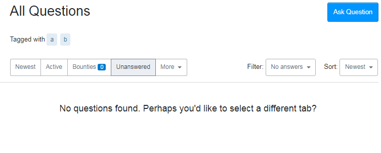
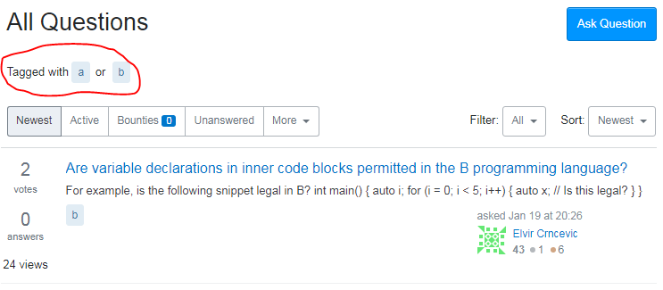
Switching tabs when filtered on the intersection of two tags () expands it to the union of two tags ( or ).

Screenshots: filter on intersection:

enter image description here

Switch to newest:

enter image description here

Possibly related bug on MSO here, that's how I discovered this.

0

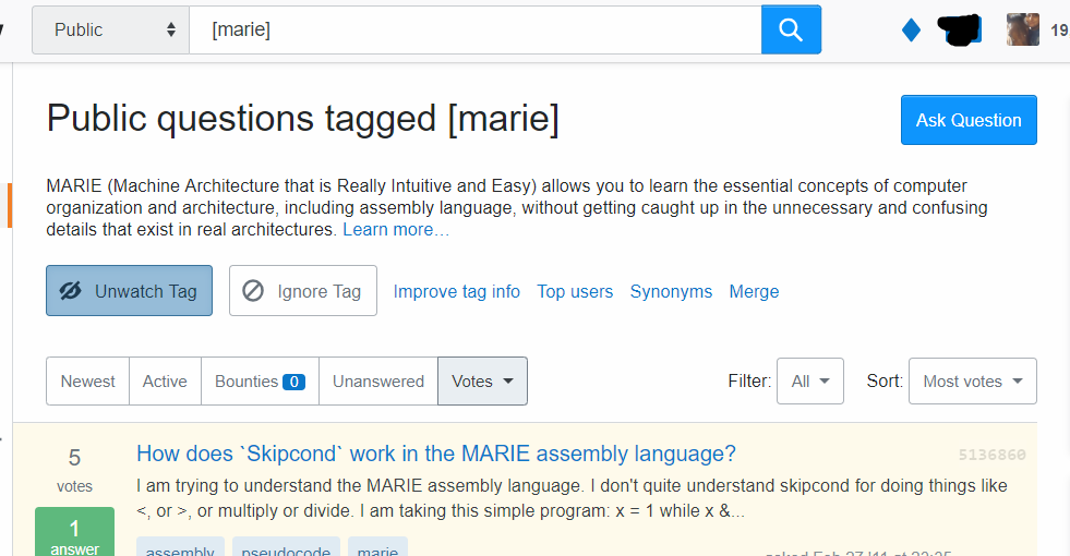
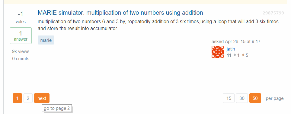
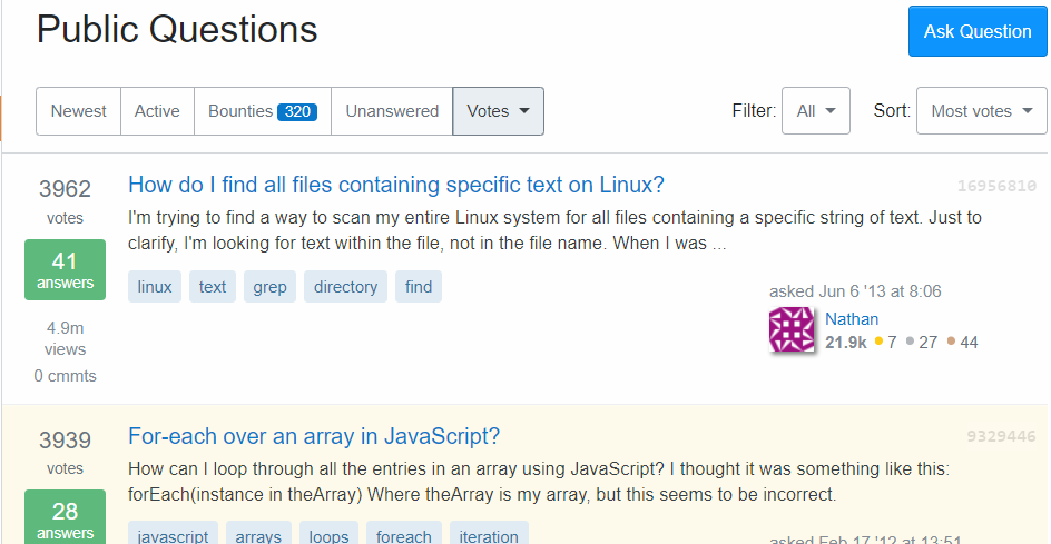
When doing a simple search on a tag (by clicking on the tag or using the new search box parameters), the pagination is not working. I've tested this on tags with more questions. When I click next it clears the search and takes me to the home screen.

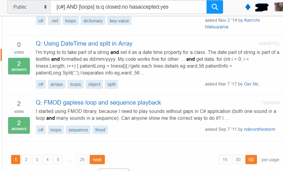
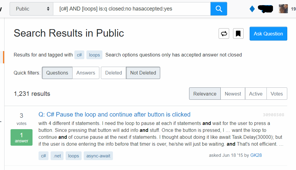
When I use the new search function and even put in some more complex parameters, it's working.

Example on one tag search

enter image description here

enter image description here

pagination leads to question home page

enter image description here

Example of more complex search

enter image description here

pagination keeps the search parameters

enter image description here

You must log in to answer this question.

Not the answer you're looking for? Browse other questions tagged .