6

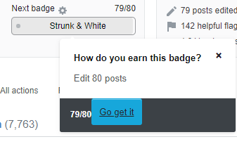
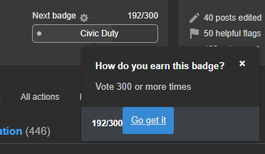
The button to "Go get it" on a badge's preview display in the profile page is aligned to the left instead of to the right, like it used to be. Its text content is also strangely underlined, now.

Here are screenshots for my Meta Stack Exchange profile and my Stack Overflow profile, with two different badges:

Meta SE profile Go get it button misalignment

Stack Overflow profile Go get it button misalignment

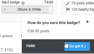
For reference, this box's design used to look like the following screenshot, with the button aligned to the right:

Old view of this box

I'm aware that I incorrectly reported a bug on this button's functionality before, but this has to do with visual design rather than functionality.

I'm running Chrome Version 83.0.4103.97 (Official Build) (64-bit) on Windows 10.

Could this be fixed?

1
  • 1
    I can confirm with Firefox 76.0 on Windows 10.
    – janw
    Commented Jun 4, 2020 at 15:26

1 Answer 1

7

Oh look, it’s our favorite thing! User interface regressions! 😛

Just merged a fix for this. I’m refactoring a ton of old buttons to use modern classes from Stacks, our design system. This one lost its layout styling in the refactor. Thanks for finding it!

It’ll get included in the next deploy, whenever that ends up being. Thanks again!

0

You must log in to answer this question.

Not the answer you're looking for? Browse other questions tagged .