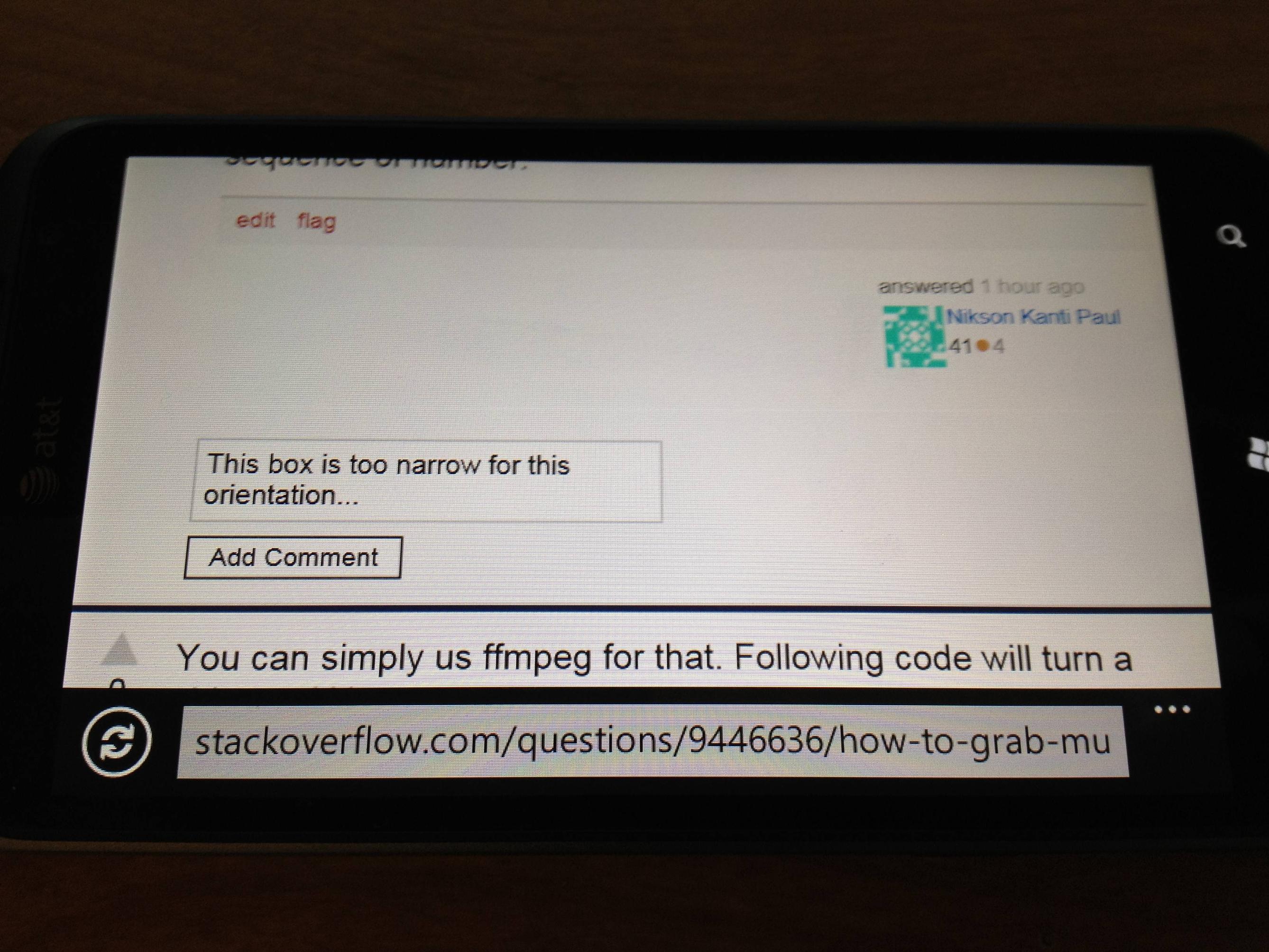
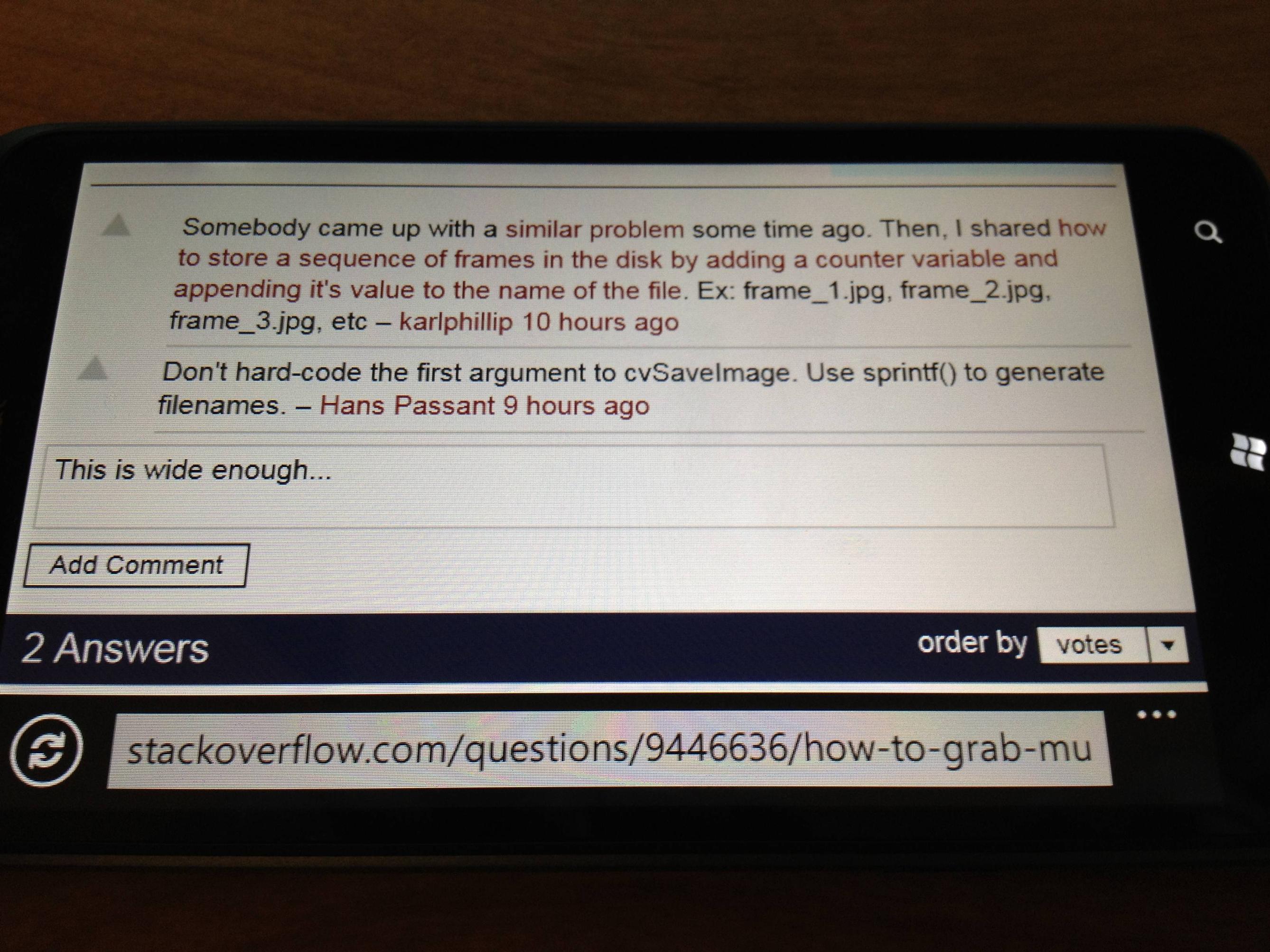
So I have an HTC Titan which runs on Windows Phone 7.5 and I noticed that when trying to leave a comment, the comment boxes behave differently in some circumstances. Yes I know, WP7 isn't officially supported yet but I see the same thing in on an iPhone 4S running iOS 5 which is supported but still shows the same behavior.
As far as I can tell, with the phone held horizontally in the landscape orientation, the comment boxes do not span the entire width of the screen when adding the first comment on a post. It stays about the width of the screen as if it were still being held vertically in the portrait orientation. Otherwise when adding another comment with other existing comments, it spans the entire width available as I would have expected. In portrait orientation, they seem to span the expected width in both cases, even if I change orientations after everything has loaded.

when posting the first comment
 when posting an additional comment
That can't be by design right?
