Not sure where to put this, but I was looking at the footer of for instance StackOverflow. The bottom portion font is very hard to read, the colors should be looked at:

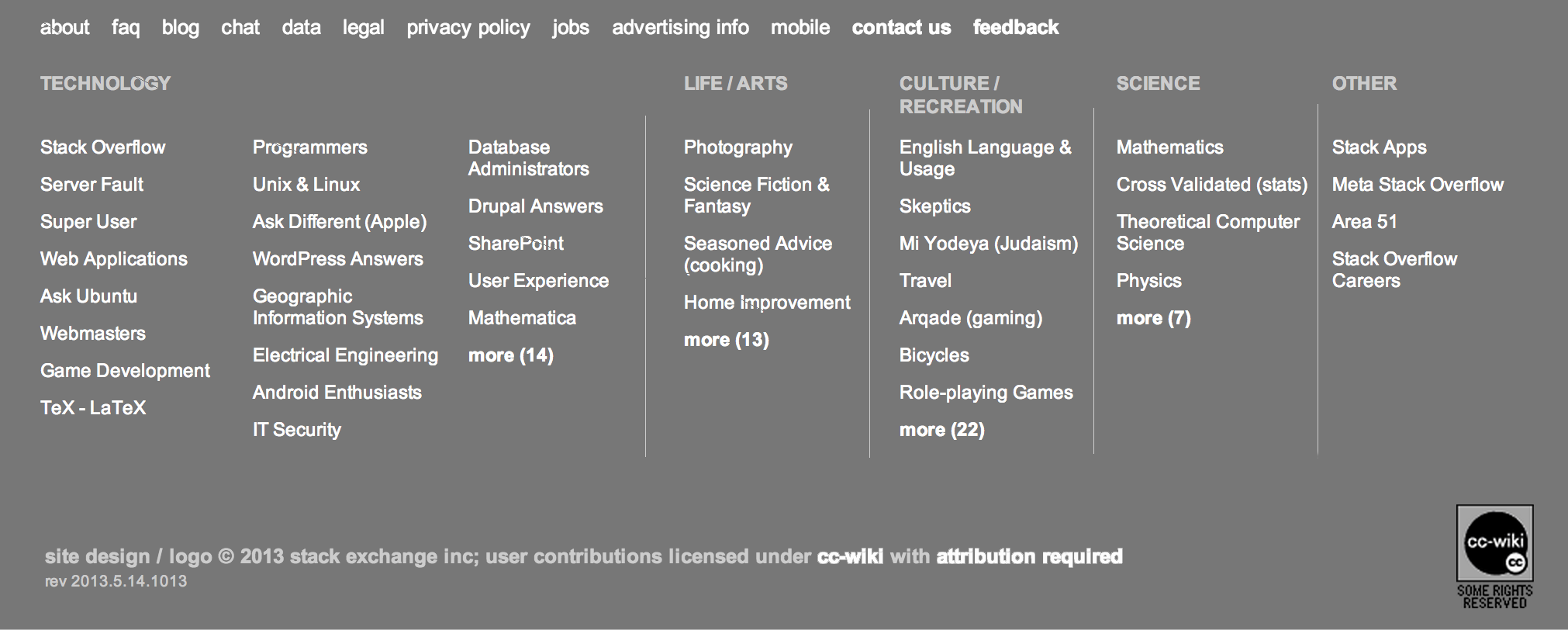
This:
site design / logo © 2013 stack exchange inc; user contributions licensed under cc-wiki with attribution required
for simplicity should be white just like the links.
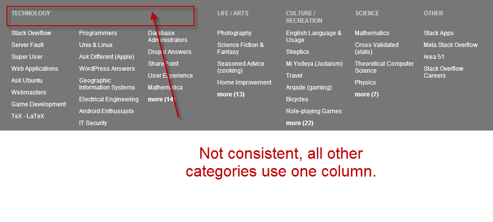
Also the footer is inconsistent, all other categories have one column except Technology it causes a gap between the various categories and just looks odd:

All categories should indicate a max # of sites ( say 5-7) and then include a link to more(n).


cc-wikiandattribution requiredis probably what is killing it, but I'd prefer it was #fff.me-a user who has used the stack sites probably more than you- why do you think you have used the sites more than @Servy? And even if you did, why does that qualify you to have better judgment about how the footer should look / function? Why do you care more about how it looks than how it functions? If you used the footer and your favorite site was now an extra click away, is that "better"? Why should I be forced to use bookmarks instead? What if I already have plenty, or if I have 30 favorite stack sites that are currently all shown in the footer? It's just clutter elsewhere.