18

Who designed it, and where does he live? >:P

Seriously, what is the purpose of it? For use on geocities? Does anyone actually use it?

1
  • 1
    Erghh. I can't read this question without fixing stackoverflow's ugly layout first. Console to the rescue: var s=document.createElement("style");document.head.appendChild(s);s.innerHTML=".site-header, .left-sidebar, #content { background-color: red; }\n";s.innerHTML+=".question-page, .container, .question, .answer, .inner-content { background-color: yellow; }\n"
    – Nathan
    Commented Jan 10, 2019 at 15:24

3 Answers 3

30

I believe it's a tribute to Windows 3.1's "Hotdog Stand" theme
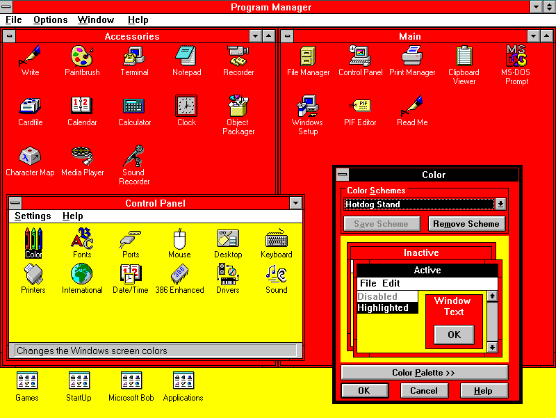
enter image description here

7
  • 13
    Okay, let's pass the buck then. Who at Microsoft can we <strike>blame</strike>credit for this theme?
    – Joel Coehoorn Mod
    Commented Nov 13, 2009 at 19:05
  • 2
    lol @ "Microsoft Bob" icon.
    – Alvin Row
    Commented Nov 13, 2009 at 19:26
  • 6
    AH! MY EYES! THEY BURN! Commented Nov 13, 2009 at 19:34
  • 2
    Could you cover this with freehand circles? Commented Nov 13, 2009 at 20:22
  • 2
    Well, there go my retinas. Commented Nov 13, 2009 at 20:25
  • It's... beautiful! Commented Mar 19, 2011 at 0:56
  • The Colour Out of Space Commented Sep 28, 2014 at 19:52
16

It's a color palette trojan horse:

alt text
(source)

7
  • 6
    No votes; the comic's not xkcd. :)
    – John Rudy
    Commented Nov 13, 2009 at 19:22
  • 5
    Why does everyone seem to hate Comic Sans? It's just a font.
    – Welbog
    Commented Nov 13, 2009 at 19:28
  • 14
    @CABAG - fixed.
    – Pollyanna
    Commented Nov 13, 2009 at 19:54
  • @Adam: xD [15 chars]
    – Alvin Row
    Commented Nov 13, 2009 at 19:57
  • 1
    -1 not related to the question, +1000 Comic Sans hate
    – perbert
    Commented Nov 13, 2009 at 20:06
  • 1
    @Adam, you get the +1 just for doing that. :) In fact, you have quite literally made my day with that edit.
    – John Rudy
    Commented Nov 13, 2009 at 21:04
  • 1
    @Adam That's really crude. Why don't you use Comic Sans MS to type XKCD with? Commented Mar 19, 2011 at 0:58
8

Why hate the hotdog? It's a beautiful colour scheme. I really like the subtle balance between the yellows and reds. It reminds me of walking through an orchard on a warm summers day with a slight floral aroma hanging in the air. Hand in hand with a lover, gazing into each others eyes, laughing, oh how we laughed as we rolled down a grassy hillock in the meadow!

But seriously, I imagine it's a high contrast scheme designed for the visually impaired maybe?

3
  • Hmmm, what web site would only have visually impaired visitors, to make using that theme suitable for a flair?
    – Arjan
    Commented Feb 21, 2011 at 10:21
  • 1
    Beautiful... maybe, but subtle no way. Commented Feb 21, 2011 at 10:27
  • @Arjan I think the original windows theme might have been for the visually impaired, the SO one is just in memory of that theme maybe!
    – Tom
    Commented Feb 21, 2011 at 10:32

You must log in to answer this question.

Not the answer you're looking for? Browse other questions tagged .