15

Update from Shog9:

Also affects Aviation, Cooking... Probably everything on the "not yet in progress" list here: meta.stackexchange.com/questions/314979/… - I've passed this on to the devs. – Shog9


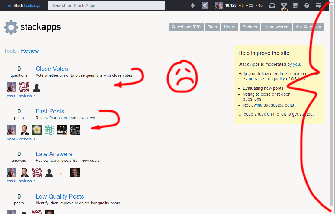
The Stack Apps review page got busted in the last few hours. It looks ugly and now needs to be scrolled, see below.

Other review pages (EG 1, EG 2) are still fine. And the problem appears for me in both Chrome and Firefox -- and whether or not I'm logged in.

bad layout

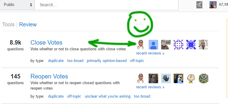
versus:

good layout

4
  • 2
    Also affects Aviation, Cooking... Probably everything on the "not yet in progress" list here: meta.stackexchange.com/questions/314979/… - I've passed this on to the devs.
    – Shog9 Mod
    Commented Nov 1, 2018 at 2:56
  • 1
    Also seen on Science Fiction and Fantasy, which is on the beta-testing in progress list. Commented Nov 1, 2018 at 4:07
  • Also affects graphic-design and movies&TV
    – Luciano
    Commented Nov 1, 2018 at 9:51
  • Can second SFF, MTV and ELU. Commented Nov 1, 2018 at 12:11

1 Answer 1

7

This is fixed for the time being; the original change was made to allow more space for localized text that was running into the next section:

review page prior to original change on Russian Stack Overflow

...unfortunately, making this column wider left less space for the (fixed-width) second & third columns on sites that haven't yet been updated with a responsive design.

The long-term fix here will be to completely redesign this page, allowing it to use as much space as is available... But for now, the text in the first column will simply be truncated if it grows too long:

review page on Russian Stack Overflow *now*, with long translation truncated

Thanks to Aaron & Jane for tackling this!

You must log in to answer this question.

Not the answer you're looking for? Browse other questions tagged .