114

Update: The line-height in code blocks is almost back to what it was before (it was 1.3 but is now 1.30769231) and the spacing between lines in regular text is now at 1.5 (it was 1.3 before the change). The background color in code blocks is still at the new #F6F6F6 (it was #EFF0F1 before the change).

What all this has revealed is that we all require slightly different settings to feel comfortable. This new setting, however minor the change may seem, does not work for me. I still need to use the userscript (see footnote) and with that I'm now able to make these settings even more to my liking than they were two days ago.

Being able to set these things directly in my Stack Exchange profile(s) would be preferable since it wouldn't require updating the userscript whenever something on the stack network changes.

Original post:


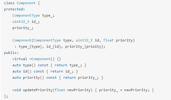
Code blocks used to look pretty similar to what it looks in an editor.

Before

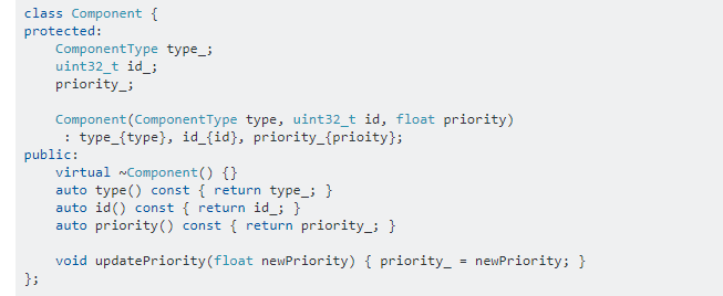
The update makes it look nothing like it. I've yet to meet a programmer that has this vast amount of spacing between lines when reading or writing code.

After

There are reasons for that. Unlike when reading a book, reading code requires that you can jump up and down between lines quickly and that you see a fair amount of the bigger picture. The new format makes both much harder. I also find the plain text in the questions harder to read, but most importantly, I care about the code blocks.

This new spacing between lines and the lighter background color (which gives less contrast) makes it much more difficult for someone that doesn't have 100% vision (like me).

I'd like an option to adjust the spacing between lines if this change isn't reverted.


Band aid 1: User CertainPerformance has created a small userscript that you can install in your browser. It sets line-height: 1.3 on many of the stack sites. I mention it here because it'll certainly help me to keep active on Stack Overflow until a real solution comes along, so I guess many others will also find it useful.

In my personal fork of that script I've added background-color in code blocks and set it to be the same color as inline code. I've also set line-height: 1.4 for normal text, and line-height: 1.25 for code blocks. It's really easy to tweak it according to your personal preferences.


Band aid 2: User Prid made a Chrome extension that restores colors and line-height to what it was before, with a menu for tweaking the parameters. A very simple fix.

9
  • 3
    I just published a Chrome extension, which should be easier than the userscript: chrome.google.com/webstore/detail/revert-stackexchange-form/…
    – Prid
    Commented Aug 28, 2020 at 22:21
  • Related: Please revert the line-height change!
    – V2Blast
    Commented Aug 31, 2020 at 21:09
  • 3
    I would upvote this twice if I could.
    – Ollie
    Commented Sep 7, 2020 at 21:06
  • "the lighter background color (which gives less contrast)" What? A lighter background color means that there is more contrast between the blue and black text and the background, not less. I certainly prefer the lighter color. Commented Sep 18, 2020 at 21:44
  • 1
    @CrisLuengo I spoke - and reacted very directly- but Yes - That's the effect. It has less contrast. I hope that what you prefer makes you appreciate the feature request.
    – Ted Lyngmo
    Commented Sep 18, 2020 at 21:52
  • 2
    Asked over a month ago...still hasn't been implemented. This question deserves and needs more attention.
    – Ollie
    Commented Oct 2, 2020 at 19:33
  • 2
    @Ollie I do agree. Implementing this may take a long time, but listening shouldn't.
    – Ted Lyngmo
    Commented Oct 3, 2020 at 0:01
  • 2
    @TedLyngmo They say they're listening in their update about s-prose, but if they care about keeping their community happy, they're going to have to do something like this.
    – Ollie
    Commented Oct 4, 2020 at 0:25
  • 2
    Excellent feature request, & perhaps with 100th upvote (just now) will draw more attention. Thank you :)
    – M H
    Commented Nov 8, 2020 at 2:35

2 Answers 2

49
+300

I couldn't agree more with this proposal!

I'm all for making the site more accessible - but it should be about making it more accessible for all. There's a fair bit of research showing that increased line spacing can be beneficial for those with certain visual or cognitive impairments (e.g. dyslexia). And I don't dispute that reasoning; what I would say is that it is foolish to assume that to be true for all.

I'm neurodiverse and I really struggle with comprehension of text with large line spacing - it's not easy to explain how I experience this, but the best way I can describe it is that the lines become separate bits of text that lack connections to each other, which is fine where the line is intended to be a discrete bit of information (such as list entries), but when it's actually part of one that continues onto the next line I have to mentally stitch them together rather than parsing on the fly as I can do normally. Often I find myself having to reread the previous line in the process of putting them together.

I start to notice the effect at around 1.4, but I can generally cope. At 1.5 it's uncomfortable, 1.6-1.8 is extremely taxing to read and comprehend, and above that it's nearly incomprehensible to me. The particular font and sizing makes it vary a bit, but those are pretty typical.

I'm not posting for sympathy on my issues, nor am I suggesting that I expect the site to conform to me, me, me - heck, at the moment I've got @CertainPerformance's excellent userscript solution running, so I'm fine. But I doubt my experience is unique and really I (and others) shouldn't have to be installing separate browser extensions just to carry on using a site I've been using fine for years, neither should those whose requirements differ from mine. So if the bods at Stack Exchange really care about ensuring the site is truly accessible and welcoming to as many people with cognitive differences or other differently-abled folks as they can, I don't think giving the user control over something as simple as line-spacing is a big deal to ask for.

2
  • 12
    "it's not easy to explain how I experience this" - What you describe is similar to my own experience although for me it's probably a mix of seeing colors in a different way than others and that one eye is only good for supporting depth perception. The "good eye" (which isn't so good anymore) gets tired easily nowadays. :-) Anyway, many thanks for sharing and supporting this feature request!
    – Ted Lyngmo
    Commented Aug 28, 2020 at 14:01
  • 4
    Given that three weeks have passed with no fixes except to the line-height in code blocks, it could be that the bods don't really care about community opinions on this matter. But I agree completely with this, and have upvoted ;)
    – Ollie
    Commented Sep 19, 2020 at 23:06
10

I also agree with this, one hundred percent.

It is only too true that we all require slightly different settings to feel comfortable. But:

Extensions, userscripts, and various other "Band-aids" are all very well, but making lots of us use multiple third-party resources to revert the various poor design choices made by Stack Exchange is...not great.

It's obvious enough that:

The proper solution requires ability for each user to customize line height (and possibly other settings) in the site itself, without needing to use userscripts and other external tools.

It would be great if we could add this as an option in user preferences. I am utilizing @Prid's excellent Chrome extension, but being able to customize the settings (or at least some), without various userscripts and extensions cluttering my browser, would be wonderful. This would make for an easy-to-use, more comfortable site, and a better user experience. Not for some, but for all.

You must log in to answer this question.

Not the answer you're looking for? Browse other questions tagged .