127

At some point during the day, quoted background, in I assume CSS, has been switched from yellow to white.

This is harder to find within an existing text, since the background color is the same for the whole text.

For some, white is harder on the eyes anyway together with the thin letters.

I don't think it is an improvement, since a major goal of a quote is to distinguish it clearly from the rest of the text.

So it would be nice if quotes would be reverted back to the original yellow.


Update based on some comments:

I don't really understand the argument about black on white being harder on the eyes.

For me it is like the sun light is being reflected off a sign - you have to squint to read it and thus a strain on the eyes.

A yellow background absorbs this glare, bringing a better contrast and is therefore easier to read

  • that is why in central Europe many traffic signs use a yellow / black combination for better readability under all light conditions.

For this reason also, I use note paper with a yellow background with black ink.

But I don't get the argument that it is harder on the eyes. I understand that it is harder than when it was black on yellow.

Black on yellow doesn't seem to be the problem, more the gold bar on yellow. A black bar on yellow would resolve that.

But in that case, why just complain about blockquotes? Why not complain about non-blockquote stuff that is black on white throughout StackExchange.

Where I have the choice, I do set the background to a (for me) more readable yellow background with black letters

  • notice the combination of light grey/yellow inside the table
    • which is not supported with the stackexchange Markdown

I mainly use stackexchange with the android mobile Chrome web version, where the offered plugins don't seem to work.

(Android Epsilon Notes application) enter image description here

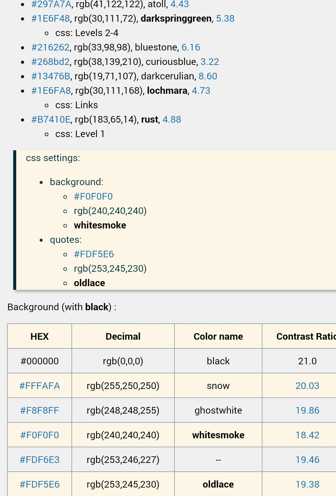
These are the main background / quote colors that I use to avoid the 'glare' problem:

enter image description here

Just as in the markdown application allows setting for specific colors, stackexchange should offer a user profile setting so that the user can determine what colors they are comfortable with.

26
  • 6
    See here for details of this change: Some improvements to blockquotes
    – nekketsuuu
    Commented Mar 10, 2020 at 0:00
  • 49
    I am a young adult with 20/20 vision, and I find it hard on the eyes too. I completely agree with this and would very much love the previous choice of the color to be reverted. Commented Mar 10, 2020 at 3:11
  • 3
    I don't really understand the argument about black on white being harder on the eyes. That's how all content is including blockquotes and most of the q and a on the network should (hopefully) be original content instead of mostly blockquotes. I would understand your argument if you were talking about a dark theme or even just making the background darker. But singling out blockquotes doesn't make sense. Commented Mar 10, 2020 at 3:24
  • 39
    Blockquotes have not been black on white for years, this is exactly the problem under discussion. The entire point is that now it's very difficult to visually isolate blockquotes from regular content, even for those with good eyesight (I'm one of them). This doesn't help people who need the greater separation and it doesn't help anybody who didn't.
    – Nij
    Commented Mar 10, 2020 at 4:00
  • 5
    @muru I know that it was different before. And FWIW, I am against the change as well. But I don't get the argument that it is harder on the eyes. I understand that it is harder than when it was black on yellow. But in that case, why just complain about blockquotes? Why not complain about non-blockquote stuff that is black on white throughout StackExchange. Commented Mar 10, 2020 at 6:16
  • 5
    @AryanBeezadhur Giving some reasons why you thing so would be nice, so one could compare them to the different reason's given for retaining the previous yellow value. Commented Mar 10, 2020 at 11:56
  • 4
    @AryanBeezadhur Blue (#0000ff) is a dark colour ; Yellow (#ffff00) is a light colour ; white (#ffffff) is a bright colour ; Dark letters should not be combined with dark or bright backgrounds for readability (contrast) purposes. When needed a light colour should be dimmed, such as pale yellow (#fdf6e3). This should be rule # 1 when designing something that will mainly be read. That it looks 'cool' should be rule # 314159265359. Commented Mar 10, 2020 at 13:09
  • 7
    @sth For RPG.SE a significant portion of the text is in block quotes because rules text needs to be cited to back-up the point an answerer is making
    – illustro
    Commented Mar 10, 2020 at 18:53
  • 8
    @sth Foe history.se also uses a lot of quotes for obvious reasons. Commented Mar 10, 2020 at 20:21
  • 18
    Keeping up with the Joneses on Web Design is not what SE exists to do. Formatting exists to increase readability and discernibility, not to add whitespace or make rounded corners. There is no improvement to make on the color scheme of white, black, and blue, with a nearly complementary yellow. There is no reason other than an arbitrary one, to change something that worked for 11 years.
    – Mazura
    Commented Mar 12, 2020 at 1:18
  • 6
    @AryanBeezadhur, you state, "I think that yellow does not fit in with SE’s web design". Yet, the same yellow is prominently displayed on every page on every SE site in the upper right section showing The Overflow Blog, Hot Posts, etc. This is clearly already part of SE's web design, and has been for a long time. If this yellow were so anathema, why has this been used so prominently for so long? This looks very much like "young developer seeks to make his mark", and also "solution in search of a problem". Add in a dash of "arrogance" and "ignoring userbase". Mazura nails it. Commented Mar 17, 2020 at 18:02
  • 6
    Please bring back the yellow block-quote... at least don't use the current white one.
    – Rickross
    Commented Mar 20, 2020 at 13:24
  • 1
    @MarkJohnson There are a variety of ways to add your own CSS or JavaScript to webpages. Personally, I have adjustments that are both CSS and JavaScript, so I have a personal userscript, which is managed by the browser extension Tampermonkey (an open source alternative in Violentmonkey). I also use a large number of other userscripts, mostly open source and publicly available, that have been written for use with Stack Exchange, which, IMO, significantly improve the SE experience. To be honest, I wouldn't want to use Stack Exchange without userscripts.
    – Makyen
    Commented Apr 4, 2020 at 22:34
  • 1
    If you just want to apply CSS, there are a variety of browser extensions which will enable you to apply custom CSS. I've been told that the extension "Stylus" is good, but have not personally used it. Of note is that I'd argue against using the extension "Stylish", for privacy reasons (the company that now owns "Stylish" collects private information from your browsing).
    – Makyen
    Commented Apr 4, 2020 at 22:36
  • 1
    @MarkJohnson Till a few a days back, the background did appear yellow in the mobile versions of the site. But sadly, now it's grey. (Insert incessant cussing and/or crying). Could you please put in something in your post about the mobile versions as well? Thanks. Commented Sep 2, 2020 at 14:59

3 Answers 3

15

I made a Google Chrome extension to revert the recent changes to line height, colors, padding, etc.

I've included an option to revert the blockquote styling as well.


Download Google Chrome Extension


Instructions:

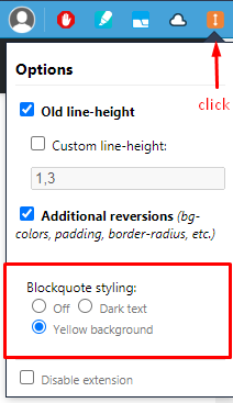
  1. After installation, click on extension icon (top-right)
  2. Under Blockquote styling choose Yellow background

Blockquote styling: Yellow background option

2
  • 14
    +1. It is amazing! What about writing a new extension for ALL StackExchange features? What about making a new stack exchange website?
    – C.F.G
    Commented Aug 30, 2020 at 14:24
  • 3
    @C.F.G Codidact and TopAnswers, but I'm not ready to give up on SE yet – especially not over poorly-thought-through CSS. Not after everything else.
    – wizzwizz4
    Commented Sep 4, 2020 at 22:45
13
+100

The best solution would be to add some global color settings to the users profile that would be valid throughout all sites.

The main goal should be readability for the person reading the text, not that it looks pretty to the web designer.

Only the user themselves can determine this properly.

Some uses may prefer a small, thin fonts with a light grey color with a white background (as some sites offer as the only option) - but for me that is completely unreadable, unless I select the text (thus inverting the colors).

This has been problem # 1 since the introduction of colors on computers.

The best solution has always been to let the users deside for themselves what they are more comfortable with, since they are the ones that use it.

2
  • I agree with your good suggestion. I am not sure whether to award bounty since the reason behind bounty was to get resonce from staff.
    – Pandya
    Commented Sep 8, 2020 at 6:58
  • 1
    @Pandya Where this changed was introduced (1 vote) and feedback asked for: Some improvements to blockquotes, there was no reaction to the mostly negative feedback (the highest with 177 votes). Commented Sep 8, 2020 at 8:11
10

Given that nearly half a year has passed with no fixes to these poor design choices, except to the line-height in code blocks, it looks like the bods at Stack Exchange don't really care about community opinions on this matter, but I'm going to chip in anyway.

I would love to see the yellow quote background color reinstated. To quote @NimeshNeema, "I am a young adult with 20/20 vision", and I still hate the white background. Others don't. The real solution would be to add this as an option in our user preferences, as I've also said with the line-height changes.

Having the yellow background color helped differentiate the quotes. The new white background does not differentiate them enough. The yellow background was also easier on the eyes.

Perhaps it would look like this:

enter image description here

I just don't think giving us control over something as simple as line-spacing, or quote-background color, is a big deal to ask for.

You must log in to answer this question.

Not the answer you're looking for? Browse other questions tagged .