-2

Update

Sorry for the delay! I’ve been thinking about this feedback in between my other projects, and I’ve landed where I’ve started 😕

I’ve made sure to continue highlighting spoilers in gray. The differentiation from normal blockquotes is super important since their behavior is so different. I explored keeping spoilers yellow, but that still has the same theming issues throughout the network. Red seemed too powerful, with its error connotations.

I understand completely that folks are using blockquotes to highlight images. However, I don’t think that’s a cowpath we want to formally pave. I’m ok with being opinionated here—blockquotes should be used for quoting, not as a way to highlight images. I understand that this will be frustrating to Machavity who made excellent points about differentiation in his answer, but I don’t think image highlighting ought to dictate how blockquotes are styled.

I’m also cautious of adding borders to images as explored by user1306322 for the same reasons and for the additional fear of being too prescriptive in how we display images there.

It’s a tough one! I went back and forth with the design team and I still think this is the best path forward.

Original post

We’re making a few changes to blockquotes soon. Historically, we had a bit of feedback that the yellow backgrounds were overpowering, reducing the contrast of the quote itself. The yellow border also lacks contrast with the background. Others have indicated that there should be more visible differences between block quotes and spoilers and between code and quotes.

These yellows also compete with theming in our communities, especially those with backgrounds that aren’t perfectly white like English Language & Usage and Role-Playing Games.

We’re proposing we switch to a single gray bar in our blockquotes. This should fix those theming issues and make it easier to distinguish between quotes, spoilers and code.

This will also improve blockquote nesting, since our current nesting is a mess because the darker yellow bar is barely noticeable on the paler yellow background.

Spoilers should pretty much behave exactly the same way. More room for later improvements there.

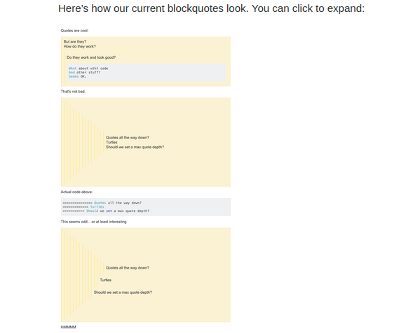
Here’s how our current blockquotes look. You can click to expand:

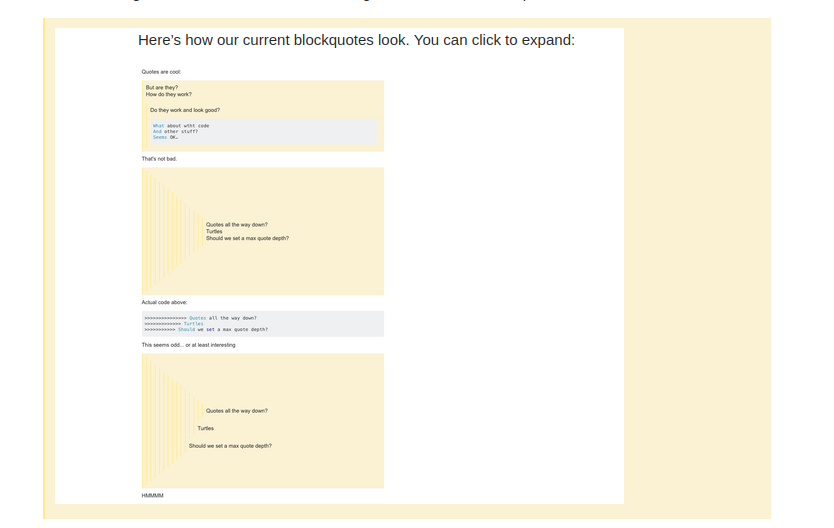
Here’s what we propose:

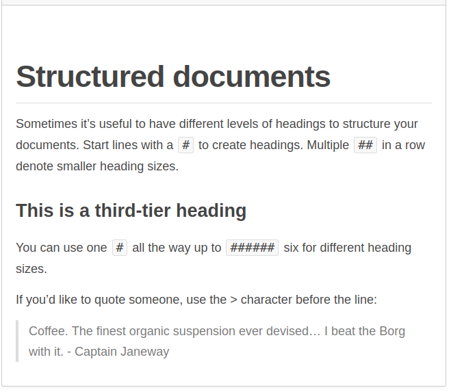
There is a lot of prior art out there for this approach. GitHub has styled theirs this way for a long time. So has Slack.

Slack GitHub

Let me know what y’all think. I think these changes will be an improvement, and I hope you do too.

Huge thanks to Catija for gathering some meta posts on blockquotes and creating an awesome blockquote playground post for testing.

43
  • 9
    Too bad your spoilers are actual images, fooled me, especially since I'm on a mobile divice. Where is the hover on that?
    – Luuklag
    Commented Feb 19, 2020 at 20:36
  • 13
    It's like Stack Fighter II
    – Machavity
    Commented Feb 19, 2020 at 20:54
  • 9
    I upvoted the "question" despite disagreeing with the proposed change, to make sure more people see the post and are able to provide feedback. Also, thanks for bringing this proposal here to discuss it first! :)
    – V2Blast
    Commented Feb 19, 2020 at 23:50
  • 9
    @tchrist I'm afraid I don't think it looks fine. I'm not sure why; text size perhaps? Amount of indent? However, since there are already custom styles for designed sites, I don't see why this element can't be in the customisation. Yellow isn't good for ELU, but no colour difference is worse by quite a long way. Commented Feb 26, 2020 at 21:46
  • 37
    Errrm, the quote styling has suddenly changed to a single gray line on the left edge and indented - I can hardly tell this apart from normal text when skimming a long question/answer - please change it back!
    – MrWhite
    Commented Mar 9, 2020 at 17:19
  • 10
    For a site like rpg.stackexchange.com having quotes be differentiated strongly from regular text is particularly important, as it clearly delineates what is quoted from a sourcebook and what is the answerer's or querant's content. This change removes that difference and makes it much harder for people reading the questions and answers to differentiate the two
    – illustro
    Commented Mar 9, 2020 at 17:30
  • 60
    Yellow was GOOD. Color was needed to actually differentiate quotes. Quotes are now very hard to identify.
    – pkamb
    Commented Mar 9, 2020 at 20:45
  • 10
    I don't think that this post shows any improvement on how the community gets involved into decisions. Now we are asked our opinion, and it is then simply ignored by the SE team developer. Being asked is a step forward, then doing nothing with the top upvoted answer is not. Commented Mar 9, 2020 at 21:05
  • 15
    Can a particular community have different design for blockquotes?
    – Pandya
    Commented Mar 10, 2020 at 8:22
  • 11
    So now it's an indent bar, reminiscent of reddit-(at)me-lengthy-whitespace-screen-stealing-garbage-comment-threads ; there's no 'block'. Give us inline block quotes that aren't in code snippet font, and stop changing things we didn't ask to be changed. "this will be frustrating to Machavity" and a thousand other people, assuming there's an active user for every ten lurkers (it's at +100 atm).
    – Mazura
    Commented Mar 12, 2020 at 1:05
  • 28
    The most upvoted answers below are all against the change, but SE changed it anyway. It gives the impression that this question was posted just to pretend the company is listening to the community, because they'd do this change regardless of the community's feedback.
    – hkotsubo
    Commented Mar 12, 2020 at 16:19
  • 17
    Oh surprise, SE not listening to its users. Eight upvoted answers, with only two in favor and five against, with the top answers against. This constant simulation of listening to the community but really doing whatever they want is really tiring by now. Commented Mar 14, 2020 at 12:02
  • 21
    The new blockquotes look bloody awful. You can barely see them
    – Richard
    Commented Mar 14, 2020 at 23:55
  • 22
    If this 'question' is indeed intended for discussion, why have these changes already been made, while the top answers here disagree, and for good reasons?
    – Joachim
    Commented Mar 16, 2020 at 12:37
  • 14
    Who is this guy, and why does he have the ability to change site-wide style without consulting with each community? This is presented as if it's been done with due consideration, but from my perspective, this is a baffling unannounced change. Reading the post above, it sounds like 1) this fixes perceived style issues with two communities, at the expense of disruption for everybody else, and 2) it's justified as if the yellow is problematic for "site theming" or something -- and yet, every site has a big yellow block at the top right on the main landing page. This doesn't smell right. Commented Mar 17, 2020 at 17:43

16 Answers 16

184

The blockquote yellow does two things

  1. Indents
  2. Differentiates

I feel like this focuses on #1 and leaves out #2. For simple uses it would be fine, but when skimming long Q&A I often use the yellow blocks to focus on what the person is saying, rather than the quotes. Yellow may not be the answer, but removing the colored block entirely doesn't seem useful.

14
  • 26
    we use block quotes to fully display error message on code. If we take the yellow away, how can we see it different? +1
    – gbianchi
    Commented Feb 19, 2020 at 21:02
  • 2
    Agree. A lighter shade of yellow would look better, but the proposal might blend in too much with nonquoted text.
    – M.A.R.
    Commented Feb 19, 2020 at 21:20
  • 5
    Considering the number of people I see using blockquotes to mark out the actual question they're asking, I'm not sure that's a bad thing. Commented Feb 19, 2020 at 22:53
  • 6
    I do agree that differentation is a useful benefit of blockquoting (...though people shouldn't use the formatting just to differentiate stuff when it's not actually a quote), and would also oppose removing the yellow background entirely for that reason.
    – V2Blast
    Commented Feb 19, 2020 at 23:45
  • 9
    Seeing how some users' answers tend to consist of nothing but huge quote blocks, which I don't consider particularly good answers, I'm afraid reducing the formatting in the proposed way is going to hide that fact and make quote-only answers look like a lot of original prose. Commented Feb 20, 2020 at 10:06
  • 7
    On some sites it's good to have quotes (even long quotes) in answers i.e. those are good answers (for example), but I still want to easily distinguish what is said about the quote from the quote itself (as stated in Machavity's answer).
    – ChrisW
    Commented Feb 20, 2020 at 16:50
  • 5
    Yes, that's the point. I want to be able to distinguish if the answer is full of quotes, especially when I intend to ignore quotes as the additional information they're supposed to be and concentrate on the essence of the answer. Quotes aren't bad of course, but they're not what your answer is supposed to ultimately say. Your linked example is an example for an answer that makes proper use of quotes. But even then it would be quite hard to concentrate on the non-quoted parts. Commented Feb 20, 2020 at 16:56
  • 22
    I doubt I mind much which background color you choose, but its having a background color helps me read it as a different voice than the poster's, which is good; IMO a sidebar isn't sufficient.
    – ChrisW
    Commented Feb 20, 2020 at 17:06
  • 2
    A conventional but not a preferable alternative is to use a different font e.g. italic -- which you'd do if it were black-on-white publishing on paper. On a screen you can keep the (most legible) font and tinge the background color instead.
    – ChrisW
    Commented Feb 21, 2020 at 10:16
  • 4
    @curiousdannii: Considering the number of people I see using blockquotes to mark out the actual question they're asking, I'm not sure that's a bad thing. – People will probably still continue to do so and it will still be abuse of formatting and needs to be edited. I don’t think that this solves much.
    – Wrzlprmft
    Commented Feb 29, 2020 at 9:57
  • 4
    Maybe I'm a little lost here, but, if the original problem was due to quotation of images, that should be solved by editing the question/answer, not changing the color of the blockquote. Commented Mar 11, 2020 at 17:00
  • @MarcoAurelioFernandezReyes No, there is no other way for users to add borders or background colors to images.
    – Mr Lister
    Commented Mar 15, 2020 at 8:51
  • 7
    This is a bad change. Please return blockquotes to what they've been before. In future, before you try to "improve" things, please first speak to people who actually use these things. Commented Mar 15, 2020 at 9:24
  • 1
    I think it looks a lot better than that ugly yellow, but the color should be at least somewhat different from the main text. Commented Mar 30, 2020 at 18:22
102

This is a retrograde step for sites that need quotes to be differentiated from text.

While I agree that there is a need to differentiate spoilers and quotes, and the light grey for spoilers works quite well to do this, removing the yellow background from quotes makes them less clear and much harder to differentiate when reading a question and answer.

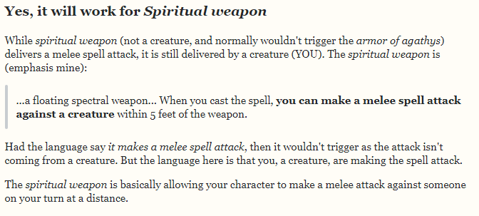
Sites like RPG Stackexchange have questions and answers that need to quote rules text from the game systems they are discussing. Having that rules text highlighted both distinctly and differently to the regular text is important, as it clarifies what text is in the author of the post's "voice" and what text is from the game system itself.

For example, this snippet from a recent answer on RPG Stackexchange:


Snippet from answer on RPG Stackexchange


The quoted text is from the rulebook for a specific game. It's point is to backup the answer, but be distinct from the answer text. When reading this answer, the quoted section is now less clear than it would have been yesterday that it is different to the rest of the answer.

Github and Slack are mentioned as examples of prior art in this respect, but those sites have a different focus to stackexchange.

Slack allows for instantaneous messages between colleagues. The messages it is optimised for are therefore short and ethereal. They are also being exchanged between people who are intimately familiar with the message content, since they are communicating about their work and livelihoods. There isn't as much need for a particular slack message to be revisited once a relatively short time period has passed. On Stackexchange however, questions and answers are expected to have a long life, and how they are presented is significantly more important.

Similarly, Github is a site primarily focused on code, specifically repositories of different collections of code. Comments on the code within those repositories are (usually) focused on a specific change made at a specific time. They are similarly ethereal. In addition, these comments do not need the same level of differentiation between quotes and comment text, as the audience reading them are going to be experts on the specific code repository being commented on and the specific topic being discussed. This is not the case on stackexchange. Here we expect the answerers to be experts, but the readers of those answers will generally be non-experts, looking for an answer given by the experts. Thus having strong differentiation between quoted and non-quoted text is important here.

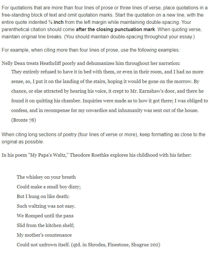
If having the transparent background is felt to be important, then some other measure should be used to indicate that the text is quoted. For example, in news articles and academic texts, quotes are quite deeply indented (and sometimes formatted with a different font):


Purdue University guidelines on quotations


Increasing the indentation on the quote formatting would go a long way to giving the differentiation that is needed. This may, however, run into issues with right-to-left typed languages that the solid background colour did not.

3
  • 5
    Indentation would definitely be a good addition to the change.
    – jscs
    Commented Mar 9, 2020 at 18:34
  • 10
    This issue also applies to Code Review.SE where answers semi-regularly quote code from the question to contrast it with an improvement Commented Mar 10, 2020 at 13:12
  • 14
    It applies everywhere you want to properly distinguish quotes from the actual content of the post, which is basically....everywhere anyway. Commented Mar 10, 2020 at 16:58
39

See my answer on EL&U and tell me the new blockquotes is an improvement. At a glance, the citations and my words look pretty much all the same now.

Please bring back "block colour"; change the sickly yellow tone to pink, make it azure, make it more striking and different from the rest of the sites; why does Stack Exchange have to be the same as Slack or GitHub?

Do you know what the single gray bar says? It spells drab. If the aim was to make quotes look dull and lacklustre, then the design team has achieved exactly that.

Could changing the gray bar to emerald green or even funky purple help give the content a more lively appearance ? I like Aryun Beezadhur's version

enter image description here

One last thing before I forget, what about users new and/or with no IT engineering background? Is the gray bar self explanatory to them? Was the design tested on people who were not "Stackers" or employees? I mean, I know today that a piece of indented text represents a quotation but would a newcomer to any of the language or non-technical sites in the SE universe?

UPDATE

Monday 16 March, 2020

In the highly prestigious The New York Times, quotations are normally differentiated by the use of double curly quotes while single curly quotes are used for nesting quotes.

enter image description here

Occasionally, the American newspaper uses the single gray bar to distinguish quotations from the rest of the article; however, they also reduce the font size.

enter image description here

Note how the first snippet with its stark white background blends seamlessly with that of Meta's. With the second snippet, I added the gray bar, now it is clearer that the enlarged font (on the SE mobile site it actually appears smaller) is not due to some HTML wizardry. But how many users on non-technical sites will actually bother to add blockquotes to a screenshot?

7
  • They appear yellow to me
    – Luuklag
    Commented Mar 10, 2020 at 8:00
  • 6
    @Luuklag If you are viewing the site from a mobile device the css changes haven't been propagated there. If however you are viewing the site from a desktop browser the quotes have been changed to have a white background.
    – illustro
    Commented Mar 10, 2020 at 18:54
  • 2
    medium purple with lavender would be nice
    – cobrexus
    Commented Mar 10, 2020 at 22:21
  • Maybe I haven’t had enough caffeine yet today, but I’m having trouble understanding some of the arguments on this page.  Are you intentionally undermining your own position?  Because you say that a “highly prestigious” American newspaper “occasionally … uses the single gray bar to distinguish quotations from the rest of the article”; that seems to suggest that the gray bar can be expected to be self-explanatory to users with no IT / engineering background.  … (Cont’d) Commented Mar 18, 2020 at 4:29
  • (Cont’d) … P.S. This is a bad example because the subheadings (underlined with “-”) punctuate your answer at a high level, and thereby frame / delimit the block quotes. And, while I dislike the new block quote format, I find myself getting used to it very quickly. Commented Mar 18, 2020 at 4:29
  • 1
    @Scott I also added that the font size is also reduced, which makes it clearer. You can get used to anything in life, doesn't mean it's necessarily good. Commented Mar 18, 2020 at 9:10
  • 2
    @Mari-LouA just a curious note: the yellow highlighter is used in several high circulation newspapers. It's efficient, as a design choice I saw it starting being used precisely when printed newspapers were thrown into a sales crisis by the internet. I still use fluorescent highlighter in my personal notebook, what's not to like about it? A mild/cold color may be more pleasing, but do we want to take "warmth" from our posts? Worth noting: it was the only color posters could use...Sigh*
    – bad_coder
    Commented Mar 22, 2020 at 2:49
31

Across the network blockquotes are by far more commonly used than spoilers, so it seems unfortunate to sacrifice the readability/identifiability of blockquotes to differentiate them better from spoilers.

(This change would seem like a good idea if the usage of quotes vs. spoilers was something like 1:50, but across the network it's probably more like 50000:1.)

I totally understand the idea of making them visually distinct, but would suggest reverting the change for blockquotes and adapting the design of the spoilers instead.

(For example, by using a slightly different shade of yellow, or a subtle texture/pattern for the yellow in spoilers that "covers" the spoiler and disappears on reveal.)

1
  • 2
    "a slightly different shade of yellow" - why use yellow at all for spoilers?
    – DocRoot
    Commented Mar 26, 2020 at 23:34
28

Visually displaying the quotation marks, as well as the color differences, may help.

e.g. (Using "FontAwesome" Symbols)

enter image description here

4
  • 5
    This also does a great job at providing differentiation. I don't know if the big quotes would be preferable on a Stack site, but the background sure is. :) Commented Feb 20, 2020 at 11:25
  • 29
    I would personally be against this. Blockquotes are used for different things on different sites, the large quotation mark is mainly sensible when quoting a person, but less so for quoting error messages, formulas, code segments, movie spoilers, etc.
    – Erik A
    Commented Feb 20, 2020 at 19:33
  • 5
    I agree with Erik, but I would like the light gray background along with the darker left border. Commented Feb 21, 2020 at 7:09
  • "Blockquotes are used for different things on different sites" - They are? That's not my experience.
    – MrWhite
    Commented Mar 26, 2020 at 23:36
27

I thought stackoverflow started out as being a programming site...Let's see:

Now we're supposed to go ASCII retro black&white and consider that better? No amount of rationale would lead me to believe that. (SO is not a .txt file, I don't recall seeing 1 single spoiler on SO that would justify/motivate losing color in quotes.)

I don't believe the "github" comparison either, it's not meant for intense SE style interactions read over&over, but check documentation on readthedocs it has plenty of color in key quotes.

7
  • 4
    Stack Overflow is not the only site that needs to fit in the design. Comparing it to sites that only have to do one trick for one audience is a tad unfair.
    – rene Mod
    Commented Mar 13, 2020 at 7:58
  • 1
    @rene let them come up with a smart solution that needn't put away with color.
    – bad_coder
    Commented Mar 13, 2020 at 8:18
  • 2
    black and white are also colors. Your wish has been granted.
    – rene Mod
    Commented Mar 13, 2020 at 8:20
  • 3
    Monochromatic argument. Why not a b&w TV, b&w smartphone, b&w pc screen...Every post looks like a wall of text now.
    – bad_coder
    Commented Mar 13, 2020 at 10:08
  • 2
    Stack Overflow still has colour, though. The messages when a post is closed or locked, the "featured" sidebar, the "New contributor" message under your profile (and the associated banner I'm seeing as I type this comment)... the site certainly does look less colourful, I'm not denying that, but claiming it's now entirely monochrome seems hyperbolic to me. As does calling it "the worst design move in history".
    – F1Krazy
    Commented Mar 13, 2020 at 11:51
  • @F1Krazy what represents "time&money" for SE members is the Q&A box. All else is an accessory. Those of use habitually battling "wall of text" docs will prefer color, because it eases reading.
    – bad_coder
    Commented Mar 14, 2020 at 22:22
  • 7
    @rene And frankly, on these other sites it's equally shit to not be able to distinguish quotes from genuine content anymore. If anything, SO is probably a site less effected by the disadvantages of this worsening update. Commented Mar 16, 2020 at 20:40
26

I'm all for the general idea, and I'd like to see higher contrast ratios across the board at SE.

However, this poses a slight issue with images. Quote markup is often used to provide a border around images that have a light background that mixes into the page background. Especially with screenshots, it makes them clear and less confusing as they stand out as separate images rather than appearing to be part of the UI.

The way that your proposal currently works, it will end up breaking this border around existing images, and no longer provide the benefits that it previously provided. I'd highly recommend searching this Meta site for images, especially within my posts; you'll see many cases where others and I have used quote markup as a means of providing a nice border around images that would otherwise mix into the background.

Can we at the very least please provide an alternative way for providing such borders that doesn't involve (ab)using quote markup? Also, if possible, can we automatically rewrite images that are the sole part of a given instance of quote markup to use this new method, so that previous posts that were using it won't need to be bumped to be fixed?

9
  • 5
    Here's a pretty good example of one of your old questions with an image that's within a quote block to increase visibility.
    – Spevacus Mod
    Commented Feb 19, 2020 at 20:49
  • 1
    This use case is known and was tested - you can see it in the images provided.
    – Catija Staff
    Commented Feb 19, 2020 at 21:05
  • 19
    @Catija I know, I saw. Not satisfied. The border is completely missing. Commented Feb 19, 2020 at 21:08
  • 2
    What about adding a border to all images within blockquotes with a blockquote img { border: 8px solid #fbf2d4 } rule? i.sstatic.net/3ze1N.png Commented Feb 20, 2020 at 0:58
  • 9
    For what it's worth, I have never seen anyone use this trick of quoting to add a border to an image before (maybe it's more common on MSE?) and I have to admit that it looks really ugly to me. The border isn't centered, it is yellow (ugh) and just looks off. I do understand that a border can be useful, but I don't think abusing markdown like this is a good way of getting it. Your suggestion of providing a different way seems like the way to go instead.
    – terdon
    Commented Feb 20, 2020 at 9:23
  • 3
    @user1306322 Sometimes we'll use inline images inside quotes that shouldn't have a border, such as mathematical equations or symbols. It would not be appropriate to give all images inside a quote a border. Commented Feb 20, 2020 at 11:23
  • 8
    [feature-request] Give us markdown that specifies an image should be bordered so that we don't have to use quote blocks for this. I still don't want to see the background go away on quote boxes but this is probably a good idea anyway. Spitballing a possibility: single bang for an image (![alt](url)), double bang for a bordered image(!![alt](url)). Commented Feb 20, 2020 at 11:31
  • 3
    Half joking: you could always use <kbd></kbd> tags instead. It doesn't abuse quote markup ;) Commented Feb 20, 2020 at 16:36
  • 2
    +1 It is now impossible to show white text on transparent background tex.stackexchange.com/a/469956 Commented Mar 20, 2020 at 9:11
26

Note that this did not solve the problem with spoilers you wanted to solve. Uncovered spoilers still look exactly like quotes:

If you click this spoiler to permanently uncover it, it will look just like the quote below.

This is a quote.

Update: With further changes to formatting, this is now obsolete.

4
  • 12
    TIL that if you click a spoiler it will be permanently uncovered.
    – LShaver
    Commented Mar 13, 2020 at 13:26
  • 4
    @LShaver Clicking a spoiler is a toggle. If you click it again, it'll become a spoiler again. Commented Mar 13, 2020 at 17:02
  • 4
    @JohnOmielan Apparently not on mobile (at least Chrome on Android).
    – Earthliŋ
    Commented Mar 18, 2020 at 8:51
  • Not working on Firefox Android either: chat.meta.stackexchange.com/transcript/message/8928913#8928913
    – Rob
    Commented Jun 28, 2021 at 6:29
25

This is IMHO totally counter productive.

There might be some remote cases where the nesting is better rendered with the left bar style, but for the most part you are breaking the intent of posters on SO who want the contrast provided by the light-yellow background.

This move does not fix any real problem. You should at least apply the common sense wisdom: if it aint broke, dont fix it.

Was there a vote on this change? Who makes this kind of decision?

PLEASE Change it back!

14
  • Did you read the post? because it explains that they talked with the design team and lists examples of issues they were trying to solve.
    – Em C
    Commented Mar 14, 2020 at 22:27
  • 13
    @EmC The fix is worse than the problem they were trying to change, at least for stackoverflow. Removing the extra contrast is going against the writer's intent. The nesting issue is irrelevant to stackoverflow users. The issue regarding images is not really relevant either for stackoverflow users as pictures are rarely welcome on coding questions and answers.
    – chqrlie
    Commented Mar 14, 2020 at 22:36
  • 1
    There are sites other than SO on the network, you know. "Writer's intent" makes no sense here; quote markup is for quotes always and authors have never had individual control over the styling of quote markup on their particular post.
    – Em C
    Commented Mar 14, 2020 at 22:38
  • 9
    @EmC: stackoverflow accounts for 90% of Stack Exchange traffic. Any wide ranging changes should be carefully studied and discussed. Authors have never had individual control of the styling, but they have made decisions based on then current rendering methods. Drastic changes to the rendering such as this does infringe on their intent. I am just a regular contributor to SO (top 0,16%) and that's the way I feel about this. I don't know about others, but your arguments are not very convincing. A simple vote of contributors, possibly on a site by site basis, would seem logical.
    – chqrlie
    Commented Mar 14, 2020 at 22:43
  • 4
    @EmC: This is not my opinion at all, I am questioning the decision process: changes that affect the behavior of the site should not be decided in a closed cenacle. Changes to the look of their contributions should be voted upon by contributors, weighted by contribution amount, which is a good measure of the time spent creating value for the owners.
    – chqrlie
    Commented Mar 14, 2020 at 23:08
  • 2
    Why does a background formatting change break behavior? Be more specific. Give examples of actual non-abuses of markup that this broke. They asked for feedback on this very post and they responded to that feedback in comments and in the edit. Right now your post just reads like "I don't like change".
    – Em C
    Commented Mar 14, 2020 at 23:25
  • 3
    The question says we propose this and that, the answers insist on the proposal not being very pertinent. So why was it put in production?
    – chqrlie
    Commented Mar 14, 2020 at 23:38
  • 1
    Because... all the other reasons listed in the post? The past meta posts, the contrast issues, the theming issues? Why shouldn't it have been? You've still failed to provide any concrete examples as to why this is actually bad.
    – Em C
    Commented Mar 14, 2020 at 23:40
  • 7
    Did you read the answers? 113 votes for Yellow may not be the answer, but removing the colored block entirely doesn't seem useful. 55 votes for This is a retrograde step for sites that need quotes to be differentiated from text. ...
    – chqrlie
    Commented Mar 14, 2020 at 23:42
  • 2
    See, those are someone else's answers, not this answer, which still doesn't have any specific examples of things you think this broke.
    – Em C
    Commented Mar 14, 2020 at 23:53
  • 6
    @EmC I personally think the change reduces the contrast of blockquotes in all my answers that have one and thus break my intent. It is certainly just my opinion, but the other answers I quoted share this opinion.
    – chqrlie
    Commented Mar 15, 2020 at 0:13
  • 3
    Setting aside Stack Overflow, this change causes problems elsewhere as well - see illustro's highly upvoted answer which explains how this is an issue on RPG.SE.
    – V2Blast
    Commented Mar 16, 2020 at 8:19
  • (1) There was an election.  This was it.  As you point out, the proposed change lost.  However, Stack Exchange is not a democracy, so corporate leadership (?) did what they decided to do and (surprise!) ignored the community.  (2) I agree with your opinions.  However, they are opinions.   P.S. Do you know what “IMHO” stands for? Commented Mar 18, 2020 at 4:33
  • 2
    @Scott: In my humble opinion, but I am an optimist and quoting the late French president J.Chirac, Il n'y a que les imbéciles qui ne changent pas d'avis ; c'est ce que j'ai toujours dit.
    – chqrlie
    Commented Mar 18, 2020 at 7:22
21

I tried to live with this for two three months now, and I gotta say: I still really miss the older layout.

I understand the problem with spoilers and design on some communities with different background colors, and I appreciate the improved nesting of quotes. I'm also not worried at all for those people abusing block quotes to highlight images; that's not what this is about. But for quoting from the question or documentation as part of an answer, the change has been a real loss for readability of block quotes throughout the big Stack Overflow site.


"When you have people adding things like horizontal lines, extra quote marks, and italics to make the quotes stand out more, it's strong evidence you've made things worse, rather than better."


I especially dislike those work-arounds because some of the formatting options used to accomplish them are supposed to have different semantic meanings in html. In other words, this change has effectively also made things worse for people who rely on assistive technologies.

We don't need to go back to the yellow background, but you should do something to better distinguish block quotes from other text. More indentation, brighter-colored bar, font adjustment, I don't care. What we have now isn't enough.

18

Suggested compromise

The major design goal of this change appears to be to remove the "overpowering" background:

Historically, we had a bit of feedback that the yellow backgrounds were overpowering, reducing the contrast of the quote itself. The yellow border also lacks contrast with the background.

Yet, according to users, differentiation is also important:

Having that rules text highlighted both distinctly and differently to the regular text is important, as it clarifies what text is in the author of the post's "voice" and what text is from the game system itself.

So, it looks like the solution is just to use a gentler color, and perhaps a border? (Probably only a border on the outermost blockquote)

enter image description here

With nested blockquotes, something like

enter image description here

6
  • 1
    I like your proposed design! It looks good, at least in that example image, though I don't know how it'd look with nested quotes.
    – V2Blast
    Commented Mar 20, 2020 at 7:16
  • 1
    added an example with nested quotes Commented Mar 20, 2020 at 8:55
  • 1
    Looks good to me :)
    – V2Blast
    Commented Mar 20, 2020 at 9:23
  • Eeeeeh looks a bit too much like a post notice if you ask me.
    – Jenayah
    Commented Mar 21, 2020 at 20:12
  • @Jenayah The old yellow was the same as post notices used to be. This looks better than the current and old implementation to me. Commented Mar 24, 2020 at 13:50
  • 2
    Much better than the 'nothing' we've got now
    – Richard
    Commented Mar 24, 2020 at 15:18
16

I agree with most of what has been said so far in the other answers. Quotes are intended to be separate from the main content, and this change makes it harder to tell apart quotes from other text. I tend to skip it automatically because I just see it as indentation, and not a quote.

You mentioned GH, but took their quote entirely out of context. This screenshot is from their markup guide:

enter image description here

See how the quotes slightly change the color of the text to differentiate the quotes? I'm not much of a fan of that either (especially when pictures get involved), but it's still possible to tell the quotes apart from other text.

Speaking of images, a colored background makes it a lot easier to tell apart from the page itself, especially when the image color matches the website background color. From the question:

enter image description here

What I see with CSS reverting the change (see the end of this answer):

enter image description here

Other sites take other approaches. Medium, as far as I can tell, enforces italics on blockquotes, and has a significantly darker line. You use a color that nearly blends into the page. Other sites take various other approaches. Some sites add lines at the top and bottom, with a quote in the middle of the line. Others use a colorized line with a quote. Text size reduction also happens from time to time. The new quotes on SO just contain a grey line, with no text differentiation. It does, in no way, stand out as a quote.

Slack and Discord take the same approach, though:

enter image description here

But Slack and Discord has one thing in common; they're chat services. They're not massive, public websites on the internet where formatting matters a whole lot more.

By all means; do redesign the blockquotes, but please don't throw the differentiation aspect out the window while you do.


Until this gets changed or reverted (preferably the first), I've made a userscript and a stylus script (stylesheet? iDunno) to revert back to the old quotes. It's not optimal, but it maintains the contrast for those who want it. It won't change it for everyone, obviously, but it's a workaround for those of you who want it.

  • TamperMonkey (direct install). Note: slower than Stylus (tiny delay before the userscript kicks in)
  • Stylus (haven't found a way to install automatically; copy it and paste it into the "import" dialog in stylus)

Update: should also work fine with dark mode now. Thanks animuson! (TL;DR: --yellow-050 as the background color instead of a hard-coded hex value extracted from the internet archive)

3
  • 6
    Although I'm very happy with the removal of the banner appearance, I'm forced to agree with this: the new styling is not differentiated enough. It needs another visual effect or two: indentation and de-saturation would be very good.
    – jscs
    Commented Mar 20, 2020 at 17:07
  • Looks like they are now indented and a bit grey as of sometime in the last week or so?
    – jscs
    Commented Aug 28, 2020 at 19:16
  • @jscs There's a new post on this on meta somewhere - they've made changes to blockquotes and other aspects of the design Commented Aug 28, 2020 at 20:20
8

I like the loud coloration for blockquotes as it makes the content appear foreign in the post which a quotation actually is.

However I consider the unlimited availability of infinite depth quote something of an

antifeature

1
  • 7
    Why would it be any better to have an arbitrary depth limit? If you use a feature in a silly way, you get silly results.... it would also look bad to have an answer consisting of the character "a" repeated as many times as possible (i.e. "aaaaaaaaaaaaaaaaaaaaaaaaaaaaaaaaaaaa...") but it wouldn't be useful to add a limit to the number of times "a" can occur in sequence in an answer, because this scenario would never come up outside of user abuse of the feature, which can be dealt with by flagging the post.
    – user306255
    Commented Mar 20, 2020 at 18:42
3

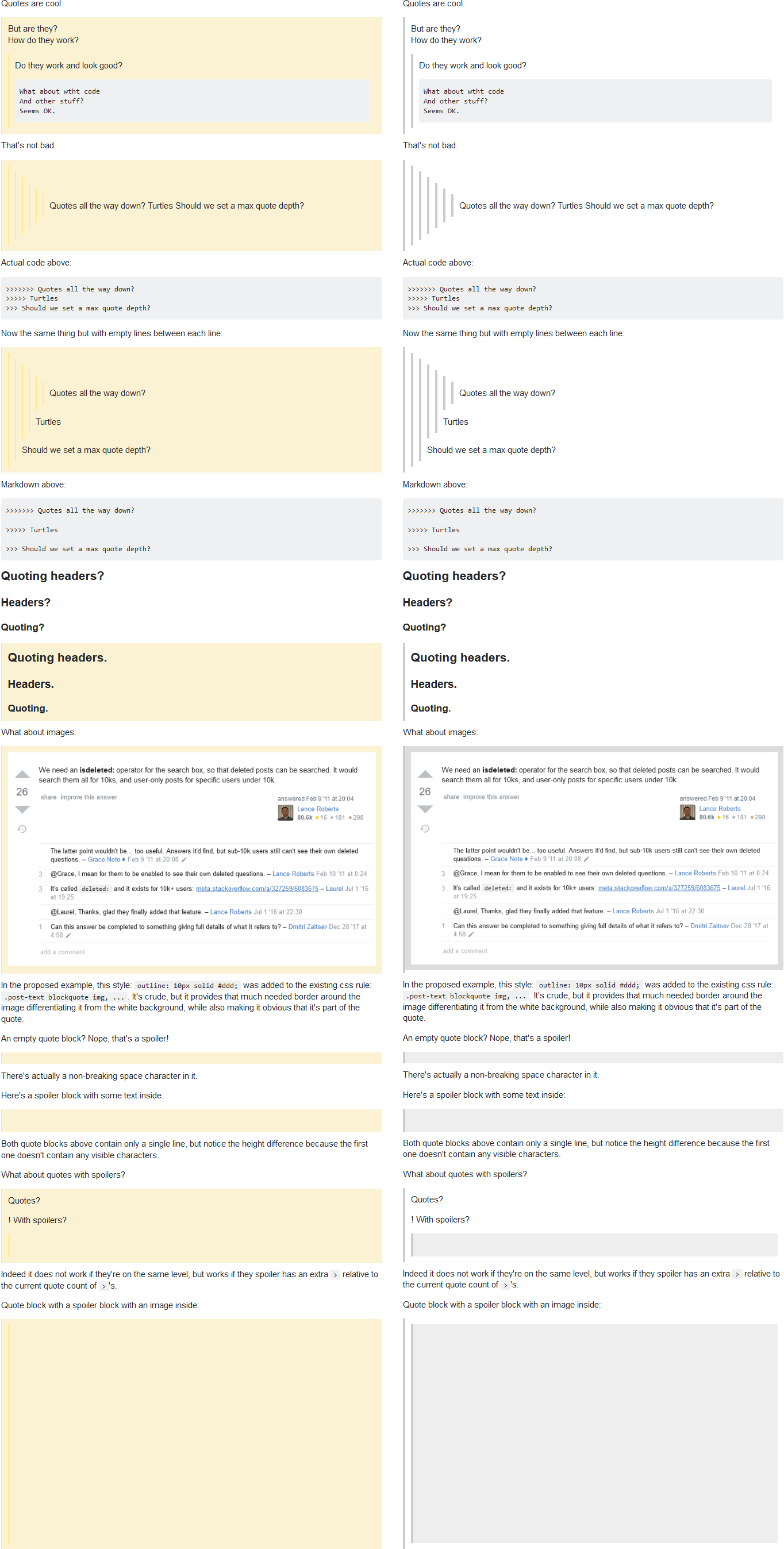
I recreated for the most part the post in the example screenshot here in the sandbox, and here's my spin on your proposition. Current style on the left, my variant on the right.

In blockquote removed background-color, changed border-left to 4px solid #ccc.

To .spoiler added background-color: #eee; and border-left: 4px solid #ccc;

To the existing style selector .post-text blockquote img adding outline: 10px solid #ddd really helps to set it apart from the white background.

Even from this reduced screenshot size the quote blocks are immediately recognizable.


1
  • 19
    "Even from this reduced screenshot size the quote blocks are immediately recognizable" - uh, no they're not. Remove the ridiculous nesting and the spoiler background, and suddenly your blockquotes have disappeared.
    – Marti
    Commented Mar 4, 2020 at 16:28
3

If the reason why you made this change was to support the dark theme I'd be be happy if instead, to support that, you used the same dark yellow which you use for the right-hand sidebar on SO, i.e.

enter image description here

-7

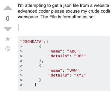
Quotes look too much like code.

Here's a real example from a question on the front page of SO.

The author had an errant > in the question.

It looks exactly like bad code markdown, which is frequent with copy-pasted code and new members.

Like so:


image

7
  • 8
    I'm sorry... I don't see how those look the same at all. Quotes have a white background and a dark grey sidebar and code has a grey background and no sidebar.
    – Catija Staff
    Commented Mar 9, 2020 at 21:13
  • @Catija I see "single character" bad code formatting all the time when people paste in code or use bad markdown. That looks exactly like the empty single quote bar. See edit.
    – pkamb
    Commented Mar 9, 2020 at 21:24
  • 3
    ... The two don't look "exactly" alike at all. The quote bar is taller and darker and narrower. Yes, if they're not directly next to each other, this may be somewhat confusing but it should be simple to open the edit window to see which is which.
    – Catija Staff
    Commented Mar 9, 2020 at 21:44
  • 1
    @Catija I'm talking about quickly glancing at a question. They look very similar. It's overall MUCH harder now to differentiate block quotes, now that they are not yellow. This is not an improvement.
    – pkamb
    Commented Mar 9, 2020 at 21:47
  • 9
    Why do you have to differentiate it. It's a mistake. If you see something like that you should fix it and it won't look like that anymore. Commented Mar 10, 2020 at 2:06
  • 9
    I agree with Kodos here. What something looks like when it is used incorrectly with improper formatting isn't really relevant, and we shouldn't be styling based on that use case. It should just be fixed in the post, and regardless what it looks like in this case, it still pushes a user to make that fix. They look nothing alike when used correctly with proper formatting.
    – animuson StaffMod
    Commented Mar 10, 2020 at 2:35
  • I guess I agree with Kodos and animuson.  If we made decisions based on the worst possible usage / outcome, we would ban knives, cars and skydiving.  The weird thing is, I believe that I agree with your position:  It's overall MUCH harder now to differentiate block quotes [from unquoted text] now that they are not yellow.  But I just don’t understand the point you are trying to make here.  It seems almost like you are saying ‘‘Pandas look exactly like zebras, so we should exterminate pandas.’’ Commented Mar 17, 2020 at 20:29

You must log in to answer this question.

Not the answer you're looking for? Browse other questions tagged .