86
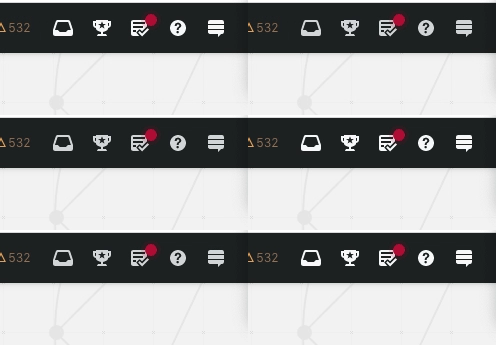
Before

enter image description here

After


If this was intended, what's the idea behind this?

More 'readable'?


The change seems to be platform wide, but due to the white background color on SO it does not seem to have any useful addition.

enter image description here


Edit
After receiving an upvote, there seems to be more change to the styling:
The blur effect seems to be new

enter image description here enter image description here

32
  • 9
    Was just about to post this too. I'll bin mine. You've got it. On black background headers it sent from grey to white. See also Change the way log in and sign up buttons (in header) appear in mobile
    – Tetsujin
    Commented Mar 30, 2022 at 9:17
  • 35
    I find the reputation change indicator much harder to read now...
    – honk
    Commented Mar 30, 2022 at 9:19
  • 17
    I find it too prominent. It was already too distracting when it was just the smaller red dot. Commented Mar 30, 2022 at 9:23
  • 39
    This change is total eye sore. Both in dark and light headers. Commented Mar 30, 2022 at 9:47
  • 15
    Just came here looking for discussion on this - I hate it, to my eyes it makes it look blurry and less-crisp, did several double-takes. Sometimes just because you could doesn't mean you should.
    – Stu
    Commented Mar 30, 2022 at 10:07
  • 15
    I think the number in the counter seems smaller and is harder to look at. Commented Mar 30, 2022 at 10:11
  • 11
    Yeah, I just posted a feature-request about the fuzzy numbers: Option to remove fuzzy outline and restore clarity to the counts on new top bar (I wonder if it should be an "answer" here?) Commented Mar 30, 2022 at 10:12
  • 4
    @for-the-love-of-soupless it's most definitely barely legible on my screens.
    – VLAZ
    Commented Mar 30, 2022 at 10:14
  • 4
    @for-the-love-of-soupless it's not the blur effect that makes it look smaller. The entire thing is smaller. The background for the number has been shrunken down as well as the number itself. The blur takes up some of the old space.
    – VLAZ
    Commented Mar 30, 2022 at 10:54
  • 16
    @ResistanceIsFutile I can get used to design changes. I can't get used to SE making those changes out of the sleeve, without planning, without research, without telling or consulting with anyone. Totally disappointing and annoying, every time. As for this specfic change, it's horrible, it just doesn't fit anything. Commented Mar 30, 2022 at 11:09
  • 8
    I don't have eye problems, and this new blur effect makes me think for a moment that there's something in my eye. It's like the effect I get when looking at UV light in a dark room. Commented Mar 30, 2022 at 16:33
  • 11
    I wish SO devs/POs would ask the community for their opinion before doing any work much less rolling out a change that the community doesn't like, instead of cooking up an idea in the vacuum of the ivory tower and launching it from orbit.
    – Bohemian
    Commented Mar 31, 2022 at 5:54
  • 5
    Yeah they had to steal space from somewhere for that massive fake glow effect. (which actually, on its own, irrespective of the numbers, looks pretty bad in my opinion. It's not a "glow" nor a "shadow". Honestly, it looks to me more like an error than anything else - first year design student learning CSS and over-styling things.)
    – Scott
    Commented Mar 31, 2022 at 9:30
  • 8
    The "blur" effect is horrible. can't believe they found another way to butcher the poor header Commented Mar 31, 2022 at 15:11
  • 4
    On the dark background the "glow" is negligible and doesn't nothing but impede readability. The red is practically invisible except where it crosses over the icons. And the green just looks like something is "wrong".
    – Scott
    Commented Mar 31, 2022 at 19:17

7 Answers 7

59

Depending on the actual network, a solid fraction of your user base is already old, and we will (hopefully) get older over the next years.

Leading to: eyesight might be more and more an issue for some of your users. So reducing the contrast area isn't a good choice, at least for some of your users.

The old notification hit a sweet spot for me, and I immediately noticed the change (dark theme) and disliked it. Where my main complaint is with the reputation count, because that is a number that I want to read. If we would solely be talking about a binary notification (it is there / it is not there), then it might be okay. But encoding more information like that, I just don't like it.

(maybe because the actual number almost overlaps with the achievements trophy icon: white number too close to the white icon)

6
  • 33
    I just wish they really gave it so much thought. I'm afraid the truth is most likely much more simple: someone thought "let's make it different to justify my salary", and that's the result. Doubt there's any planning here. Commented Mar 30, 2022 at 11:07
  • 10
    @ShadowWizardSaysNoMoreWar I disagree with that pretty negative view on front end changes. Yeah, maybe the responsible people didn't fully think it through, or didn't consider it worth alpha/beta testing. But to claim "they just did that to produce something", that is call I won't support. I know enough designers and front end developers who put a lot of discipline and diligence in their work ... thus not engaging in such cliches.
    – GhostCat
    Commented Mar 30, 2022 at 11:13
  • 3
    Note: the user base likely gets new young users as time goes by... At least I hope for SE that it's not only we, the same old people who registered some 5/10 years ago, who use their sites.
    – dim
    Commented Mar 30, 2022 at 12:42
  • 4
    @dim Sure. I am perfectly fine with UIs adapting to stay relevant with younger people. It is all about balancing: keep things fancy and attractive for everybody, but ensure they really work on "function level" for all (major) user groups.
    – GhostCat
    Commented Mar 30, 2022 at 12:50
  • 1
    I think that "let's make it different to justify my salary" is the reason behind a lot of changes in software UI across entire industry. Commented Mar 31, 2022 at 16:41
  • @wha7ever Maybe, but then it is also a cliche that doesn't contribute much insightful information.
    – GhostCat
    Commented Mar 31, 2022 at 17:51
14

For anybody who wants it, I (Ginger) made a userscript to revert the header to its original format: https://github.com/GingerIndustries/userscripts/raw/main/SE%20Header%20Fix.user.js

If there's anything I missed, feel free to tell me!

7
  • 5
    Anybody who downloaded this prior to this comment needs to reinstall as old versions break voting icons and a few other things
    – Ginger
    Commented Mar 31, 2022 at 15:08
  • The review queue icon looks squarish rather than round with this userscript installed, on my FF 98. Otherwise - definitely an improvement, although not all the way to how it was before. Thanks :-)
    – einpoklum
    Commented Mar 31, 2022 at 19:16
  • @einpoklum I'll look into it.
    – Ginger
    Commented Mar 31, 2022 at 19:53
  • Also, if you could add more padding around the numbers within the bubbles, that would also be awesome.
    – einpoklum
    Commented Mar 31, 2022 at 20:03
  • @einpoklum Okay, I think I've fixed it.
    – Ginger
    Commented Mar 31, 2022 at 20:41
  • Well... not the top&bottom padding for the reputation change, still.
    – einpoklum
    Commented Mar 31, 2022 at 22:38
  • 1
    I'm not thrilled with the fuzzy border ... that was just a dry run for the 3D filter coming today ;-)
    – GhostCat
    Commented Apr 1, 2022 at 6:31
13

I'm not thrilled with the fuzzy border either, but instead of a user script, I wanted to just make a style change.

It can be used with the stylus extension

It's partly inspired by the post on Stack Apps by Ginger

Before:
enter image description here

After:
After

/* Remove the shadows and make the blobs larger */

.s-navigation--item .s-activity-indicator,
.js-inbox-button .s-activity-indicator,
.js-achievements-button .s-activity-indicator {
    box-shadow: none;
    height: 17px;
    padding: 3px 4px;
    border-radius: 5px;
}

.s-topbar .s-topbar--content .s-topbar--item.js-inbox-button .s-activity-indicator {
    right: 25%;
}

#review-button .s-activity-indicator {
    box-shadow: none;
}
6
  • 4
    This works well. There are also fuzzy blue notification icons in the user profile on the left side of the activity tab (bounties, responses, etc.) It would be great if those could be defuzzified.
    – ColleenV
    Commented Mar 31, 2022 at 20:10
  • 2
    @ColleenV Done. I made them all 1 pixel higher, since the values seemed to not be centered. Commented Mar 31, 2022 at 20:22
  • @Justin Too round for me, but you can play with the border-radius to get your desired roundness. Stylus will update the page on-the-fly :) Commented Apr 1, 2022 at 9:07
  • 1
    @Unconsidered: I was thinking that's how it would possibly look if SE took out the fuzziness and left the indicator rounded instead of rectangular. Although... I would like things to get back to normal, or at least the way you've done it :-)
    – Justin
    Commented Apr 1, 2022 at 9:18
  • Nice work (though I don't care for the centering this applies, personally)
    – TylerH
    Commented Apr 1, 2022 at 22:21
9

UPDATE

The white icons have been toned down a bit (it's much better now).

From Scott's post in Can I dim the top bar? (gif):

gif


UPDATE #2

Looks like they removed the fuzzy outline:

enter image description here

1
  • 1
    But it's still small and annoying :-(
    – einpoklum
    Commented Apr 10, 2022 at 20:52
6

I added a few answers on other posts that I feel address the main points here, so I'm going to summarize and link those instead of copy/pasting.

Regarding icon/text color tl;dr Color was chosen for design consistency along with some contrast improvements. We dimmed the icon/font color on network dark version a bit because it felt really bright.

Regarding notification indicators tl;dr We updated the indicators to remove the transparent shadow because it made the indicator count as well as the icon below a bit hard to read/visually absorb

1
  • 7
    Both fixes are improvement, but the text is still hard to read on notification indicator because background area is to small. Commented Apr 5, 2022 at 17:51
5

I liked the previous smoother contrast of the icon colors against the background better. For me the effect is that this new increased contrast is more noticeable in the corner of my eye so I'm drawn to look at the top bar icons more even when there's no notification.

-46

I like it. There's greater contrast than before.

enter image description here and enter image description here

Today 30/03/2022
enter image description here and enter image description here

UPDATE 31/03/022
enter image description here and enter image description here

The contrast level has been slightly decreased since yesterday. I still like the recent change but I would far prefer the top bar to be non-sticky and to be less jet-black it has always looked so horrible on the EL&U site.

In 2018 I wrote

Now, I'm not a designer but it seems to me that the sandwich menu should be brighter. Currently it is practically invisible, a dark grey icon on a pitch black background, it doesn't light up and it's situated on the far right-hand side.

ORIGINAL

The change seems to be platform wide, but due to the white background color on SO it does not seem to have any useful addition.

However, on the black top bar which is network-wide the new brighter icons will help users and visitors alike with eyesight problems.

But can we have the option to unstick the top bar please? That way any users who feel blinded by the bright icons can scroll down the page and not feel annoyed.

16
  • 20
    This doesn't help anyone with eye problems... Probably the icons, but not the indicators (which IMO is more important).
    – Justin
    Commented Mar 30, 2022 at 10:56
  • 24
    No, there's less contast for the notification badges, by any definition of the word contrast. The only help it offers to users with eyesight problems is to exacerbate those problems.
    – Stu
    Commented Mar 30, 2022 at 10:56
  • @Stu If a somewhat grey icon is now whiter doesn't that mean an increase in contrast? Commented Mar 30, 2022 at 10:58
  • 7
    @Mari-LouAСлаваУкраїні Yes there's multiple styles here, I should clarify I'm referring to the notification badges - this is the change that really annoys.
    – Stu
    Commented Mar 30, 2022 at 11:00
  • Isn't this what the "high contrast" theme (in beta testing) is for? And not something that everybody needs? Commented Mar 30, 2022 at 11:06
  • @samcarter_I don't know what you mean by beta testing. Do you mean that the company should have told the community before rolling out the change? Wasn't there a recent post about people with impaired eyesight and how SE should adress this issue. Let me see if I can find it somewhere Commented Mar 30, 2022 at 11:09
  • 14
    Too much contrast is as bad as not enough contrast. I was fine with the old design (except for the green notification color that was too light) so it made reading numbers difficult. But, current design is way worse. Now I cannot even directly look at header icon area (especially black header + white icons) without straining my eyes, and I still cannot read the numbers. Commented Mar 30, 2022 at 11:22
  • 2
    If there are users that really need extreme high contrast theme, then there should be separate themes to cater for their needs (think of Windows high contrast themes). Commented Mar 30, 2022 at 11:23
  • 3
    @ResistanceIsFutile Stackoverflow already has a separate high contrast theme, it can be activated in the profile. They'd just have to bring it to the rest of the network. Commented Mar 30, 2022 at 11:26
  • 1
    I actually like it either, not sure why it's absolutely hated
    – nicael
    Commented Mar 30, 2022 at 11:42
  • 8
    It’s the green notification icons that are the problem, not the bright white icons in the bar. The red notification icons don’t show the issue as much because you can’t really see the “glow’ on them. They’re just smaller. the text in the green icons isn’t even aligned properly and looks really crowded. I didn’t downvote, but I think you missed the point.
    – ColleenV
    Commented Mar 30, 2022 at 11:44
  • 1
    Then make everything contrast to solving all eye-sight issues at once! It is over-highlighted that catch my view there and that hurts my eyes!
    – kelalaka
    Commented Mar 30, 2022 at 16:01
  • 3
    @ResistanceIsFutile there is a high contrast theme. It does not really help after this change. The notification is tiny
    – VLAZ
    Commented Mar 30, 2022 at 16:17
  • 4
    There's no reason why the high contrast white icons have to be accompanied by smaller, poorly rendered notification icons. What is the point of removing a quarter of the area of the notification to add a fuzzy outline that does nothing to improve readability? All it does is reduce the amount of space for symbols in the solid area of the notification. I still think that you aren't really understanding the problem from the original question. It's talking specifically about the red and green notifications, not the white static symbols on the bar.
    – ColleenV
    Commented Mar 30, 2022 at 20:08

You must log in to answer this question.

Not the answer you're looking for? Browse other questions tagged .