69

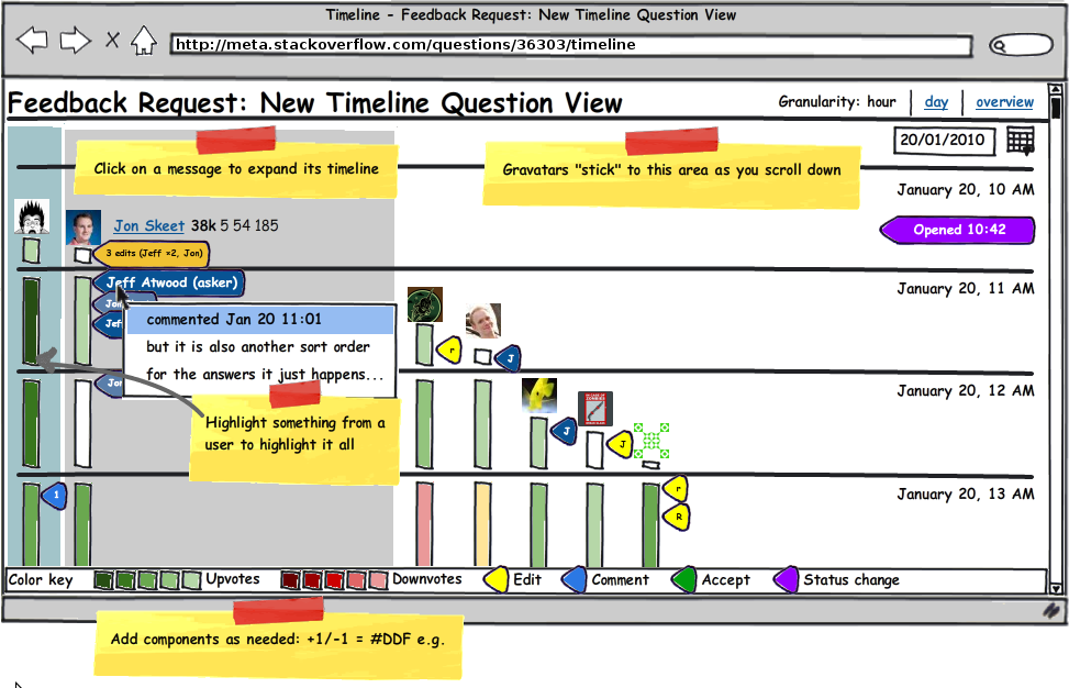
There is an experimental timeline view for questions now available on meta ONLY! (Now working on SO, SF, and SU as well)

This is partially motivated by comments about how difficult it is to follow very active questions which have a lot of activity, and also the feedback on the API which was heavily dominated by "we need to know what happened in this time range" type responses.

It can only be accessed through URL hackery at the moment. To get to it, enter question URLs like so:

https://meta.stackexchange.com/posts/{id}/timeline

This is a chronological timeline of everything that happened on a question, including

  • initial question ask
  • answers
  • revisions
  • comments
  • closure, deletion, reopen, undelete, etc
  • votes

all based on when they happened in chronological order.

We are thinking about making this a fourth tab on the question, like so:

Timeline | Oldest | Newest | Votes

Please try it out and provide feedback. It is still a little rough, so we are not looking for highly detailed bug reports, just more general feedback.

Timeline view for this question:
https://meta.stackexchange.com/posts/36303/timeline

11
  • 1
    I think it is a nice feature, I think it would be een nice to do it like the google timeline (horizontal scrolling) I have seen that done with jquery too!
    – JasonDavis
    Commented Jan 20, 2010 at 12:32
  • 1
    If a question is edited then a particular answer got heavily down-voted, it would be nice to be able to see that with a glance. Commented Jan 20, 2010 at 16:20
  • 2
    Sweet, now I want to see a Google Wave 'play' button, so I can see it all happen.
    – jjnguy
    Commented Jan 20, 2010 at 16:23
  • 2
    As Jeff mentioned in his comment to Jon, the version of the SO software (see the bottom of each page for the revision number) that MSO is running is slightly newer than that of SO. I'm sure they've made changes to the feature in those revisions.
    – heavyd
    Commented Jan 20, 2010 at 17:34
  • @Jeff: If this were to be put on all the sites, would we get a link on every question (like the retag | flag | edit links)?
    – Kredns
    Commented Jan 29, 2010 at 23:57
  • Loved it. But it could use the feature from wikipedia's history for revisions (as @RobertCCartaino answered), and have a RSS version where it also shows the deleted answers and comments. Or a mix of all this.
    – cregox
    Commented Mar 2, 2010 at 19:14
  • 1
    This is awesome. Most underrated / unknown feature I've seen in a long time! Commented Oct 13, 2010 at 21:18
  • 1
    Some feedback in chat: chat.meta.stackoverflow.com/rooms/89/conversation/…
    – balpha StaffMod
    Commented Dec 12, 2010 at 20:46
  • highly related and also yet another good example of how some ideas are often overseen: meta.stackexchange.com/questions/14643/… (I know Jeff knows this already and that it's already linked elsewhere in this question)
    – cregox
    Commented Dec 21, 2010 at 16:19
  • I'm voting to close this question because the timeline has been in place for years now and answering this post is no longer the best way to provide feedback (especially since the OP no longer works for SE). If you have a new bug report or feature request about the timeline, please ask a new question.
    – Monica Cellio Mod
    Commented Jun 26, 2019 at 3:01
  • For Stackoverflow questions the timeline URL to be used is https://stackoverflow.com/posts/<question_id>/timeline. Reference: meta.stackoverflow.com/questions/253012/…. Commented Dec 28, 2023 at 12:16

21 Answers 21

20

It doesn't seem to show answers being posted but then deleted, even though I can see the deleted answer.

Generally speaking though, it looks very handy. The triangles are a bit ugly, but it's functionally great :)

EDIT: Okay, I've just tried creating and deleting a second answer for this question here on meta - again, I can't see it. I know you don't want hugely detailed bug reports, but consider this a vote to be able to see that information (users with enough rep).

In terms of other feedback...

  • I'm not sure I'd make it another tab, because it's not just a different sort order for the answers. I'd consider making it another link next to "edit / close / flag" at the bottom of the question.

  • The nature of the URL suggests that it should be feasible to show the timeline of just an individual answer as well. In some cases this could be very useful, rather than having to mentally filter out all the bits that for other answers. If this became available, again it could be another link in the "link / edit / flag" set.

6
  • but it is also another sort order for the answers, it just happens to include additional information as well -- it also includes the chronology of the revisions of the answers. We get a lot of complaints about chronology, so it needs to be front and center. Commented Jan 20, 2010 at 11:01
  • 2
    @Jeff: It also includes revisions of the question... it just doesn't feel quite right as a tab there, to me. Admittedly it's a bit like the "stats" view for a tag - but that doesn't have a question above it, so it feels slightly more natural.
    – Jon Skeet
    Commented Jan 20, 2010 at 11:15
  • 1
    well, but we also get complaints that users edit the question, changing the "tone" of answers downstream of that edit. Thus I would argue edits to the question are highly relevant to the answers. Commented Jan 20, 2010 at 11:35
  • @Jeff: They certainly can be, and it's good to have the ability to see the changes everything in the question - but I think it would be nice to have the "zoomed in" view too. Heck, that could even potentially include changes to the question, but not to other answers, if you felt that was important.
    – Jon Skeet
    Commented Jan 20, 2010 at 12:01
  • 2
    I don't like moving the link next to "link / flag .." etc because those links are actions, and the timeline is simply a view. Placing the link next to the "oldest / newest ..." links makes the most sense for categorization, but perhaps it could be differentiated by using a different font or style.
    – Ether
    Commented Jan 20, 2010 at 16:22
  • 1
    In what way is "link" an action? I take your point for edit / flag / delete though.
    – Jon Skeet
    Commented Jan 20, 2010 at 20:31
14

Maybe it's just me, we'll see how the votes go.

Sometimes at work, we've built something that we think we want, but when we have it in front of us we realize it's designed all wrong, and we need to just throw it away and go back to the drawing board. Nothing personal, but I think this is one of those times.

To me, the way you present the data is flawed, and it results in a giant list that is essentially un-glanceable. The only way to retrieve information from it is by carefully studying times and text. Everything just blends into each other, and all I see when I look at it is a wall of text. It's functional yes - it provides the information, but I want it to do more - I want it to be 'pretty'. Recall you did hire a designer after you did the first revision of SO.

So, if you agree with me on that point, but disagree with me on the next, hopefully you'll still upvote as a sign of agreement but comment with your own idea.

What I would try and do is make a horizontal (not vertical) graph that looks something like github's but different in key points.

  • First off, the indicators of activity (asked, comment, edit, etc) should be spaced relative to each other, possibly with a breaker for long periods of inactivity.
  • Each activity has a flag/symbol, that upon mouseover loads the details in a div below
  • You can click multiple symbols to get all those details at once
  • You can select and drag to get a stretch of details (like the rep graph)

    |--X-X--o---E---X-X-X-o-o-o-o-----/ /----X-----/ /-----|

There are design flaws with this. Making it work for a popular question would be tough - you may even have to switch it to vertical.

But the biggest advantage of this is you can quickly see, at a glance, the amount of time that passes between actions in a relative sense. Those are my thoughts.

3
  • What a beast: meta.stackoverflow.com/posts/9134/timeline
    – random
    Commented Jan 20, 2010 at 13:02
  • 4
    you don't need to flip to vertical, just rotate 30 degrees and enhance Commented Jan 20, 2010 at 13:25
  • 1
    You could have, instead of a single line, many lines, one per activity type (answer, vote and so on). Something like a "GuitarHero timeline" :-) Commented Jan 20, 2010 at 14:24
13

Can haz click to show all little arrows to expanded?

Hey, that "Return to Question" link is back! Clicking on the green "answer" in the timeline didn't go anywhere. Was expecting the answer permalink.

Like the whole page of non-pagination.

But what about those of us who would like to read down the page for the timeline instead of crawling up?

1
  • 5
    I definitely want a top-down view. Commented Jan 20, 2010 at 17:02
7

I didn't get the arrows the first time I looked at it. Maybe [+]/[-] would be more intuitive?

3
  • 3
    I agree, but it took me like 2 seconds to click it and see what happened...
    – juan
    Commented Jan 20, 2010 at 12:35
  • 2
    The arrows are the same as in the post revision histories.
    – balpha StaffMod
    Commented Jan 20, 2010 at 16:18
  • 1
    The arrows totally threw me at first. I even posted an answer suggesting the vote totals be separated by question and answer (which they already are if you click the arrow). Doh! Commented Jan 20, 2010 at 16:45
7

Should comments be placed in-context with the post?


I'm wondering.

Would comments make more sense if they were grouped under the post they apply to? Comments are pretty specific to that post. What you want to know is when comments were added to a post and which comments were added after a revision.

Group them that way.

It might make it easier to understand the sequence of events if comments were contained by the post (and revisions) instead of being interwoven with the rest of the answers.

Something like this: (This is real data, except the time stamps increment by 1 minute)

45 mins ago      question      Jeff Atwood♦     New Timeline in Question View
40 mins ago      answer        Jon Skeet
  39 mins ago      comment     Jeff Atwood♦     answer by Jon Skeet
  36 mins ago      comment     Jon Skeet        answer by Jon Skeet

38 mins ago      revised       Jeff Atwood♦     answer by Jon Skeet remove SO links
37 mins ago      revised       Jeff Atwood♦     question added 9 characters in body
  25 mins ago      comment     splattne♦        question by Jeff Atwood♦
  24 mins ago      comment     jasondavis       question by Jeff Atwood♦
  12 mins ago      comment     Brad Gilbert     question by Jeff Atwood♦
  10 mins ago      comment     jjnguy           question by Jeff Atwood♦

35 mins ago      revised       Jon Skeet        answer added 261 character in body
  34 mins ago      comment     Jeff Atwood♦     answer by Jon Skeet
  33 mins ago      comment     Jon Skeet        answer by Jon Skeet
  31 mins ago      comment     Jeff Atwood♦     answer by Jon Skeet
  27 mins ago      comment     Jon Skeet        answer by Jon Skeet
  11 mins ago      comment     Æther            answer by Jon Skeet

32 mins ago      answer        random
30 mins ago      revised       random
29 mins ago      answer        George Stocker
  28 mins ago      comment     Jeff Atwood♦     answer by George Stocker

26 mins ago      answer        Jon B.
  23 mins ago      comment     Juan Manuel      answer by Jon B.
  13 mins ago      comment     balpha           answer by Jon B.
   9 mins ago      comment     gnostradamus     answer by Jon B.
:
:
1
  • 2
    I like this. I'd also make it so that the comments are collapsible and grouped like daily vote summaries are. That way question/answers/revisions are the main focus, but you can see how many comments were added to a revision & expand to see the specifics of those comments and then expand to see the comments themselves. That would help to give a much simpler "at a glance" view of what's happened.
    – Alconja
    Commented Jan 21, 2010 at 5:20
7

UPDATE: this has since been implemented

I love it, but think it should also show bounty events (ala my other feature request). But since that's a status-planned maybe it'll be included in this new UI?

5

I like it and I am going to look at the content and usability shortly but my very first impressions:

  • Add a link to reverse order (in a header above the dates) - When coming into a new discussion with lots of information, it is too hard to read from the bottom up.
  • Add a link to expand all arrows - Again, if you are coming in late in the conversation, that's a lot of clicking to open everything and catch up.
4

It would be good to be able to see where votes were cast in the context of the timeline, rather than having them at the top - there wouldnt be any need to show individual votes, you could just show the number of up / down votes between each other action on the timeline, for example:

  • question
  • 1 downvote
  • edit
  • 3 upvotes
  • etc...
4

I really do want to see when delete events happen. Everything else looks great!

4

It would be nice if revised posts showed the actual changes. Right now, all you see is the final result; no revision markup. You can reuse the display style from SO's revision history views. Like so:


BEFORE (no markup)

alt text


AFTER (with markup)

alt text


0
4

Is acceptance of an answer supposed to appear in the timeline?

If not, could that be added?

When trying to accurately answer an acceptance rate question, I headed to the potentially referred question, and I needed to determine to a certain degree of accuracy when the accepted answer had been accepted, which the timeline isn't showing.

1
  • It'd be nice to see accepts also, since it doesn't show bounties, so that would help divine a little bit of that. Commented Mar 24, 2010 at 22:50
3
  1. This question got a Nice Question badge, and I'm not seeing it in the timeline.
    It would be nice to add that information too
  2. The upvotes don't contain time information (they're summarized at the top); would it be better if they were in the timeline like the rest of the actions?
  3. The revised event shows the whole text; could it highlight the added text like the revision history does?
5
  • 4
    Adding time information of up/down votes could reduce the anonymity of votes. Commented Jan 20, 2010 at 16:15
  • 1
    votes are in the timeline, they're summarized daily. Commented Jan 20, 2010 at 17:15
  • In addition to #3, it would be nice to make the word "revised" link to the post's revision history.
    – mmyers Mod
    Commented Jan 20, 2010 at 18:44
  • @Jeff, yes, that's what I said. I suggested they contain the time they were casted, I didn't say they weren't there
    – juan
    Commented Jan 20, 2010 at 18:48
  • #1 is impossible; we don't store badges by post but by user. There is zero badge-to-post correlation. Commented Jan 21, 2010 at 11:22
3

link text

One can sketch up... not sure how it would work in practice, however. I can foresee a need to collapse inactivity moments...

8
  • 2
    omg that looks difficult to implement. Cool, but.. difficult. Commented Dec 14, 2010 at 10:14
  • Source
    – badp
    Commented Dec 14, 2010 at 10:16
  • 1
    @Jeff Agreed. :)
    – badp
    Commented Dec 14, 2010 at 10:18
  • This looks like it would require a ton of clicking in order to see actual content as just about everything is hidden when the page loads. It looks like this might give a full chronology of comments, rather than just on a single post which is something I think is lacking, but I don't like how all the content is hidden. Not sure how I'd change that though. |: Commented Dec 14, 2010 at 13:28
  • @Rebecca The point is that there is too much data, so you need to hide some. That said the only two places where I put clicking is expanding snippets and expanding timelines (which only really expands pins)...
    – badp
    Commented Dec 14, 2010 at 13:47
  • If same-day comments were first-class just like comments posted on a different day from the owning post, I'd be ok with the current presentation. Probably because I mainly use the timeline view when there are multiple posts getting a lot of comments at the same time. Maybe it is because I prefer keyboard usage, but having to click or hover to get at the main information of the page is uncool. Commented Dec 14, 2010 at 14:02
  • @Rebecca it would be trivial to design keybinds for this view. Left and right move post highlight, up and down move between post events.
    – badp
    Commented Dec 14, 2010 at 14:09
  • True, this still feels like I would need to play hide-and-seek though. Commented Dec 14, 2010 at 14:10
2

I could be mis-interpreting the UI, but it feels like clicking on an 'answer' for a certain timeframe should take you to that particular edit of that answer. Instead it just takes you to what his answer most recently is, and you still have to do some mental math to determine what the answer looked like at the time before the question was edited.

2
  • 3
    well, you can click the down arrow on the row in the timeline page to show the revision in correct chronological form. Commented Jan 20, 2010 at 11:55
  • 1
    @Jeff: It would be a little clearer if the arrows had style cursor: pointer;.
    – Richard
    Commented Jan 21, 2010 at 10:31
2

Vote counts would be great:

  • Answer by bla received 5 upvotes and 3 downvotes
  • Comment by foo on answer by bla
  • Answer by bla edited
  • Answer by bla received 8 upvotes

That would sometimes allow to understand the impact and reason of edits better.

2
  • vote counts are present; expand the vote summary with the arrow Commented Jan 20, 2010 at 17:06
  • @Jeff Yes, but they are summarized at the top. Jon Skeet edited his answer, and I do not know how many of his 7 votes were given before the edit. Commented Jan 20, 2010 at 17:32
2

I find that the comment entries aren't very useful due to lack of context. I don't know, at a glance, what that comment was about. Yes, I see there is a link to the question or answer to which the comment is attached, but it would be nice if more information were provided right there in the timeline.

1
2

I was playing around with a possible layout for the "timeline" view . (see below)

(This mockup is a bit crude but, hopefully, you get the idea)

Between the newest, oldest, and votes tab, there is now a timeline tab.

Here are the design highlights:

  • The timeline display is designed to look as much as possible like the SO's current Q&A pages and revision history, only in timeline order. This should make it easier for the users to understand (and much less design work for the SO team).
  • Each revision shows the votes received for that revision (disable voting, of course).
  • Edited posts, title, and tag changes use the same display style as SO's revision history.
  • The posts a sorted in chronological order (oldest first). There should probably be a "reverse order" link to display newest first.
  • Comments are grouped under the post (or revision) they apply to (per my suggestion here).

The individual posts might need a little better labeling to make everything more clear but this is the basic idea:


alt text alt text alt text alt text alt text alt text alt text alt text alt text alt text alt text alt text alt text

2

I feel like the current design is overwhelming me with data, especially for large questions with plenty of activity. There's so much data there, almost raw, unfiltered. This monster timeline, for instance shows me screen upon screen of downvotes, upvotes, almost without context, comments that have no meaning without knowing where they were in relation to all the other comments.

Maybe I'm just picky, but it's hard for me to see the utility of this. For small questions you can simply follow the question and not bother with a timeline, for large questions there's too much data and it makes it hard to use. Either way, its usefulness is hard to see. However, if the design was somehow tweaked, it could prove useful. Robert C. Cartaino is onto something with his design.

1

Since it still hasn't got promoted to a normal feature, and received its own link somewhere (to me the natural place would be replacing the "latest activity" which currently links to the question like the title) here are two ways we can have it on the browser, using scripts (thanks to @random):

We can use the javascript bookmarklet made by @balpha:

javascript:window.location.href=window.location.href.replace(/questions\/(\d+)\/.*$/,"posts/$1/timeline");

Or we can use the greasemonkey script (direct link to install it) posted by @S.Mark.

I personally prefer my personalized and reduced version of the script even while it probably takes more memory than the bookmarklet, though I can't find it under chrome processes. I just don't have a bookmarks tab on any browser I use.

1

I checked out the timeline on this post and saw that the last date showing is Feb 9, when as of this moment we are still on the 8th (I checked server time: 2010-02-08 22:32:14Z).

1
  • 1
    correct, votes are always rolled up to the end of day. Commented Feb 8, 2010 at 22:39
1

As disccused on this Meta question here, and demonstrated by:

(and countless others, I'm sure), a poke from the Community user does not display in the timeline. Probably should, because sometimes it's nice to know that your question was pushed back to the front page to get more attention.

Not the answer you're looking for? Browse other questions tagged .