150

Thanks everyone for your feedback. The team has responded to feedback in the post Left nav, responsive design, and theming next steps . Check it out.

Ch-ch-ch-changes are coming. As you've hopefully read in our various posts on Teams, we are in the midst of some major work. We're introducing a new product, Teams (née channels), and doing the requisite research and design thinking to get it right. In addition, early on we realized that we have a unique opportunity to pay off technical debt that prevented us from serving Stack Exchange communities as well as we should have been.

As Donna alluded to in her blog post "Updating Navigation for Stack Overflow, Enterprise, and Stack Exchange Sites", we'd let our codebase and experiences fork and fragment. In the past, we would focus our efforts on Stackoverflow.com and consider network sites and Enterprise later. This lead to long delays in getting improvements from one to the the others. It also meant we were doing the same work over and over again (top bar anyone?). And, we didn't design things from end to end thinking about all of the permutations up front. As we started up on Teams we realized this had become untenable. This post will provide you some details around how we are reunifying all our products (Stackoverflow.com, Stack Exchange network sites, Stack Overflow for Enterprise and now Stack Overflow for Teams) around a coherent design and single codebase.

Stack Overflow Q&A offerings (including Stack Exchange network sites) will be delivered via a unified codebase as a continuum of services. We will still have feature differentiation at times and the experience may be adjusted (for example Teams doesn't need the same level/type of moderation as public Stack Overflow) but it will be done intentionally in order to optimize the experience for the use case, not because we haven't gotten around to porting a feature to one of our products.

This is going to result in two key improvements for all of our users:

  • Greater experience consistency across the products
  • An increase in the velocity of bug fixes, improvements and new features

What changes are coming?

Left navigation (+ more)


We will be introducing a left navigation to the side of all Q&A experiences. As we looked at introducing Teams in the context of Stack Overflow it became obvious that we needed to review our overall information architecture. Donna covered the details in her blog post, so I won't revisit all that here. By adding the left nav we are gaining flexibility and scalability in our information architecture. And, though we know it's a bit of a departure from anything we've done in any of our products, this style of navigation is more amenable to making a responsive design a reality in the scope of our current and future offerings. see the GIF of our left nav and responsiveness in action

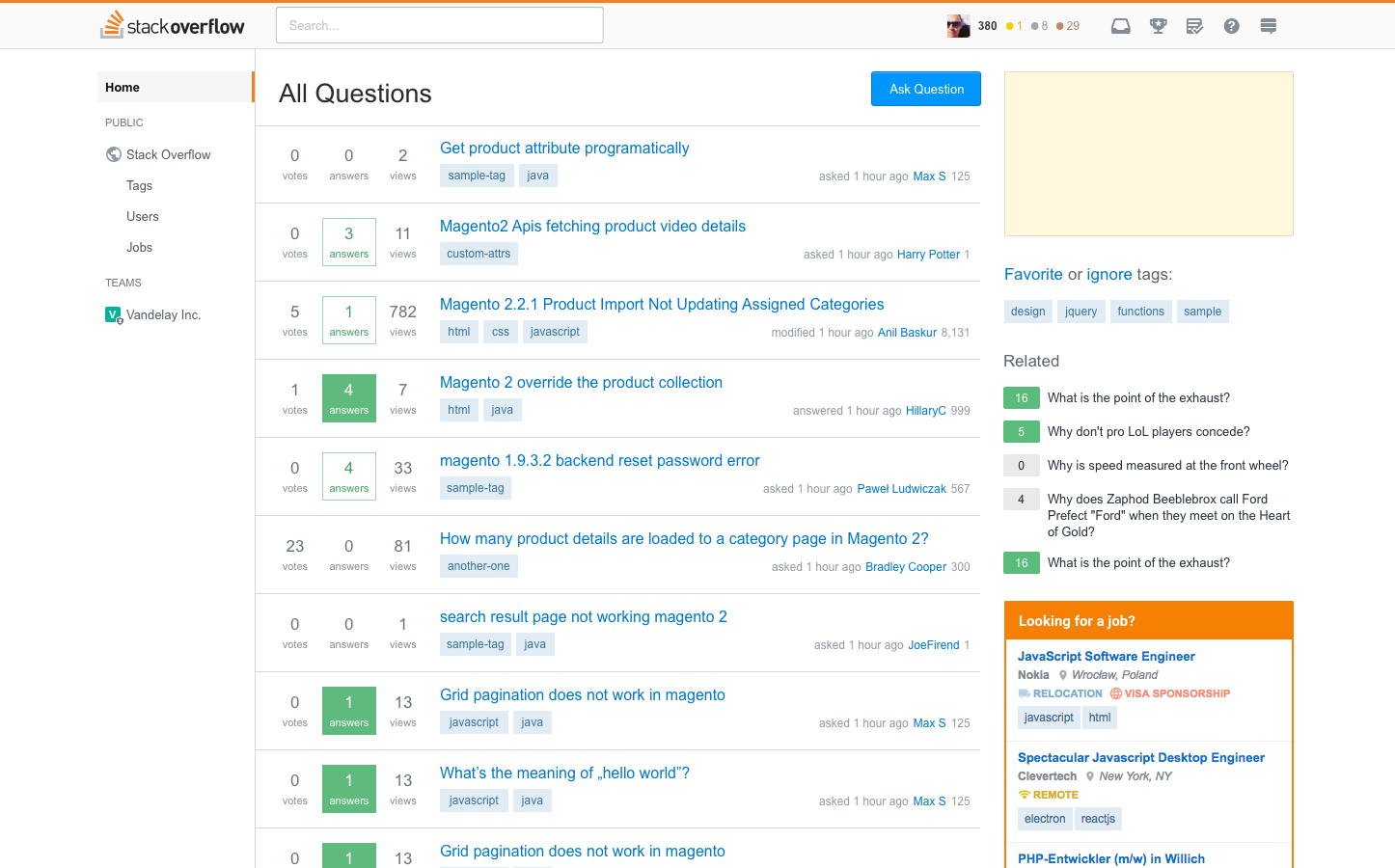
Stack Overflow with left nav

Stack Overflow + left nav


Responsive Design


People have wanted Q&A to have a responsive design for years and years. The addition of a left nav both requires and better enables a responsive design. So, we are deep in the process of creating a really great responsive site.

This will be done in stages:

  • First up is desktop (the mobile skin isn't going anywhere for now).
  • Common pages and experience get responsive treatment first. This includes question pages, ask a question, various question lists, search, user and tags
  • Once these are done we will release them for your enjoyment.
  • We will tackle the remaining experiences one by one and release them when they're ready. This includes profiles, review/mod tools, help center, etc.

Once all our pages are responsive we plan on doing some additional work to make sure everything works great on phones. At that point we will retire the mobile skin.

Stack Overflow in a small viewport (Click here to see it in action)

Stack Overflow with responsive design


Site theming


Every Q&A site has its own theme. But there is great inequality in the level of theming that we support. A few (~10) get Cadillac treatment, some (<50) are more like a Honda, while most (~100) are a Yugo. The reality is we created a theming system that we didn't have the design resources to fully support, thus the inequity. In addition, as currently defined, our theming gets in the way of releasing new features on the sites.

In order to deliver the left nav, responsive design and future improvements to all sites we've created a more standardized way to support theming. This will reduce the burden of supporting designs as we make Q&A improvements. The result is that most sites will see an improvement in the level of theming that they can get. While some sites will see a reduction. All of Q&A (Enterprise, Teams, etc) will standardize on this new theming scheme.

Example of a site theme (see more)


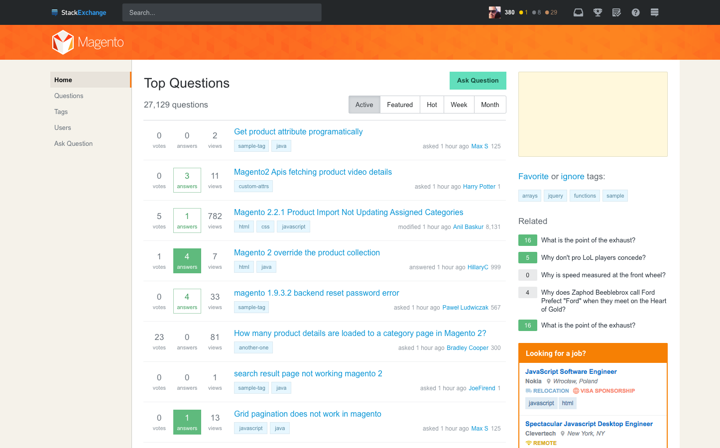
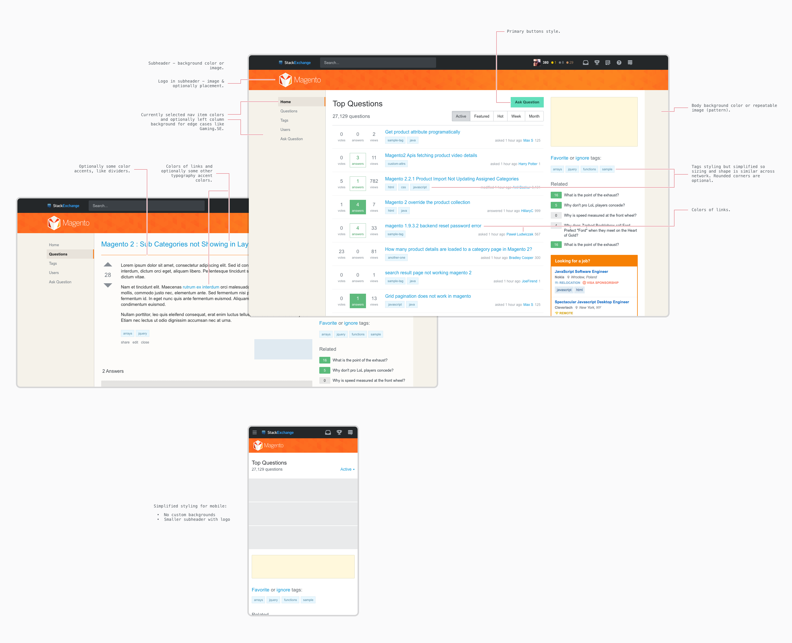
Illustration of a new site theme for magento.stackexchange.com


Details on theming (click image to zoom in)


Breakdown of themable elements


Takeaways

In the early days there were few rules for how theming worked. As a result, some are image heavy, with tons of customizations and some are very, very simple. The image above shows you what will be themable. However, there are several things that will now be standardized to follow the look and feel on Stack Overflow. Note: This primarily impacts the "Cadillac" sites.

Standardized items will include:

  • Navigation
  • Fonts
  • Buttons/Icons
  • Tags
  • Newsletter ads

The plan is to create designs for each of the sites that currently have themes and run those by the communities. We are starting that work this month (March 2018). Expect to see a meta post with details later in April. If you've been cleared for graduation but don't yet have a design, someone from the community team will be posting on your meta site in April to get some input so we can get your site themed based on your answers. We will start enabling the new design across the network in May.

When will you start seeing these changes?


Roll out plan

  • If you're in the beta for Teams, then you're seeing the left nav already and will see responsive changes later this month
  • We will start flighting these changes with SO user in April (there may be a way to opt-in)
  • We hope to roll out to everyone on SO in May
  • SE sites will start seeing them in May depending on the progress we make on themes

We know this was a lot to take in all at once, it's really three major things that are coupled together so tightly that we had to talk about it all in the same context. We know that many of you have strong, possibly mixed feelings after reading this, and we'd like your feedback. We're going to listen to everyone, discuss all of the input you provide and update here as we move forward.

Thank you for your time, thank you for your patience, and thank you in advance for remembering - we're human too.

47
  • 26
    This looks like fantastic stuff, I can't wait to see more of it rolled out! I probably shouldn't be reading too much into your brief example GIF, but I do want to note that responsive layouts don't need to have variable text-column widths, as they seem to in your mockup/example. If practical design-wise, it can be nicer to pick the component widths that are most readable/usable, and use variable padding to provide the flex between layout breakpoints. In particular, even if I maximize a window on my 4K screen, I should never got a 200-character wide text column: that's a readability disaster.
    – Jeremy
    Commented Mar 12, 2018 at 18:02
  • 10
    This looks great. But what about the recently vanished tag tabs on Stack Overflow? They were the best thing since sliced bread. Commented Mar 12, 2018 at 18:13
  • 19
    Teams... Teams.... Teams... this rings a bell. Bad bell. Something that failed. Those like me who are not new to Stack Overflow will always remember Teams as what Teams originally was. This is bad name for a new project. Commented Mar 12, 2018 at 20:03
  • 16
    "Every Q&A site has its own theme." cough cough
    – user307833
    Commented Mar 12, 2018 at 22:25
  • 12
    @Mego As I understand it, one advantage of the planned changes summarised in this post is that they'll enable newly graduated sites to get their designs faster - i.e. mitigate the very problem you're raising. Commented Mar 13, 2018 at 0:17
  • 67
    I think you're trying to standardise too many of the things that give SE sites their own personality, and I suspect that those proposals will go down like a lead balloon with those communities that have put the effort in to heavily customise their sites. Nothing that you have posted above seems to provide any context as to why it is important to standardise those items. The restriction of fonts and graphics seems particularly petty, IMO. Commented Mar 13, 2018 at 9:54
  • 38
    @StevenRands Standardizing the site design elements and layouts allows you to roll out changes very quickly across the network. Every time I ask for a new feature or a simple UI tweak, quick fixes become days-to-months of design work across multiple sites. Nothing get done. Dozens of sites have their own UI gotchas ("can't do that because {site x} will break"). Gross. If this lives up to its promise, it adds an agility to fix things quickly instead of letting "issues" get progressively worse until they finally justify the epic amount of work every change dictates. This is a good thing. Commented Mar 13, 2018 at 16:18
  • 20
    @RobertCartaino Surely the goal should be to standardise things to improve the lives of developers whilst also retaining a suitable level of customisation for those sites that desire it? Of course there is a balance to be reached. However in my opinion these standardisation proposals swing too far in the "make the lives of devs easier" direction. Note that I am talking about the skinning/theming proposals, not the remainder of the layout changes described in the OP. Commented Mar 13, 2018 at 16:56
  • 10
    Could you clarify that most (if not all) of the 100 "Yugo" sites are just the beta sites and don't get a custom theme at all. So, unless that's changing and beta sites are getting something, that "100" sites is really just one site design... right?
    – Catija
    Commented Mar 14, 2018 at 3:30
  • 60
    I'm going to repeat something here that I wrote in a mod chat a while: I'm frustrated, and I'm losing faith in Stack Exchange to be able to rise to the mission they've set themselves. When I see SE work on side project after side project, instead of helping individual sites succeed, it feels like they've given up. "There is nothing more we can do to help you. How about a new top bar?"
    – user206222
    Commented Mar 14, 2018 at 18:38
  • 20
    I dislike the extra space lost on the left - things are tight enough anyway. I cannot imagine how many lines of code are different for each site that has custom badges (maybe they can use graphic elements in the redesign). The "responsive" design looks to be neither responsive nor designed. For all appearances, once the redesign is complete it will look like a Junior High student created the site on Wix. SE should demand a refund from the contractor providing design services.
    – user351780
    Commented Mar 15, 2018 at 4:49
  • 38
    We don't need more clutter and "unifying" changes. Why are you trying to be some corporate network where everything is the same and nothing stands out with character. Let us focus on what we are here to do, Questions And Answers for people who need help in their profession. None of these changes help us do that, it really does the opposite. More effort should be spent on improving search and reducing duplicates and old information to make sure a user finds the most relevant to what they are actually looking for.
    – span
    Commented Mar 16, 2018 at 10:31
  • 7
    If this only for Teams, for them to become a part of SO, why affect other sites too? This doesn't make sense for me. I prefer SE as it is now, not as said on the question
    – RedClover
    Commented Mar 17, 2018 at 17:11
  • 19
    I deleted a few more comments here. Look, I quite empathize with the concerns a lot of you are raising, but you're not doing the cause any favors by being rude about it. Attacking individuals for trying to do their job here is a great way to get everything else you write ignored; making a reasoned argument for why something is a bad idea has at least a chance of doing some good.
    – Shog9 Mod
    Commented Mar 20, 2018 at 0:04
  • 8
    Unifying themes just feels like putting shackles on the users' ankles (especially the ones that roam the site on a daily basis) and turning them into answer monkeys. Every time I open tex.stackexchange.com, I am soothed by the design. It's warm, cozy, original, and elegant. Look at the detail below the main title. I would miss that and I am a 100% certain many others would, too. The new design may be responsive, but it's also cold in its angularity, machine-like and killing creativity. I'm not usually against new things, but this change will definitely not boost my attendance. Please don't.
    – thymaro
    Commented Mar 20, 2018 at 12:35

31 Answers 31

420

Please reconsider your decision on badges, and allow customisation per site?

One of my favourite features which sets sites apart is the wonderful range of badges we have across the network:

For me, these really give each site their own personality and character, and it would be great if they stay customisable.

9
  • 136
    Definitely +1 for this. Customised badges are one of those cool things that make graduation fun. Commented Mar 12, 2018 at 19:55
  • 31
    Also note that in this screenshot, the only way I can tell which one is Travel versus scifi, etc. is by the badges... you would need to replace that workflow if you (sadly) choose not to implement Tim's suggestion.
    – NH.
    Commented Mar 12, 2018 at 20:38
  • 2
    // , It does add visual clutter, but @NH does have a point here.
    – Nathan
    Commented Mar 13, 2018 at 3:31
  • 71
    Well, removing custom badges (and any custom design in the near future) is just another step in making SE/SO less fun and more boring. Commented Mar 13, 2018 at 13:08
  • 7
    @NH. You mean, you can't tell what site you're on by looking at the URL, or the site header, or possibly the unique background image? Sorry, I don't buy your argument.
    – TylerH
    Commented Mar 13, 2018 at 13:36
  • 6
    @TylerH scroll down, to the comment area. All site identifying elements disappear.
    – Tim
    Commented Mar 13, 2018 at 13:39
  • 4
    @Tim Still, you had to land on that site in the first place. So you should know where you are that way. Then, you should still be able to see the URL, so you should know where you are that way. Then, the topbar is sticky, so you should know where you are that way (the Search Bar tells you what site you're on). I agree that the custom badge icons are nice (albeit confusing the first couple times you see them on a new site). I'm just saying they're not at all the only way to tell what site you're on. Besides, comments don't show badge icons anyway, so not sure what your argument is, there.
    – TylerH
    Commented Mar 13, 2018 at 13:43
  • 3
    Have to admit, this was one area I really did think needed to be standardised - it's weird to go to your profile, for example on Aviation, look down to the "Accounts" section and see your SO or SU badges represented as aeroplanes... Commented Mar 13, 2018 at 14:28
  • 71
    That's a bug that should be fixed @GrahamWager, not a feature that should be removed.
    – jscs
    Commented Mar 13, 2018 at 15:30
323

Don't waste so much space on the left sidebar

Please, please, please, don't waste so much space on the left sidebar. Keep the left-sidebar as collapsible/slide-out/pop-over/drop-down. Don't have it visible 100% of the time. We care about questions and answers. We want to see Q & A. We don't want to waste a bunch of space on those controls.

Update:
A per-site user preference has been added which allows you to "Hide left navigation" on a per-site basis. You will need to go to your local preferences on each site and check the "Hide left navigation" preference. There's no stock way to set this preference network-wide. While I don't think this solves the issue, it does help.

Userscript to move the left-sidebar into the topbar network-wide ( Stack Apps ) ( install ) ( GitHub )

Because I really don't like the left-sidebar, I created Left-sidebar in the Topbar, which moves the left-sidebar into the topbar on all SE sites which have the left-sidebar, regardless of the preference set on each individual site. Installing this userscript is equivalent to having selecting an SE network-wide preference to "Hide left navigation". You will not need to set the preference on each individual site.

26
  • 5
    @Makyen People have suggested being able to hide the left nav. Currently we aren't planning to allow that, but we will keep an eye on the feedback when more people have access to the change. Also, it's been requested that we allow for resizing. This is a bit tricky, but something I'm going to explore with our design team. The other thing under consideration is additional features/functionality that make the left nav more useful a higher percentage of the time. Nothing specific in the works on that front yet.
    – Joe Friend StaffMod
    Commented Mar 12, 2018 at 18:55
  • 46
    @JeremyBanks, watch the clip closely. When you widen your window, the space for Q&A gets wider and wider gradually, and then...oops! It gets narrower to allow for the left nav bar. And then it continues to get wider for a while before the right side content appears, which is fine. But if you want actual Q&A content in a window to take up half of your screen, then you either have to waste space for the nav bar, or stick the window partially off your screen on the left side (making other browser tabs unusable). If you could just collapse the left nav bar then this problem would disappear.
    – Wildcard
    Commented Mar 12, 2018 at 19:03
  • 4
    @JoeFriend I appreciate that. I strongly recommend just having it as another icon in the topbar, which the user can access when they want to. Although, frankly, I'm surprised at you moving the Jobs link out of the top-bar, as it's one of the things driving your revenue (you did testing earlier just to determine what text to display). If one of your desires is to indicate when the user is in a team, that can be easily done by changing the drop-down's icon, or having a badge for the icon (showing the Team's icon).
    – Makyen
    Commented Mar 12, 2018 at 19:03
  • 2
    @JeremyBanks No problem. It's a heated topic. As to dealing with a beta, yeah, I understood when signing up that there might be issues. I must admit that I wasn't expecting such a change to the UI. If there had been an obvious way to opt back out of the Team, I probably would have done so. Given that there wasn't, I just wrote a userscript/CSS styles to make the left-sidebar collapsible, as did various other people. I'll be fine. I'll just write code to make the interface do what I want. The issue is to discuss how it can be better for everyone.
    – Makyen
    Commented Mar 12, 2018 at 19:19
  • 10
    @JoeFriend thank you for considering resizing. I don't want to have to give up ~200px of Q&A space for left-column space when, really, collapsing it down to 10-20px, enough to show the first letters of "tags", "users", etc, would be sufficient. The set of options is small; let me rely on memory and position there and use most of my space for the stuff I actually came to SE for. Thanks! (Collapsibility addresses the problem too; I actually think both features are important and address slightly different needs, but if we can't have collapsing, at lease please give us resizing. Thanks.) Commented Mar 12, 2018 at 19:30
  • 3
    For me, currently there's lots of white space left and right of the Q&A. It would be great to utilize that for navigation. However I fear that will be left intact and instead the Q&A part will indeed be reduced.
    – celtschk
    Commented Mar 13, 2018 at 8:01
  • 13
    @henry Wikipedia doesn't have two sidebars (I don't know about FB). If the sidebars are present by default that's fine; what we're asking for is the option to get the new sidebar out of the way. Userscripts don't work on all devices and can break when SE changes things. This should be first-order design, not a user patch. Providing the ability for experienced users to focus on Q&A does not harm new users (or anybody else who needs the extra help or has tons of screen real-estate). Commented Mar 13, 2018 at 16:28
  • 6
    vast majority on just whitespace (below the menu) (whitespace likely to be filled with ads, if not now, then later). It's navigation that is rarely used, compared to actually reading the Q&A. If it's something that the user uses so often, then it should be in the top-bar (as it is now, or moved into a drop-down to save horizontal space in the top-bar; or a fly/swipe-out left navigation, which the user can access when they want). As the left-sidebar is now, for the same room for Q&A as current, the user must have a viewport (window) which is significantly wider than the current SE design.
    – Makyen
    Commented Mar 13, 2018 at 17:53
  • 47
    People are asking for a responsive design because they want the ability to view questions and answers on viewports (screens/windows) which are both wider and narrower than SE is currently designed for. The left-sidebar that is currently implemented, and shown in the GIF, is contrary to the desires expressed in the requests for responsive design, because it gives users less of what they are asking for: they want to see questions and answers.
    – Makyen
    Commented Mar 13, 2018 at 17:53
  • 8
    I don't need tags and jobs in center of my sight, i want to see Q&A, not all useless stuff.
    – A K
    Commented Mar 13, 2018 at 21:45
  • 29
    I'm against a left sidebar altogether.
    – einpoklum
    Commented Mar 13, 2018 at 22:56
  • 21
    I don’t even understand why there is a need for a vertical navigation. There are just five links there at all times. This is a change that will be affecting millions of users just for those few that will end up using Teams… That’s really disappointing when similar usage comparisons are used to shut off features
    – poke
    Commented Mar 15, 2018 at 1:46
  • 3
    @poke They'll probably change the design again when Teams gets cancelled.
    – bye
    Commented Mar 19, 2018 at 11:16
  • 4
    This change terrifies me. Atlassian switched to a left-nav and I absolutely hate it. Commented Mar 19, 2018 at 16:31
  • 7
    @JoeF - RE: Currently we aren't planning to allow that, but we will keep an eye on the feedback when more people have access to the change. There seems to be pretty strong feedback already, and that idea seems like a simple way to end a lot of angst: Let those who love the sidebar use it, and let those who hate it hide it. I find it odd how there seems to be so much resistance. Why not merely accept this simple suggestion as a good one that ought to be adopted? Commented Mar 19, 2018 at 22:11
306

Can we at least select our fonts?

Check out the resolution to this question: Fonts and the new Q&A theming

I think the fonts give much of the feeling to a site, and may even affect usability. For instance, English.SE benefits from using a serif font to clearly distinguish letters and make IPA more readable. Likewise, Judaism.SE's serif font makes Hebrew phrases (which are very common there) look much better. And on Math.SE the serif font makes MathJax formulas blend in nicely.

This isn't to say that serif fonts should be the standard. Sans-serif is quite fine for StackOverflow and other coding related sites. Indeed TeX.SE benefits from its sans-serif to distinguish rendered TeX. Sites that use Unicode characters extensively, like Japanese.SE, will want to chose a suitable font too. The same applies to the code blocks of Codegolf.SE that often have to display special Unicode symbols for which the default font is inadequate.

List of sites that need an alternate font for reasons other than just wanting to be different

Non-Latin source texts

  • Mi Yodeya (serif for Hebrew including vowels & other markers)

  • Hermeneutics (serif for Hebrew and ancient Greek)

  • Christianity (Hebrew + Greek)

  • Islam (serif for Arabic esp. for diacritics)

  • Hinduism

  • Buddhism

  • Literature (many scripts)

  • English Language & Usage (Greek, occasionally Cyrillic)

Notation

  • Code Golf (monospaced for programming languages with Unicode symbols)

  • Math (serif to blend well with MathJax)

  • RPG (serif to blend well with MathJax)

  • Physics (serif to blend well with MathJax ─ feature request)

  • Chemistry (serif for formulas with support for special chemistry symbols)

  • Mathoverflow? (serif to blend well with MathJax)
    already has styling, but have not chosen special font

  • Music? (font that has various music symbols)

  • Mathematica? (font that supports its Private Use Area characters)

  • HSM?

  • TeX (monospaced to distinguish code from commentary)

IPA

  • Linguistics

  • English Language & Usage

  • Constructed Languages

  • Language Learning? (foreign scripts)

  • English Language Learners?

Cyrillic

  • Русский язык

  • Russian Language

  • Stack Overflow на русском

  • Ukrainian Language

East-Asian

  • Chinese Language

  • Japanese Language

  • スタック・オーバーフロー

  • Korean Language

Feel free to edit this list to add other existing SE sites that need font support

22
  • 77
    +1 for the Unicode impact. We use Hebrew extensively on Mi Yodeya and it looks way better than Hebrew on another site -- and it's because our Hebrew face depends on the base font. Changing our font could make our site harder to use in an important way. Commented Mar 12, 2018 at 19:09
  • 1
    It should be noted that the linked Chromium issue has been tagged "wontfix", so it would need a new ticket opened if it's still a problem.
    – mbomb007
    Commented Mar 12, 2018 at 20:04
  • 3
    @mbomb007 FYI.
    – Adám
    Commented Mar 12, 2018 at 21:29
  • 31
    @adam and Monica, You all have identified some strong arguments for allowing a limited number of sites to choose alternate fonts. No promises, of course, but I'll raise these issues with the team.
    – Joe Friend StaffMod
    Commented Mar 12, 2018 at 22:07
  • 7
    And don't hardcode any font in the shared code: just use serif or sans-serif, so that each browser can choose what's best for them. Otherwise you'll open a huge can of worms...
    – Nemo
    Commented Mar 13, 2018 at 8:50
  • 9
    Thanks @JoeFriend, I appreciate it. Hebrew is already harder to read than a Roman alphabet at the same font size, because the vowel markers and (when present) cantillation marks are much smaller than the letters. Adding the challenges of a poor font face to that would really impact usability. And I don't just mean for vision-challenged folks like me; it affects lots of folks, as indicated by the font complaints from BH. If y'all can design for the possibility of overriding a font (rather than forking code), you can then decide if individual cases have a strong-enough case. Commented Mar 13, 2018 at 16:25
  • 24
    @MonicaCellio Having worked for years on document creation (Word, PageMaker, and several others), I'm familiar with the concerns related to font choices. Honestly, I wasn't really thinking of these issues when we made the decision to restrict font choice to 1. We will discuss how to address this on the team and report back.
    – Joe Friend StaffMod
    Commented Mar 13, 2018 at 16:28
  • 2
    @MonicaCellio and others: Feel free to edit the list!
    – Adám
    Commented Mar 13, 2018 at 17:25
  • 31
    @JoeFriend Why not simply make the font a switchable feature and retain it in the sites that already have a different one? Standardization in all honours, but I can't really think switching the font being more trouble then, say, the background image. It's not an entirely different UI experience with a ton of special cases, it's just a different font. Especially if you would give the sites that supposedly "really" need it another font option, why not just leave the font customizable to begin with? Noone says to give each site its own font when making new designs. Just keep the old ones. Commented Mar 13, 2018 at 18:23
  • 10
    @ChristianRau Why not let every site chose their font(s)? If all sites will have completely identical layout, plus very recognisable black top-bar, then I think they will all be unmistakably SE-y, even with all custom (vetted, of course) fonts.
    – Adám
    Commented Mar 13, 2018 at 18:38
  • 2
    @Adám Well, that's pretty much what I'm saying, yes. Except we won't let the sites decide about their design rather than the SE design people, since that's how it works. In recent years the new SE designs have pretty much used the standard fonts anyway. But given that SE already considers giving some sites special fonts, there's no reason to not make that design option available to all. This still doesn't preclude them from just not using a non-standard font for any new design if they don't want to. But it keeps the old sites working as they are. Commented Mar 13, 2018 at 18:59
  • 2
    FWIW, Electrical Engineering has a sans serif font and uses a lot of Mathjax. I guess a graphic designer would be bugged by how it looks, but to me it's not a problem worth griping about. Here's an example of an answer that, only now that I think about it, looks pretty crummy with this combination.
    – The Photon
    Commented Mar 14, 2018 at 16:42
  • 10
    In the text of the answer it says " Indeed TeX.SE benefits from its sans-serif to distinguish rendered TeX." In practice, rendered TeX is inserted as an image, not needing "local" font support. But it's really essential to be able to read code and especially error messages from logs as monospace; otherwise, they become incomprehensible, and questions become impossible to answer. Commented Mar 14, 2018 at 17:51
  • 3
    @JoeFriend I would be grateful if you would take a quick look at my "Update 1" and "Update 2" (especially the latter!) in this post on Hermeneutics.Meta about Hebrew fonts. Targetting a unicode range is now a "thing" and easily done, as I'm sure you know better than I do. It seems to me to be a simple, effective, low-cost way of catering to some of the non-Latin font desiderata. Thanks!
    – Dɑvïd
    Commented Mar 18, 2018 at 15:06
  • 2
    @JoeFriend This has been marked completed, but you’ve left far too much in the wrong font, which means it is not completed. I have several constructive suggestions for how to make this much, much better for everyone, but so long as you’re dead set on every site having identical font paths, particularly the ones you’ve chosen, I can't see why to bother. You guys need to step up your game on fonts: the web has come a long ways in ten years.
    – tchrist
    Commented Sep 5, 2018 at 2:33
224

Welp, that’s going to direly reduce my screen real estate devoted to actual Q&A

I have my browser set to use only half of my screen. Most sites work well this way. Stack Exchange has some of the right-hand navigation cut off, but I don’t need it on a regular basis, and I can see enough there to know when I should scroll over to get the rest.

A responsive design means that, instead of less-important material on the right getting cut off, real estate available to Q&A will be shrunk. Add in another section of navigation, now on the left side—where it won’t be cut off by the default scroll position—and the Q&A space seems likely to be quite limited for me. For reference, my <body> tag reads as having 1075 px in Chrome’s devtools right now.

Sure, it will be responsive, no more horizontal scrolling. Sure, most content is going to shrink down to match. But it means that the margins on the thing I actually care about 90% of the time are going to be that much tighter. Not wild about that; I will likely end up user-styling it away as much as possible.

Anyway, clearly no one user is going to sway you at this point; clearly you have the stats about how many users are likely to be affected (I remember seeing them when the ad size changes happened), but I wanted to point out that this isn’t going to be all joy and glitters.

An actual suggestion: collapse the left nav before taking anything away from Q&A

Make the “collapse point” demonstrated in the video identical to the current fixed width of the Q&A section (from the stylesheet, #questions,#answers{clear:both;width:728px}). In the video, the left navbar collapsed only after the Q&A section got to be what seemed much narrower than that, which means the left navbar is stealing real estate from Q&A. Stealing real estate from the Q&A is badwrong! Don’t do that.

...better yet, just make the navigation always collapsed. Or give us a user preference to make it so. Being able to toggle it collapsed or not, as suggested elsewhere, would be nice, but not if I have to do it every time the page loads.

26
  • 110
    I dearly hope the left nav will be collapsible...
    – user311528
    Commented Mar 12, 2018 at 18:18
  • 25
    @Riker It's currently not. If you've signed up for teams, then you've already got the basics of this, and that is definitely not collapsible. It's a terrible waste of space.
    – Makyen
    Commented Mar 12, 2018 at 18:28
  • 9
    @Tim Our point is that it should always be collapsible (and collapsed, by default), or at least until such time as the width is such that Q & A can't expand further. If the controls were always in the top-bar as is shown in the clip with the narrowest widow sizes, I'd think that was fine.
    – Makyen
    Commented Mar 12, 2018 at 19:31
  • 4
    @DavidZ I think, rather, that it is the description of this change as being “responsive” that is most misleading. The responsiveness of the design really isn’t tied to the existence of a left navbar, that change is just being arbitrarily forced into the changes that produce a responsive design. And so far, I haven’t been (remotely) convinced that this is a good idea, or is being done well.
    – KRyan
    Commented Mar 12, 2018 at 20:44
  • 3
    @KRyan I appreciate your concern and want to pay attention to the details, but your tone is making that difficult. "I haven’t been (remotely) convinced that this is a good idea, or is being done well." Want to cut the team a bit of slack?
    – Joe Friend StaffMod
    Commented Mar 12, 2018 at 21:42
  • 15
    @JoeFriend For what it’s worth, I didn’t say that it wasn’t a good idea, or wasn’t being done well, but rather that I hadn’t been convinced of these things. That leaves room for the issue to be in my understanding, and that was intentional. But I don’t understand what this left navbar does for anyone, or what it has to do with a responsive design, which makes it rather hard to swallow any loss of functionality or experience in order to make room for it. I am also concerned that what seem like obvious issues seem to have not been considered.
    – KRyan
    Commented Mar 12, 2018 at 21:50
  • 5
    The left nav bar does at least three things: 1. It provides critically needed space to expand our top level navigation. The top bar was getting far too cramped. Adding new products/features was going to be impossible. 2. With responsive design there is a much stronger association (created by many other products) with a left side nav and the hamburger. This makes the transition to responsive design easier for users. 3. For Teams users, the left nav provides strong visual indicators for where you are (public vs. private space).
    – Joe Friend StaffMod
    Commented Mar 12, 2018 at 22:01
  • 55
    @JoeFriend I really, really have tried to read your comments in a more positive light, but all I can take away from that comment is “we really, really want to push this Teams thing, and possibly other new products, and are willing to sacrifice the core Q&A experience in order to do it.” I know that’s not charitable, and I’m sure my complete and utter disinterest in Teams informs that, but you really have not sold this idea in terms that are relevant to the core mission of providing a high signal-to-noise ratio in the Q&A space: this adds noise rather than reduces it.
    – KRyan
    Commented Mar 12, 2018 at 22:42
  • 6
    @JoeFriend So I stand by my suggestion: add whatever you want, but whatever it is will always be secondary in my mind to the Q&A, and so everything that detracts from the Q&A experience for any other purpose is going to be a bug, not a feature, at least for me. Squashing the Q&A view to have a navbar I largely don’t need is not an improvement in my eyes.
    – KRyan
    Commented Mar 12, 2018 at 22:44
  • 8
    @Clonkex Direly is a word.
    – KRyan
    Commented Mar 12, 2018 at 22:55
  • 6
    @Clonkex OK, then, direly is also precisely the word I intended to use. It doesn’t seem to be hurting this answer’s vote count.
    – KRyan
    Commented Mar 12, 2018 at 23:02
  • 11
    @JoeFriend The recommendation here, in particular, is that some button to collapse it isn’t as useful as it could be, if the default state is open and it needs to be collapsed constantly to see the Q&A. The suggestion here is to “hamburger-ify” as soon as the width is low enough to reduce the width of Q&A below where it stands today, rather than ever reducing the width of Q&A below its current size.
    – KRyan
    Commented Mar 13, 2018 at 2:12
  • 14
    @JoeFriend Sorry, possibly I was unclear. The “reducing the width of Q&A below its current size” was a reference to the navbar doing the reducing. The Q&A would still reduce in width if the display got narrow enough, including narrower than today’s width. But it would only do so after moving the left and right navbars elsewhere (hamburger menus, presumably), to make sure Q&A only gets reduced when all other options have already been moved and there’s nothing else for it.
    – KRyan
    Commented Mar 13, 2018 at 2:27
  • 7
    @JoeFriend Uh... your own gif shows the left navbar disappearing and going to a hamburger menu. So not only would it work, you’re already doing it. I’m just saying it should happen sooner than it appears to in the video—it should do so at the point where not getting rid of it would cost us space relative to today.
    – KRyan
    Commented Mar 13, 2018 at 14:42
  • 34
    @JoeFriend To be blunt, as of this writing, this answer has the same rating as your announcement. Another answer begging you not to “waste space” with the left navbar, citing the fact that “We care about questions and answers. We want to see Q & A. We don't want to waste a bunch of space on those controls,” has even more. I think you perhaps don’t actually know what is truly important to “many/most users.” There are loads and loads of comments from people who don’t think those items are important at all and are deeply confused why they’re being highlighted like this.
    – KRyan
    Commented Mar 13, 2018 at 15:19
210

Please don't be so restrictive on the theming

It's one of the things I love dearly about the SE sites. The in-depth theming really sets SE apart from other generic Q&A sites and gives each SE site a very strong identity and sense of community (don't underestimate the importance of that!). Take a look at RPG.SE, for instance:

enter image description here

That's beautiful. It will be a very sad day if we lose this. I hesitate to say this lest I cause us to miss out on some other theming feature, but at the very least, would it really be that hard to allow us to keep our themed voting/favourite buttons?


More specifically...

I'm only using RPG.SE as an example (because it's a great example), but if I had to pick three specific features I most want to keep they would be (in no particular order):

  • The themed voting/favourite buttons
  • The large header image (because a small image stuck inside the header won't be anywhere near as impactful)
  • The imagery around the navigation buttons (though if the navigation is moving to the left side I'm not sure if that's relevant)

Special mention goes to the repeating background image, but since that's already a planned feature I'm not worried. Additionally this answer is intended to supplement Adám's fantastic post about the fonts.


Regarding mobile...

I rarely use SE on my phone, but looking at it now I'm rather disappointed with how very generic it looks. I'm assuming when the new site goes through for mobile it'll at least have custom colours. I would also want to see the same features as on PC but I suspect the large header image would have to be a much smaller cut-down version, and perhaps the repeating background image wouldn't be visible depending on how large the mobile screen is.

I'd need to know more about how the new site will look on mobile to be able to make any real suggestions, unfortunately.

17
  • @Thunderforge Well I was only using RPG.SE as an example, but since you ask I've edited my answer with more information.
    – Clonkex
    Commented Mar 13, 2018 at 3:45
  • 51
    Agreed - some of the sites, such as RPG.SE and SFF.SE really have lovely themes and it would really be a shame if they lost some of their uniqueness.
    – Mithical
    Commented Mar 13, 2018 at 9:10
  • 3
    The example you have shown is actually one of the most problematic downsides of several SE sites. They use Georgia without any suitabile replacement for users who don't have it (like Linux users). Commented Mar 13, 2018 at 17:19
  • 5
    @AndreaLazzarotto That's a very good point, but easily solved by only using websafe and web fonts (for example, Google fonts).
    – Clonkex
    Commented Mar 13, 2018 at 21:22
  • 1
    @Thunderforge More comments added, but it's mostly speculation because I don't have enough information at this point.
    – Clonkex
    Commented Mar 13, 2018 at 22:11
  • 1
    @Clonkex the actual issue is that Georgia is considered "web safe" but it really isn't. Commented Mar 13, 2018 at 23:06
  • 2
    @AndreaLazzarotto Well... the solution is to use websafe fonts. Even if SE doesn't implement that solution correctly, it's still the correct solution. I can't do any more than that ¯\_(ツ)_/¯
    – Clonkex
    Commented Mar 13, 2018 at 23:14
  • 38
    I'm an RPG.SE ♦ mod. I'm interested in a standard layout making the devs' lives easier, but I also agree these communities will feel like they lost out. (They had their Ferrari taken away and replaced with a Honda, why wouldn't they?) As a web developer I see options here: Convert image banners like RPG.SE's or SFF.SE's into background images, stick it in the header space here. Sites like WB.SE get images in the left/right gutter still. Have themeable voting buttons: all the same size (e.g. fits within 32x32) as an image that get swapped out. (That's it.) Commented Mar 14, 2018 at 10:03
  • @Clonkex again, Georgia as part of the msttcorefonts collection is labeled as "web safe" in every single list of web safe fonts, but web safe fonts are not safe. They are a myth. SE must either use web fonts, or proper fallback font stacks. Commented Mar 14, 2018 at 11:09
  • 1
    @AndreaLazzarotto If they're not websafe, they're not websafe. I don't know what your point is. Either they are or they aren't, and I'm suggesting to use fonts that are. If Georgia isn't one of them, SE can't use it. I'm pretty sure I'm agreeing with you here.
    – Clonkex
    Commented Mar 14, 2018 at 12:20
  • 1
    @AndreaLazzarotto why are you even bringing up fonts? Clonkex's post has nothing to do with fonts, it's about the graphics. Even with a different font, RPG.SE would still have a Ferrari design and SE now wants to replace it with a Honda... Commented Mar 15, 2018 at 17:08
  • 3
    @AndreaLazzarotto again he never mentions fonts, only graphics. And when he goes into specifics, again he focuses on graphics. Commented Mar 15, 2018 at 18:47
  • 1
    @andrewtweber again I don't care. Comments are also for underlining possible issues or observations about a post. The font problem was not considered by the answerer but it affects other users. Commented Mar 15, 2018 at 18:48
  • 2
    @andrewtweber To be fair, it does seem reasonable to mention fonts in a discussion about theming. Additionally in my first edit I pointed out that my answer is intended to be a supplement to Adám's post about the fonts (which is the main reason I didn't mention them in the post). Don't panic man, we're on the same side here :)
    – Clonkex
    Commented Mar 15, 2018 at 21:31
  • 7
    That's kind of a funny question to choose for your wide audience screenshot. "That's beautiful. It will be a very sad day if we lose this." :D
    – Wildcard
    Commented Mar 20, 2018 at 4:48
183

Please reconsider your decision on voting buttons

The voting buttons are an ever-present aspect of a bunch of sites' graphical identity, and they pull a disproportionate amount of weight in making the theming feel like a complete skin rather than just some surface-level attributes. My main site has fairly bland voting arrows and they're really a joy to see in the sites that do have them.

It would be a real shame if these were lost:


Status: as per the follow-up thread, this is currently , and indeed

things like voting and favorite buttons are a core part of the Q&A experience that should be shared across the network. It was a mistake that we ever allowed for those to be themed.

so, you know... =(. I rather disagree with the "should be shared" aspect - instead, I see "site that has gorgeous voting buttons" as a strong indicator that I'm on a Stack Exchange site (with the associations that has regarding the quality of the content). But it appears that SE places less value on those aspects. Oh well.

13
  • 2
    You know, I never realized how much code there was in all these custom icons, badges and other elements. If standardization of these things allows the code base of so many sites to be collectively merged, there must be hundreds of lines of code involved. Maybe even 20-30 lines per symbol.
    – user351780
    Commented Mar 15, 2018 at 4:40
  • 38
    @GypsySpellweaver For the above custom stuff, there really isn't any per-site code. There's a single image (see above) containing the sprites (the individual sub-images) per site. If designed well, the only thing that changes is the URL for the above image containing the sprites (i.e. you set a size and location within the sprite-sheet for each element; each site just references that location, always). Some other site customizations do take significant changes in the code-base, but changing the graphics used for the controls is something that should be easy (once the graphics are designed).
    – Makyen
    Commented Mar 15, 2018 at 8:18
  • 9
    @GypsySpellweaver For more details, this is the sprites sheet for MSE, and the ones for other sites can be seen with the obvious changes to the url. Obviously any customization adds code and differences, but as Makyen points out, if the sprites are homogeneous enough then the differences can be boiled down to just the sheet itself ─ absent any feedback to the contrary from the team, of course.
    – E.P.
    Commented Mar 15, 2018 at 12:17
  • 18
    The core point I was trying to make is that the vote buttons are really worth it: they do add fragmentation, but they pull a ton of weight in making the skin work as a coherent whole instead of just a few sprinkled details.
    – E.P.
    Commented Mar 15, 2018 at 12:23
  • 5
    My point was that there's no need to drop the custom badges, etc. to unify the code base, so that "argument" is not a valid reason to do so. Let the sites keep their sprite sheets.
    – user351780
    Commented Mar 15, 2018 at 13:22
  • 2
    @GypsySpellweaver So it seems we agree? Your initial comment read very differently.
    – E.P.
    Commented Mar 15, 2018 at 13:25
  • 3
    Sometimes I forget that main meta isn't as tongue-in-cheek as most site metas.
    – user351780
    Commented Mar 15, 2018 at 13:41
  • 11
    @GypsySpellweaver Ah, a failed Detect Sarcasm roll. Oh well, happens to all of us.
    – E.P.
    Commented Mar 15, 2018 at 13:48
  • Next time use d% rather than d20 ;P
    – user351780
    Commented Mar 15, 2018 at 13:49
  • 3
    To be fair, @GypsySpellweaver, 20-30 lines per symbol times ~2 dozen symbols is hundreds of lines; whatever hyperbole there is in your comment is hard to spot.
    – jscs
    Commented Mar 15, 2018 at 13:52
  • As you can see from my post I strongly agree with this post.
    – Clonkex
    Commented Mar 15, 2018 at 21:40
  • 6
    @JoshCaswell It should only be one line, which never needs changing: you only swap the image, not the localised URL, to customise elements. This should actually be easy to unify. (What is hard is adding new custom sprite sheets for new sites, because that's per-site graphic designer work-hours. But that's already something that isn't a block for new code because defaults get used.) Commented Mar 16, 2018 at 0:47
  • 1
    The actual implementation is irrelevant to my comment.
    – jscs
    Commented Mar 24, 2018 at 14:41
151

On question pages, prioritize the right column over the left.

In the animated images, the right column always drops out first, and then eventually (as the window narrows) the left column is replaced by a toggle control. When looking at an individual question, though, the important stuff that isn't Q&A itself is on the right -- age, last active, and especially linked and related questions.

When I'm looking at a question I care about that stuff, not about other tags/users/etc over on the left. Please don't sacrifice the useful right-column information to the stuff we don't care about right at that moment from the left column.

And please don't do this by keeping both around and making the actual Q&A part unmanagably narrow. This is a case where the left column should be the first thing to get out of the way.

A broader change that I'd like, that would also accomplish this, would be to always make the left column collapsible, like in the narrow case in the animated images. If I can always collapse it -- because 95% of the time I'm not going to use it anyway -- then I automatically get the desired behavior on question pages.

15
  • 6
    Alternately, important items could be moved from the right nav to the left nav. It doesn't make much sense to me to have a left nav for just 10 or so links while the right nav extends well below the fold. Commented Mar 12, 2018 at 19:09
  • 4
    @StephenOstermiller could, but (a) that's a bigger change and (b) that elevates that stuff. In the current design, Q&A is primary and the right column -- secondary visually, based on how people view pages (in RTL languages) -- holds the secondary stuff. Left nav will draw more attention than it deserves; it's in a "primary" location but contains secondary and (now) tertiary content. Moving linked questions etc there would, I suspect, make things worse not better. (Really, the answer is to make it collapsible or at least narrowable (in a sticky way).) Commented Mar 12, 2018 at 19:13
  • 1
    @MonicaCellio Of course, that criticism also applies to the things they want to put in the left navbar to begin with.
    – KRyan
    Commented Mar 12, 2018 at 19:14
  • 1
    @KRyan indeed. At least it won't be a visual distraction after the first page-scroll, but it's still going to be an annoying space-thief if it's not collapsible or adjustable. Commented Mar 12, 2018 at 19:16
  • 26
    Another thing here, where does the right content go when it disappears? If my window is too narrow, how do I still access those things when I need them? Do I have to scroll up to the top, open something, and scroll back down? That’s an even-worse UX than a horizontal scrollbar. Or, worse, can I simply not access those things on a narrow view?
    – KRyan
    Commented Mar 12, 2018 at 19:32
  • 12
    @KRyan ooh, good point. When I'm reading a question thinking "wait, don't we have this already?", my next stop is that list of similar questions. If I can't get to it without changing my window size (spoiler: not gonna happen!), I'm not going to find those dupes and get askers their answers more quickly! Commented Mar 12, 2018 at 19:36
  • 1
    @KRyan, currently the right column shifts to the bottom of the page when there isn't enough room. IMO, it should collapse and be available as a fly-out, if the user moves the mouse to the right side of the view (or swipes to open it).
    – Makyen
    Commented Mar 12, 2018 at 19:36
  • @Makyen Well that’s pretty atrocious.
    – KRyan
    Commented Mar 12, 2018 at 19:37
  • 2
    @MonicaCellio It isn't as easy as prioritizing the right over the left. There are good scenarios why each should be prioritized over the other. For Teams, the left nav is critical. We believe there is an opportunity to add value for all users via the left nav as well. Also, you're spot on that some of the content in the right side bar may need to find better spots or at least migrate to those spots when in a narrower viewport. These are problems we're still working through.
    – Joe Friend StaffMod
    Commented Mar 12, 2018 at 22:24
  • 10
    @JoeFriend, IMO, it would be more accurate to say that for Teams it's critical to make sure that the user prominently informed as to the page being in the Team, or on the Public site. That doesn't need to be done in a left-sidebar that's visible 100% of the time. There are multiple other options. One option that springs too mind is to have that indicated by an icon in the top-bar (i.e. either global or the Team's icon), which is also the drop-down/popup control to display those selections.
    – Makyen
    Commented Mar 12, 2018 at 22:30
  • 8
    @JoeFriend Most of the content Monica highlights on the right, still belongs on the right, because it is secondary to Q&A. That the new left content is even less important, tertiary behind Q&A and the right content, in many views on the site, is a large part of the driving force behind my dissatisfaction with this direction.
    – KRyan
    Commented Mar 12, 2018 at 22:47
  • 2
    @JoeFriend Maybe it helps Teams users, but on the SE sites I use the top navigation (Tags, Users, Badges) a small fraction of the times I visit a site, where most of my browsing happens on the frontpage (unlike SO, interesting questions are often up front on a smaller SE site). It's much more helpful to be able to see more of the QA content on a single page. Please at least make it collapsible on SE sites.
    – Troyen
    Commented Mar 12, 2018 at 23:36
  • 44
    @JoeFriend the vast majority of SE users, and all users on all but one site, are not Teams users. The other stuff being added there is accessed rarely enough that its current home at the top of the page is fine. So this feels like squishing the primary content (Q&A) and taking away relevant secondary content (parts of right column) to make room for tertiary content. Some right-column stuff is important to my use of the sites and seems to disappear entirely; stuff in the left is far less useful and sticks around longer. Maybe toggles for both is the answer? Or at least resize for the left. Commented Mar 13, 2018 at 0:03
  • 1
    Monica, probably worth adding your comment about right-side disclaimers to things that need priority here. (That one, probably uniquely, might actually justify coming “first” and being “primary.”)
    – KRyan
    Commented Mar 13, 2018 at 17:38
  • @KRyan I added that here, but since this answer is otherwise specifically about question pages, if anybody thinks I should move it to its own answer, please say so. (Actually, maybe it should be edited into the answer I commented on instead. Yeah, that'd be cleaner. Rolling back.) Commented Mar 13, 2018 at 17:57
96

Separate from my other answer, since that one is a bit of personal tragedy and this one is a more generally-significant issue:

How is MathJax going to be affected?

MathJax doesn’t really work responsively, can’t work responsively, so far as I know. As it is, you can easily define MathJax that extends past the space allotted to questions or answers, awkwardly sliding under the Featured On Meta box and Hot Network Questions. On a fixed design, a conscientious questioner or answerer could avoid that situation by making sure their MathJax doesn’t fill that space.

This comes up a lot on the RPG Stack, where \begin{array}-based tables are sometimes used, and sometimes get rather wide. For an example, this answer quotes a table copied from D&D 3.5e’s System Reference Document, and it just barely fits in the (currently fixed) width available on the desktop version of the site. A different fixed width could be accounted for by adding more lines and wrapping earlier, but MathJax requires doing that manually.

Another example is this answer, which has a table of various options meeting the criteria in question. Notably, a couple of the lines (the “citadel elite” and “prestige bard” entries) have manual line-breaks added to avoid extending into the right-hand navigation. For posterity, it looks like this:

MathJax table with manual line breaks, fits in width

If I remove those line breaks, our result is this:

The same MathJax table with line breaks removed, content appearing “under” Related questions

You can see how Shattered Gates of Slaughtergarde is long enough to extend out into the Related questions section of the website, with the green box indicating 1 accepted answer for “Is it possible for a Cleric to catch up on spell levels not gained because of a prestige class?” covering the lower half of “rgard” in Slaughtergarde.

On the mobile version of that site, these wide tables cause a horizontal scrollbar. Not ideal, but workable. Nothing gets covered or blocked by other content, is the big thing, which does happen currently for over-wide MathJax content on the desktop version.

16
  • 3
    Without thinking too deeply about this, it will likely require side scrolling for those elements. Take a look at this example to see what I'm talking about.
    – Joe Friend StaffMod
    Commented Mar 12, 2018 at 18:45
  • tabularx anyone? It's a bit of a pain, but you could go as far as rendering the MJax on the fly with a full-fledged LaTeX implementation in the browser.... Commented Mar 12, 2018 at 18:48
  • 5
    @JoeFriend That should see testing. And even if that is what it does, sharply reducing the available width for Q&A is going to be massively negative, because that’s a terrible user experience. Definitely not getting anything I value even remotely as much out of a left nav in exchange for that terrible UX.
    – KRyan
    Commented Mar 12, 2018 at 18:49
  • 67
    This wouldn't be as much of a problem if we had real tables.
    – Laurel
    Commented Mar 12, 2018 at 19:19
  • 15
    @Laurel I wouldn’t have an example ready and waiting with real tables (and I totally support those as a general request!), but I’m sure there exist legitimate mathematics on some of the sites using MathJax that could also run into space issues.
    – KRyan
    Commented Mar 12, 2018 at 19:20
  • 15
    Here is an example of math in MathJax that won't do well with a narrower pane. (I just picked the first one I found; we've got bunches more, and that's on a site that isn't Math.SE or Physics.SE!) Commented Mar 12, 2018 at 19:41
  • 1
    It is a StackExchange defect: your array shouldn't be able to overflow on the right-hand navigation.
    – Cœur
    Commented Mar 13, 2018 at 1:56
  • 5
    @Cœur Yes, of course it is. What I am saying is that with a fixed design, users can work around the defect. With a responsive design, they cannot, so this defect needs to be addressed.
    – KRyan
    Commented Mar 13, 2018 at 1:58
  • On a website where I implemented MathJax, I just added horizontal scrolling (including touch). It should work pretty well, in any case MathJax is not the correct option for tables. Commented Mar 13, 2018 at 17:29
  • 3
    @AndreaLazzarotto MathJax is not the optimal option for tables out there, but MathJax absolutely does support tables as a thing that it performs, and at least currently, the only other option is abusing code blocks’ monospace fonts and preformatted behavior—which is definitely worse from any perspective. And while horizontal scrolling works well enough, it’s not great; you would prefer to not have to. For example, if faced with the choice between the left navbar, and some MathJax without scrolling, I’d choose to ditch the navbar every time.
    – KRyan
    Commented Mar 13, 2018 at 17:34
  • 1
    @KRyan In a responsive scenario the left navbar would already collapse on mobile. No matter what you remove, at a point you either need to scroll or to zoom out (while the latter is frowned upon in responsive websites). Commented Mar 13, 2018 at 17:47
  • @Laurel I had a markdown proposal for tables some years ago on SciFi.SE, thoughts?
    – Izkata
    Commented Mar 15, 2018 at 21:24
  • 2
    @AndreaLazzarotto I don't think anyone is disputing that horizontal scrolling is possible. I think people are taking issue with the idea that horizontal space for posts might be reduced resulting in horizontal scrolling happening more and/or earlier. And since (in my personal experience with it) horizontal scrolling is godawful for users, that is therefore viewed as a defect of the new design. That being said, horizontal scrolling should be implemented regardless, so that when MathJax does overflow something sane happens to it. I think people's fundamental objection is to a loss of horiz. sp.
    – jgon
    Commented Mar 20, 2018 at 5:03
  • 4
    @AndreaLazzarotto Did you actually read the announcement, any of the other concerns, any of the responses to those concerns? There absolutely will be a loss of horizontal space at some viewport sizes (e.g. mine) because of the addition of the left navbar. For that matter, even with no left navbar, I currently have horizontal scrolling because my viewport is too narrow, but it’s only the right navbar that gets cut off/needs to be scrolled to. In a responsive design, Q&A would be smaller instead, which could mean horizontal scrolling in the Q&A, which is worse than what I have now.
    – KRyan
    Commented Mar 20, 2018 at 12:49
  • 1
    (The solution, of course, is to collapse/hamburger-fy those menus before taking space away from Q&A, but there has been resistance to that.)
    – KRyan
    Commented Mar 20, 2018 at 12:53
87

We are reunifying all our products (Stackoverflow.com, Stack Exchange network sites, Stack Overflow for Enterprise and now Stack Overflow for Teams) around a coherent design and single codebase.

Absent from this list is Area 51. Area 51 is an important area where all new sites are created - something critical to your business model.

As it stands, the site is very outdated - will it be included in the new codebase as well?

Notice the old navigation bar, the lack of global log on, a highly custom layout etc.

10
  • 40
    kinda ironic that the place that studies advanced alien civilizations is the most technologically outdated...
    – NH.
    Commented Mar 12, 2018 at 20:21
  • 21
    Area 51 is a case in point. Code base is forked. UX is old because by the time we get around to it something else has come up. We still have an item on our backlog to get the new top bar wired up. Sigh.
    – Joe Friend StaffMod
    Commented Mar 12, 2018 at 21:40
  • 17
    @tim Yes, we will need to update Area 51 in this process. Not sure how soon that will be. Area 51 is a bit of a special case and will require special consideration.
    – Joe Friend StaffMod
    Commented Mar 12, 2018 at 22:31
  • 2
    "Area 51 is an important area" - wrong. It was important when SE was young and needed new sites, these days it's only a burden. Important new sites (e.g. Quantum) are now launched with sponsors, without really going through Area 51 anymore. I'm 100% sure Area 51 will be closed, in matter of a few years. Commented Mar 13, 2018 at 13:12
  • 11
    @ShadowWizard in fact, Quantum was at almost 100% committed. They will not launch sites without the backing of a community because the site will fail. Area 51 is going to remain the key way to expand their Q&A - even if their funding changes to sponsorship.
    – Tim
    Commented Mar 13, 2018 at 13:14
  • I don't think so. Quote from Robert's announcement: "Some of these project teams have sizeable communities of their own". So, they need no backing from existing SE users. Commented Mar 13, 2018 at 13:20
  • 4
    @ShadowWizard I'm not sure - "Sponsors work alongside our communities who ultimately build these sites" - it sounds like the communities will be formed in the same way.
    – Tim
    Commented Mar 13, 2018 at 13:25
  • For now. But as time goes by, Area 51 becomes heavier burden which needs extra care and ugly hacks to keep operating. At some point, the cost will become more than the gain, and with enough sites, the decision will be obvious. Commented Mar 13, 2018 at 13:34
  • 1
    @ShadowWizard oy! I'll have you know that Quantum Computing was very far along in the committing process. We didn't "skip" area 51, and right now the site is entirely SE users.
    – auden
    Commented Mar 13, 2018 at 15:01
  • 21
    Ho boy, lots of wild conjecture here, so... as of Mar-2018, (1) Area 51 remains a legacy system with no immediate plans to reboot, update substantially, nor integrate into the main Q&A experience because (strangely enough) it still meets a loosely defined need as-is. (2) We still need A51 for community building and definition unless a customer wants a very product-specific site they are solely responsible for promoting (i.e. no broader subjects like "nano technology" without proof of concept). (3) Some quick fixes coming soon to alleviate common failure modes so A51 remains less of a "burden". Commented Mar 13, 2018 at 15:25
87

Allow me to be the first to say this is a pretty lame cop-out that has an obvious, albeit difficult programmatic solution.

Have you guys considered that cool themes might be one of the things that actually set you apart from other generic Q&A sites and having awesome and complete themes like what Jin dreamed up on Christianity.SE make for a better user experience than being able to see stuff when I shrink the web page?

Also, does a lack of an expectation of a cool theme (because something that looks like what I can do in 4 minutes on a wordpress blog is not cool) affect the morale of the core group of users on the newer sites? I don't think I would have tried half as hard on Christianity.SE if I knew that graduation meant "beta" is going away.

All I'm saying is you're sucking the leaven out of the cake and you probably will only wind up with flat cake, viewable on a tiny screen.


On a completely opposite note, is there a responsive design for big screens? Like 4K projections?

6
  • 1
    or just 4k screens. SE's kinda "tuned" towards 1080p, designwise I suspect, since I can happily have 4 normal windows open on my UHD screen and have it usable. Commented Mar 13, 2018 at 1:56
  • "Complete themes like what Jin dreamed up on Christianity.SE". Do you have a link? Commented Mar 13, 2018 at 3:01
  • 1
    @Thunderforge Christianty.SE. SciFi.SE and RPG.SE are similarly fully-themed.
    – Izkata
    Commented Mar 13, 2018 at 4:01
  • @Thunderforge meta post announcing the design: christianity.meta.stackexchange.com/q/1705 (in case that's what you're looking for)
    – muru
    Commented Mar 13, 2018 at 4:11
  • 2
    @JourneymanGeek Actually SE's more than kinda tuned toward sub-1080p, because its sites are contained within a wrapper 1060px wide.
    – TylerH
    Commented Mar 13, 2018 at 13:39
  • 2
    I suspect it's DPI driven rather than strictly screen size, but my 4k (@125% scaling) screen gets nicer fav icons on the tab bar than my low dpi one. And by playing games with the window straddling 2 monitors I can confirm that at least some of the high DPI ones (eg physics.SE) also look nicer scaled down to standard resolution than the default icon does. Commented Mar 13, 2018 at 14:30
59

What is the semantic difference between left nav and the site selector? Should they be merged?

The new left nav includes a mix of site-specific stuff (tags, users) and teams. Teams are implemented as being site-specific, but from the beginning some of us have asked about (actual) teams that cross sites. You could imagine a team having a presence on SO and DBA and Server Fault, for example. Right now only SO gets teams, but if that expands beyond SO you're not going to want that group of people to need to go make three different SE teams.

Logically speaking, a team is a mini-site, not a subset of a site. Navigating between SO and a team is like navigating between sites.

Which raises the question of how this site selector is different from all other site selectors the site selector we already have.

Does it make sense to unify them? In fact, wasn't Jobs (then called Careers, I think) in the site selector on SO at one time?

This is a question, not a proposal. There's probably some piece of design intent or information architecture that I'm missing, that would make this all clear and logical if only I had that clue. If so, I'd like to learn it.

6
  • Monica, really great question. Though I have to admit that my mind went all Inception with your talk of minisite, subsite, and cross site teams. Seriously, we've modeled this several different ways and still have some work to do to figure out the best path. Nothing we are doing currently blocks off any options to the best of our knowledge.
    – Joe Friend StaffMod
    Commented Mar 12, 2018 at 22:21
  • 7
    Yes. My immediate thought was, "if I'm going to have this additional sidebar there, please make it actually useful" -- a well-chosen selection of site chooser (incl links to chat and meta) and mod tools would be way more useful than the current selection. Those things I almost never need.
    – Raphael
    Commented Mar 12, 2018 at 22:57
  • 24
    @JoeFriend thought experiment: what happens if you put Teams in the site switcher, leave tags and users in the top, therefore eliminate the left panel, and otherwise proceed with the design simplifications including IA changes? What use cases break, and what use cases does that enable? It feels to me like that acknowledges Teams as the quasi-sites (:-) ) they are, allows you to proceed with responsive design with a two-column format, and allows for extension if Teams reach past SO later. Who knows; maybe you'll decide that users and tags go in the site switcher along with chat and meta now? Commented Mar 13, 2018 at 0:08
  • 9
    This is a good point, and I like the way this is phrased. The first thing I thought when I saw the mock-up is that I'll probably never be in a team, but it would be nice to add my favorite network sites to the sidebar, or even to see their questions in the homepage. I think this true for most users.
    – Kobi
    Commented Mar 13, 2018 at 11:16
  • Not that it is such a paragon of beautiful design, but it sounds like Sharepoint might be a good inspiration here (from an information layout perspective, not UX). I.e. this talk of minisite/subsite/crosssite/etc reminds strongly of Sharepoints Site/Subsite/Site Collections/personal sites/libraries/etc . Could be some interesting patterns to see how it was solved (and that part was solved well, despite all other complaints).
    – AviD
    Commented Mar 13, 2018 at 12:05
  • I think that tags on Teams are currently seeded by SO tags, so they are connected. (But I think they're still separate enough that your question makes sense.)
    – Laurel
    Commented Mar 13, 2018 at 17:47
52

Don't squish search bar into oblivion

It seems like the top bar, particularly the search box, isn't really responsive at all (at least in your animation). This leads to the search bar being way too small as in this frame where all you can see is part of the S:

enter image description here

1
  • 17
    You're correct, we are not done with our responsiveness work on the top bar. I wouldn't bother posting bugs/issues based on the animated GIF. It's most definitely a WIP (the code, not the GIF).
    – Joe Friend StaffMod
    Commented Mar 12, 2018 at 21:34
40

With regards to the Cadillacs, the Hondas, and the Yugos, I have wondered for a long time why we don't allow sites to theme themselves through their own metas. This would involve creating an allowable set of graphical elements (with constraints), and giving site moderators the ability to upload graphics and change color schemes.

Given reasonable constraints, this allows every community to design itself, while still allowing you (the SE devs) to unify your process. You will wind up with beautiful, clearly differentiated designs across the whole ecosystem, all without destroying any of the consistent, unified functionality that you are trying to create.

5
  • 31
    Put another way: get the community to create your content for you, like the rest of your core business. Commented Mar 14, 2018 at 2:29
  • 8
    With a standardized theme, this would indeed be a possibility. (And it most certainly isn't without it.) Once the theme is deployed and the inevitable bugs are worked I'd be interested in trying to let per-site metas on beta sites work out their own designs. But I suspect we'd want to retain editorial control to avert Larry Wall syndrome.
    – Jon Ericson StaffMod
    Commented Mar 14, 2018 at 4:16
  • 1
    @JonEricson That... was horrifying.
    – Ben I.
    Commented Mar 14, 2018 at 10:51
  • 4
    Oh come on, @JonEricson, is that the best you can do?
    – TRiG
    Commented Mar 14, 2018 at 23:00
  • 15
    @JonEricson PPCG has already created and applied our own design via a userscript. Granted, our site appeals more towards users with programming and design experience than other sites, but I don't want a genuinely good idea to be shot down by what-if-ism.
    – user307833
    Commented Mar 14, 2018 at 23:51
34

This new design is 164px wider due to the new left sidebar as far as I've seen from the Teams beta. Assuming that not everyone has SE open fullscreen in wide monitors, the site should still be as useable as now if the screen is only as wide as the current design. Wide high-resolution screens are pretty common now, but they're also really useful to put things side-by-side, so it doesn't mean that space is available.

The right sidebar is more important in some contexts than the left one, but you're hiding it first in the responsive design. Monica Cellio already mentioned aspects of this, but I'll add a bit more on this.

The left sidebar contains the links to the homepage, the questions list, tags, users and jobs (ignoring Teams for now, as most users won't have that). That some really important links like the homepage and questions, and some that are likely used much less like tags and users. It feels like a lot of wasted space for the few truly important functions there.

The right sidebar is a mix of extremely useful items like favorite tags, and expendable stuff like Hot Network Questions. It also contains e.g. the "How to ask" section on the Ask Question page, and likely some other useful stuff on other pages I can't think of right now. The favorite tags element is probably the navigation tool I use the most often on sites where I have multiple favorites defined. On a few sites, the right column contains a professional-advice disclaimer that is very important to the members of those communities.

In your new design, the sidebar is hidden early, and in this case it really shouldn't contain any elements that are very important. Currently you have two sidebars which both contain important elements, and that means important stuff gets hidden the moment your window is narrower than the maximum width of the new design.

If you decide to stay mostly with the design as proposed, I think the non-fluff elements of the right sidebar should either be moved, or have alternative forms once the design gets too narrow for the sidebar. Otherwise the site becomes far less usable on narrow windows.

1
  • 29
    Another example of an important right-column element, just on a few sites, is the professional-advice disclaimer (see Health, Law, and Mi Yodeya for examples). We specifically want visitors to see that notice. Commented Mar 12, 2018 at 19:56
31

I actually like the idea of the left menu bar, especially with modern desktop/widescreen displays, but agree it should be collapsible. It's a waste of real estate the moment someone uses more than one window (or does something nutty like this) - which is someone working on a problem is going to do. That's an extreme case, but it gets worse if say, someone's snapping 4 windows to a screen or more.

That said, this feels like a great chance to flatten out navigation to the other parts of the site - things like meta and chat feel like a more natural fit for the new side bar - and it's worth considering if they could go there, especially with sites without teams/channels. It's kind of odd to have to go to a little icon in the corner, meant for site switching, for things integral to the site.

And while I do get why getting rid of as much site customisation as possible - I do feel that those, badges and icons go a long way towards 'distinctiveness' - and these are important to people. While from a technical perspective - it's probably simpler, I think the special badges, icons and such are worth keeping from the perspective of the community. Changes should, hopefully add on to, rather than delete things that folks are used to.

Also, once these changes are decided on (I do hope some of the input here's taken!) could we have an "official" walkthrough of them, like I did for the 2017 new top bar on MSU? It's a much more significant set of changes than the top bar, and there will be many people going EEEK!

8
  • What, are the rest of users not on at least 5 different SE sites at one time? :P
    – Quintec
    Commented Mar 13, 2018 at 1:57
  • 1
    heh, or multiple windows/tabs. This is actually a fairly common workflow for me since I can throw everything in place on one monitor and peek over as needed. Commented Mar 13, 2018 at 1:58
  • also, only 4. And 2 are chats. And I don't remember why I was looking up albanian blood feuds that day. Commented Mar 13, 2018 at 1:59
  • 4
    Channels tester here - yeah, not having the sidebar collapsible is driving me crazy, especially because I have a rather small screen.
    – Mithical
    Commented Mar 13, 2018 at 9:11
  • There is already a user script to collapse the left side bar (thanks to ArtOfCode) SO Channels Sidebar | Userstyles.org. Commented Mar 13, 2018 at 14:13
  • 2
    there's situations where a userscript isn't an option though and eh, it seems to be a super common request. Commented Mar 13, 2018 at 14:14
  • @JourneymanGeek Thanks for the feedback. I will definitely be following the model we set for the "new top bar" feedback. So expect a post that collects and responds to the feedback.
    – Joe Friend StaffMod
    Commented Mar 13, 2018 at 15:10
  • @canon I probably float on water, and thankfully no one has set me on fire. Also vivaldi lets you run sites in mobile mod on "web snippets" and lets you stack and split panes, which is super cool. Commented Mar 20, 2018 at 0:18
28

As noted, this is a terrible idea. The left sidebar is not what this site needs, it is a step back, we may as well just start making geocities websites and pretend like its the early 2000's again if this is the direction that design is going.

PLEASE do not use this approach. It is dangerous to damage the flagship product in order to test the channels feature, and this would be damaging. It would literally be removing a large section of the most prominent part of the viewing screen. Put simply, this change will make the site harder to use.

10
  • For one, I'm sure a lot of people have plenty of screen real estate to spare on their screen, I'm on a laptop and I still have a massive amount of space on the sides. Plus, if done right it will make navigation to relevant content a lot easier.
    – somebody
    Commented Mar 12, 2018 at 22:39
  • 4
    That said, it would be a very good idea to make it collapsible (to e.g. a hamburger menu) on every screen size, but that's already been mentioned.
    – somebody
    Commented Mar 12, 2018 at 22:41
  • Yeah, collapsible would be nice, and in a different place away from the left side of the screen. But hey, this is just a fair warning to avoid alienating hundreds of thousands of users. As for your laptop... it is built widescreen, right? So I am not sure why you would emphasize that when it seems kind of obvious.
    – Travis J
    Commented Mar 12, 2018 at 22:43
  • I'm just saying the majority of users probably have a screen that's big enough to fit the sidebar
    – somebody
    Commented Mar 13, 2018 at 2:06
  • 21
    @somebody not everybody browses, or wants to browse, full-screen. For me that would make a window that's too wide for me to read (because of vision problems), unless I zoom everything a lot in which case I'm back to the small-window problem, logically speaking. Besides, I often want to have something (an editor, usually) open beside my browser. Commented Mar 13, 2018 at 2:10
  • 2
    "we may as well just start making geocities websites and pretend like its the early 2000's again" Yeah, well, I'm all for that. You can't tell me that these are better than these. Commented Mar 13, 2018 at 4:00
  • 1
    @Monica Cellio: Of course, assuming they do RWD right, that won't be an issue. Commented Mar 13, 2018 at 4:05
  • 5
    @BoltClock'saUnicorn - That's an amazingly big assumption.
    – John Y
    Commented Mar 13, 2018 at 15:00
  • 12
    A left-side bar is a terrible idea design-wise which will make the browser window cluttered and discourage users from being on the site. Also, there is nothing that I can think of which is important to be able to navigate and is not navigable enough already. I'm worried the left nav bar will basically have a bunch of uninteresting j- uhm, I mean, umm, let's call it "pot-pourri" - and from the mock-up, that looks like it's the case.
    – einpoklum
    Commented Mar 13, 2018 at 23:01
  • 1
    @einpoklum Eh? There's Teams stuff - everyone uses Teams, right? And Jobs, and Users. Everyday stuff.
    – bye
    Commented Mar 19, 2018 at 11:24
23

While I'm happy to hear about this update and the beautiful responsiveness of the redesigned sites, I've got to disagree on some of your design choices. Some of these have already been covered by other answers, but I'm just stating my opinion here.

  1. Why standardize everything? Things like fonts, badges, up/down vote arrows and custom banners are the best part of each SE site and make each one of them different and peculiar. The first time I took a look around I was amazed about the dedication in creating such sites with their own personality, and it would be a shame to lose it. Please, don't throw these details away! Don't make SE look like a boring collection of identical sites.

  2. A non-collapsible left navigation bar for things like "Users", "Jobs" and "Tags"? Why? You know how many times a day I use those pages? Zero. I don't really remember the last time I visited one of those, so I don't understand why anyone would like to have all that space cut off to just hold useless links. Not to talk about the little space left for the actual body of the site, which looks suffocated by the presence of left and right bars. Looking at the GIF you guys provided as a demo of the responsiveness of the site made it even clearer: if I have a ~500px or ~1000px screen width there is no difference in the size of the actual body of the site, because on one hand the left bar is gone but the screen is narrow, on the other the screen is wider but the sidebar eats out the additional space. What am I supposed to do? Write my own user styles to get rid of those bars? I have a wide screen because I like to do more than one thing at a time, and use more than one program at a time, not because I want to use my browser full screen and have web pages fill all the existing space with content.

  3. The top navigation bar looks way too clumsy on narrow displays. There are two million icons and a search bar the size of a grain of rice, plus a menu button which only contains the same left navigation bar you have on wider displays. Why collapse everything up to the point the top bar is just a mess full of icons? Why not move some of those in the menu instead? Icons like "Help Center" and "Other SE sites" are basically up there only to waste space. I personally clicked them maybe twice in my lifetime.

    EDIT: looks like Joe already acknowledged this, and changes will be made to the currently proposed style.

2
  • 2
    Regarding #3, Joe commented on another answer that the top navigation is going to go through some changes as well so just ignore the top navigation in the screenshots. Commented Mar 19, 2018 at 5:02
  • @KodosJohnson I read it, thanks for the advice! Commented Mar 19, 2018 at 9:21
20

How will the changes to design affect chat?

Chat rooms that belong to a certain site also get a theme when the site gets a design. Will this still be the case?

2
  • 10
    As far as I know there will be no changes to chat.
    – Jon Ericson StaffMod
    Commented Mar 12, 2018 at 23:10
  • @JonEricson Yaaaaay! I was afraid that Science Fiction & Fantasy would lose its nice black chat theme that newcomers always comment on. Commented Apr 6, 2018 at 18:44
20

The main problem I see with left navigation is that I don't see anything of value in that left nav bar. I don't see anything I would ever actually need to click on. Yet this is being given priority over the right side, which I use all the time. In fact, the entire reason I've said I wanted responsive design was so that the right side bar never goes off the screen.

We're here to read questions and give answers (and vice versa). Not teams (whatever that even means), not jobs, and not to check out users. And, if I'm interested in a particular tag, I'll search for it. Everything in that left nav bar seems entirely useless to me.

My current plan is just to manually hide that bar if you force it on me. It seems to just be wasting space. I hope you will make this unnecessary by moving the stuff from the right into the left bar, if you're going to add it.

3
  • 10
    I mean, this just seems very basic. If it's going to be always there, it needs to always be useful. If it's not useful, it's bad design.
    – trlkly
    Commented Mar 19, 2018 at 7:58
  • 1
    Teams and Jobs are how this site makes money, it's pure business decision. Commented Mar 19, 2018 at 9:36
  • 5
    @ShadowWizard But, selections for a Team aren't something that's expected to even be shown to those who are not part of a Team. I agree wrt. Jobs. But in that case, why move "Jobs" out of the topbar, where it gets top notice and might be sticky, if the user has selected. Moving those links into a left-sidebar gives them less exposure than they are getting now.
    – Makyen
    Commented Mar 19, 2018 at 22:27
19

Two things:

  1. Please don't make the sidebar appear to be way bigger than the content actually inside it:

Poor sidebar design

The way it is designed now makes it look like it is going to take up 33% of the screen, while the links only take up a portion of that apparent area. Combine that with the fact that it is stuck to the left edge of the questions area, and it gives the feeling of a super cramped view. As someone else said before, this is not 1990s Geocities. Move the sidebar to the left side of the viewport (sticky menus should be on the outer edge of the viewport, not the outer edge of the content).

At the very least, if you won't do that, let us collapse it to some icons and no text; like Makyen (and others) have said, we want to see Q&A. Stack Overflow is a Q&A site. All your other offerings and business models depend on users coming to SO for a quality Q&A experience. So take care of that first.

  1. And I really can't stress this enough. Don't ignore chat

    Chat does not resize correctly shows that chat is in a dire need of a responsive layout fix.

10
  • 5
    That will just make the whole thing off-center, which is a ton worse to overall appeal (unless you're arguing for extending the current maximum width of the Q&A section, which isn't really any less bad an idea). Commented Mar 13, 2018 at 14:11
  • 4
    There is equal space on both sides. The design has a max width so that line lengths don't get too long and make it unreadable. No one would want it to work the way you describe on a high resolution, wide screen monitor.
    – Joe Friend StaffMod
    Commented Mar 13, 2018 at 14:30
  • 1
    And, we won't forget chat.
    – Joe Friend StaffMod
    Commented Mar 13, 2018 at 14:31
  • 4
    @JoeFriend I would want it to work that way (slightly wider Q&A), so please don't throw around such easily-refuted generalizations. That seems to be a big problem with your responses here; 3 of the top several answers all have the same complaint and the response to each has been essentially "lolno".
    – TylerH
    Commented Mar 13, 2018 at 14:53
  • 1
    @TylerH Actually, I haven't said no to anything. Everything brought up here that has a reasonable level of support from the community will be considered. Now some of it is in direct opposition to the goals we set out, so it's gonna be tough for that stuff to make the cut. But that doesn't mean we aren't going to seriously listen and consider all the feedback. My attempts to articulate the reasons behind the design we worked hard on are not refutations of the feedback. They are explanations.
    – Joe Friend StaffMod
    Commented Mar 13, 2018 at 14:57
  • @JoeFriend on a further note, how do you reconcile "we won't forget chat" with the linked quote by Jon Ericson saying this effort doesn't apply to chat? Is Jon simply not up to speed yet on what these changes will cover? Or has something changed in the last 16 hours? I'm not super familiar with the company hierarchy or internal practices (obviously) of SO, so I don't know at what point/intervals Community Managers would expect to get briefed by Product Managers.
    – TylerH
    Commented Mar 13, 2018 at 15:28
  • Both are correct. Chat will need to be considered at some point in time, but it isn't our top priority (as anyone can tell). The current designs and plans haven't considered chat or Area 51 at all.
    – Joe Friend StaffMod
    Commented Mar 13, 2018 at 15:31
  • 3
    I have 66% ( or more ) of the screen blank space on either side of the content right now. It is apparently still 1996 and the majority of the revenue generating users are still using 4/3 screens.
    – user148287
    Commented Mar 13, 2018 at 16:21
  • 7
    @JoeFriend I'm curious which suggestions you assert are "direct opposition to the goals we set out"? Most of what I've read is suggesting what I would consider a minor modification that would make your user's experience much better. I'm actually really glad to see that you're investing in re-integrating the code base, that is excellent (I mean who doesn't want it to be easier to fix bugs and release new stuff?). But just as far as new designs are concerned, what were you thinking of in that specific comment?
    – Ajean
    Commented Mar 15, 2018 at 1:34
  • 4
    @JoeFriend Why not get rid of the left bar altogether? Who exactly needs that stuff? All of those links are already available on the top. What is gained by putting additional clutter on the page?
    – Masked Man
    Commented Mar 18, 2018 at 6:43
19

A number of Stack Exchange sites have specialized support for non-standard types of post formatting. For example, on Japanese.SE we have some custom JavaScript to add ruby to our posts. We've used this all over our site, and without it the site will essentially break.

Since site customization is being reduced, I'm nervous that these might get hit with the feature removal bat as well. Could you please reassure us and let us know that these site-specific customizations are not going away as part of the redesign?

1
  • 2
    There are no plans to remove that feature or others like it. As far as I know, none of those customizations intersect with site themes so these changes won't have an impact on them.
    – Jon Ericson StaffMod
    Commented Mar 14, 2018 at 3:51
17

Since you guys are overhauling this system, can I make one small request? Allow any user to use the base SO theme on any site. I personally think that it is a lot cleaner than the other themes, and I quite like how it looks.

I made userscript that replaced all the css files with SO's files and it turned out to be fairly easy at the moment with the current HTML architecture since you guys helpfully used the same naming convention for all your css files. With the new system, it will likely be easier. However, if this was baked into the new themes, that would be even better.

Specifically what I'm thinking is that there would be an option in site settings that is just a checkbox like [_] Use Stack Overflow Theme. If checked, then on page load, the server pulls in the SO.css files instead of site specific ones, and Bob's your uncle.

Would this be feasible to implement?

1
  • 6
    This would be as easy as adding an extra style tag and letting the browser deal with the preference choice, if the HTML was the same.
    – wizzwizz4
    Commented Mar 12, 2018 at 19:55
15

Standardizing classes, elements, names and what not to allow for unlimited styling choices "A good thing"™, forcing every site to look/work/feel the same is "A terrible thing"™, just as terrible as 80 column code blocks and having more than 66% of the screen white on either side of a 16/9 monitor.

Imagine how much wasted space is on my Ultrawide 21/9 monitors.

0
12

Is MathJax staying as-is?

Relevant, yet not the same. Given all those major changes that are coming, perhaps it's time to leave MathJax behind and move to a newer and faster service (e.g. Katex), or is it too much work to do for too little gain? Swapping services might indeed be a bit of an overhead, but it might be worth it in the long run.


The Jobs and Teams sections won't be present on non-SO sites, right?

I honestly hope that Jobs and Teams won't be there on other SE sites. If that's the case though, what is that big navigation bar going to be populated with, apart from Users, Tags and Home?


General remarks about the impact on user experience

As other answers to this thread noted, standardizing everything impacts user experience dramatically, albeit improving the loading time of the page infinitesimally. I don't think it's worth it sacrificing so many nice, small things that make the overall site more friendly to the user. While I do agree with standardizing things like navigation, giving up on vote buttons, fonts and badges is just too much.

Apart from this, the leading navigation bar should really be collapsable, given that it's not really relevant for everyone and it really takes a lot of space.

1
  • 2
    Switching to Katex is seems near impossible this point. Unless Katex becomes almost entirely compatible with MathJax (which I just checked, it isn't (e.g. no commutative diagram support)), a lot of MSE questions and answers will break.
    – jgon
    Commented Mar 20, 2018 at 5:19
8

I don't understand why so much time, effort, and real estate went into a menu I almost NEVER click on, when it could be going to information I read.

7

It's unclear how this affects sites in beta?

As someone who partcipates a lot on a "Yugo site" I welcome the interest in this design being changed. But it's not clear how this affects all the beta sites like ours? Can we have more details on what's actually happening here?

  • Will all beta sites still be "beta" branded?
  • What will this look like, etc?
  • How does it affect the chances of actually getting out of beta?
3
  • No change in how beta works. That is a separate issue. The goal of the new theming is to enable theming for more sites. So you will be able to transform your Yugo into a Honda.
    – Joe Friend StaffMod
    Commented Mar 13, 2018 at 16:50
  • So just to be clear, it will be possible to theme beta sites? This would be great news. We've been wanting to customise our look for a long time.
    – user217110
    Commented Mar 14, 2018 at 9:38
  • @Liam Once a site is cleared for graduation, you'll be able to give quite a bit of input on everything that can be customized, and given that applying the changes are extremely easy compared with the work that goes into a full / rich design, you'll have a customized site much faster (no more design backlog). Once we see how all of this settles, we can see about what customizations might be able to be made available sooner, if it looks like applying them will help the site in very demonstrated ways.
    – user50049
    Commented Mar 29, 2018 at 14:00
6

I assume the reason for not collapsing the left-bar is to draw visibility to Teams and increase conversion rate. The reason for standardizing design is to save on development/design costs.

Thank you.

No sarcasm. Any way you can stay (become?) profitable without lowering your ad quality or charging me money is fine by me. Stack Overflow provides a valuable service free of charge. Stack Overflow needs to make money to continue providing said service.

There's no such thing as a free lunch and I think this path forward is better than the alternatives.

4

I'm not sure if you posted the right picture. There seems to be a large amount of excess padding on the left, most likely due to a problem with the CSS style causing it to display vertically instead of horizontally (highlighted in red).

It's surprisingly obvious that this left padding when added to the current column we have on the right exceeds the width of the valuable content in the middle.

Ch-ch-changes!

I've gone and hidden this left-padding to illustrate how StackExchange could look if this pressure were to be alleviated. Notice how the content in the middle becomes more prominent:

Ch-ch-changes --undone!

I apologize for resizing the images I've linked. I wanted to ensure that they would fit within the small space in the middle without too much distortion.

3
  • You can already choose to hide the left sidebar (it's in your profile settings, preferences) if you don't want it there. But the center section gets a larger percentage of the page area if you make your window wider. If you choose not to, then it is responsive to that choice, rather than side-scrolling. :)
    – Catija StaffMod
    Commented Jul 28, 2018 at 17:36
  • 2
    In smaller viewports the right column grabs as much as 40 of the width, smooshing the primary content (Q&A) to fit. Unfortunately, a request to change that was declined. :-( Commented Jul 29, 2018 at 2:54
  • Wow, must be nice to have reasonable line lengths. That's not what it does for many of us, where it is far too long a line (100 characters) and set far too small for a desktop, and with the line spacing at 1.3 set way too close together. What is this, Slashdot still stuck in the cold dead 90s?
    – tchrist
    Commented Oct 27, 2018 at 3:45
3

Please announce this prominently to users BEFORE it changes

Ok. This is a bit late, but Today I got the 'June 2018' UI change. I always need some time to adjust, and it would make my life a lot easier if I was greeted with a popup / hint / link somewhere explaining the changes; and ways to change stuff back (if possible).

When Google makes bigger UI changes, it almost always explains the changes or even announce the changes so they don't hit that hard when they arrive.

Could you please, please, please next time announce (in the face) it before it happens?

For example: to switch to the 'new' UI:

enter image description here

17
  • i.sstatic.net/83s4F.png and there have been earlier featured posts
    – rene Mod
    Commented Jun 13, 2018 at 7:39
  • I got his point @rene. We knew they were working on it, we didn't know it was live all of a sudden SE wide. Commented Jun 13, 2018 at 7:40
  • I give you network-wide featuring didn't work well till june 5th: meta.stackexchange.com/questions/310880/…
    – rene Mod
    Commented Jun 13, 2018 at 7:41
  • Maybe I didn't add enough emphasis on 'prominently'. My workflow is not to read to upper right box, but to seek questions / answers. A pop-up / pop-out, red indicator catches my attention, a low-contrast yellow box is 'skip this' Commented Jun 13, 2018 at 8:04
  • 2
    I agree, but they did announce this months in advance. This proves you simply did not bother to check meta. You expect to get emails for such changes?? I totally disagree with such a feature. If one wants to know about changes before they happen, he/she can just check the meta site. Simple. Commented Jun 13, 2018 at 8:11
  • @ShadowWizard why would I, as a normal user, ever have to check meta? How would I know that I have to check meta? Also, I do not expect mail (that would totally not work), but, like Google's Gmail, it would be very nice to have a small, read-once, popup that says something like: "Hey, we are about to make a big UI change. You can check out here to see what it will look like". Commented Jun 13, 2018 at 8:15
  • 2
    @RobAu I consider such a popup noise on the verge of spam. I don't want those to appear for every change. I want to use a clean site. And many think this way. Meta exists exactly for this reason: to let active users know about changes, and even have ability to affect those changes by giving feedback, reporting possible problems, and suggesting improvements to the changes. Commented Jun 13, 2018 at 8:18
  • Anyway, you have better luck to get attention by posting a new feature request. Pro tip: don't expect it to be very popular, i.e. you'll likely get quite a few downvotes. Commented Jun 13, 2018 at 8:23
  • @ShadowWizard I also don't want it for every change! That is not what I asked for :) This is one of the bigger changes (also the black bar in the past, and the top menu redesign). Maybe a red indicator somewhere would also work, the final form would be up to the UX designers of SE. Commented Jun 13, 2018 at 8:23
  • 1
    @RobAu still, it's just a design change. The cheese is the same cheese, they just moved it around. Commented Jun 13, 2018 at 8:24
  • But thanks for the feedback, I'll try to make it a proper feature request, and am welcome to all the feedback, be it positive or negative. If most people don't want it, it's ok. I can work around it Commented Jun 13, 2018 at 8:25
  • @ShadowWizard 'just a design change' is what people get fired for, why digg.com didn't survive etc. I get it from a technical perspective, but don't underestimate the users (like me) that have to adjust their workflow. Commented Jun 13, 2018 at 8:26
  • 1
    @RobAu I'm sure SE spent time and efforts on determining how this will affect existing users vs. how attractive this is for new users, and made their math. Sure there's a risk, but staying frozen in time and in design is usually the worst thing possible. Anyway, the Product Manager who is responsible for this is Joe Friend, he's available for chat in the Tavern. If you have any concrete question or suggestion to make to him personally, feel free to chime in. (Needless to say, just ranting won't do any good.) Commented Jun 13, 2018 at 8:29
  • 1
    @ShadowWizard I am in favor of change. I just what that heads-up :) Commented Jun 13, 2018 at 8:32
  • Oh wait.. sorry, confused you with someone else who post questions ranting about how bad the left nav bar is. Guess I'm not good in multi tasking! :-/ Commented Jun 13, 2018 at 8:33
3

Since the changes of the design I can no longer vote the review lists, specially if I do not want to vote for approve.
The buttons do not scroll with the page but freeze on the screen when you scroll.

I already had this on a computer with a smaller screen, now I also have it on my full size laptop.
It would help if the buttons would be fixed to the page, so they scroll with the page underneath, but better still to have them on the left of the page, which is always accessible.

screenshot of the problem.

You must log in to answer this question.

Not the answer you're looking for? Browse other questions tagged .