73

Update (Feb. 8, 2022):

I appreciate all the thoughtful feedback on this post. Your input caused us to rethink some of what we originally proposed. Rather than update this post with all the changes, I started fresh with a new post.

Please see the new post for the latest screenshots and details:
Revisiting changes to answer sorting menu: better use of space, moving menu into a dropdown, ascending/descending sort options, clearer descriptions


Original post:

Over the coming weeks, we will be making some changes to the menu that allows you to sort the answers to a given question. We are making these changes based on a user survey that indicates that the names on the current sorting menu are confusing. This work is also part of the Outdated Answers project for Stack Overflow

Moving the sort menu

The Sort menu currently appears to the right of the header that shows the number of answers. 

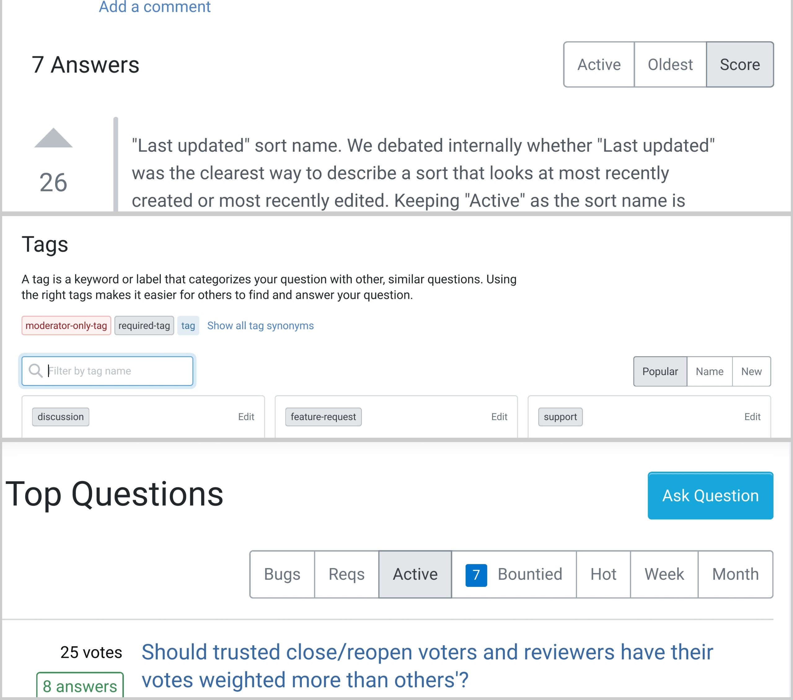
answer sorting menu screenshot - current placement on right

We are moving it so that it appears underneath that header. We will run an experiment on Stack Overflow to make sure that moving the menu doesn't negatively impact the number of clicks on the sort menu or the number of answers created. Assuming no negative impacts, we will change the placement of the sort networkwide.

screenshot of answer-sorting menu - new placement

Creating a Newest sort

We currently have an Oldest sort that sorts answers in ascending order based on the creation date. In our survey, 51% of respondents felt that a Newest sort would be valuable. We are now adding a Newest sort that sorts answers in descending order based on the creation date. 

Changing the names of the sort options

We are changing two of the sort names as follows:

  • Active will be changed to Last updated. Our survey revealed that 49.6% of users were confused by the Active wording, and many thought that it meant that answers with the most recent comments would appear first. In fact, this sort only takes into account the date that an answer was created or edited, so we feel that “Last updated” makes this criteria clearer.

  • Votes will be changed to Score. Answers are currently sorted based on the score (upvotes - downvotes), not the number of votes (upvotes+downvotes). This language makes that distinction clearer, and is a long-asked-for change that we are delivering. (This is now completed.)

screenshot of new menu sorting options: last updated, oldest, newest, score

Adding an info icon and popover

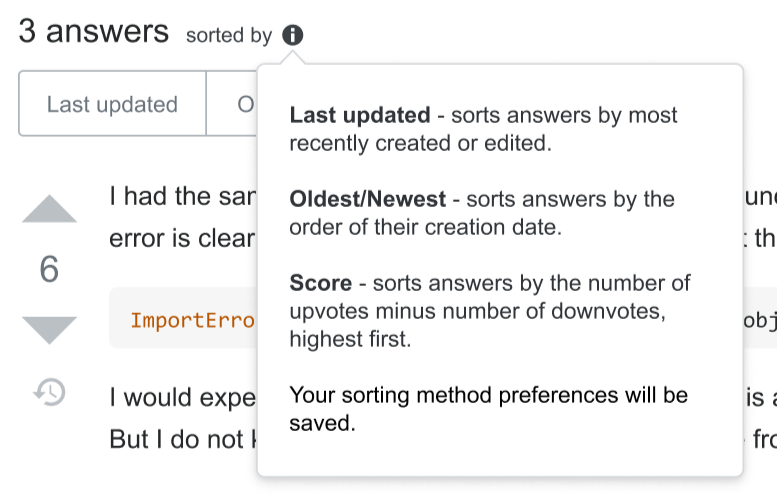
To make it clearer how each sort works, we are adding an info icon and popover that explains what each sorting option does.

  • Last updated - sorts answers by most recently created or edited

  • Oldest/Newest - sorts answers by the order of their creation date

  • Score - sorts answers by the number of upvotes minus number of downvotes, highest first

screenshot of info icon popover that explains each sorting option

Feedback

I’ve posted this primarily to give the community advanced notice on changes that are coming. But I welcome feedback on two ideas:

  1. "Last updated" sort name. We debated internally whether "Last updated" was the clearest way to describe a sort that looks at most recently created or most recently edited. Keeping "Active" as the sort name is NOT on the table, as a substantial percent of users are confused by it. Do you have an alternative name? Needs to be succinct: 1-2 words.

  2. "Last edited" sort. As an alternative to changing the name of the Active sort, we could also consider replacing the Active sort with a new Last edited sort. We now have a Newest sort that sorts answers by most recently created, so we don't necessarily still need a sort that combines last created and last edited. Is there any value in making Last edited a standalone sort? Why or why not?

Please provide feedback no later than Friday Feb. 4, 2022.

21
  • 10
    "Last edited" feels like a poor choice for a sort order, in my opinion. It would, at least to me, imply that an answer that has never been edited should be sorted last, regardless of how "new" it is. I can't see that being particularly helpful. If that isn't the wanted order, then "edited" isn't the right keyword, in my opinion, as "edit" has a specific meaning within the communities.
    – Larnu
    Commented Jan 31, 2022 at 16:54
  • 16
    Thank you for using an info icon instead of a tooltip you have to hover over the text to see. I'm assuming I can poke that icon on my touch devices to see the popover?
    – ColleenV
    Commented Jan 31, 2022 at 17:19
  • 11
    If people think comments impact "Active", why not just make it so.
    – Kevin B
    Commented Jan 31, 2022 at 17:42
  • 6
    @KevinB because that's not what everyone want to see, and I don't think it's helpful if you are focused on question content. Plus you then need to handle deleted comments. Commented Jan 31, 2022 at 18:27
  • 8
    Why is the alignment of the buttons changing on the page? If it is for visibility/attention, why not just make the active sort option more colorful rather than grayscale?
    – TylerH
    Commented Jan 31, 2022 at 18:39
  • 12
    This is amazing news, Anita! The "newest" sort option was sorely needed, and the "votes" -> "score" change is a welcome improvement too. It is also nice to see that the changes are approached with research behind them and with advance notice - something I came to expect from the team - keep it up (can't be grumpy all the time)!
    – 0Valt
    Commented Jan 31, 2022 at 18:42
  • 1
    As a bit of feedback on the placement of the sorting button group: maybe instead of pushing it to the new row (which will likely be done with fd-column class and removal of the ai-center class + one of the g[N] classes for a vertical gap), which looks a bit strange as it is not supported by the current layout of the page (the left side looks visually "heavier" than the right), maybe just inverse the order of the button group and the "N answers" element? This would preserve the one-line layout and visually balance the page while keeping the benefit of the "all actions are to the left"
    – 0Valt
    Commented Jan 31, 2022 at 18:58
  • 11
    I see "Votes" were already changed to "Score". While I'm not against the change, I really fail to understand why you announce something, say it will be done in few days, when actually it is already done. I don't like this behavior, sorry. Commented Feb 2, 2022 at 9:05
  • 5
    @ShadowWizardHatesOmicron This was a matter of fulfilling a long-standing feature request - both from like 2011 and recently on the new questions list view design. This post isn't an announcement of that change, it was written knowing that the changes from "votes" to "score" were already in progress. We don't generally make announcements when we're responding to a feature request.
    – Catija Staff
    Commented Feb 2, 2022 at 18:16
  • 3
    @Catija Thanks a lot for featuring this post 😊 Commented Feb 2, 2022 at 18:22
  • 7
    @Catija no. It's clearly written here: "Votes will be changed to Score." Note the "will be changed". In the future, after the "Please provide feedback no later than Friday Feb. 4, 2022". And this is just wrong, aka not true, that's why I'm upset. Changes just keep happening without any notice, some changes are good, but some are not good. Commented Feb 3, 2022 at 7:35
  • 5
    You know what a moany lot we are, so perhaps more than a mere five days for feedback to settle down to some median would be useful. Commented Feb 4, 2022 at 19:43
  • 1
    "Recently updated" would be much clearer than "Last updated" IMHO. Something about the word "last" always seems ambiguous, whereas "recently" is extremely clear. (When I hear "last updated" I subconsciously think, the one that was updated the longest ago, even though it's the opposite of that.) Commented Feb 7, 2022 at 5:32
  • 1
    @stevebennett if the last update is 10 years ago, that's not very recent Commented Feb 7, 2022 at 9:03
  • 4
    @ColleenV We decided to go with a different implementation that won't use the info icon. But I confirmed with our designers that in general info icons do work on touch devices, as they are tied to a click event
    – Anita Taylor StaffMod
    Commented Feb 8, 2022 at 17:29

14 Answers 14

49

"Last updated" sort name. We debated internally whether "Last updated" was the clearest way to describe a sort that looks at most recently created or most recently edited. Keeping "Active" as the sort name is NOT on the table, as a substantial percent of users are confused by it. Do you have an alternative name? Needs to be succinct: 1-2 words.

We don't use the word "updated" much in the UI; I'd opt towards using "last modified", which is consistent with most of the wording around the site.

I don't see the point of moving it to the other side, but IMO it does create a more "cluttered" look - everything is all in one place instead of being spread out where you can see everything separately.

I do appreciate the "newest" sort option, though, that's been sorely lacking in the past. Thank you.

5
  • 1
    Ha! I was just about to post this very thing. Sorting by modification date is standard in many contexts, while "update" implies some new detail has been added and might be confusing to users ("why is this first? There's no update, someone just fixed a typo!).
    – terdon
    Commented Jan 31, 2022 at 16:41
  • 34
    "I don't see the point of moving it to the other side, but IMO it does create a more "cluttered" look" - Not to mention it would add to the already unnecessary amount of vertical space used by the site by changing things that were previously on the same line to be stacked. Commented Jan 31, 2022 at 16:42
  • 6
    github calls this "recently updated" for sorting issues. Commented Jan 31, 2022 at 17:06
  • I would drop the word "last" and just put "modified" - I think that would be clear enough Commented Feb 7, 2022 at 9:47
  • 2
    We decided on a different implementation, but took your suggestion to use "Date Modified" instead of "Last Updated."
    – Anita Taylor StaffMod
    Commented Feb 8, 2022 at 17:30
29

I disagree with "moving the sort menu" - for consistency it implies that the other sort menus will be moved from right justified to left justified:

Currently:

enter image description here

In particular, with the Tags menu it will be rather cluttered on the left.

Generally, similar items are in close proximity and different items are spaced further away.

It will also cause the ℹ️ pop-up to clobber the choices, instead of seeing the help and being able to click on your choice simultaneously:

enter image description here

Moving everything to the left places all the tappable elements in too close a proximity, unless the vertical spacing is also generously increased; both to avoid misclicks (fat fingers) and to delineate them according to best UI design practices:

9
  • 1
    "It will also cause the ℹ️ pop-up to clobber the choices" – Do you mean "cover"?
    – V2Blast Staff
    Commented Feb 1, 2022 at 20:57
  • 3
    @V2Blast Definition 2a or 2b.
    – Rob
    Commented Feb 1, 2022 at 21:56
  • I don't think either of those definitions really make sense here... The sort options aren't being "defeated overwhelmingly" (e.g. as a sports team might), and I think 2b/2c are basically figurative versions of meaning 1. In any case, "clobber" definitely isn't the word I'd use here.
    – V2Blast Staff
    Commented Feb 1, 2022 at 22:05
  • 7
    @V2Blast - It's a common term used by programmers: en.wikipedia.org/wiki/Clobbering itectec.com/unixlinux/… softwareengineering.stackexchange.com/questions/310330/…
    – Rob
    Commented Feb 1, 2022 at 22:34
  • 1
    Ah, that explains why I'm not really familiar with it then... :P
    – V2Blast Staff
    Commented Feb 1, 2022 at 22:47
  • 3
    Moving the options to the left also further increases vertical white space (consistent trend in recent changes) Commented Feb 3, 2022 at 5:57
  • I feel like Wiktionary is a much better dictionary in general… Commented Feb 5, 2022 at 14:50
  • 2
    We decided on a different implementation that includes NOT moving the sort menu.
    – Anita Taylor StaffMod
    Commented Feb 8, 2022 at 17:31
  • @AnitaTaylor, thanks for reconsidering the move.
    – Rob
    Commented Feb 8, 2022 at 18:37
25

Moving the sort menu

The Sort menu currently appears to the right of the header that shows the number of answers. We are moving it so that it appears underneath that header.

Why oh why are you giving up precious vertical space when there is ample space to keep those buttons in their original location?

Making a responsive UI does not mean "everything must look identical on a 300px flip-phone and on a desktop computer".

3
  • 1
    It’s for discoverability. We get several “bug” reports about the highest-scored answer no longer being at the top, probably because users don’t see the sort options. Commented Feb 5, 2022 at 13:24
  • Even as a seasoned user I constantly forget that the sort options exist. Hopefully, moving them over to the left will mitigate this somewhat. If moving the answers down the page a few extra px was a real issue, they could put a little dropdown next to the "X answers" message, but then you'd have people complaining that their 1-click action is now 2-click :P
    – Robotnik
    Commented Feb 6, 2022 at 23:06
  • 2
    We decided on a different implementation that includes NOT moving the sort menu.
    – Anita Taylor StaffMod
    Commented Feb 8, 2022 at 17:31
22

Combine the oldest/newest buttons to "age", and have each button switch direction with a second click.

This is a pretty standard feature across sorting UI. The buttons could be labeled as such:

[Modified] [Age] [Score]

As you click each one, an arrow appears to indicate if it's sorting ascending or descending:

[Modified ↑] [Age] [Score]

If you click it again, it switches direction:

[Modified ↓] [Age] [Score]

This will add functionality and reduce clutter.

18
  • 2
    Hey, that's sort of what I'm getting at here 😄. Commented Jan 31, 2022 at 18:24
  • I like the idea, but not your labels. "Age" and "Score" don't match "Modified". We could say "Modified", "Created", and "Scored", but I think that's too terse. We could just make the header a sentence "15 answers sorted by: | modification time| creation time | score |.
    – ColleenV
    Commented Jan 31, 2022 at 18:37
  • I agree with the shorting addition, bur your "combine buttons" wording doesn't make sense. Combine what buttons?
    – TylerH
    Commented Jan 31, 2022 at 18:38
  • 5
    @TylerH: The (proposed) "newest" and (existing) "oldest" sort options, presumably.
    – V2Blast Staff
    Commented Jan 31, 2022 at 19:03
  • @AncientSwordRage you must have added yours while I was writing, but agree this is a duplicate. I'll delete this answer.
    – LShaver
    Commented Jan 31, 2022 at 19:04
  • @LShaver, not sure, I think yours is doing better than mine vote wise... Commented Jan 31, 2022 at 19:06
  • 8
    I know it's common, but ... I kinda hate toggle sorts. If I want oldest now I can click "oldest" and get it without having to think about what the current sort is; toggle tends to require multiple clicks to get it to settle in correctly.
    – Shog9
    Commented Jan 31, 2022 at 19:31
  • 1
    Imagine how much time it'd take really heavy pages to switch back and forth, if the one you wanted wasn't what you got on first click.
    – Kevin B
    Commented Jan 31, 2022 at 21:12
  • 1
    @KevinB not that long? this huge page takes 500ms for TTFB already, and~250ms to download for me. Adding more options/sort ordering won't change that. Commented Jan 31, 2022 at 22:34
  • @Shog9 it's not ideal, but I'll take it over not being able to at all... Commented Feb 1, 2022 at 8:45
  • 1
    @AncientSwordRage yea that took me ~ 10 seconds. It's not that adding more options will slow it down, it's that if i have to click twice to get the DESC order i want, i have to load that page a total of 3 times to get there with a toggle. If it weren't a toggle, it's only 2.
    – Kevin B
    Commented Feb 1, 2022 at 16:08
  • 2
    I always hated this arrow or “asc.” and “desc.” thing, specifically for dates. It always takes me a few seconds to think what “sorted by date, ascending” even means. For quantities such as price or score this makes sense, but for date-times it could refer to either the UNIX time stamp or the age, effectively, which are opposite quantities. I found it genious that SE labeled these tabs “Oldest”, “Active”, etc. because it immediately gives me an idea which posts to expect first; I instantly know what I need to click, even if technically “sorted by oldest” is meaningless. Commented Feb 5, 2022 at 12:58
  • 1
    Also, with toggles, I don’t even know which direction (ascending or descending) comes first, so I have to think about what clicking this tab means, click it, scroll down to check if the sort order is correct, if not, click again. That just sounds annoying. Commented Feb 5, 2022 at 12:59
  • 1
    @sebastian that all sounds like implementation details. I share the exact same pains, but I still want some way to go from oldest to newest in one button Commented Feb 5, 2022 at 13:33
  • 2
    We decided on a different implementation, but your suggestion inspired us to go with ascending/descending sorts.
    – Anita Taylor StaffMod
    Commented Feb 8, 2022 at 17:33
18
  1. "Last edited" sort. As an alternative to changing the name of the Active sort, we could also consider replacing the Active sort with a new Last edited sort. We now have a Newest sort that sorts answers by most recently created, so we don't necessarily still need a sort that combines last created and last edited. Is there any value in making Last edited a standalone sort? Why or why not?

In my book, the first revision also counts as an edit. At the very least as an edit to the entire Q&A page. I don't think a 'Last edited' sort would add any value, and the site search and question lists don't have that option either.

1
  • 4
    I appreciate this feedback. We won't make this change.
    – Anita Taylor StaffMod
    Commented Feb 3, 2022 at 20:36
16

At the top of the page, under the question title, it reads

Asked yesterday   Active today   Viewed 350 times

Will the word "active" there also be changed to "last updated"?

1
  • 2
    Good point. We discussed internally about changing "Active" to "Modified" but will reach out to Meta in a separate post for feedback before we make that change.
    – Anita Taylor StaffMod
    Commented Feb 8, 2022 at 17:34
11

Move Score to the leftmost option

This is the overall default option, it might as well come first (regardless of the past order).

8
  • 1
    If it is the default, would it be the least likely one you want to click?
    – ColleenV
    Commented Jan 31, 2022 at 17:48
  • 4
    @ColleenV Yes, probably, but it's a "sticky" selection that gets preserved across pages after you make a selection. I'd expect the default option to come first and start highlighted, because it's not just an option but also information about how things are currently being done. Personally I'd also probably click it more often than the others because I tend to use it as my default but often switch to the newest (especially when moderating) and then back again; however, that's not my motivation for putting it first. Commented Jan 31, 2022 at 17:51
  • 1
    Are you concerned that the currently selected sort might not be visible if it's last? Frankly, I see more benefit to preserving the existing order as much as possible.
    – ColleenV
    Commented Jan 31, 2022 at 17:55
  • 1
    @ColleenV I just tend to expect default options to come first in most menus. I figured it would be less impactful to change the order now, when the positions and list of options are changing as well, rather than changing it later. Commented Jan 31, 2022 at 17:57
  • 1
    Weird, I expect the things I'm most likely to be looking for to be top-left in a UI, and things I'm less likely to need be bottom-right. I don't see any value in changing the order from what people are used to in such a small menu though. (And I mean that as "it's weird that I see it completely differently than you do", not "your view is weird". Sorry if that came across wrong.) I see that menu as a way to change from score sorting, not as a way to tell me the list is sorted by score.
    – ColleenV
    Commented Jan 31, 2022 at 18:01
  • 1
    @ColleenV No offense taken; it seemed to me that the order was a bit haphazard and I couldn't make a sensible argument for how it's organized now, so I made a couple suggestions to give an order that would make sense to me. I'm sure there are arguments for keeping it the way it is (yours and others) or for further permutations. Commented Jan 31, 2022 at 18:22
  • 2
    We decided on a different implementation that includes having "Highest score" be the first choice in a dropdown menu.
    – Anita Taylor StaffMod
    Commented Feb 8, 2022 at 17:35
  • @AnitaTaylor I like this and I'd say that putting highest score as the first option and marking it as default is consistent with the spirit of my feedback, thank you. Commented Feb 8, 2022 at 17:40
11

As work is now being done to the sort order links, it'd be nice if the team fixed a technical design flaw in the implementation of the buttons:

Only save the sort order selection when the button is actually clicked

Currently, the sort order selection is handled through a GET request on the selection. This means that when following a link that has a specific sort order specified (i.e. contains ?answertab=[sort]), it also changes how subsequently-viewed questions on the same site are sorted. This opens up a cross-site request forgery (CSRF) vector.

Per the past request, Avoid possible CSRF attacks by saving sort selection only when actually clicking:

Now, suppose someone sends me such a link. It looks innocent enough, link to a question on Stack Overflow. I click it, take a look, close the tab and forgets about it. However, when viewing other questions, with more than one answer, I suddenly realize something is really strange. The answers are all messed up, in the wrong order, as I never asked to change the order. It takes a really good set of eyes to notice this change

The sort order selection should only be saved when the user actually clicks on the button, not if they follow an external link to the same URL as that the sort button uses. The easiest way to implement this is to make the button use a POST request rather than a GET request.

When such an external link is followed (i.e. a sort order is requested using a GET request), it should only use that sort order for that particular page load, not for future page loads. The ability to link to particular sort orders is still useful, and should not be removed. As an example, on the Photography site, the links to photo competition posts contain the sort-by-active query string, so that the answers can be sorted in the most recently updated order so as to reduce the benefit of early voting on earlier submissions.

4
  • And Jeremy actually did it 30 months after mentioning it: Default page size when searching is 1 instead of 15/30/50. Commented Feb 5, 2022 at 12:07
  • @SebastianSimon As stated in the answer there, the CSRF vulnerability still exists: it's only been slightly mitigated. It's still possible to execute such an attack if the number is one of the selectable options (15, 30, or 50). Commented Feb 6, 2022 at 0:27
  • 2
    We will prioritize this in the coming weeks, along with the other changes.
    – Anita Taylor StaffMod
    Commented Feb 8, 2022 at 17:37
  • This seems to be a problem coming in from external search engines. For example Google always sets to last-modified, which is irritating.
    – Beth
    Commented Feb 13 at 3:55
7

Drop the word "Last" from "Last Updated"

It should be clear enough to just put "Updated" (or even "Modified"), dropping the word "Last". It keeps it as one word like all the other options.

2
7

Sorting by (#upvotes − #downvotes) is objectively a terrible metric, and using it as the default is worse, as pointed out in a related discussion.

As suggested by a commenter there, Wilson scoring is known to be a superior ordering in similar scenarios, and it stands to reason that an adapted version would also be superior on Stack Overflow. It’s actually surprising that this hasn’t been tried yet. In particular, the naïve sorting by score assumes that upvotes and downvotes are dispensed in equal measure and should carry equal weight, whereas we know that this is not true.

I therefore posit that the default sorting should use an improved scoring with better weighting of downvotes and total vote count. This change alone might fix or at least drastically improve a whole tail of related issues (such as outdated answers/popular but wrong answers being too prominent).

4
  • There's a related post on meta.SO where they tease a "trending sort".
    – LShaver
    Commented Feb 7, 2022 at 15:51
  • 3
    @LShaver I’m aware, the “related discussion” I link refers to that. However, it doesn’t seem like this “trending” sort is similar to what I am suggesting here and while it might also be interesting, I’m more and more convinced that it’s more important to weigh votes more appropriately, than it is to let their value decay over time. In fact, I’d really like to see some numbers on a head-to-head comparison. I predict that a Wilson score would work better (= be more indicative of the actual answer quality and relevance). Commented Feb 7, 2022 at 16:15
  • 2
    Changing how we compute the default scoring to using Wilson score is out of scope for this project. We are aware of the discussion about this and have done some preliminary explorations, but don't have any immediate plans to change how we do the default sort.
    – Anita Taylor StaffMod
    Commented Feb 8, 2022 at 17:40
  • Thanks for the feedback @AnitaTaylor, it’s appreciated! Commented Feb 8, 2022 at 17:53
5

Oldest/Newest should just be 'Date Posted'; allow sorting each item

Although it's probably out of scope currently...

Having two options to just change the sort order seems redundant, and could simply be indicated by an arrow/multiple clicks.

Then you could apply sorting on some of the options:

Mock up of the suggested change, with Date Modified, Date Posted and Score buttons

I'm making this answer to make sure that there's some note of this feedback for when it's ready to be implemented.

8
  • 2
    I think this is a good idea, but that it is out of scope as feedback on the proposed changes here. It would be nice to be able to easily sort by score, creation time, or modification time and be able to choose ascending or descending. (not my downvote btw)
    – ColleenV
    Commented Jan 31, 2022 at 17:45
  • @ColleenV you're right, it probably is out of scope. I wanted to make sure that this feedback was noted now in case we miss the opportunity. I can't tell if the downvotes are form disliking the idea, the suggested implementation or just because it's out of scope though? Commented Jan 31, 2022 at 17:47
  • It's impossible to tell why people downvote. Maybe they don't like the way you abbreviated ascending? I would update your answer to explain what you just explained to me though. It might help prevent the "this is out of scope" dvs.
    – ColleenV
    Commented Jan 31, 2022 at 17:50
  • 1
    I find this to be more verbose than it needs to be. while i do have some.... concerns with "Active" becoming "Last Modified", given that active puts new posts ahead of recently modified even though they haven't been modified, last modified is still better than Date Modified ASC, particularly when you take into account these are the headers that will be used for all sites, not just technical ones.
    – Kevin B
    Commented Jan 31, 2022 at 18:09
  • @kevinB it's not ideal, but it's a direction I'd like to see explored. Commented Jan 31, 2022 at 18:23
  • @AncientSwordRage Instead of "Asc." and "Desc.", arrows (top arrow and bottom arrow respectively) would be better I guess... Commented Feb 2, 2022 at 18:39
  • 1
    @Random yup that could work. Just having a way to change sort would be a start! Commented Feb 2, 2022 at 19:15
  • 2
    We decided on a different implementation that uses the words "Date created."
    – Anita Taylor StaffMod
    Commented Feb 8, 2022 at 17:41
5

Will there be tooltips on the individual buttons or is the info icon i meant to completely replace tooltips?

Can we have a preview of the tooltips on the individual sort buttons? (If they're meant to be kept and there's already a proposal for some of them.)

3
  • 1
    My understanding is that the info icon popover replaces the tooltips.
    – 41686d6564
    Commented Jan 31, 2022 at 18:55
  • 15
    There will be tooltips IN ADDITION to the info icon popover, and we will use the same language for both
    – Anita Taylor StaffMod
    Commented Jan 31, 2022 at 19:00
  • 1
    We decided on a different implementation that no longer includes tooltips or the info icon, as it no longer relies on buttons.
    – Anita Taylor StaffMod
    Commented Feb 8, 2022 at 17:41
4

I wonder if enhancing the "Active"/"Last Modified"/"Freshest" sort algorithm should exclude some reasonably ignored "bumps".

What if the the system/Community bumps an answer because it was merely adjusting a url?

What if a FGITW user is striving for maximum attention in the first few minutes while an easy question is getting pummelled with answers? If they keep making superficial edits/bumps to their answer to stay at the top of the page, should this tactic be prevented by the system to discourage the behavior? Should the sort ignore edits within 2 days of the creation date? ...by then the dust has surely settled.

Are there other reasons/occurrences that can/should be ignored when deciding the last modification?

Are we going to have another tab that says "Special Sauce" and uses Stack Exchange's secret algorithm that factors: freshness, votes, copy-pastes, and hover time?

3
  • 2
    Ooh, I like the idea of not re-sorting things if they're edited within a certain time-limit after posting. One of my pet-peeves for using the active sort here on MSE is that I see small, insignificant edits (like grammatical corrections or fixing of markdown) drown out newer answers that I'm more interested in :D
    – Tinkeringbell Mod
    Commented Feb 3, 2022 at 10:21
  • 1
    Not special sauce. It will be called "Trending", per this meta.SO post.
    – LShaver
    Commented Feb 7, 2022 at 15:52
  • 1
    This request is out-of-scope for this project. We aren't changing the mechanics of how the Active sort works, just renaming it and adding an Ascending sort option. See new Meta post for details.
    – Anita Taylor StaffMod
    Commented Feb 8, 2022 at 17:44
-1

Move "newest" before "oldest"

I feel it's more logical to group "last updated" and "newest" to be adjacent in the list, as they're most similar in intent (and will often give an identical order); it also feels most natural to me to have "newest" before "oldest" in a list.

I'm not sure why this feels most natural (possibly along the same lines as What is the rule for adjective order? - just one of those implicitly things in language that's hard to explain with a simple rule, or perhaps because that's the direction Brenda Lee rocks around the Christmas tree?).

3
  • 2
    Note: If "Newest" is moved before "Oldest" (and nothing else changed about the sort options or the order they're listed in other than adding "Last updated" in the first position, per the image in Anita's post), then the 4 sorting options would also be listed in alphabetical order. :)
    – V2Blast Staff
    Commented Jan 31, 2022 at 18:14
  • 1
    @V2Blast Though my other suggestion would break that, of course :) Commented Jan 31, 2022 at 18:16
  • 1
    We decided on a different implementation that uses a dropdown menu instead of buttons.
    – Anita Taylor StaffMod
    Commented Feb 8, 2022 at 17:45

Not the answer you're looking for? Browse other questions tagged .