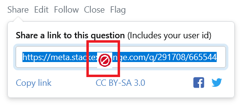
A recent chancechange in the CSS of the Share button under posts has the pointer turning into a stop (or forbidden) sign if you hover over the link.
(I wasn't able to take a screenshot containing the cursor so I copy-pasted one over the screenshot to give an idea of what it looks like).
Is this change part of the previously announced upcoming changes aimed at improving accessibility? (The announcement says the changes would be rolled out on SO and Teams.)
This change causes some difficulty in reading the link if you want to select a part of it on some systems. It might also not be the best choice semantically and in terms of UX.
Using Windows 10, Firefox 104.0.2 (64-bit), 1920x1080. rev 2022.9.13.42974

