89

UPDATE: This is now live on all Stack Exchange sites. You can access it at /help or by clicking the "help" link in the top nav or footer of any page.

We can all agree that Stack Exchange is a complicated beast that takes a while to understand. New users can be overwhelmed and confused by all of the rules, where to find them, and how to abide by them. Even though many established users leave comments linking to helpful resources, or answer questions posted to metas, it's a scattershot way to help users learn our rules and answer their questions.

And so, we're introducing a new Help Center, which you can now see here on MSO: https://meta.stackoverflow.com/help.

Here's what we're hoping to achieve:

  1. Consolidate important information that is currently scattered throughout a great many resources: MSO and child metas' lists, each site's official FAQ page, blog posts, and miscellaneous other resources like our "contact us"/account help pages and "How to Ask" / "How to Answer" guides. Any rules or explanations of basic site mechanics should be easily accessible in one place.
  2. Allow easy linking and easy navigation. Each topic is separated out onto its own page, with a unique URL to allow pointed linking to that page. Each article page also has sidebar navigation that shows other topics in the same category, as well as a list of other categories, for the rare user who is motivated to read more.
  3. Use comprehensible language that non-power users will be able to understand. A lot of our guidance, written by the community and by Stack Exchange itself, uses jargon that can be unclear to users learning our system for the first time. We want to make sure terminology is sufficiently explained and use plain language wherever possible.

This Help Center will (once we roll it out to all sites) replace the current FAQ pages. Each site will continue to have its own tag on meta, but any policy that is essential to the functioning of the community will be rolled into the appropriate section of the new Help Center.

What's broken, and what are we missing?

We're already planning to add more features and articles to the Help Center in the coming weeks, but we wanted to show you all the core of it and get your feedback. There are additional articles that we plan to include here (especially in the "Reputation & Privileges" category), but the articles currently included should cover everything that exists in the current FAQ and old /help page /contact page (which will be redesigned when the new Help Center is live everywhere).

This is live only on MSO right now. We want to get your opinions about the Help Center in general, fix any bugs or typos you might find, and add any crucial information that's missing. Once we've addressed all those things, the new Help Center will roll out network-wide.

A couple of implementation notes:

  • We will be adding a "search" feature to the /help landing page that will make it easier for users with a specific problem to find the relevant article(s).
  • Site moderators will be able to edit the "What topics can I ask about here?" page to include lists of what is on- and off-topic for each site, just as they can currently edit the "What can I ask here?" part of the current FAQ.
  • You may notice that some article titles are preceded by a round bullet. The bullet is temporary while Jin designs an icon, but those articles are "featured" articles; they are meant to draw attention to the most important site policies or most frequently encountered issues. Fixed

So there you have it. A new, consolidated, Help Center to provide a single resource for users looking to understand how our network works.

We're still making some small changes to this feature. Please continue to post here on meta if you encounter any bugs / typos / broken links. If you want to suggest a new page, have an issue specific to one site, or have another major change, you can start a new meta post and tag it .

30
  • 2
    @BenBrocka You're right; there are a couple of things that are a bit out of place when viewing this on MSO. That "take the tour" is supposed to point people to /about so if they're completely new, they can get a brief overview of what's on-topic, how voting/rep works, etc. The About page is a high-level intro, and the Help Center is more of a deep dive when you want to know about a particular topic.
    – Laura StaffMod
    Commented Jun 3, 2013 at 14:39
  • 25
    This is a step in the correct direction, however, I have some qualms. This is an enormous amount of reading material for a new user. Looking at this from a new user's perspective, I'd be even less likely to read through this than the previous FAQ. Is there a way to consolidate what needs to be read through? It's a little tricky to ask "have you read through the FAQ?" when the FAQ contains 32 pages.
    – user206222
    Commented Jun 3, 2013 at 15:04
  • 2
    There's a lot of text in there. Many of the pages could do with some illustrations/screenshots, especially the ones that describe parts of the UI. Also, there are some broken variable interpolations ($Questions.Bounty.DurationInDays) on the bounty page.
    – hammar
    Commented Jun 3, 2013 at 15:06
  • 9
    @Ben The current FAQ is a single page; while you can point a user to a single page, asking a user to read 32 split pages is a much more intimidating task (even if the word count is the same).
    – user206222
    Commented Jun 3, 2013 at 15:11
  • 3
    @KnightswhosayNi The Help Center has a slightly different goal than the FAQ. We don't really expect any user to sit down and read the whole Help Center at once; we think the About page does a great job of providing a baseline explanation, and we want everyone to START there. The main use of the Help Center will be for experienced users to provide just-in-time learning by linking to a page that explains a problem happening right then, or for a user to search for a specific issue they encounter - not to try and understand every nuance of SE in one sitting.
    – Laura StaffMod
    Commented Jun 3, 2013 at 15:13
  • 7
    Is there any reason why the Help Center doesnt have a more vibrant colour scheme/coding? I get that the theme should match the site, but it doesnt look like something that users would want to explore/read unless explicitly told/directed/need to.
    – asheeshr
    Commented Jun 3, 2013 at 15:14
  • 1
    At a quick glance, it looks nice, although I still think providing "do" and "don't" examples (as suggested a couple weeks back) would add value even in the light of this new Help Center. Side note: some of the entries seem a bit shallow in their current form, such as this one: meta.stackoverflow.com/helpcenter/no-one-answers will it be getting links to stuff like the canonical "how to gain more attention" Question eventually? I realize that the Help Center is intentionally simple and you've done a great job at that, but linking to more in-depth info would probably still be good...
    – Pekka
    Commented Jun 3, 2013 at 15:33
  • 3
    Why does this remind me of Windows XP and its "help" center...
    – Linuxios
    Commented Jun 3, 2013 at 15:36
  • 2
    I'm nitpicking, but the path /helpcenter should be /help-center since it's written as "Help Center". (Ideally, one would redirect to the other.) Commented Jun 3, 2013 at 15:57
  • 2
    Why /helpcenter and not /help? If you're removing /help anyway and this covers all of the information in there it would make it easier to spell and more intuitive to the everyday user. Commented Jun 3, 2013 at 19:22
  • 11
    Looks nice. Don't forget to update the comment magic links like [faq#dontask] please.
    – Mat
    Commented Jun 4, 2013 at 6:01
  • 3
    This post should be featured across the entire network. Not everybody visits MSO.
    – asheeshr
    Commented Jun 5, 2013 at 13:53
  • 4
    "Once we've addressed all those things, the new Help Center will roll out network-wide." And the next day the Help Center rolls out network-wide. <sigh>
    – yannis
    Commented Jun 6, 2013 at 9:15
  • 2
    @Laura, think the design is actually worth asking a few more questions at UX.SE before innovation sweeps across StackOverflow like a tornado. Commented Jun 6, 2013 at 14:12
  • 2
    @Laura: Right now I see only "sign up", "log in" and depending on the site "careers 2.0" at the top beside the search box while not logged in. IMO the About and Help links should also be prominently displayed there, instead of users having to scroll all the way down to the bottom of the page. Why add those links to the top nav bar only after the user's logged in?
    – Karan
    Commented Jun 7, 2013 at 1:01

25 Answers 25

45

Are these going to be editable by users? The posts here get updated pretty much constantly, and historically info that's supposed to be updated by SE staff tends to not get updated very frequently; you're going to end up with constant bug reports here about out-of-date FAQ information

5
  • 8
    Users will not be able to edit the Help Center pages, but we have a MUCH improved workflow for SE staff updating them. We built a much more efficient staff interface that makes updating these articles much easier, so the community managers will be able to change the articles as needed. The team will monitor both the faq and faq-proposed tags to make sure we don't miss any awesome content that should be included in the Help Center.
    – Laura StaffMod
    Commented Jun 3, 2013 at 15:10
  • 24
    @Laura I strongly disapprove of the move to eliminate community moderation of these pages. Community editing is what makes this site strong, and shouldn't the users know more about how to use the site properly (as a user) than the developers? Or possibly specific tags here on meta to propose changes to these articles, so that the community can at least influence it? Commented Jun 3, 2013 at 16:35
  • 6
    I didn't mean to imply that we're going to stop soliciting input from the community. Moderators will be able to edit on/off-topic pages for their sites, as well as any custom pages, and the community team will continue monitoring the faq and faq-proposed tags. If someone wants a new Help article written or a current one updated, by all means, post about it on meta. We're still open to input, and these pages are not static from here on out - we just don't want them constantly changing, or changing before the guidance is fully decided on.
    – Laura StaffMod
    Commented Jun 3, 2013 at 17:45
  • 1
    I think high reputation members should be able to edit it (not me yet). From your comment, @Laura , I can imagine that before you had to edit manually some text files hidden somewhere randomly :P Commented Jun 21, 2013 at 19:41
  • 1
    @Chris, part of Laura's job as associate product manager here is to improve the processes by which the sites are made to reflect the community's needs. She just started in this role (after almost two years in other various job functions) and I think we're already starting to see huge improvements in response time - and it'll only improve from here. I hope you'll be pleasantly surprised.
    – hairboat StaffMod
    Commented Jun 27, 2013 at 21:40
25

It is now far too difficult to find the information about what is on-topic on a site. I knew exactly the content I was looking for and it took me over five minutes to find it as an experienced Stack Exchange user. There is no way we can reasonably expect a new user to find what is on-topic without having to have it linked to them when they post something that is off-topic.

This is not user friendly and the on-topic section should be highlighted more directly in either the About/Tour page or in the main "Here's How It Works" graphic. What is on-topic is core to the essence of each site and should be the first thing presented to a user when they are looking for more information on the site and what its purpose is.

5
  • If it helps any, the way I approached it was first to look at the Tour, then About, then got down to the Categories and found Asking. I tried What Topics Should I Avoid Asking first before finally getting to the correct topic. Commented Jun 5, 2013 at 19:17
  • 9
    No newbie will ever find the on-topic section.
    – fuxia
    Commented Jun 6, 2013 at 4:49
  • 4
    What irks me most is that the rather unspecific information about what not to ask comes before the on-topic list.
    – slhck
    Commented Jun 7, 2013 at 10:17
  • Just a note that we're still working on tweaks to the help center: the on-topic page should be pinned at the top of the "Asking" category for all sites now. We may shuffle the layout of the help landing page so that the "asking" category appears first, and we'll be adding a larger, featured link to the on-topic article from the help home.
    – Laura StaffMod
    Commented Jul 5, 2013 at 18:58
  • @Laura - thanks, I did notice that they seemed to move up. Personally, I think that makes a lot of difference even with the column order the way it is, though it also might just be me getting used to the new layout. Commented Jul 5, 2013 at 19:33
25

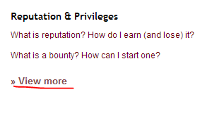
Some of the view mores are unnecessary:

enter image description here

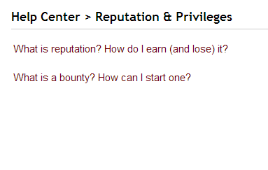
Leads to:

enter image description here

The "Badges" view more is exactly the same as the only item listed under "badges", same with "Privileges". The View More could just be removed.

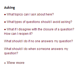
The top three bullets here look weird and don't seem to serve a purpose, typo? There's one under "Answering" too

enter image description here

Also in the "asking" list IMO "disagree with closure" should be moved down below the items about actually answering questions; newbies probably don't know what "disagreeing with closure" means, I'd keep the brand-new user stuff on top since (presumably) that's who's most likely to look over this (not counting people looking over this to link other people to it).

Maybe "how do I delete" should be shown on the front page? I see requests for that more often than requests to add/remove credentials, but for all I know SE gets more emails about credentials than deletion.

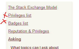
The Badges and Privileges links in the sidebar are dead-ends if you're leafing through the sidebar nav here:

enter image description here

Problematically they're also two of the first items on the list so it's pretty easy to end up on the dead ends. I'd either move them more toward the bottom or make them link to special pages which show the same info but keep the consistent nav, or at least differentiate Badges/Privs since it's fairly surprising to click on them and find yourself clearly not on a help center page (they're already denoted as "lists" I guess but it's still a bit weird).


The direct links to bits of the old FAQ were great teaching/reference tools, but now there's two problems:

  • It's no longer apparent how to get those anchor links (like #promotion)
  • Anchor links no longer highlight the relevant section

Ideally if I wanted to say "hey, excessive self promotion isn't okay here, see this" I should be able to go to the help center and copy out a link directly to that subheading, and when you click that link the relevant portion is highlighted in some way. For example with this link the final section on self-promotion really should be highlighted somehow. IN the old FAQ the linked bit was given a yellow background or something to make it stand out, that would work fine.


Will the Badges, Privileges and Reputation and Privileges sections be consolidated? It seems silly to have two "Privileges" sections when one could just be a "list of all privileges" link under "rep and privs". But then Badges would get lonely so it should probably be edged in somewhere too (IMO it fits well enough along side rep and privs as it's a third part of the gamification thing).


This is a bit touchy-feely but perhaps What's reputation could point out explicitly that downvotes "hurt" rep less than upvotes because we're focused on curating good content moreso than "punishing" bad content? I think it's an important part of the philosophy and it can help people to understand that downvotes aren't quite as big a deal.

Sidenotes: the link to https://ux.stackexchange.com/helpcenter/bounties is broken, it's referred to in What's Reputation but it goes to a 404. Should probably be https://ux.stackexchange.com/helpcenter/bounty instead, which works.

The link to https://blog.stackoverflow.com/2011/09/bounty-reasons-and-post-notices/ in the Bounties page is pretty startling; different website, URL, layout and format. Maybe link that to a Meta.SO FAQ page or include it on the page itself? There's also some other jarring transitions like going to the How To Ask page, but the blog link is the most significant one I've found.

5
  • 4
    Regarding the "view more" links: we'll probably keep them, since we have more articles lined up to put in each section. The Badges page and Privileges page are anomalies at the moment because they're getting an overhaul, too. They'll be like this for probably a week or two, but then the new designs will be live and better integrated with the Help Center (including having the same sidebar navigation that the other categories have). The bullets are going to be replaced with a pin icon or something similar to denote important articles or issues frequently encountered.
    – Laura StaffMod
    Commented Jun 3, 2013 at 15:16
  • 2
    You make some good points about the order of the items; I'll make a note to rearrange some of those.
    – Laura StaffMod
    Commented Jun 3, 2013 at 15:17
  • Why are there two separate sections for "Reputation & Privileges" and "Privileges"? Perhaps the two should be merged into one. It just caused me about 60 seconds of confusion. Commented Jun 4, 2013 at 20:59
  • @Brendon just "privileges" takes you to the list of privs, the other is an actual help page. I'm guessing that's going to change with the other stuff Laura said about overhauling the priviledges/badges links
    – Zelda
    Commented Jun 4, 2013 at 21:08
  • Most disagreements with closures come from newbies who aren't entirely aware of how the site operates, so I'm not sure what you mean there.
    – user200500
    Commented Jun 5, 2013 at 19:25
23

I'm sure you are on some level aware of this, but in the spirit of your item (3) Use comprehensible language, please also try to place yourself in the shoes of someone who speaks only rudimentary English.

Upon clicking 'Take the tour', two things jump out at me:

The etymology for the “meta-” prefix dates back to Aristotle’s Metaphysics, which came after his works on physics. The fundamental meaning of the prefix in Greek is simply “after.”

and the use of phrases like "navel gazing". Neither of these seem like they are particularly geared towards "using comprehensible language" if your English skills are pretty basic.

4
  • 1
    Your point is taken. This is a bit of a special case because MSO's About page is different from the rest of the network and, yes, needs improvement. An example of where that points on every other page is stackoverflow.com/about, which I think does a much better job of refraining from hard-to-understand idioms.
    – Laura StaffMod
    Commented Jun 3, 2013 at 15:43
  • 10
    +1 for navel gazing - colloquialisms are much harder to deal with than big words, for foreign speakers.
    – djechlin
    Commented Jun 3, 2013 at 16:06
  • 1
    Perhaps the Help page should be written in Simple English like the Simple English Wiki?
    – user170979
    Commented Jun 5, 2013 at 13:14
  • @WorldEngineer I think a Help/FAQ written to the audience of the site seem more appropriate that dumbing it all down to the lowest common denominator. I would expect the page for Seasoned Advice to be much simpler than for Electrical Engineering as an example.
    – Chris S
    Commented Jun 27, 2013 at 13:13
17

The two main activites on this site are Asking and Answering.
With that in mind:

The The Stack Exchange Model column should switch places with the Asking column.

The first thing you see when you come up right now is stuff about how to edits posts or searching through the site which is important but only when you know the topic of the site.

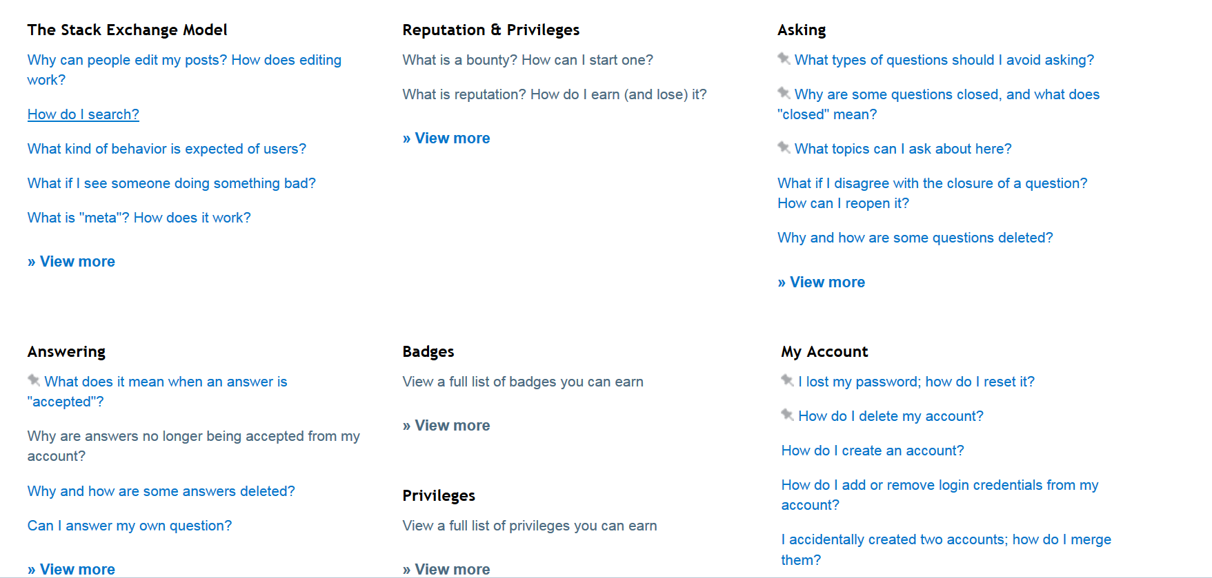
Current:

enter image description here

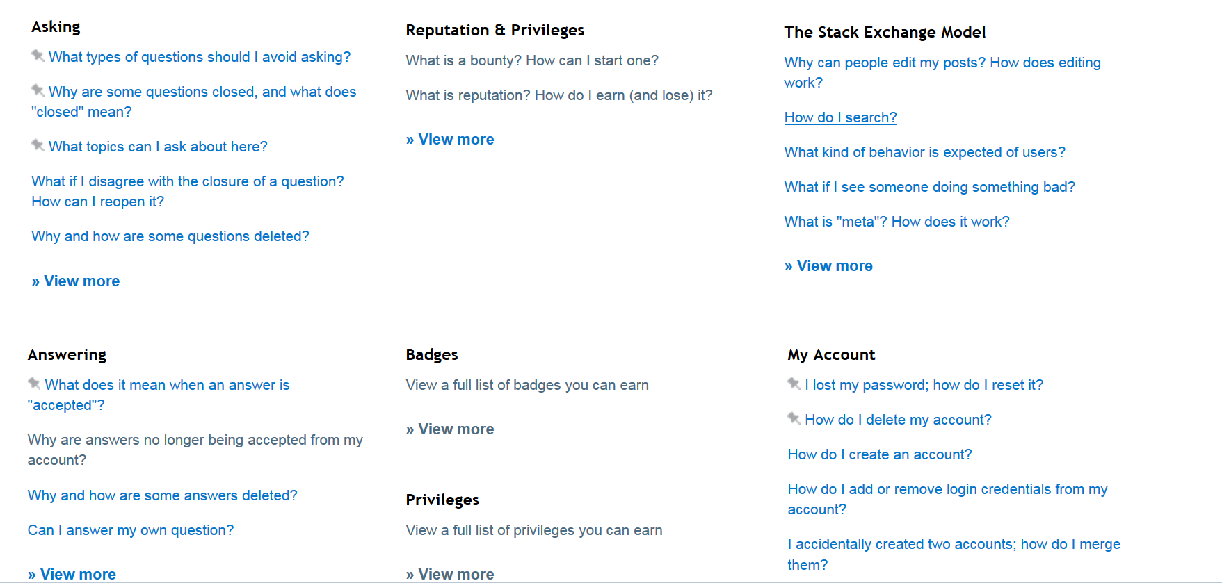
Proposed:

enter image description here

I'm sure there a more asking than answering new users so the order would make more sense.

9
  • 10
    I agree that we should change up the order, but I'd propose a different arrangement. Top row: Asking, Answering, The Stack Exchange Model. Bottom Row: Rep & Privileges, Badges, My Account. (Don't particularly care about the order of the bottom row, to be honest, but the top should include the three most important sections, IMHO.)
    – Adam Lear StaffMod
    Commented Jun 6, 2013 at 4:46
  • @Anna Im with you in this one. Since most users are going to read from left to right in first sight they should see asking and answering Commented Jun 6, 2013 at 15:53
  • 1
    @AnnaLear: I just don't see "The Stack Exchange Model" being important enough for the top row. The top row should handle questions in order of user-frustration, and frankly "The Stack Exchange Model" information is pretty unlikely to be causing frustration. "My Account" should be first, since not finding that information immediately is the single most likely cause of a lost casual user. Followed by the basics of how the site works "Asking" and "Answering". After all of that is done, the more "meta" information about badge systems and rep and general design descriptions on the second row.
    – user118150
    Commented Jun 6, 2013 at 19:11
  • 2
    @user118150 The more common use case here is a new user coming to the site and learning about how to ask, answer, and participate on SE. Most stuff under "my account" is completely irrelevant until you have a specific problem (i.e. "I want to delete my account"). I agree that putting My Account before rep and badges is likely a good idea, though.
    – Adam Lear StaffMod
    Commented Jun 6, 2013 at 19:14
  • @AnnaLear: Do you have any evidence to support the idea that new users visit help until they're linked there (social problem) or have a technical problem? If not... the order should prioritize dealing with specific problems, in decreasing order of user frustration.
    – user118150
    Commented Jun 6, 2013 at 19:33
  • 2
    @user118150 Do you have any evidence to support the idea that they don't? I don't really mean to be excessively flippant here, but we have to balance two use cases for the help center: actual account problems and becoming familiar with the site. The help center is replacing our existing /faq that tried to explain how the site worked. I personally think that's more important/more common than technical issues. So long as the "My account" section is still clearly visible, it doesn't have to lead the pack IMHO. New users never need it right away and existing users can read to the second row.
    – Adam Lear StaffMod
    Commented Jun 6, 2013 at 19:38
  • @AnnaLear: Given that I've seen the front page of any given SE site... yes I do. In your mind, a user who is currently experiencing frustration with a site is more likely to browse through what is frankly a wall of links to find the account information than a user who is more casually looking for information on how the site works. Okay then. I don't think there's anything more to say then.
    – user118150
    Commented Jun 6, 2013 at 19:46
  • 2
    @user118150 In my mind, it is still easy to find the right section when someone has a specific (even if frustrating) account problem.
    – Adam Lear StaffMod
    Commented Jun 6, 2013 at 19:56
  • 3
    We've moved the "Asking" section to occupy the top-left position on /help. There are a lot of arguments to be made for where the other categories should fall, but the only position that had consensus (here and among the SE team) was that Asking was the most important and therefore should come first.
    – Laura StaffMod
    Commented Jul 22, 2013 at 14:06
16

Will sites be able to add their own sections? There are currently a bunch of sites with custom FAQ sections, and I know at least one site links to them constantly, but they've never exactly worked right

1
  • 6
    Yes. Sites won't be able to create as many pages as they want, but we recognize that some sites have policies or problems that are unique to them, and we'll have a method for adding custom pages to deal with those. I'll explain the full mechanics when we have the network-wide rollout, and there will be something about it in the next mod newsletter after this is live, too.
    – Laura StaffMod
    Commented Jun 3, 2013 at 15:21
16

I think there needs to be a site-specific moderator-editable preamble. There used to be such in the old FAQ, and it contained a lot of valuable information. Moreover, it can be updated, if the community deems it appropriate. With respect to the smaller sites, it is possible for the communities to be more nimble than the SE team (with no offense intended).

Edit in response to comment:
I see it now, listed under "What topics can I ask about here?", but it's hardly prominent. I think it would be best if there were an editable section at the top, between "Take the tour" and "Find out more about...", that wasn't behind a link. This would make it more salient for new users and address the non-linear navigation issues associated with the new design.

1
  • 1
    The most important things for individual sites to communicate are what's on- and off-topic for that site. Every site already has a mod-editable page that lives at /helpcenter/on-topic (I just moved over what was already in the old FAQ). If a particular site finds that the one page is not enough, we can discuss adding an additional custom page.
    – Laura StaffMod
    Commented Jun 5, 2013 at 13:37
12

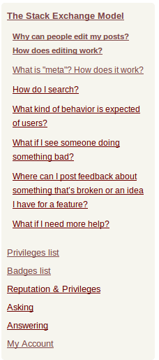
This may not be a big issue but I find the sidebar rather hard to read from and navigate. It looks too homogeneous.

enter image description here

There should be some differentiation between questions and topics. Maybe the underlining could be removed from questions.

Alternatively, some form of colour coding for topics could be used (not just here, but throughout the help center).

3
  • 9
    Too many colors can get icky fast, but I do think the "subsections" should look more...subsectiony
    – Zelda
    Commented Jun 3, 2013 at 15:32
  • 1
    We're going to add some extra indentation to the subsections and get rid of the underlining (on MSO - not all sites have the underlining right now). I think the extra indentation will do the trick - that'll probably go out sometime tomorrow.
    – Laura StaffMod
    Commented Jun 5, 2013 at 21:00
  • @Laura some more bold might make the list a bit more scannable: i.sstatic.net/J0vDz.png
    – Zelda
    Commented Jun 6, 2013 at 19:40
11

Can I also suggest a redirect be added in:

from https://meta.stackoverflow.com/helpcentre

to

https://meta.stackoverflow.com/helpcenter

for those of us who spell 'Centre' the correct alternative way around?

8
  • Why would a user ever type this in manually though? Commented Jun 3, 2013 at 16:38
  • 9
    Also redirect /qwestions to /questions, for those of us who can't spell at all Commented Jun 3, 2013 at 16:41
  • @RichardJ.RossIII Well I couldn't cope with it showing up as 'helpcenter' even if I'd copied and pasted the link, so I'd need to edit that URL so it reads correctly. That would break the link. A simple 301 would mean I could keep my sanity. Just feel happy I'm not demanding that the actual link be changed (although now that I mention it...)
    – JonW
    Commented Jun 3, 2013 at 17:59
  • Shouldn't it be mtea.stæckoeverflow.coum/helpcentre?v=Bangersandmash to be entirely correct?
    – Zelda
    Commented Jun 3, 2013 at 21:53
  • Isn't centre British English? In which case, how is this unreasonable?
    – asheeshr
    Commented Jun 5, 2013 at 11:41
  • 1
    I must be missing something: why isn't this just help? Why include center/centre at all? @AsheeshR: whenever I see this spelling, I mentally read it as "cent-ray". English is, in general, unreasonable, however. Commented Jun 5, 2013 at 17:52
  • 2
    Because there's already a page at /help, @Jon - which is confusingly also titled "help center". Eventually, all of that should be rolled into this new one and it'll go away... But until then, using that path isn't feasible.
    – Shog9 Mod
    Commented Jun 5, 2013 at 23:30
  • 5
    We went ahead and moved everything to /help.
    – Jeremy T StaffMod
    Commented Jun 7, 2013 at 15:44
11

Reading through the entries, it's quite detailed and informative. It will definitely be more useful than the old FAQ for quickly linking to in a comment.

Possible problems I see with it:

  • Visibility: It's harder to get to. "faq" is something people are used to, and expect to find somewhere near the top. I personally look for it in the topbar and read it on any site I plan to participate on. It's currently hidden in the footer and in the middle of /about. I guess it makes sense to have one primary page and a reference page, though.
  • Length: The previous FAQ was still short enough for a good read. Now it looks labyrinthian, and chances are that people won't read it at all, even the important bits. We need to emphasize some of the sections (specifically the #ask and #dontask sections of the erstwhile FAQ). I recommend linking to them from the About, since the About seems to be the new introduction page.
  • Backwards compatibility: Some links like #promotion link to the whole subpage, not a section on the page.
  • Extra sections: Some sites have extra sections in the FAQ, which were basically created by adding section headers to the top(editable) FAQ entry. Chemistry had one on notation, but it is now part of the page that is supposed to only list what is on topic. This is rather counterintuitive. The same section on Physics is separate because the FAQ entry was a different post (I don't know how that was set up). In the past, moderators were told to just use a section header to add to their FAQ (Programmers has done it too). At the time it was a sensible and easy task. Now that the only editable section is /helpcenter/on-topic (which is a separate page), doing this doesn't make much sense. It would be nice if mods could add more pages (at least one) to the help center.
3
  • 1
    xkcd.com/1172
    – asheeshr
    Commented Jun 5, 2013 at 16:53
  • 2
    Visibility - the help link should be in your top nav, not just the footer. Length - You're right, the new help center is longer. Extra sections The chemistry thing was an oversight on my part - it's now split onto it's own page. Any other mods that have a demonstrable need for an additional custom page should post on their meta sites (with what the problem is and the text of what they want the page to say). I'll get something in a future mod newsletter about this.
    – Laura StaffMod
    Commented Jun 5, 2013 at 21:14
  • @laura Great, thanks :) Commented Jun 6, 2013 at 2:38
11

The Help Center looks intimidating. I can no longer direct a new user to the FAQ to read about the scope of a specific site because this information is nowhere to be found.

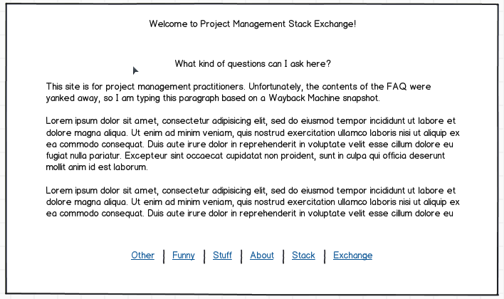
Has there been any A/B testing before rolling this feature out? In its present state the Help Center is a clickfest-heavy, sensory overloaded hive of pages. I had to use Wayback Machine to get the old contents and concoct a mockup of a better (IMHO) layout:

Mockup

7
  • 1
    Just a thought, redirect people to the tour page instead. That's the intended landing page for new users.
    – wax eagle
    Commented Jun 5, 2013 at 23:22
  • @waxeagle - New users are not going to read the landing page. Noone reads the ... manual until directed there by reviewers. There's still need in a FAQ page. Commented Jun 6, 2013 at 0:00
  • 1
    If your goal is to get someone to read about the scope of the site, and you're going to include a link anyway, is it really any extra trouble to link to /helpcenter/on-topic rather than /helpcenter? The use case we built this feature for is exactly that - where established users want to direct new users towards guidance on a particular issue...not for people who just say "go read the manual" in its entirety. It is very dense, but we're not expecting anyone to sit and read it all at once.
    – Laura StaffMod
    Commented Jun 6, 2013 at 13:52
  • 3
    @Laura - let me be frank - was a bit miffed by the disappearance of scope information that differentiated one site from another. Scope was painstakingly defined and refined by meta discussions. Now it's gone and inaccessible, and actually undiscoverable. The beauty of a single-page FAQ is that it is really discoverable - one only has to scroll up or down, and not be forced to click at obscure links, to discover without (or with minimal) prodding what the site is about. Commented Jun 6, 2013 at 14:07
  • @Laura - I retract my statement on inaccessibility - however, it shouldn't take THREE (a few more for the dense types like me, actually) clicks to get there. Commented Jun 6, 2013 at 14:15
  • 1
    I've posted a feature request to get a hotlink to the On Topic page, at least, so we can link people to it. You can find it here: meta.stackexchange.com/questions/184817/…
    – WendiKidd
    Commented Jun 19, 2013 at 16:35
  • 1
    We've added a big featured link at the top of /help that highlights the article explaining what's on- and off-topic.
    – Laura StaffMod
    Commented Jul 10, 2013 at 14:54
9

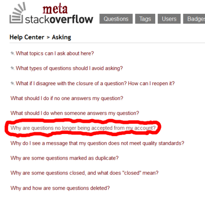
It may be worth while to add something like: "How to avoid Getting a question/answer ban" above Why are questions no longer being accepted from my account.

Or perhaps it would be better to re-title these sections with something like:
"Question/Answer bans: what are they, how to avoid them, and what to do if you get one."

enter image description here

While the current version isn't bad, it may be worth while to expand on it, hopefully new users will read it before they need to know why questions/answers are no longer being accepted from their account.

Also,
It might not be a bad idea to cross reference and add a warning about question bans on:
What types of questions should I avoid asking?

6
  • When they get that they're already given exactly where to go, for the record. If they're going to willfully ignore the instructions, that's that.
    – djechlin
    Commented Jun 3, 2013 at 16:06
  • @djechlin Is there an indication that you can get banned for poor questions and answers in the faq currently? Not that many of them read it... It would be nice to say that we gave fair warning.
    – apaul
    Commented Jun 3, 2013 at 16:13
  • 3
    @djechlin - One advantage I can see with this is that by hosting it on a discrete page within the help center on the site in question, we might have fewer people be directed to the Meta question who don't read it and just start posting on Meta. If they still have questions about the ban, the more observant users will find their way here to ask. That question and answer are also a bit long, so organizing the suggestions there into a help desk format could make it easier to read.
    – Brad Larson Mod
    Commented Jun 3, 2013 at 16:24
  • 2
    There already are pages for question bans and answer bans. They'll be easier to find once we add the search box in. Those pages link to How to Ask/Answer and the MSO post, along with a brief explanation that answer bans cannot be lifted by request.
    – Laura StaffMod
    Commented Jun 3, 2013 at 17:41
  • @Laura "Stack Exchange cannot lift answer bans by request" is not true. Community Manager can lift the ban, I've seen Tim Post doing it recently. Commented Jun 3, 2013 at 19:43
  • 4
    @Sha: yeah, we can "lift" the bans by, uh, making your history on the site look slightly less sad. Of course, so can anyone else who thinks something you've written is worth an up-vote. What we can't do is make you no longer banned without actually changing how you're ranked on the site.
    – Shog9 Mod
    Commented Jun 3, 2013 at 22:43
8

The "asking" section says -

If your question is about the site itself, please don't ask it here. Visit our meta-discussion site, where you can talk about things like what questions are appropriate, what tags should be used, suggest a feature, point out a bug, or generally discuss how this site works.

This was meant for the main site, no?

2
  • 2
    It's lifted straight from How to Ask, which has always been wrong on MSO :-). It should really open up to a list of questions filtered on meta. Commented Jun 3, 2013 at 20:58
  • I've removed that paragraph from that page on MSO's help center only. There are probably other tweaks that could be made if we had infinite time for tiny changes, but at least now there's no reference to a nonexistent meta-meta. :)
    – Laura StaffMod
    Commented Jul 5, 2013 at 19:05
7

Perhaps it would be a good idea to encourage users not to answer questions that are blatantly not a good fit for the site with a sort of "What types of questions should I avoid answering?" page within the Answering section of the Help Center.

When bad questions get good answers it reinforces negative behavior, the user who asked the bad question walks away with a good answer and is encouraged to ask more bad questions, worse still other users see that even terrible questions get answers and the problem spreads.

Please note I'm not talking about questions that are just poorly worded I'm talking about the more obvious questions that should be closed/deleted.

Suggested wording:

What types of questions should I avoid answering?

Please avoid answering questions that you know aren't a good fit for the site:

Answering questions that are not a good fit for the site simply encourages more questions that don't fit. Rather than answering please consider flagging/voting to close and or downvoting.

related: my answer to "Should one downvote answers to off-topic questions?"

2
  • reacting to chameleon questions is an advanced technique. We're not going to be able to explain the reasoning behind the best practices within the confines of a help centre entry. Ditto vampires. It will just become dogma that newish users quote at each other without understanding. But your first bullet I do support. Commented Sep 5, 2013 at 20:48
  • @KateGregory that's a good point, I certainly don't want to provide new ammo for snark comments
    – apaul
    Commented Sep 5, 2013 at 21:16
5

Your "What topics can I ask about here?" seems like it would be very confusing to a new user.

I clicked on it expecting to see it explaining the fact that SE sites have specific topics, and to read the FAQ/about page to find out what the exact topic is for a SE site, and instead see what looks like a page telling you what you should ask the help center about.

If we're going to be sending new users to the "help center" for help with the SE network then you might want to clarify that section or title in some way, as I think it would be one of the first links new users click on, and in it's current form does not seem very helpful.

1
  • 2
    This is one of the places where seeing it only on MSO is awkward. That page is going to pull from the current /faq#questions section (e.g., programmers.stackexchange.com/faq#questions). It looks strange because the MSO faq tells you that pretty much everything related to Stack Exchange is on-topic here. That being said, I'll make a note to clarify the page here on MSO.
    – Laura StaffMod
    Commented Jun 3, 2013 at 16:45
5

The About pages and Tours still have a "Visit the FAQ" link which goes to Help Center. These should be updated to indicate visiting the Help Center.

1
  • 1
    This has been fixed.
    – Laura StaffMod
    Commented Jul 5, 2013 at 19:01
4

I guess this is more of a question than an answer but it won't fit in a comment.

I'm a little concerned by this paragraph:

This Help Centre will (once we roll it out to all sites) replace the current FAQ pages. Each site will continue to have its own faq tag on meta, but any policy that is essential to the functioning of the community will be rolled into the appropriate section of the new Help Centre.

Does this mean that the current questions that are used in the Help Centre will be removed? There are only two possible answers to this question:

  • Yes:

    There are a constant stream of questions on MSO, and I'm sure the other "child" metas, that are duplicates of these questions. If the questions are deleted what are the communities on these sites meant to do with duplicates of them? Closing the duplicate without explicitly closing it as a duplicate of a valid question would seem quite harsh to a new meta bunny.

  • No:

    As already noted it's possible to edit the current questions. How will the divergence of the Help Centre and the meta archives be managed? Locking the meta questions means they get more and more out of date unless they're updated at the same time as the Help Centre, which will require significant additional workload (and for the editor to not forget). Not locking them means that they'll never stay the same.

P.S., I know I'm an essentially negative person but I do think this is sorely needed so kudos for getting it done.

1
  • 1
    We're not planning to delete the faq questions right now. As I said before, core information should be included in the Help Center, while nitty gritty details or community resources that are nice to have but not essential will continue living in faq posts. We really don't have major policy shifts or changes in site mechanics all that often, so SE staff will take care of making sure that the Help Center pages are up to date. It's okay if the Help Center and community faq aren't exactly the same at every moment.
    – Laura StaffMod
    Commented Jun 4, 2013 at 16:03
4

How does this affect the Analytical badge?

I've been trying on and off to get it for the last couple days, and just realized now that the entire FAQ section was recently replaced.

1
4

I find it odd that "What topics can I ask about here?" follows "What types of questions should I avoid asking?", instead of preceding it, on the list at /helpcenter. It seems sensible to learn what one can ask before learning what one cannot.

Update: This has been effected.

3
  • Agreed...in addition the moderator-editable part of the ---faq--- helpcenter is there, so it would be nice for them to see the "intro" to the site moderators may have put in there as the first item.
    – Zelda
    Commented Jun 6, 2013 at 19:59
  • 2
    Yup, there's a bug in the way that list is ordered right now. It'll be updated soon - it was always intended to have on-topic stuff appear at the top of the list.
    – Laura StaffMod
    Commented Jun 6, 2013 at 20:01
  • 1
    What's on-topic should be at the top of the Asking category for all sites now.
    – Laura StaffMod
    Commented Jun 13, 2013 at 20:15
3

The Help Center once rolled out will be site-specific, *.stackexchange.com/help-center. However, most of the Help Center will be common to the entire Stack Exchange Network and only a small sub-section will be site-dependent.

The motivation behind going site-specific would probably have been the current site-specific FAQ pages, but if we are going with an entirely new concept of a Help Center, why not relook this as well?

My suggestion : stackexchange.com/help-center, a centralized help center common to all of SE, with Community specific sections navigable through, say, a simple drop-down menu.

Pros :

  • Easier to keep up to date.
  • Easier bug reporting and tracking. If we go for site-specific Help Centers, then bugs will first be reported to the site-specific metas', then would have to be pushed forward by a moderator to a Community Manager. Moreover, there is a high probability of the same bugs being reported across multiple sites. If centralized, all bugs would naturally find their way to MSO/MSE and would minimize redundancy. Also, no bugs would be lost across the Network metas.
  • I voiced this above in a comment, repeating here. The Help Center could then have a single theme, and probably allow for even better and vibrant design than per site Centers. The only restriction would be to match with the SE.com theme.

Cons :

  • One more level of indirection to navigate to the per-site sections.
4
  • 3
    We monitor site-specific metas already. Once in a while mods do have to escalate stuff to us, but anything major we'll notice anyway. That aside, most people never need to know or care about The Network. They are happy participating on their favourite site and pushing them off to stackexchange.com would be a bit weird, I think. It behaves nothing like the Q&A sites, if nothing else, so linking to it from a site would be a jarring experience.
    – Adam Lear StaffMod
    Commented Jun 4, 2013 at 2:25
  • @AnnaLear I dont entirely agree with that. There is a fair bit of overlap amongst userbase of the SE 2.0 sites. Also, users who initially just participate on one site, may end up discovering the Network through the Help Center itself. However, something indicating the site from which they came to the help center would probably make the experience less jarring. For example, the help center could display the site-specific user flair on a corner of the screen. Then again, I think most users would probably understand the concept of help center and not feel lost.
    – asheeshr
    Commented Jun 4, 2013 at 7:24
  • A lot of popular sites have a special help section which is designed differently from the main site. And users who come to SE sites would at the very least be Facebook or Linkedin users and would understand the concept of a help center. The biggest advantage that this would give is that the help center could be made to look much better than it currently is. This alone could make people want to explore it.
    – asheeshr
    Commented Jun 4, 2013 at 7:29
  • I realize nobody clicks on it, but legal in the footer works like this. cc @AnnaLear Commented Jun 5, 2013 at 20:06
3

Can we have a shortcut for on-topic to replace [faq]? Something like [on-topic]?

4
3

I expected to find the /editing-help page somewhere in the Help Center. I couldn't find it via the menu system, so I used search. "Markdown" turned up no results. Searching "format" and "edit" turned up irrelevant results (from my perspective).

Can the Markdown help page be added to the Help Center?

1
2

Maybe it's a misinterpretation on my part, but I think the current flow is a little misleading: when clicking on take the tour at the main page in the helpcenter, we end up at the about page. This does not feel like a tour to me, it's more like a mission statement.

It may be better if this page also included stuff like what to ask, how to ask, the voting process ... since this is likely what most new people actually want to know (and that's the audience of the help page, right?). Perhaps it may be useful to include 'next' links to move to said pages step by step?

I realize that the main page contains links to how to ask-pages, but I think it may be useful to duplicate those links at the end of the current about-page.

4
  • 3
    Most other About pages on the network look better. For example, Ask Ubuntu.
    – jokerdino
    Commented Jun 3, 2013 at 14:37
  • Yes, those are the way I expect them to be. I assume the current About page will be of a similar form once it's finished. I mentioned this issue just in case it is planned to stay as it is now. Commented Jun 3, 2013 at 14:39
  • I was also disappointed that the 'take the tour' link didn't land me on an actual tour page. A link that lands you on the 'about' page should say 'about'. A link that says 'take the tour' should land you on the first page of an actual tour of the site's features.
    – RobH
    Commented Jun 4, 2013 at 15:50
  • @RobH The About page for every site other than MSO does give you a tour of the site's features - it explains asking, answering, voting, editing, accepting, rep, and badges, complete with animations. MSO is a special case.
    – Laura StaffMod
    Commented Jun 4, 2013 at 16:05
2

I'm guessing that there will be a link to this once it goes live site-wide, correct? The link should be prominent enough that users (especially the new ones) don't have to go hunting for it.

1
  • Yes, the current "faq" link in the top navigation will be replaced with a "help" link when this goes live everywhere.
    – Laura StaffMod
    Commented Jun 3, 2013 at 17:36
2

Minor, but it would be nice if breadcrumbs could be made consistent across all links. Subsections within the Stack Exchange Model section, for example, have breadcrumbs at the top, which is nice:

Help Center > The Stack Exchange Model

The Badges and Privileges lists do not have a link back to the Help Center, however:

Badges

2
  • 1
    This particular page isn't done yet - it still has the old design.
    – Shog9 Mod
    Commented Jun 5, 2013 at 19:25
  • 1
    The breadcrumb appears everywhere in the help center, now that the new badges and privileges sections are live.
    – Laura StaffMod
    Commented Jul 5, 2013 at 19:00

You must log in to answer this question.

Not the answer you're looking for? Browse other questions tagged .