15

We're really close to launching custom question lists and we're extremely excited to be in the final phases of fine-tuning the back-end notification mechanism and finalizing all of the UX components. If you haven't been following along, here are two things you'll need to catch up:

  1. Custom question lists help you drill into tags to find questions to answer with a much simpler view, and handy notifications. To see how the idea started and evolved, head to the original idea and follow the links from there.

  2. We're now at the end of phase III, where we're working on integrating the list and the notifications into the main design. That's what we're here to talk about, because there have been some changes.

We can't fully integrate custom question lists into the left nav.

There are many reasons for this, a lack of trying everything we could think of isn't one of them. In order for this system to be useful notifications have to work, otherwise we're just duplicating the ad-hoc feed readers folks are currently using.

Getting dynamic question lists and notifications AND everything else planned long-term for that space just isn't possible; it would be like paying off a high-interest credit card and running up a high balance again in a technical debt sense.

We want to put the lists in the left nav. We understand that, perceptively, it should seem easy for us to do it that way, but the reality is unfortunately that it's not.

The left-side navigation is a very important component for Teams & Enterprise users, but the dynamic nature of custom lists renders it a bad fit in the way things ultimately came together. We'd be stunting the feature by forcing it to live in a space where we ended up with more constraints than we imagined.

We're going to take over the right sidebar on /questions instead.

Details are still being worked out on what the actual design will look like, but the saved lists along with any notifications will be easily accessed on the sidebar on /questions and /questions/tagged/{tag}. For logged in users who see ads in the sidebar (i.e. users without the "Reduce Ads" privilege or users with that privilege who have opted to see ads), this means you'll no longer see the Community Bulletin (the yellow box that includes the "Hot Meta Posts" or "Featured On Meta" sections); your saved lists and indicators along with the UI for manipulating favorite and ignored tags will have higher priority. The Community Bulletin may come out of that view altogether, or move to the bottom (again, only for users who see ads). The important takeaway is, the yellow box gets the lowest priority.

If you don't normally see ads when logged in, the only major difference you'll notice is the addition of the custom lists and indicators, again, with the Community Bulletin losing priority. Essentially, we're optimizing /questions for the purpose that almost everyone has for visiting it, finding questions to answer.

This is our best long-term option, for a variety of reasons.

Another equally important reason for the change is, the left nav is very constrained when it comes to possibilities. While shoehorning something in there with a bit of patch work and silver tape is technically feasible if we take on debt, there's little to no room for features like question lists to evolve and mature in that location. Yuck, more debt!

Being in the left nav makes everything harder if you're a dynamic feature; having the run of the right sidebar in /questions gives you a lot of freedom to grow and evolve.

We wanted to have some screen shots ready, but we're not quite there yet.

We'll be very open to feedback (especially anything of an accessibility / HID mileage, etc) concern. We want to get the MVP out and in use, see how everyone ultimately settles on use, define the right use cases for iterative tests for when we make changes, and then we can go from there.

Our target ship date is before the end of the month, but we'll update if it's going to push more than a week into next month. We're launching this along with some other stuff waiting to go out as soon as all the cogs appear to be turning correctly; there will be more about it on the blog and some of the folks that worked on it will also be sharing their stories of working on the project on their personal blogs, which we'll link to.

All in all, it's coming out better than we envisioned, and we're really excited to once again be working with everyone on iterative improvements to really bring great tooling to folks that just want to find interesting questions to work on.

Questions? Thoughts? Please leave an answer below so any comments are easy to correlate and parse.

8
  • By /questions, do you mean just the questions page (the list of questions), or does this also include /questions/[post ID]/post-title pages as well? Commented Mar 21, 2019 at 16:47
  • 1
    @SonictheWizardWerehog /questions and /questions/tagged/{tag}.
    – user50049
    Commented Mar 21, 2019 at 16:49
  • 2
    You might want to clarify this will appear on the /questions/tagged/{tag} pages as well in the post itself. I only have a gut feeling on this but I would imagine /questions itself isn't actually used all that much. For users like me who have the left nav hidden I'd imagine it's used even less. Commented Mar 21, 2019 at 16:57
  • 10
    I'm not sure how I feel about the community box being hidden. I know that there were some users who complained about massive changes to the site, and the response to those people was that the changes were announced in the community box. Now if that box is hidden, there would be no way to alert people of future changes. Commented Mar 21, 2019 at 18:07
  • 3
    Would it be possible to just add another hamburger menu for the custom question list? Why stop at 2! :D
    – Travis J
    Commented Mar 21, 2019 at 18:10
  • 1
    @TravisJ but then we would need a way to highlight any new activity on questions. A bit like with review queues. You see a red dot when there are important things and when you click on the review queue icon you see the details (where are new things) Commented Mar 21, 2019 at 18:12
  • 3
    I don't quite understand how the yellow meta box figures into this. You're saying it will disappear for <200 users, but does this only happen for the questions page or for all pages? Your post also makes it sound like its disappearance is vital for this to work, while the fact that it is still there for >200 users would mean it isn't. Was this just an independent design decision based on <200ers not caring for meta too much? And to make super sure, for >200ers there isn't any change in that box to be expected in the future, right? It is quite important really. Commented Mar 21, 2019 at 18:48
  • @ChristianRau 200+ rep users have the privilege to not see a sidebar ad, so the Community Bulletin shows up instead. That said, it would be nice to hear if it's going to be hidden for 200+ rep users who opt to keep advertising enabled. Commented Mar 21, 2019 at 18:52

5 Answers 5

22

A large push for the left nav across the network was Custom Question Lists, seeing as you are no longer using the left nav for this will this space be used for anything else in the future?

I understand it is still used for Teams and Enterprise users but for those of us not part of these products there is a lot of space wasted so it would be good to know if there is a plan to use this space for anything else.

3
  • 5
    The push was because SO Teams needed the left nav, with CQL presented as a post-hoc justification for other sites.
    – user302202
    Commented Mar 21, 2019 at 17:11
  • The answer is yes, but we don't know what yet. That's not because we have no plans, it's just that we don't have any that are fully baked enough that we'd want to say yet, or we just risk making this recursive (where we say "Hey, we can use the space for [x]" prematurely, and end up not doing it). I don't want to seem evasive, and Joe was 100% confident when he said we'd use it for the CQL, Joe just couldn't have anticipated the things that got in the way of it. Architecture and perf issues often creep in at the last few minutes.
    – user50049
    Commented Mar 21, 2019 at 18:08
  • 2
    Or, more simply, the best way to realize you have a bottleneck is to have just created one. They often surprise you, and ... these things happen. We always do try to build things the way we initially discuss them but that kind of transparency has the unfortunate side-effect of sometimes disappointing folks. I feel bad about that (not that I have things to be sorry for, but you can feel bad about something without feeling guilt).
    – user50049
    Commented Mar 21, 2019 at 18:11
22

Since we have no current plans to make use of the left-nav column for anything else, but its presence is essential for SO/Teams, I'm re-raising a request from earlier in the left-nav saga:

: have left nav default to collapsed, not expanded.

If I have an account and am logged in, I can (and do) collapse the left nav using a profile setting. But if I visit a site where I don't have an account or am not logged in, I'm stuck with it. (These are things I sometimes need to do, particularly as a moderator.) With even slightly larger fonts or a non-humongous browser window, this squishes questions a lot. Further, it contributes to a terrible first-time experience for new users.

New users aren't likely to be looking for the questions list (as opposed to the front page they're on) and probably don't care about the users list, and it's only a special few who'll jump into browsing the tags list. We're not putting anything else there. So please default to showing more Q&A instead. If you also add a tooltip to the collapsed-nav control (there's none there now), you can make the left nav more discoverable without grabbing all that unused page-width. Or, if there's a concern that visitors with accounts won't think to check that hamburger, we could add wayfinding like you see on SO occasionally when there are new announcements that light up next to the logo, or like those in-page "tours" that some sites have. (Just make sure the user can dismiss it after reading it.)

Users with accounts can use a profile setting to enable the left nav everywhere. Experienced users will know that, and I'm confident that we can provide UI hints too. It looks like reversing the current default would maximize global utility. Please do it.

12
  • 5
    Indepenent of this, I wonder if you ridea of putting the site switcher there might also make more sense now, though, since I remember a primary hindrance to that were the supposedly new custom question lists. Commented Mar 21, 2019 at 19:12
  • 2
    @ChristianRau good point. Now that -- on all sites except SO -- the left nav only ever has five menu items, it seems strange to have it be separate from another widget that only has about 7-8 menu items and a search box...
    – Monica Cellio Mod
    Commented Mar 21, 2019 at 19:22
  • 4
    @Catija sure, eventually, if we find a use for it. Meanwhile, it's taking a lot of real estate out of circulation. We could always revisit defaults when there's more content, just as I'm proposing revisiting the default now when we know there won't be any time soon.
    – Monica Cellio Mod
    Commented Mar 21, 2019 at 21:13
  • 1
    I think the solution that really solves your problem is to have the preference apply on all sites, not only those you're a member of. The thing is, hiding these links by default in a hamburger on a full webpage view makes for pretty bad UX because non-logged-in users will not be able to find them easily. People shouldn't have to poke around in hamburgers to find these links. I just think it'd be more fair for your answer to say that there's no current plans rather than that it "probably won't be" made use of.
    – Catija StaffMod
    Commented Mar 21, 2019 at 21:19
  • Collapsing the left sidebar hides the Questions link, that’s a very important navigation item for me. Hiding that behind two clicks is seriously annoying. I don’t think the current collapsed state is good enough to be a default. Commented Mar 21, 2019 at 22:50
  • 5
    @MadScientist but you're not the target -- you're an experienced user and you can set a preference (especially if we go with Catija's suggestion to apply it everywhere, including where you don't have an account). People coming from Google, on the other hand, are unlikely to be using anything in the left nav, even questions -- they're landing on the main page which already gives them a list of questions, after all, and why would they think that a "questions" link would be any different? For them, the left nav consumes a lot of space without providing value compared to more space for Q&A.
    – Monica Cellio Mod
    Commented Mar 22, 2019 at 0:54
  • 1
    Preferences are not an acceptable solution to bad default choices, odds are that the vast majority of users will never touch them. The problem here isn't necessarily that the sidebar is expanded by default, it is that it collapses last in the responsive design. The current responsive design is simply unfinished and broken. Commented Mar 22, 2019 at 10:39
  • 1
    @MadScientist "bad default choices" is in the eye of the beholder. (I supported my argument.) The left nav collapsing last is a big problem, I agree -- is there a meta post that covers that?
    – Monica Cellio Mod
    Commented Mar 22, 2019 at 14:03
  • The preference to hide the left sidebar is a hack, it was done this way because the preferences system exists and it was easier. If your screen is wide enough to fit all content, the left sidebar doesn't hurt the other content. The issues you mention come into play once the screen is too narrow for everything, and this is something that needs to be fixed in the design, not with a preference. Commented Mar 22, 2019 at 15:09
  • 1
    I'm not sure anyone bothered with a meta post about the priority of resizing in the responsive design, though there might be some answers on the big topics about it. My personal reason for not posting full questions about it is that SE said the responsive design is unfinished, and chasing after this kind of moving and ill-defined target is rather futile as an outsider. The design also seems to have plenty of constraints I don't understand or can't follow, which makes it hard to make any useful suggestions. Commented Mar 22, 2019 at 15:11
  • 1
    I wish I could upvote this a hundred times. On the other hand, I would have to agree with @MadScientist, they really need to adjust the threshold when the sidebar goes away. Personally, I would like it if SE adopts the design of YouTube. The sidebar is all the way to the left and disappears long before it severely affects the width of the content. Commented Mar 22, 2019 at 18:56
  • 1
    Also wanted to add another observation about youtube. If you happen to be logged in and you subscribe to channels. You will notice that a list of your subscriptions show in the left sidebar and a blue indicator dot shows up if there are new videos in any of your channels. This is very useful to me and I don't see why the same design couldn't be used for custom question lists. Commented Mar 22, 2019 at 19:37
17

I'm quite confused by this change, there doesn't seem to be a big difference between putting the list on the left or on the right. The left sidebar isn't as wide as the right one, but I assume that is not the reason behind the switch. I also don't see how performance would be different, unless I'm misunderstanding the post and the custom question lists on the right sidebar are not present on every page.

The community bulletin is quite useful to draw attention to meta. That might not matter much on SO, but it can matter on smaller sites. Putting this in a less obvious position is not without consequences.

I don't understand why the "reduced ads" privilege plays a role here, as the sidebar ads are not affected by it.

And if the left sidebar is fundamentally not suited to displaying dynamic content, was adding it really the best way to fulfill the needs for the Teams feature? If you can't fill it with more content than it has now, it will remain a significant waste of space. Especially as it collapses last in the responsive design. And hiding it isn't a good option, the "Questions" item in there is probably my most often used navigation element, putting that behind two clicks is seriously annoying.

Maybe allowing users to put a non-dynamic list of bookmarks on the left sidebar would be useful enough. The bookmarks could be individual custom questions list, links to other SE sites, or mod tools, or a page with an overview of all custom questions list and how much new stuff is in each.

6

While I am also a bit sad that the left-nav was no possible solution (because it seemed to fit perfectly), I understand that you have technical reasons and I trust you that you attempted everything in order to put it in the left nav.

I have one though:

Please don't put the notification area (or however it should be called) at the bottom of the page when on mobile.

It is already tedious to look for community bulletin changes and I think that the notification feature will be used way more often than the bulletin.

Ideally, you would put it somewhere to the top or in some kind of menu (no idea, not an UX designer :P). I like how you did it for the /review page with the This site is moderated by you banner that floats to the top when on mobile.

2
  • 1
    I know that in the responsive configuration, we're optimizing to keep them at the top. That's why the community box is being de-prioritized (on full desktop view, all the way down to small screens) in the responsive design. I will add a note to make sure this carries over to the mobile theme deliberately.
    – user50049
    Commented Mar 21, 2019 at 18:03
  • 8
    @TimPost for sites that have it, please make sure the professional-services disclaimer remains visible. (Currently it's at the top of the right column.)
    – Monica Cellio Mod
    Commented Mar 21, 2019 at 19:46
3

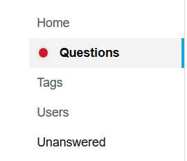
I am not sure whether this is possible for technical reasons and I know that the core part of your change is to remove indicators from the left nav, but it would be really great if there was only a single indicator in the left nav that there are updates on any custom question list.

Not having this would kind of defeat the point of not updating a question list all the time to see updates.

Upon clicking the question link I would then be able to see the details (similar to how the review queue indicator works).

I imagine something like this:

Example image of proposed change

You must log in to answer this question.