5

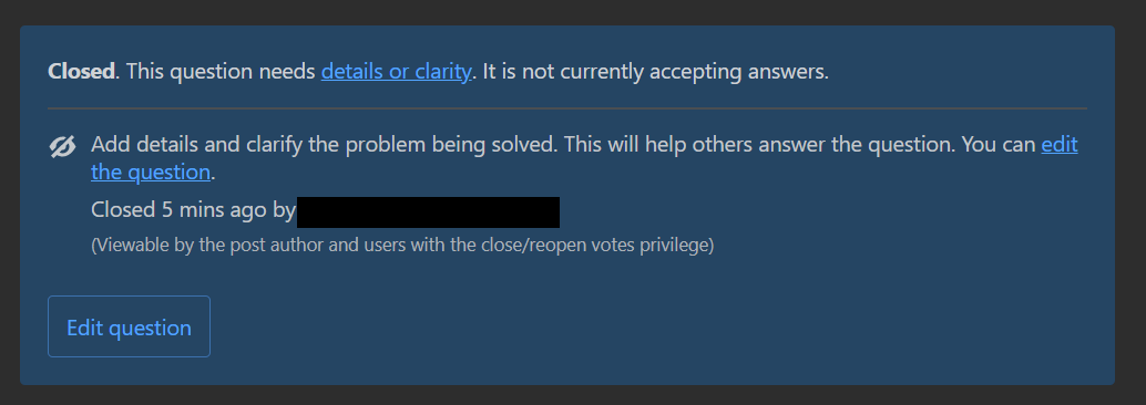
Did the box color above closed questions change?

Is this a bug somehow related to the recent color bug from the theming API in Stacks? Or is the current color meant to remain? I seem to notice the current color scheme degraded contrast and readability of text inside the box.

enter image description here

1
  • 2
    @Glorfindel just confirmed by Ben Kelly here: "This issue is not related, but was introduced with the same release. We already have a PR in progress here if you're interested in following along".
    – bad_coder
    Commented Jul 23, 2021 at 16:54

1 Answer 1

6

Yes, but we've just pushed live a few tweaks to address the contrast of these colors in dark mode. Here's how the box looks as of the time of this post:

enter image description here

We're not quite 100% satisfied with the algo we're using across all of our colors in dark mode, but we wanted to at least improve it for now and not let perfect be the enemy of good.

1
  • But imperfect certainly isn't it's friend either. Due to time constraints there exists a limit to the research time available, but Google and Adobe have extensive experience and documented tools for creating accessable content across various devices; dark or light mode. --- Check out Adobe's open source solution, with light/dark switcher at top of the webpage: spectrum.adobe.com/page/principles opensource.adobe.com/spectrum-css/button-over-background.html
    – Rob
    Commented Jul 23, 2021 at 21:14

You must log in to answer this question.

Not the answer you're looking for? Browse other questions tagged .