Update:
Since this was posted, we've taken your input below, and incorporated it into a newer prototype, described here:
Profile Page Makeover, Part 2: the Prototype
The Big Idea
Create a page on the network that summarizes who I am as a developer, and lets me show off the stuff I am most proud of. Some of this information is only available by creating a Careers profile, but we want to open it up to everybody, even if you don’t have one.
Background: The Problem
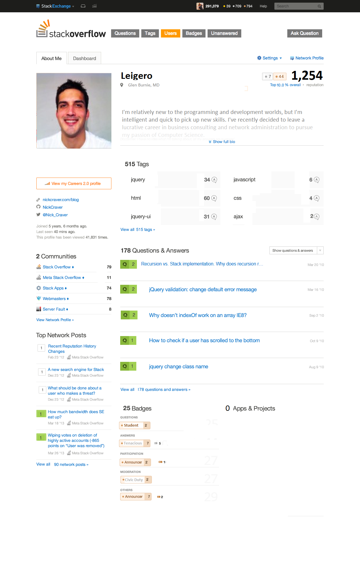
Our current user profile page tries to do too many things. It is trying to make basic user info available for a person who knows nothing about me (by showing my name, website, “about me” text, etc.), and at the same time it’s trying to give me information about myself (by showing reputation, activity, etc.). The result is a cluttered, confusing page that isn’t optimal for either party.
It is also missing key information that is captured in the Careers profile but cannot fit into the existing user page. I want to show off my open source projects and apps, but there is no room for them except the free-text “About Me” section. When we add in all of this new stuff, it’s just too much.
So where do we put everything? We looked at meta posts, and metrics, and heatmaps...and we found out that the use cases for this page split neatly into two groups: what users want to see when they’re viewing somebody else’s profile, and what users want to see when viewing their own profile.
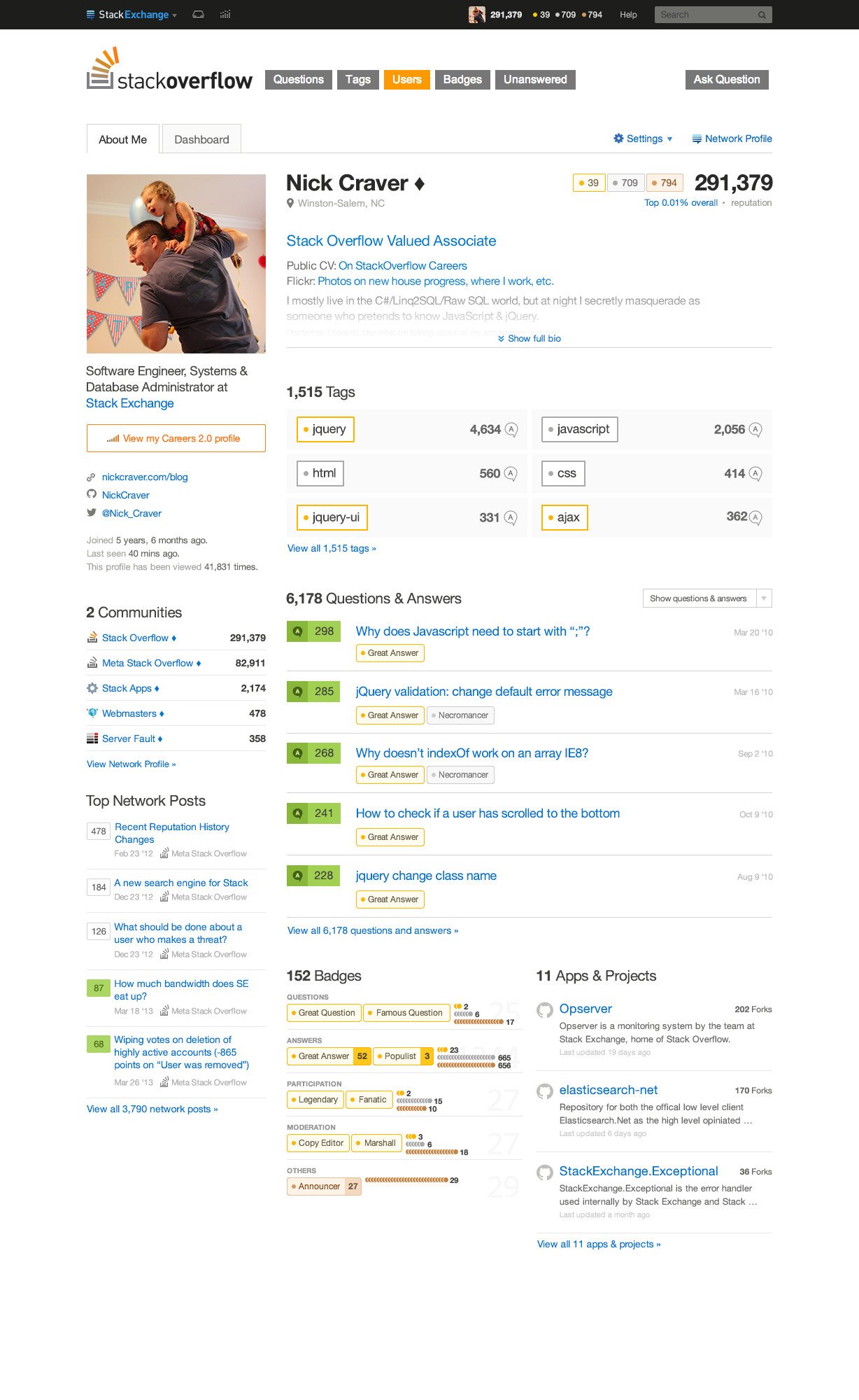
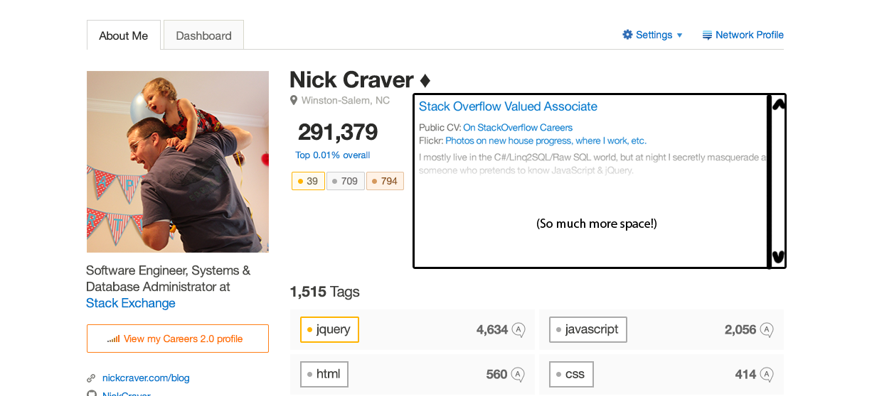
So, we are proposing a split for the profile page: a new, more specialized user profile page, called About Me, that summarizes who I am as a developer and shows off the stuff I am most proud of. We’re focusing on summary and context, instead of a big page of numbers and lists.
The existing profile page, which we will call a dashboard for now, will remain the same except for losing the bio section at the top. We’ll come back around to that sometime later.
The Design
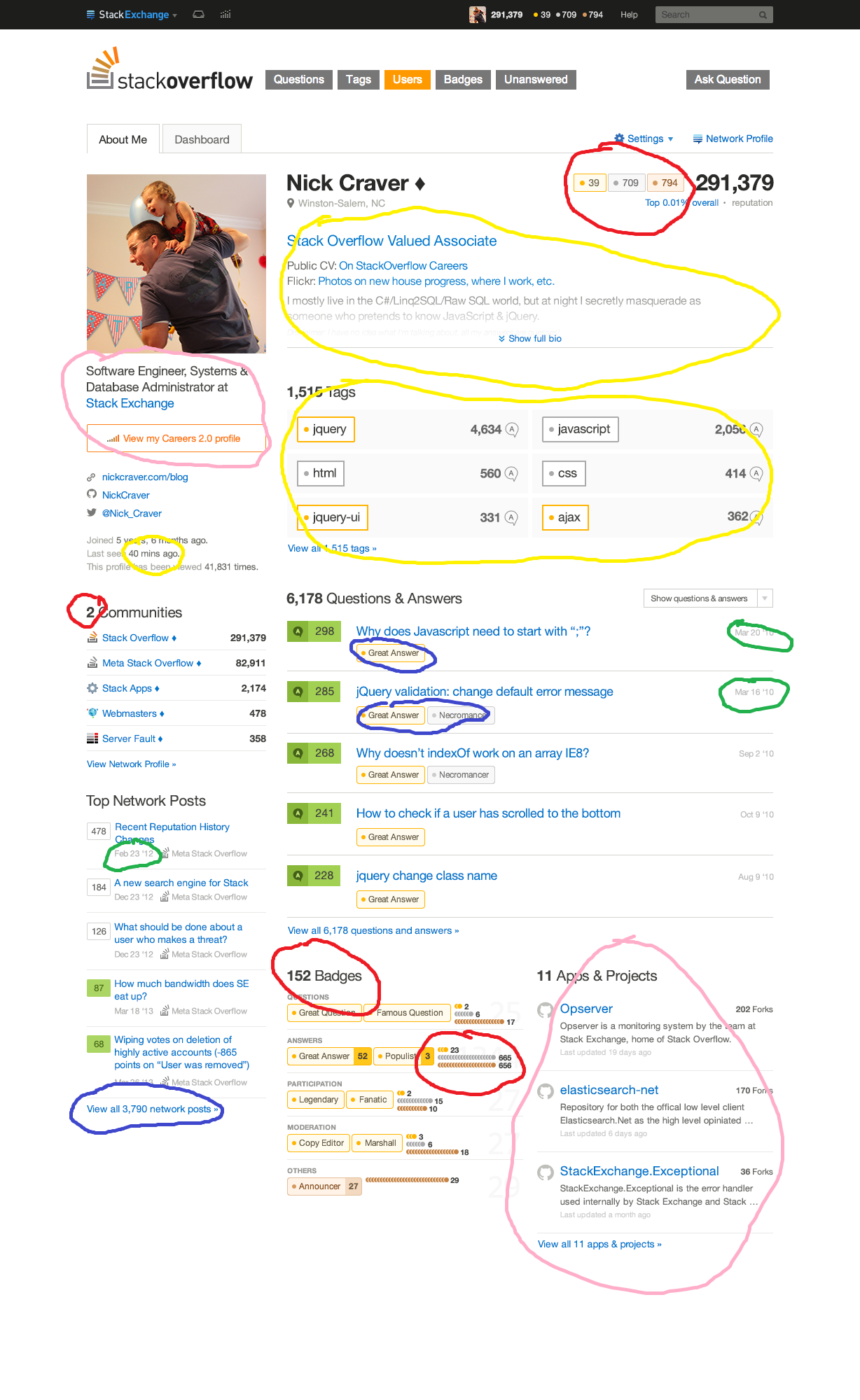
The bio information is the core of the about me page, so we keep that at the top: Screen name, reputation and rank, badge, long bio. You’ll now be able to include your current employer and position, even if you don’t have a careers profile.
Your tags are a good indicator of your interests and aptitude. We bring the tags higher on the page, and make them bigger. They’re limited to your top six, and we have special bronze, silver, and gold styling if you have earned the corresponding tag badge. This section is now interactive, allowing users to click on your tags and drill down into your posts in that tag.
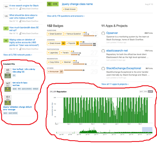
Questions and answers go immediately below tags. This section gets more real estate than the old version, and we’ve integrated post-related badges into the display. If you’ve received a badge related to the post, it’ll appear below the title. We’re experimenting with a new votes display, which may or may not make it into the final version.
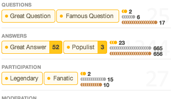
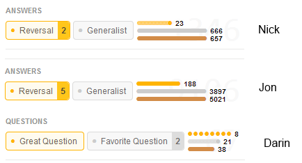
The badges section used to just be a list… Of badges. A huge list. Some people have thousands. Nobody ever scrolled through all of them. We’ve now broken down the badges into categories for better, quicker viewing. Your two most important badges in each category get featured status, and the rest get a visualization.
More links to other services. The left sidebar will now have a section for including links to your Twitter, GitHub, and portfolio/website.
More network awareness is coming to the page. Your top posts of all time on the network will now be visible in the lower part of the sidebar, along with your top network sites.
Applications and projects are coming over from Careers. You’ll now be able to list your applications, open-source software, and other projects on your Stack Overflow profile.
What happens to the existing user page?
The current user profile page will stay, without the user information section at the top. Everything you could get to before will be accessible through this page.
How do I navigate between the “About Me” page and the existing page?
Whenever you click a user link from a post or the users page, you’ll be linked to the “About Me” page. If you click your name in the top bar, you’ll go straight to the current page, as always. You can navigate between them using the tabs within the page.
What about sites other than Stack Overflow that won't have Careers elements?
There won't be an applications and projects section and the badges section will be full width.
What about moderator stuff?
Everything will still be there. We are just going to put it in a box at the top of the page. Design TBD.
This is a draft, and is still open to change, especially elements that might have to be reflected throughout the site (vote indicator boxes, etc).
This is where we open the floor for comments. You know the drill: Try to keep it to one request/comment per answer, and upvote/downvote according to your agreement. We’ll do another round of revisions to take feedback into account.







The result is a cluttered, confusing page that isn’t optimal for either party.that's almost literally what I said, many times over, when the profile page got its current design a couple years back. Not that anybody gave a damn back then beyond "well if you want it changed, you can always make a feature request". Just sayin'.