5

There is a strange display issue with the comment flag popup.

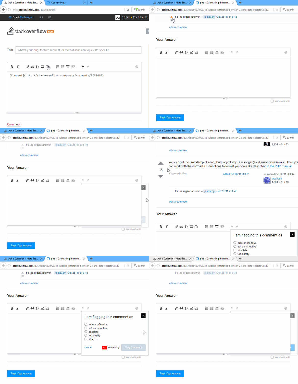
When I open a comment from the Data Explorer, the comment appeared in the top of the page. Then I click the flag link, the popup box is appeared but overlapped with the Answer box.

This strange issue occurs when the comment's answer have the negative points and the answers are ordered by votes.

Order by Votes

But I can manually click the partial visible part of the popup to flag the comment. Initially I found the issue in Stack Overflow and posted in its meta. Later I see the same issue in other SE communities too, so I posted here.

The following sample comments with negative votes, can be produce the issue:

The same is in the below GIF format:

GIF for the issue

It happened in the Google Chrome, Mozilla Firefox and Internet Explorer browsers.

4
  • I have seen the flag dialog lose opacity when the answer gets gray, but I have never repro'ed this.
    – M.A.R.
    Commented Aug 31, 2016 at 11:56
  • @hichris123 shouldn't the dupe target be this? it has an answer.
    – user310756
    Commented Sep 1, 2016 at 0:04
  • It can always be reposted, @Yvette. :) Since that one was a year earlier, and both are about the same quality, I figured the older one could be the target.
    – hichris123
    Commented Sep 1, 2016 at 0:08
  • @hichris123 I didn't see it was a dupe (obviously). I thought that is they have similar upvotes, that the one with the answer should be the target. Anyway I believe it's status by design.
    – user310756
    Commented Sep 1, 2016 at 0:10

2 Answers 2

2

As discussed in user3956566's answer, the root cause here is partial opacity applied to the children of elements with the comments class.

Given the only children that actually need opacity are the children of the elements with the comment-text class, the simple solution is to just apply the styling to those instead.

With this done, the transparency and answer-form collisions no longer occur.

4

What is happening is the comment flag dialog box is in the same div as the downvoted answer, which is set to fade without focus, so when the cursor brushes the following div, which is often a post answer box, the dialog box is fading with the downvoted answer.

With a post new answer box beneath the down vote answer, as you have demonstrated:

enter image description here


The same can be demonstrated with a Question status beneath the low voted answer:

enter image description here


The pop up is in the same div as the answer:

enter image description here

enter image description here

enter image description here


The question status notification is in a new div:

enter image description here

enter image description here

2
  • I believe this is status by design.
    – user310756
    Commented Sep 1, 2016 at 0:00
  • Relevant CSS is .downvoted-answer .comments,.downvoted-answer .post-signature,.downvoted-answer .post-text,.downvoted-answer .vote>*{opacity:.5;transition:opacity .5s}. The comments flag dialog is a child of the div with the comments class.
    – CalvT
    Commented Jun 12, 2017 at 10:50

You must log in to answer this question.

Not the answer you're looking for? Browse other questions tagged .