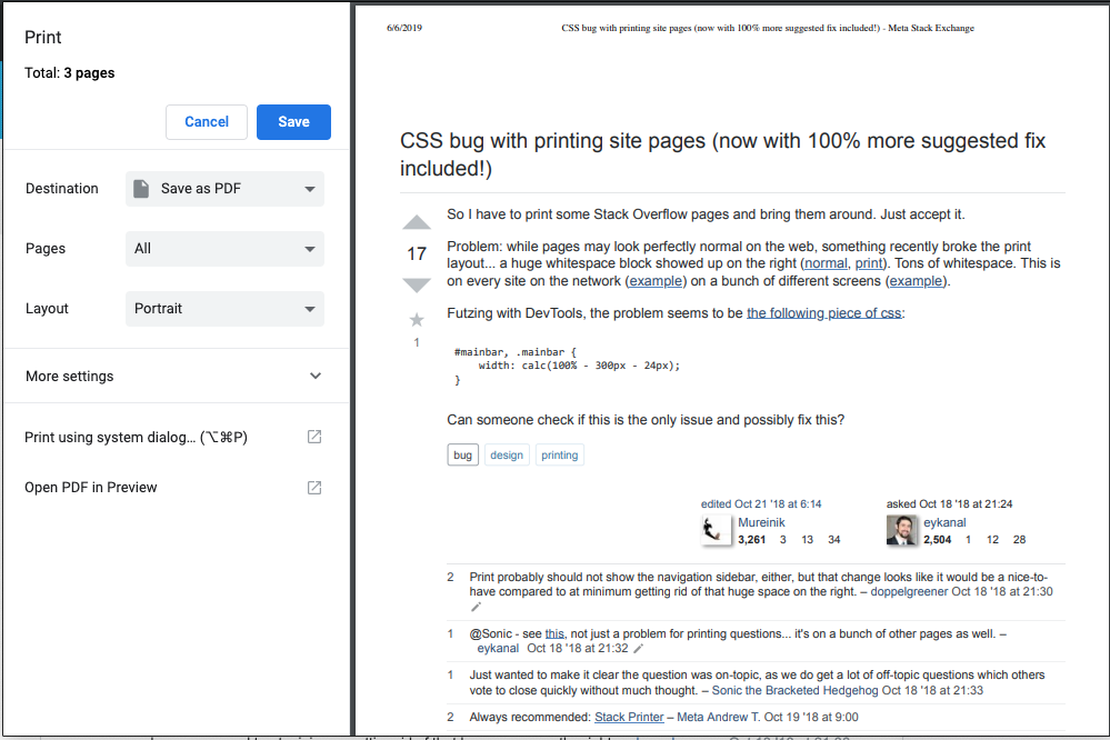
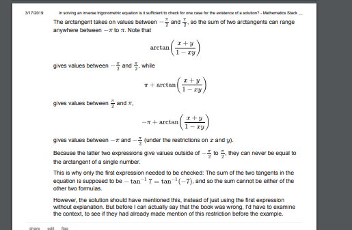
This is fixed.

Our previous style rules were more or less, "If we're printing, hide this list of elements."
Now, it's a lot smarter, thanks to responsive design. We have a few methods for handling responsive breakpoints:
.if-responsive-and-below-breakpoint(@breakpoint, @rules)
.if-responsive-and-above-breakpoint(@breakpoint, @rules)
.if-responsive-and-between-breakpoints(@smaller-breakpoint, @larger-breakpoint, @rules)
These methods let you turn on extra styles if you're on a narrow screen. For example, the following code constrains page content to accommodate a sidebar. When the page gets narrow, the width expands and the sidebar moves below the main content.
#mainbar,
.mainbar {
    width: ~'calc(100% - @{sidebar-width} - @{su-24})'; // 100% - width sidebar - spacing between sidebar and content

    .if-responsive-and-below-breakpoint(@breakpoint-l, {
        width: 100%;
        float: none;
    });
}
I simply amended if-responsive-and-below-breakpoint to treat printed pages as the narrower than any breakpoint, so it would render in the same way as a mobile view:
.if-responsive-and-below-breakpoint(@breakpoint, @rules) {
    // ...

    // Print is the smallest viewport, below medium and large
    @media print {
        @rules();
    }
}
I also added some small refinements, hiding a few elements like "Ask Question" as well as removing some vertical padding from the hidden topbar.


