12

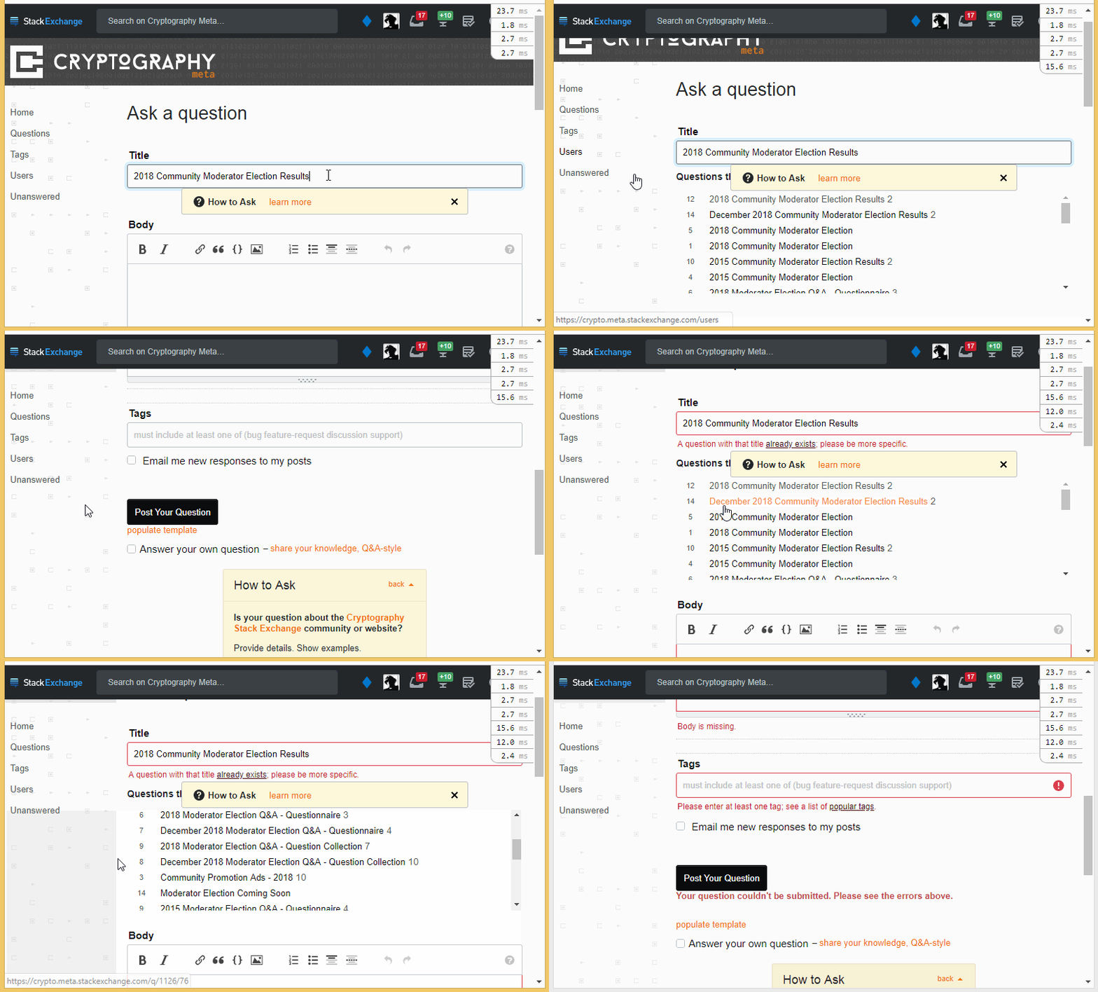
Over on Cryptography, I was wrapping up their recent election. When I got to the meta post announcement, it wasn't posting and I couldn't tell why:

Why isn't this working?

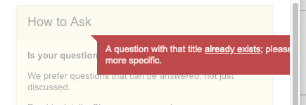
Turns out there was already a 2018 Community Moderator Election Results announcement I made in February. But I didn't see the error because the page didn't scroll back to the title:

Oh. I wrote that already.

I'm using macOS version 10.14.1 and Chrome version 71, but I happen to know it also happened in a previous version of Chrome before I updated. In the past, I'm pretty sure the page did refocus. It does on Enterprise for sure. In addition, on Enterprise there is a notice under the "Post Your Question" button in case the focus doesn't change:

I done screwed up.

On the plus side, the new error message on the Title box is clearly superior to the old popup that was liable to drift offscreen if you changed your window size:

Hello there!

At any rate, just refocusing to the Title if there is an error would make a big difference. (And I think the title errors should take priority over tag or body errors if I have those too.)

1 Answer 1

8

This was apparently triggered by the move to inline "Stacks" validation a few months back. The editor currently supports both inline and old-style pop-up validation messages, but the checks on submission responsible for scrolling (and displaying the message below the button) weren't updated to be aware of the newer styles... As a result, it would fail to find the old-style messages and just give up, leaving you staring at the button.

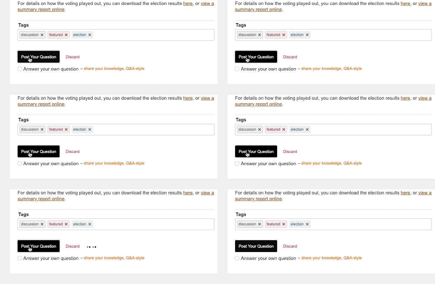
I've updated this logic to work with both sets of styles. If there's an error specific to an element, that element will be scrolled into view; if that doesn't happen for some reason (or you scroll away from it), the message below the button will be rendered as a reminder until the error is cleared.

Message "Your question couldn't be submitted. Please see the errors above." shown below "Post Your Question" button

animation of the scrolling that happens when validation fails

2
  • The error message under the button needs a tad of white-space at the top, no? Or is that due to interference with one of your userscripts?
    – rene Mod
    Commented Jan 2, 2019 at 16:23
  • Not my scripts this time, @rene (good eye though - the actual page doesn't have a "populate template" link on it...). I guess it could stand to have a bit more space there, but I'm not overly concerned right at the moment.
    – Shog9
    Commented Jan 2, 2019 at 16:49

You must log in to answer this question.

Not the answer you're looking for? Browse other questions tagged .