12

I know this has been posted years before, but screens have become wider...

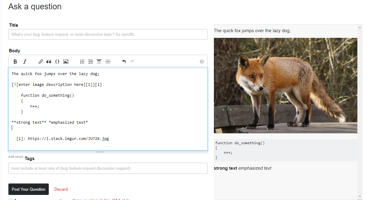
It would be nice if it was possible to have the editing window and the result/preview window visible at the same time.

When the question is long, I have to scroll up and down all the time to see if the formatting works as expected.

The preview could be put into a scrollable div, ideally it would scroll in sync with the editing window. Even better would be to have a mode where the editing and preview were in separate columns, side by side; on most modern screens the resolution permits that.

The left column could collapse into a topbar or a hamburger menu, the "Similar Questions" in the right column should end at the same height as the "Questions that may already have your answer" in the middle column..

Something like this:

enter image description here

6
  • 3
    Can't deny, this would be nice as an option. On my phone / laptop, I'd hate it. But when I'm editing some huge complicated post and have a big screen to do it on, I'd love to make better use of that space.
    – Shog9 Mod
    Commented Jan 18, 2019 at 0:18
  • I reposted this myself, before the original got migrated, and added links to 9 year old similar posts. So I (tried to) delete the original.
    – Lenne
    Commented Jan 18, 2019 at 0:18
  • 1
    "ideally it would scroll in sync with the editing window" - Just saying, that's pretty much impossible given that the two can have completely different heights. E.g. in your very example, the image rendered has a very different height than the ![image](link) syntax. But otherwise I don't see why this couldn't be a future project given we have responsive layouts now.
    – animuson StaffMod
    Commented Jan 18, 2019 at 0:20
  • If that's not possible, then perhaps when I scroll the editing window, and click in it, the equivalent preview should at least be visible.
    – Lenne
    Commented Jan 18, 2019 at 0:27
  • I agree with the preview window automatically scrolling with the edit window. (At least whenever the vertical position of the cursor in the editing window changes—you need to be able to manually scroll the preview window at times.) But I don't agree with it floating right or left. I think it should stay underneath, as it currently is. Having both visible at once should still be possible, even as screen size lessens. Commented Jan 18, 2019 at 0:28
  • 7
    Check out stackedit.io for a pretty snazzy implementation of this, BTW
    – Shog9 Mod
    Commented Jan 18, 2019 at 0:36

0

You must log in to answer this question.