17

I just saw now that the line between the number of answers on a question, and the answers to that question, has vanished:

No longer a line

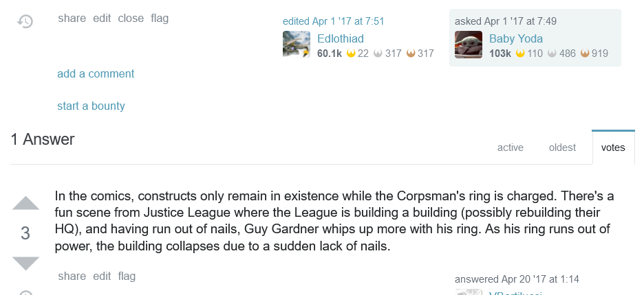
There used to be a gray line between those two parts (where the red freehand circle line is in the above screenshot):

former look

Can this line please be brought back? This line provided a clear differentiation between the number and sorting controls at the top, which are global to all the answers, and now they look specific to the top answer.

It appears that the line was part of the sorting button markup, which used a tab bar style, but when that was replaced with the buttons seen today, it was removed along with it.

3
  • Hey Sonic, turns out I asked the same but didn't find your question because I only searched for dupes in the FR tag. Mind if I add it?
    – Jenayah
    Commented Mar 20, 2020 at 9:26
  • @Jenayah The removal is a bug, in my opinion, not an intentional feature change. Also, I'd recommend leaving out tags when searching, because occasionally people can use different tags (e.g. support, which I've used to ask about why things were implemented, etc.). Commented Mar 20, 2020 at 9:29
  • 1
    'K, I've just added a screenshot of the former for clarity, then.
    – Jenayah
    Commented Mar 20, 2020 at 9:32

1 Answer 1

4

I removed the line as part of refactoring the sorting controls from tabs to the new controls we've been rolling out in various places over the last couple years. Having tried it both ways, Aaron and I settled on removing the line because it looked out of place with the new controls (unlike before where it tied into the tabs) and more like clutter than anything else.

I understand that it's a change to a UI that's been in place for years, if not the entire lifetime of the site, so any change is guaranteed to feel jarring. But, give it a bit (more?) time and I think you might find that you don't miss it nearly as much as you felt at first you would.

5
  • I know to wait a while for design changes to settle; I learned that with the new 2018 designs. In this case, I wasn't aware that it was an intentional design change and thought it was a bug (so I tagged it as a bug). Commented Mar 23, 2020 at 22:46
  • 1
    It might be possible (don't know yet) that 6-8 weeks later, I still don't appreciate the change. What's the ballpark delay time that you'd be willing to accept a feature request to change the design, if things turn out that way? Commented Mar 23, 2020 at 22:48
  • @SonictheAnonymousHedgehog Off-hand... a literal 6-8 weeks sounds reasonable to me.
    – Adam Lear StaffMod
    Commented Mar 23, 2020 at 22:58
  • 1
    The page looks strange to me without the line separating the # Answers + controls from the first answer. It's even more strange with multiple answers and a line separating each of the other answers from both other answers and from the "Your Answer" area. Effectively, this has been changed from something that was more-or-less symmetric (a line before all answers, between answers, and after the answers) to asymmetric, which leaves a feeling of "strangeness" when looking at the page. Looking just at the # Answers + Active/Oldest/Votes area, it leaves it less clear what those controls are for.
    – Makyen
    Commented Mar 24, 2020 at 0:29
  • There are lines under the new controls in the user profile page (i.e. meta.stackexchange.com/users/current where it shows the list of questions and the list of answers), so it seems inconsistent here. Or will the lines be removed in the profile page as well? Commented Mar 24, 2020 at 19:49

You must log in to answer this question.

Not the answer you're looking for? Browse other questions tagged .