35

We all have our pet projects - things we wish SE would do but which seem to be forever stuck in the backlog pile. Other times, something that's well received gets forgotten in the shuffle.

Inspired by the post here and my own complaints about backlogged features, what would the community, both on Meta and network-wide benefit from SE paying attention to?

6

16 Answers 16

34

The dead new user onboarding project

I want to see new user onboarding more seriously- particularly helping new users understand what the platform is, and how to use it properly (which in turn contributes to having a better experience, or at least avoiding unnecessary bad experiences). I'd like to see significant and intentional promotion of the Help Center in the site UI, and changes made to provide better JIT (just-in-time) guidance.

I think this is particularly relevant with traffic dropping as people start going to ChatGPT instead of SO to ask questions. See also Mithical's answer to What about the community is "toxic" to new users?, and BJ Myers' answer to "Come Take a Look at our New Contributor Indicator!".

Update: https://meta.stackexchange.com/a/398739/997587

In the same vein, Staging Ground

(?): The return of Staging Ground to Stack Overflow

I'm not saying it's a perfect idea/solution, but there were some good ideas being explored, discussed, and actively worked on there, and it's sad to see that it got sidelined to jump on the AI hype train- especially when one of the main things I have seen in comments on reddit and hackernews as driving people away from Stack Overflow and toward ChatGPT is perceived toxicity from downvotes and closure, which supposedly Staging Ground would have helped to tackle.

At least on the bright side I suppose, work is being done on search, which could also help: if you find the answer without asking (a dup), then you can't get downvoted or closed :P

5
  • 2
    Please. Wish we could set the goal without that "new" word, though. Show the relevant thing and make it clickable? Nothing "new" about that. And the unregistered users, repeatedly returning from search engines? Not easily mixed into a singular "new" blend either, with their highly non-uniform levels of topical, language, site-specific and general internet proficiency. Almost all the good ideas turned out the be unspecific accessibility/QoL features, while targeting "new" user specifically brought us that talk to the hand thing.
    – anx
    Commented Aug 3, 2023 at 3:16
  • @anx just in case there is any misunderstanding, "new" modifies the word "user"- not the word "project". to rephrase, "project for onboarding new users". I don't understand what you are talking about (I can't decipher the meaning of your words)
    – starball
    Commented Aug 3, 2023 at 5:44
  • 1
    Old grug like JIT guidance. New grug like JIT guidance. JIT guidance always good. Grug no understand why say new?
    – anx
    Commented Aug 3, 2023 at 8:17
  • I'm not sure what they had planned for their project, but there are definitely things that I feel are missing for new user on-boarding.
    – Laurel
    Commented Aug 3, 2023 at 19:36
  • 1
    @Laurel the project is stuck/dead in product-discovery-hell, which I guess is like the hell before development-hell.
    – starball
    Commented Aug 3, 2023 at 19:37
30

Roadmaps

In 2020 we were promised that there would be quarterly roadmaps in order to rebuild trust with the community.

That lasted all of 8 quarters (2 years) and silently ended in 2022.

It would be good for the company to go back to this.

25

Outdated answers project

Started 2.5 years ago. Essentially died off with almost1 no consequences.


1Accepted answers were unpinned from the top which I admit is something. However, it did not really address outdatedness all that much.
There was also trending sort which probably helped a bit with the outdatedness. But I am not sure how much. Or how much is it even used.


A comment from V2Blast:

I think it would be helpful to identify what exactly you'd want to see worked on in this regard. (I'd also note that the Content Discovery initiative is sort of the successor to that project, in that it builds on learnings from that project.)

I never saw the Content Discovery as anything even remotely like Outdated Answers. These are two entirely orthogonal concerns to me:

Content Discovery tackles "How can I find information which is probably buried".

Example: some user trying to find a solution and the solution existing but not being able to be found.

Outdated Answers "How do we identify and deal with (either highlight or maybe remove) information which is visible but potentially wrong nowadays."

Example: a user easily finds a solution from 2010 and that is no longer a recommended path to take. It might have been wrong a decade ago as well but just the least worst. Or perhaps in the intervening years, new approaches that solve many more potential issues showed up. Might even be that problems with the old approach were found and it is dangerous to use it.

Part of the Oudated Answers is to also promote the recommended approaches one should take instead. However, toppling the historical inertial of old dangerous answers is a concern.

We solved this:
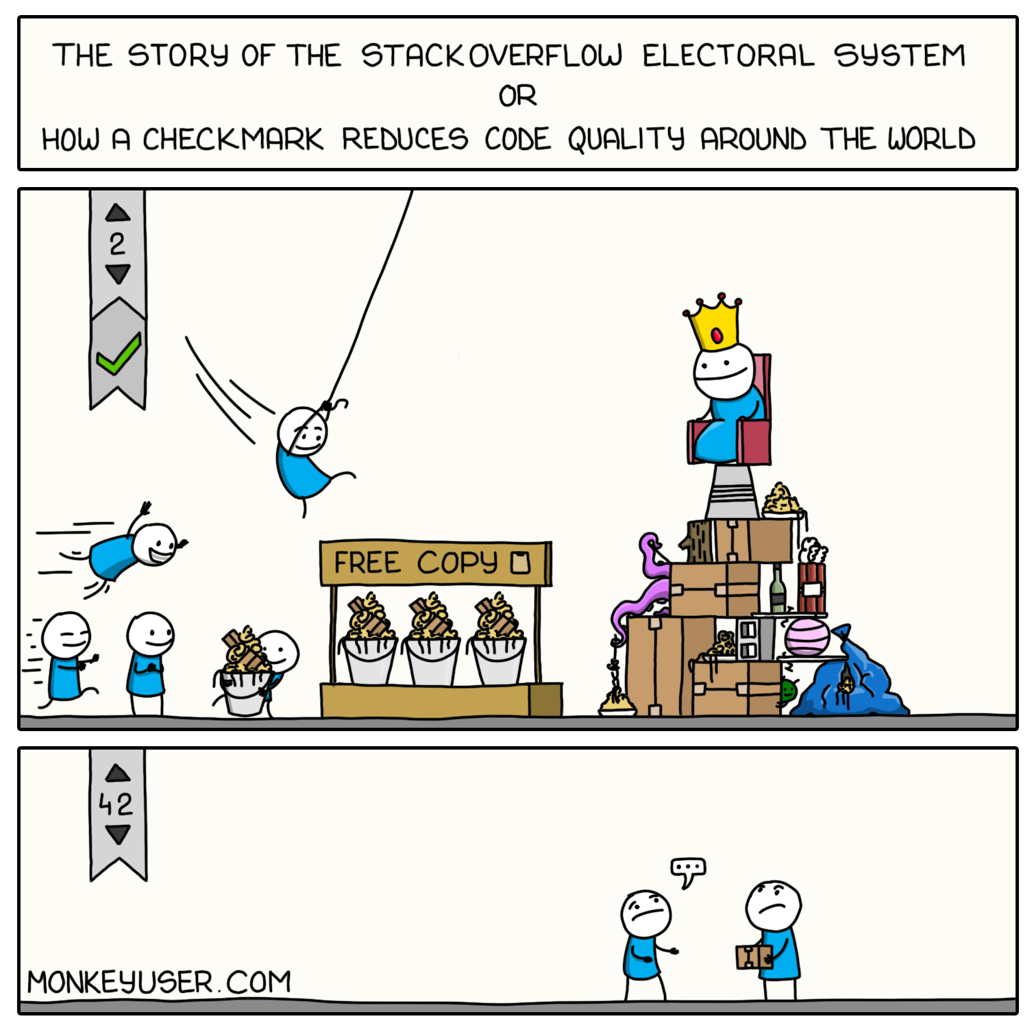
The comic has a big header "The story of the StackOverflow electoral system or how a checkmark reduces code quality around the world" and shows a low quality accepted answer with a score of two being used by many people. The next answer with a score of 42 sees almost no usage.

Only for accepted answers with low score. The same issue of reducing code quality around the world is still not solved where instead of a checkmark, the answers have accrued a score higher than all good or at least more correct answers combined. By virtue that the old answer was...older. Rather than better.

3
  • additionally, they added trending sort and gave collectives a way to indicate "recommended" answers, the former being neat but mostly inconsequential and the latter being locked behind collectives
    – Kevin B
    Commented Aug 3, 2023 at 19:44
  • 1
    @KevinB forgot about trending sort. The recommended I do not see as a solution.
    – VLAZ
    Commented Aug 3, 2023 at 19:49
  • 4
    I think it would be helpful to identify what exactly you'd want to see worked on in this regard. (I'd also note that the Content Discovery initiative is sort of the successor to that project, in that it builds on learnings from that project.)
    – V2Blast Staff
    Commented Aug 3, 2023 at 20:38
24

things we wish SE would do

Rebuild/Rework Area 51!

The platform is buggy, hard to navigate, and somewhat outdated. Is it really the best way to build new sites? (Plus, the friendly robots are a lie.)

I don't have any specific suggestions at the moment, but there are tons of feature-requests out there that could be reviewed and implemented.

2
  • 5
    Even just fixing the 3 worst bugs on area 51 would make a huge difference in usability Commented Aug 2, 2023 at 21:02
  • 3
    I feel like the GenAI site was a missed opportunity to push this through.
    – Journeyman Geek Mod
    Commented Aug 4, 2023 at 6:50
19

Fixes for the inbox improvements

The implementation of persistent notifications is something I did want for a long time. And since December 2022, I wanted the company to do the remaining work on this feature.

There are various issues:

  • A lot of times a notification will not be marked as read, even if you open it.
  • In some situations, notifications will be marked as read even if you have not even interacted with them.
  • Marking notifications as seen is a chore when you have actually read what they notify you off. For example, comments on a followed question - there might be 10 comments but you only need to open one notification and read all 10. Then mark the other 9 manually.
  • Overall, there is a host of issues when dealing with high volume of notifications in general. And by "high" I mean more than 20. Although more than 50 have additional pain points. That is not such a huge number - following a post, going to bed, and the post becoming very popular might yield you 30+ notifications by the time you wake up.
  • Getting multiple notifications on your own post hides the older ones. This is, admittedly, an existing bug. However, the new notification system exacerbates it as you need to painstakingly read a notification, reload the list (or page), to mark the next one as read, etc. Or just mark all as read if you are sure that all the ones are the grouped ones.
  • If you want to read your new notifications in a tab where you have already read the notifications, you probably need to jump through hoops. If the "Refresh" button is present in the inbox menu (not always the case) then you need to click it and only then you would see the new notifications. If it is not there, you need to refresh the entire tab. Or go to another tab.
  • Loading indicator for the notifications is frequently missing. With an occasionally spotty network connection, after waiting for 5+ seconds I start wondering is a) my network down b) SE down (which also happens often enough) c) maybe everything alright, I just need to wait extraordinarily long this time (also happens often).

These are just off the top of my head.

There was a podcast episode which I have not listened to. The episode notes read:

The inbox improvements were Radek’s graduation project. Not bad for a newbie.

Not everyone likes change, and the inbox change was no exception. So we looked into fixing that.

Yet, I am not sure anything was fixed1.

1Apparently the grouping of messages on own posts is fixed.

5
  • 1
    I think some of these were fixed. For example, messages on one post are grouped and now one click on the envelope marks them all as read. (Unfortunately, it's not clear that they're grouped so you may miss some messages.)
    – Laurel
    Commented Aug 3, 2023 at 19:49
  • I'll leave you another comment so maybe you can see this yourself.
    – Laurel
    Commented Aug 3, 2023 at 19:49
  • @Laurel I was not aware that the grouping was fixed. However, small correction: "messages on one post you own are grouped" - following a post which gets several comments still does not group the notifications.
    – VLAZ
    Commented Aug 3, 2023 at 20:06
  • 2
    I don't get how this has only nine upvotes. We can't be the only ones who often have to click a notification 2 till 5 (!) times to get it marked as read; it's been that way for half a year already. meta.stackoverflow.com/questions/424147/…
    – CodeCaster
    Commented Aug 5, 2023 at 7:30
  • 2
    I upvoted with some hesitation. It wasn't broken in the first place and the simplest fix by far would be to roll back the changes. There are much more important parts which desperately need attention; diverting resources to mess up the inbox is something we want less of, not more.
    – tripleee
    Commented Aug 5, 2023 at 8:26
18

I would like to see more (public, community aided) research on ways we can improve the general perception of Stack Overflow Q&A and reduce friction while not negatively impacting our ability to curate the content it contains. It shouldn't be a constant conflict between driving people off and indicating content isn't useful or won't serve as a useful entry to the long-term system.

I'm all for people receiving the help they need even on posts that aren't a useful entry into the long-term system or are duplicates. However, the current way the system is structured works against that; it requires far too much effort from SME's to clean up this content once it has been answered, and the only tools we have to do so are often viewed as toxic due to the side effects they cause.

We should be able to indicate to the system that a post isn't a pearl without preventing the user from receiving help. The system should be able to get rid of or deemphasize these posts regardless of whether someone answered them. The only reason there's ever any real rush to shut down a post as soon as possible is because waiting makes it feel impossible to do so.


And, no, while I think AI aided search can certainly help people avoid asking things they should have asked Google, it isn't a solution to any of the above.

16

Dark mode beta

3 years old. Still not available even on Meta.Stackoverflow. Much less on any other site.

High contrast beta

Over a 1.5 years old.

There are instances of things having ridiculously low to non-existent contrast in high contrast mode. And other instances of things just not looking great. I personally use high contrast + dark mode and it feels like that almost any UI update is basically not tested in that combination. A lot of the UI updates introduce more weirdness.

Accessibility, accessibility, accessibility

The whole initiative started a year ago. Few changes were made, some thing were made worse. For example, one of the areas that suffered was high contrast dark mode.

And yes, I am aware there has been more on the topic a month ago. As far as I know, no part of it has been released. Not even the better highlighting of questions with watched tags seen here. Which might (I hope) finally fix the basically non-existent highlighting in high contrast dark mode which has been reported since day 1.

Keyboard shortcuts

There is not one or even a small number of things to point out here. Keyboard shortcuts are immensely useful for me, as it means I do not have to use the mouse. The problem is that there have been no updates to them. Not to my knowledge. There have been new features on the sites - like following or saving, yet those cannot be accessed via the shortcuts. Other old features like editing duplicates list or expanding comments without also trying to add a comment, or trying to edit your own post if you do not have full edit privileges, are not available, either. Almost nothing on the user profile is reachable via shortcuts, either - for example trying to go to questions, or answers, or all actions. And so on and so forth.

The keyboard shortcuts are not extensible programmatically, or I would have made a userscript for this.

I do not know when was the last time keyboard shortcuts were updated but it feels like there is no interest from the company to do anything with the project.

Since this is in the post concerning accessibility, also I already complained several times about high contrast dark mode: the highlighting of a selected post does not work in high contrast dark mode. Ever since one of the accessibility changes. For context: the highlighting is important in order to know which post are you currently working with. Without the highlighting it is exceptionally hard to know

1
  • 1
    "And yes, I am aware there has been more on the topic a month ago. As far as I know, no part of it has been released." – That's not quite true; see the update to that same post on July 24. (That said, there's a lot more work to be done in terms of accessibility, as you point out.)
    – V2Blast Staff
    Commented Aug 3, 2023 at 20:40
13

Bringing Meta and Chat to the sidebar

In the old days, the links to meta and chat were front and center in the top bar. They're hidden under the SE/hamburger menu and its hugely unintuitive. This practically results in underutilisation of tools helpful for a healthy community - our second space (meta) and third space (chat) could use more love.

Especially considering the whole intent of the sidebar initially was to inline teams into regular sites, and teams essentially is its own thing now, it seems a better use of that space

6
  • 1
    Or alternatively, what if they added a fourth hamburger menu to the mobile version? 3 hamburger menus isn't enough. Meta and chat could have their own dedicated one! Commented Aug 5, 2023 at 0:47
  • 1
    I'm a fan of text over hamburgers and icons personally.
    – Journeyman Geek Mod
    Commented Aug 5, 2023 at 1:12
  • 1
    If the trend continues, they need to add theming so we can distinguish the "cheeseburger" menu from the "Big Mac" menu and the "charred chicken with jalapeño salsa mexiburger" etc.
    – tripleee
    Commented Aug 5, 2023 at 8:19
  • Hence calling it the SE/Hamburger menu over the simple 3 bar psudo left sidebar for mobile..... waaaait @curiousdannii - 3 how?
    – Journeyman Geek Mod
    Commented Aug 11, 2023 at 0:51
  • @JourneymanGeek Left, right, and the SE logo is basically one too. Teams are even worse though, there are already 4 dropdowns (though not all are burgers) Commented Aug 11, 2023 at 1:10
  • huh. Having more burgers than a Mickey D's something that I didn't quite notice, but you're right
    – Journeyman Geek Mod
    Commented Aug 11, 2023 at 1:21
13

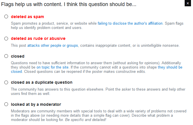
Continuing to improve the close/flag dialogs. The text of the standard close reasons has been actively worsened by successive updates to the dialog, and they no longer communicate what they are actually meant to. For example, the "too broad" reason only mentions multiple questions, not questions that are too broad to handle in one Q&A.

Unfortunately it seems like almost all the feedback from April this year went entirely unacknowledged.

And in particular, Machavity's excellent proposal should be implemented:

I think flagging in general suffers from a poorly worded set of options. I wanted to try and address this so I mocked up what I think it should look like

New flag window

Key changes

Red flags make deletion obvious

A common problem I run into flagging spam is that people don't always understand why we red flag. I had someone make this quote on Politics under a post that was spam

Mine was not a flag, but rather a vote to delete. Just being "nice"

A red flag is a vote to delete (not in the same way as a Trusted User, but the same net effect). I also slightly expanded the verbiage for spam to include promoting a website (a ton of spam is of the "visit my website" variety). I also expanded rude/abusive to include flagging unintelligible content (a reason few people know about).

Closed and Duplicate

Let's not mix terminology. The blue box says closed. The privilege says closed. "needs improvement" is highly confusing because it dumps you into the close dialogue box. Not every close reason is reopenable, either. Let's tell people we want it closed, and make it clear that closure is not necessarily a death sentence for a question or mean.

Mod flags

We need people to understand how and why you should use these flags. I've had several mods tell me that they prefer detailed mod flags when there's any question about a post.

NAA/LQP

NAA/LQP

This has been endlessly debated, but I think we can make some minor improvements. Most people do not know when to use Low Quality Post flags. Some verbiage cleanup would help and I try to denote that LQP flags are marked helpful if the post is edited (something that is not obvious).

4
  • 1
    The feedback from April hasn't been ignored - no changes have been made. That's not quite the same thing. I just haven't had time to finalize the copy and get it passed off to get on a development team's backlog. I accept responsibility for that but saying it's been "ignored" is inaccurate.
    – Catija Staff
    Commented Aug 5, 2023 at 4:57
  • 2
    @Catija That's great to hear! I'll edit to say "unacknowledged" instead, as that seems factual: most answers have no staff comments, nor have they been edited to add in-progress/deferred/declined tags. Commented Aug 5, 2023 at 6:25
  • Stuff getting fixed is also a useful data point the 'other' way. Sometimes positive changes get missed or go under the radar, or even no one realises it got fixed.
    – Journeyman Geek Mod
    Commented Aug 5, 2023 at 8:13
  • @Catija about NAA, Shog already had a proposal about what it actually communicates and how to fix the feedback from the moderators end too. I made a comment about a path that flaggers may not be aware of. I'm not sure how to incorporate all of that. Maybe also change the help center/meta post.
    – Braiam
    Commented Aug 8, 2023 at 10:38
12

An [official] chat API

There's third-party (community-maintained) libraries that work with the SE websockets that can be used to send chat messages automatically. The third-party library I'm using is super userful, but I'd love to see an official and documented API for sending chat messages and monitoring a room for new chat messages.

This is primarily for users developing chat bots to do various tasks on SE.

3
12

Letting question-banned users know about their ban even if their 6-month limit has opened up

A while ago, I asked Let question-banned users know that they're banned even if their 6-month limit has opened up. The request received quite a few votes and was marked deferred as the responding employee was planning it for an upcoming project on new user onboarding, but the employee no longer works for Stack Exchange.

Essentially, when more than six months have passed since a user who's banned from posting questions has posted their last question, the system will allow them to post a new question to try and get out of their ban. However, users aren't told that they're still banned - it looks the same as if the user doesn't have any sort of ban. This creates a gap in communication:

Often, I've seen cases where users post a bunch of bad questions and get banned, and forget about the ban. Then, after a long period of time (in most cases, several years), they have another question they want to ask, so they go and post it. When they type up and post their question, at no point are they told about their prior history and that they were banned in the past due to bad questions. Then, when they try to ask another question, they all of a sudden find that they are banned without any advance warning.

In many of the "why am I banned" questions that come up here and on Meta Stack Overflow, this is the cause: they were banned due to bad participation years ago, and the previous ban was immediately re-imposed after they asked one question. As they'd forgotten about the previous ban, such users are left wondering why they were suddenly banned for just one question which may not have been negatively received.

I hope this didn't fall off the radar after the staff member ceased working for SE.

9

I suggest to bring back the Mentorship Project.

As its results clearly say, it was a huge success and improved the questions quality.

Near the end of the wrap up, it's said:

For larger communities like SO, we’re going to explore ideas for a scalable mentorship program

So please, go ahead. Explore those ideas.

Disclaimer: I was a mentor.

2
  • I think I find this idea personally more attractive than Staging Ground because even though it also has scaling issues, my understanding is that this would be opt in (?). so as a mentor I wouldn't be dealing with the struggle of workshopping a post against someone's will. also, I think I'd have greatly appreciated this (as a mentee) when I was newer to the network.
    – starball
    Commented Jun 2 at 7:31
  • @super-starball-ultra yeah, from what I understand the goal was to add it as option when asking. Commented Jun 2 at 8:12
7

Probably only needed on Stack Overflow, maybe a few other network sites at most.

The long-talked-about tag features:

1. Parent/master tags for questions

  • Put in the work to generate a list of 'master' or 'parent' tags for things that have all sorts of specific sub-tags associated with them, whether those sub-tags are about features or particular versions. These parent tags would not count toward the 5-tag limit on questions, and would be give pride of place in the tag list somehow; appearing first, but maybe also above or off to the left side of the rest of the tags, with special coloring, just like the required tags group on Meta (discussion, bug, feature-request, etc.). Sub tags could be associated with parent tags (similar to tag synonyms today) by vote or by moderator action; a parent tag of "Visual Studio" would prompt users for sub-tag choices of the various version tags, e.g. "visual-studio-2022". Conversely, using any sub-tag which has a parent tag would automatically apply that parent tag to the question.

    Also create a process by which users can request and vote on a new master tag being created. Bonus points if it is an automated process (e.g. one that doesn't require posting a feature-request on Meta and having moderators handle it).

2. Version labels/tags for answers

  • Create a system that lets answerers set version "labels" (or "tags") as part of the answer (rather than just relying on creative tag-formatting in the post body) whether that be specific versions or "this applies to all versions before/after version n". This would ultimately allow developers to provide sort and filter options based on what version labels are listed in given answers. Readers would be able to sort by version, or version + score, and/or set filters on answers "where version >= 3" (for example).

    Way, way down the road, this could even allow for things like multiple accepted answers or showing certain answers side by side, so long as answers are labeled for different versions.

2
  • 2
    If it matters, the version of tags for answers previously being discussed were termed "labels" to differentiate from question tags. My understanding is that the core design may be simple enough but that actually retroactively (and accurately) adding those labels would be very complex, particularly in cases where individual answers specifically address different versions. It's totally fair to mention it here but that's likely a significantly more complex change than the tag hierarchy recommendation.
    – Catija
    Commented May 31 at 15:23
  • 2
    @Catija Thanks--I updated slightly to include that terminology. And, FWIW, I was not considering any retroactive addition as part of this system implementation. In my opinion, any retroactive addition would need to be completely manual.
    – TylerH
    Commented May 31 at 16:02
3

Tell users when edits have been rejected

Just as with approved edits, rejected edits should cause a notification for the editor.

The request is (IMHO) wrongly tagged . Currently, there is a little info box telling you that the latest edit was rejected when doing another edit. Which is

  1. not what was asked,
  2. easy to miss, especially as that box is always there, normally just with other content,
  3. due to the suggested-edit queue working in the meantime other edits could have been approved,
  4. and in case of multiple rejection, one is only notified of the most recent.

The official argument for implementing this "solution":

Receiving an inbox notification saying you did something wrong at any given time (likely not while editing) would have a more negative impact on most users than reading a notice while they are actively in the flow of editing.

If that were truly the case, I would suggest removing all notifications for downvotes/closed question etc as well, instead showing them in the question editor when the user is actively in the flow of asking.

0

How do we encourage edits to obsolete/out of date answers?

This is the only cost-effective solution to the obsolescence of information. Many people pick edge cases to have a total dismissal of the idea itself. SE should not make rules based on exceptional circumstances and shouldn't allow Hecklers veto to allow these users to ram against the most useful behavior that a wiki-like site has.

-6

I'd love if SE would revisit the possibility to ignore users, see e.g. Add the ability to ignore users

I think the ability to ignore known trolls etc. would improve the mood of many users. When visiting a community, their actions won't be the first thing which greets you. For example here on meta.se, the first thing I saw today was a -64 question, which got bumped to the home page because the OP replaced an image with the same image. I'd rather not get greeted by such posts.

For the larger community, this will have the advantage, that users in good mood will be more patient when dealing with other things in their communities and overall make communities a nicer place to be.

7
  • 6
    I would rather have that concern troll with a −64 question banned than add him to an ignore list and pretend there is no problem. Commented Aug 2, 2023 at 12:17
  • 10
    I'm going to disagree with your last paragraph: I'd see it more likely as a net negative, where persistent problematic behavior from a single user account will end up ignored, instead of promptly flagged and moderated away (because too few other users see it).
    – Tinkeringbell Mod
    Commented Aug 2, 2023 at 12:22
  • 8
    @Tinkeringbell not all annoying behaviour is serve enough that mods will take action. The ability to ignore users will allow the user to act themself for cases which are not acted on by mods. There could even be some statistic, e.g. "user xy gets ignored by 42 users" and mods can have a look into the case. Commented Aug 2, 2023 at 12:33
  • 1
    how useful is it to ignore people? Even if you can ignore a comment, you can't ignore a downvote. And if you ignore something that gives you actionable feedback, then you can wait yourself right into a question closure without anything more specific than the standard closure notice. We have flags anyway.
    – starball
    Commented Aug 2, 2023 at 23:53
  • 6
    On the smaller sites in particular, there are users who comment on virtually every post (or virtually all of your posts). This behavior quickly gets annoying and tedious, and I've not wanted to use whole sites because of a single such user at that site (*groan* that user is commenting again). It would improve my user experience to be able to "unsubscribe" to such users. I can already ignore tags. I don't want to be a conscripted moderator deputy at every single site---mostly, I want to Q&A. (Alternatively, set limits on what proportion of a site's posts a user can comment on.) Commented Aug 3, 2023 at 7:55
  • 1
    I actually think SE have perfected the ability to ignore users. Except, not for you, but for them :-(
    – einpoklum
    Commented May 29 at 7:01
  • @RebeccaJ.Stones "Alternatively, set limits on what proportion of a site's posts a user can comment on." This would not be feasible, as there's no way to do it in a way that doesn't also trample over the ability of other users who may just want to participate.
    – TylerH
    Commented May 31 at 14:50

You must log in to answer this question.

Not the answer you're looking for? Browse other questions tagged .