189

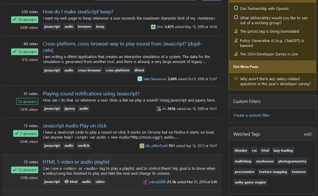
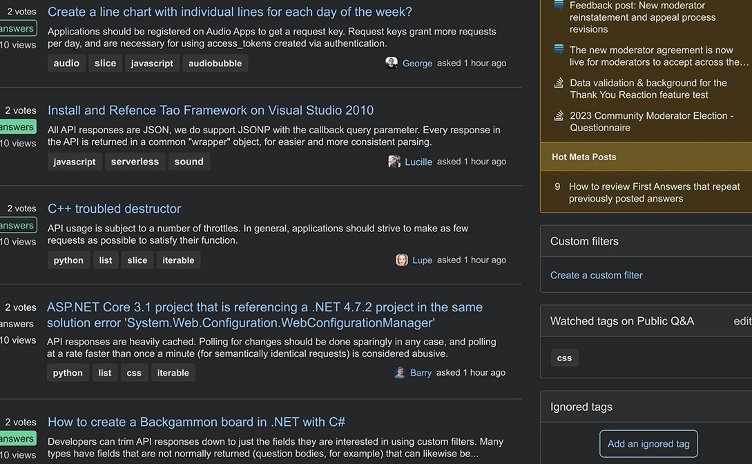
On all the sites, the tag names started appearing bold in the last 15 or so minutes. Looks rather garish. Is this some new un-announced feature release?

For example:


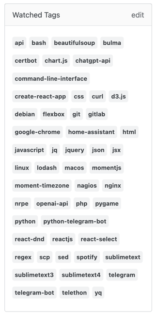
One of the worst affected pieces of UI is the "Watched Tags" box, which can easily end up with ten or more lines of bold text. Here is a screenshot provided by user 0stone0:


Several users (1, 2, 3) pointed out in comments that this is likely related to Seeking feedback on tag colors update

27
  • 17
    @Not only the font, also the color. The background used to be very light blue which was perfect in terms of the degree of in your face.
    – GSerg
    Commented May 21 at 12:44
  • 26
    6-8 months... it seems meta.stackexchange.com/q/395062 and of course that I said that bold fonts were a bit much during feedback there. Commented May 21 at 12:48
  • 8
    @ResistanceIsFutile I would like to take a moment to appreciate here that even a Stack Exchange employee who wrote that post is using a Stylus user stylesheet to roll back the font change introduced even earlier, which is evident from her screenshots that all show Arial. I'm also using it. The OP here is using it. Yet the font served by Stack Exchange is still that one that nobody wants - except, I may surmise, that same design person.
    – GSerg
    Commented May 21 at 12:52
  • 16
    A quick re-read of Seeking feedback on tag colors update suggests that answerers preferred option 4 the most. The one we are seeing today is option 3.
    – InSync
    Commented May 21 at 12:56
  • 2
    @0stone0 Those are the meta tags that used to be different color.
    – GSerg
    Commented May 21 at 13:16
  • 83
    All I can see are the tags because they are in bold
    – j08691
    Commented May 21 at 13:58
  • 8
    Yet another problem with this is that the tags are now smaller. Tough luck if you like programming languages with one-letter names C, D, R etc. Keep clicking and you'll hit the tiny tag eventually!
    – Lundin
    Commented May 21 at 13:58
  • 22
    I proposed 4 in the initial enquiry. I feel even more justified in that request now it's gone live. Bold is not the way to go. Maybe go do some voting on the original post, see if we can flip the numbers;)
    – Tetsujin
    Commented May 21 at 14:03
  • 2
    When exactly do we plan to produce the version of this Q&A that we want the design team to read? There's a lot of name-calling in the comments, some quite creative, but none of it productive.
    – wizzwizz4
    Commented May 21 at 15:09
  • 8
    I seriously wondered if my eyesight had deteriorated drastically since yesterday. (I'm not joking, or being hyperbolic - this is something that has actually happened to me.) I don't know if the change is only to tags, because the whole front page of Mathematics Stack Exchange now looks blurred to me. Commented May 21 at 16:35
  • 2
    @CalumGilhooley Me too! This puts a horrible strain on my already tired eyes.
    – Ted Lyngmo
    Commented May 21 at 20:56
  • 2
    We don't yet even know if this was intentional or not, right?
    – JonathanZ
    Commented May 21 at 22:27
  • 14
    @Dominique My sight sucks, and it really doesn't help with anything (I don't need a sea of attention grabbing little rectangles, with the useful content hiding in-between).
    – Dan Mašek
    Commented May 23 at 9:50
  • 2
    @Dominique That's not a good summary of the comments. In particular, it contradicts my comment. (Perhaps I didn't write clearly enough?) My eyesight is bad. This change caused the Maths.SE front page to start looking more blurred to me than it did before. Commented May 29 at 16:52
  • 3
    @Slate Can we get feedback on some of the issues mentioned here and the process behind this change? Slapping on a status-by-design tag (and referring to the older posts which did not really announce anything (until the change was introduced, anyway)) seems dismissive of those problems and evasive.
    – Joachim
    Commented Jun 26 at 7:58

12 Answers 12

114

This is what the new tags look like on Software Engineering Stack Exchange, with an example of a question with a watched tag and a question without, using the home view (which doesn't show a question excerpt).

New tags on Software Engineering Stack Exchange

The tags are extremely overpowering.

In this view, the most important content is the question title. However, the bold of the tags draws my eyes away from the question title to the tags. The next most important metadata is the votes, answers, views, asker, and asked/answered/modified timestamp. The tags, in my opinion, are tertiary content. However, they are more prominent than the primary or second pieces of information that I look at when browsing.

This is extremely distracting.

6
  • 2
    I think it's alright in the other views (e.g. the question page), but this is the view where I'm most likely to use tags. (Aside: this is why I don't like checklist accessibility. The designers can do everything right, and be fully-conformant with WCAG, and it can still just not work. Guidelines are really useful, but sometimes the correct compromise will lose you marks on the checklist.)
    – wizzwizz4
    Commented May 21 at 13:21
  • 5
    @wizzwizz4 I think they are still a bit to bold and excessive in the questions view, too. Commented May 21 at 13:36
  • 29
    Besides being distracting, they're also hard to read because the fatter letters are closer together. Commented May 21 at 14:47
  • 1
    I can definitely see a design defense for SE making tags more readable than they were, but this isn't the right approach. If this was the only feasible option for making tags more readable (which I'd dispute), then the weights and prominence of the other elements needs to be adjusted to compensate for and work with this design change... many words to say that I completely agree that the balance is all wrong right now.
    – zcoop98
    Commented May 21 at 15:42
  • 13
    @zcoop98 I am half blind and this is not easier to read. On the contrary... I cannot even look at the front page. Commented May 21 at 16:26
  • 1
    "This is extremely distracting" should be in bold
    – j08691
    Commented May 29 at 20:27
58

The problematic part here is not the design change itself. It can be changed again, some people might even find it better.

The actual problem, which is x1000 worse than any possible design change is the total lack of communication between Stack Exchange and their users. The users who, well, use it. Make it what it is.

And this is what makes me really sad, and more determined in my view that Stack Exchange does not want to even try and bridge gaps, or communicate with the users: they choose to do things their way, and nothing will stop them.

To clarify, this is not a minor design change. It's a major change, affecting all sites, and millions of users who see something very different out of the blue. In an healthy site, there would have been at least announcement about such a change. Sadly, SE is not healthy, for way too long.

Technically, it was announced half year ago in Seeking feedback on tag colors update, however:

  1. As the title says, the update is of tag colors, not making them bold.
  2. Yes there are screenshots, and if you take a close look you find that the tags would become bold. But in the screenshots it doesn't stick out.
  3. Most fatal part: there was no timelime for implementation whatsoever. No advance warning.
  4. And to rub salt on the wound: when people tried to give feedback, in the feedback request question, it got locked as a result.

So sorry, but that does NOT count as communication or helpful announcement.

11
  • 5
    Spot on. It would have taken couple of minutes at most to post an announcement prior to pushing the changes to production. I don't get it.
    – Dan Mašek
    Commented May 21 at 18:01
  • 1
    @DanMašek actually there's announcement already, but highly misleading (e.g. saying changing tag colors, while they change lots more), without timelines. And they didn't even bother to update it. Commented May 21 at 20:40
  • What do you mean? I'm aware of that post from half a year ago that several people referred to, I edited that into my post. Is that what you mean, or do you refer to something else?
    – Dan Mašek
    Commented May 21 at 20:48
  • 1
    @DanMašek ah, yes that's the same. Commented May 22 at 7:27
  • 16
    Not only a lack of communication - they LOCKED the announcement post of the project so now people can't respond to it and can't change their vote on the original post.
    – Catija
    Commented May 22 at 13:59
  • 6
    @Catija In a way that also communicates a message. And to be honest, a locked post titled "Seeking feedback" is quite priceless.
    – Dan Mašek
    Commented May 22 at 14:59
  • 2
    Did I miss something? SE gave us 4 options for the tags update here: meta.stackexchange.com/q/395062/643262 , and the two top-voted answers prefer option 3. Option 3 has been implemented. Why are you claiming "lack of communication"?
    – wimi
    Commented May 22 at 16:43
  • 15
    @wimi Announcing the change was going live and giving an explicit space for bug reports and feedback rather than locking the old post when people started trying to give feedback would have been a great place to start when it comes to improving communication.
    – Catija
    Commented May 22 at 17:47
  • Oh, the design change itself is quite problematic...
    – einpoklum
    Commented May 24 at 19:29
  • @einpoklum perhaps, but others already focus on that. Personally I don't like it, but don't think it's so drastic. Commented May 24 at 21:58
  • 2
    I thought better communication was one of those promises in response to last year's moderation strike. Commented May 28 at 7:11
43

CSS snippet to (partially) revert this rather peculiar design:

.s-tag {
  font-weight: normal !important;
}

In case you haven't installed it, here are some quick links to Stylus:

9
  • 2
    Sylus's official homepage has links for Chrome, Firefox, and Opera-Chrome, so it's probably a better link.
    – wizzwizz4
    Commented May 21 at 13:06
  • 5
    Bringing back the colors would also be nice.
    – GSerg
    Commented May 21 at 13:07
  • @wizzwizz4 It seems that not everyone can access that link. Myself included.
    – InSync
    Commented May 21 at 13:07
  • @InSync Weird; I didn't think add0n.com had shut down yet. Well, here's Firefox and Opera if you want to add them.
    – wizzwizz4
    Commented May 21 at 13:08
  • @wizzwizz4 Thanks, added FF. The Opera link also returns a 404 for me.
    – InSync
    Commented May 21 at 13:12
  • I get mileage out of even just reducing the font weight... they current have it set to 700; I feel like bringing it down to 600 or 550 still has an arguably positive effect without being nearly as overpowering (though I believe the effect varies between browsers for nonstandard font weights).
    – zcoop98
    Commented May 21 at 15:56
  • 3
    Consider posting this over on StackApps too!
    – cocomac
    Commented May 21 at 16:34
  • 1
    I humbly suggest you replace that line with "font-family: "Comic Sans MS", "Comic Sans", cursive;" :P Jokes aside, added to my script that also restores the old style vote buttons... Commented May 21 at 17:09
  • 1
    I also added .s-tag__required { background: #ffecec; color: #af3235 !important; border: 1px solid #eccdce; } to restore the reddish colors of required tags (not sure if that's the correct colors of previous version though, but it looks much better than this all-gray aspect)
    – hkotsubo
    Commented May 22 at 13:49
38

I already expressed my preference in the original meta enquiry proposing the changes, & included a gif comparison of all 4 suggestions, so I don't really need to cover that ground again.

In short, I don't like the bold. I don't like anything that tries to look more important than it actually is.

In case people didn't get chance to see a direct before & after, I managed to screenshot a couple of pages in the before & after versions [sorry, one is inverted to the other, the source images are gone now]:-

enter image description here

enter image description here

3
  • 23
    Ironically the feedback post claims to have taken your feedback here in account: "The 'compulsory' meta tags are much too weighty. They distract from everything else. Punchier than even the question title." So the fix was apparently to make all tags that punchy so that not only the meta tags stand out but all tags...
    – Lundin
    Commented May 21 at 14:55
  • Well, killing those over-punchy compulsory tags is definitely an improvement; it's just bolding everything which is the sticking point for me.
    – Tetsujin
    Commented May 21 at 15:09
  • 7
    It's kind of handy - if I close my eyes I still see the tags. So that when I open them again, I immediately know where to click. The big "eye of Sauron" icon for watched tags is creepy though.
    – Lundin
    Commented May 21 at 15:13
17

I think it is supposed to grab your attention, but the title is the most important part! Now, it both is ugly and distracting to me. Shouldn't SE at the very least communicate with its users? Just like the advertising problem, it was announced 5 months before, make us think they're just kidding, and just smack us in the face 5 months later.

17

This change is (again) communicated poorly, nor does it resemble what seems to be considered its 'announcement'.


Part of the agreement struck last year between SE Inc. and the moderator team, was that SE Inc. would report changes in a timely manner:

Committing to transparency

Stack Exchange, Inc. staff will be as transparent as possible about product development and policy, regularly sharing updates and proposed changes. Releases will be communicated in a timely manner. Whenever possible, staff will provide insights behind key product and policy decisions to the community.

Arguably none of these points have been met.

The question Seeking feedback on tag colors update was "seeking feedback" on "exploring options" about "identifying a direction" in which the design could be taken (feedback on colors, as pointed out in another answer here). That post clearly emphasised how a potential redesign was at a preliminary stage.
The most upvoted answers there point out option #3 is the best of the four options given, and give general feedback, not absolutes.

Yet here we are, with a sudden, unannounced design change based on a limited set of options. The official 'announcement' of the change we're seeing now followed almost 12 hours after it was noticed by the OP.


Moreover, the proposed example option (#3) and the design change that was implemented are in fact different from each other:
enter image description here
Proposed design #3 (cropped)
enter image description here
Implemented design
enter image description here enter image description here
Proposed design #3 (detail) Implemented design (detail)

As you can see, the font and padding are both different, which has a big impact on how the change is perceived.

This is not about whether or not the change is an improvement*—this is about the lack of communication and cooperation concerning this change.


* I prefer the original option #3 over the current change, but would likely still lower contrast and change the colours to more clearly indicate different 'registers' of content.
4
  • 5
    Thank you for pointing this out. The proposed design is so much easier to read. Commented May 23 at 13:15
  • I think this is minor details. Also compare how it was before the re-design, it was far better (second image here) meta.stackoverflow.com/questions/426889/…
    – Jonas
    Commented May 23 at 14:16
  • 2
    @Jonas Are you referring to the differences between the designs? When it comes to UI/UX design those details can mean a world of difference (I think the history of (the reactions to) design changes on this platform illustrates that well). Besides, as pointed out, my point is that the unannounced change is not even the same as what was pseudo-proposed 5 months ago.
    – Joachim
    Commented May 23 at 16:16
  • 8
    I think I still would have preferred option 4 without the bold letters (even compared to the proposed option 3). It's much more subtle yet still readable. Commented May 23 at 18:32
15

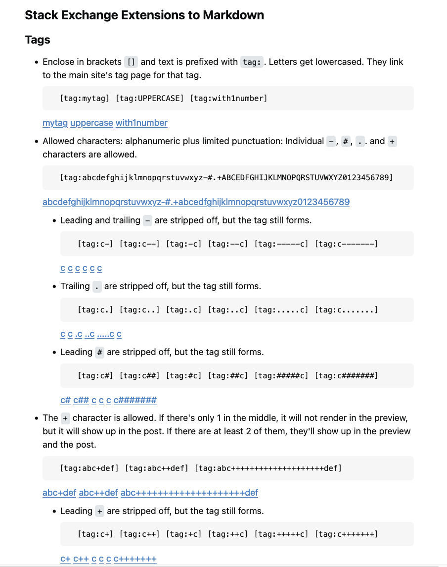
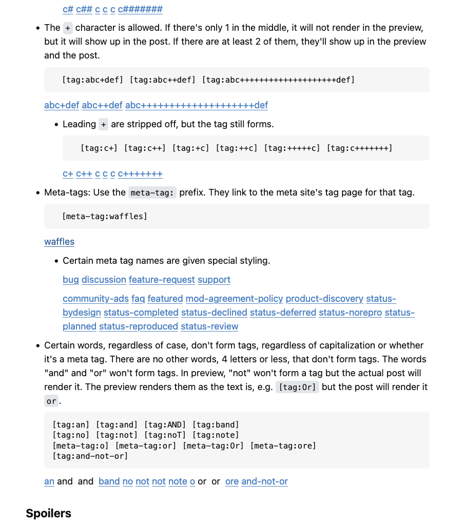
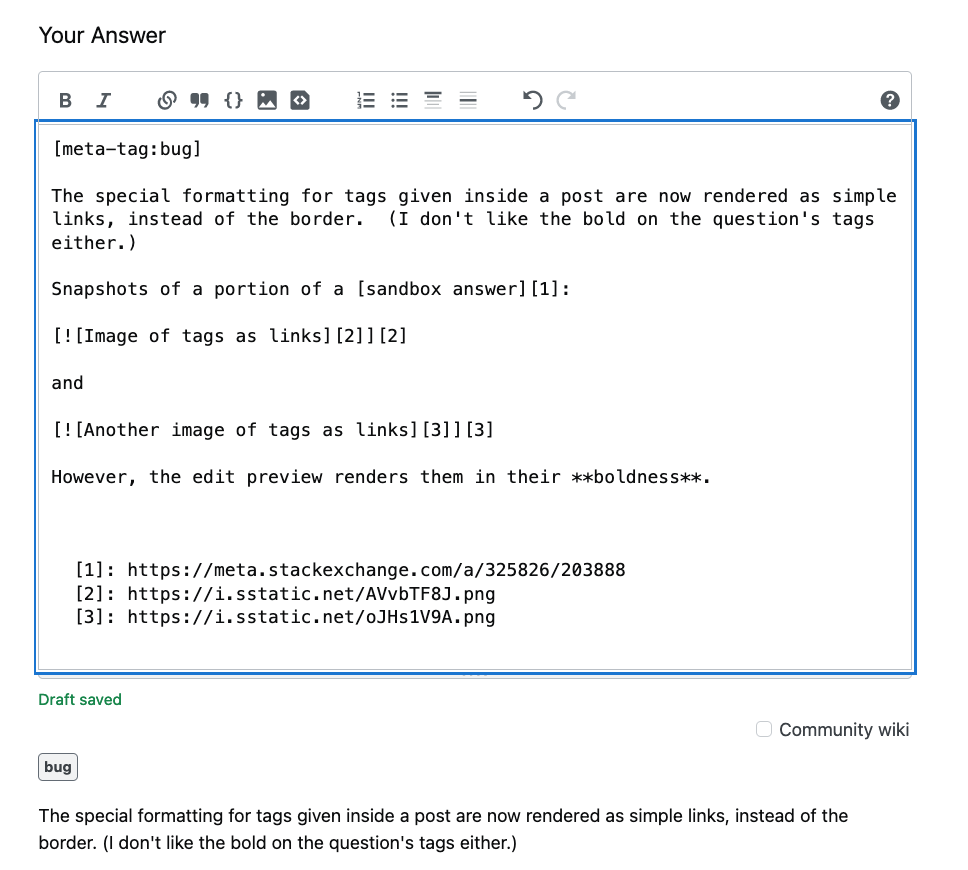
The special formatting for tags given inside a post are now rendered as simple links, instead of the border. (I don't like the bold on the question's tags either.)

Snapshots of a portion of a sandbox answer that has lots of tags in its body:

Image of tags as links

... and ...

Another image of tags as links

... However, the edit preview renders them in their boldness.

Snapshot of edit preview that renders tags

This occurs on my Mac and on my Windows laptops, regardless of browser.

2
11

I recommend that the font used for tags be reduced to normal weight.

I've worked in graphic design (text and titles for television) for 30 years now and I can attest, as a professional, that using bold for the tags is the wrong design choice.

Encountering a different font size, style, or weight increases cognitive load and fatigue. Mismatching weights diminishes harmony and repels readers.

The title is larger, but lighter weight; whereas the tags are smaller, but heavier weight. The two are fighting for prominence in conflicting ways.

A good way to test to see what's most prominent is to squint and blur your eyes until the text is unreadable but only the structure of the page remains. In this case, the boldness of the font combined with its darker background makes the tags much more prominent than the question title -- even as prominent as the title at the top of the page.

Here's a visualization of prominence of the Stack Overflow page, which I think helps convey how unnecessarily prominent the tags are:

A visualization of prominence on the Stack Overflow page

1
  • 4
    Awesome points, but I doubt staff still monitor this thread so better post this as a new feature request. Commented Jun 14 at 15:14
4

The bold font, I guess to some degree it's more attention grabbing in that aspect? But I find bringing the colors back from having a contrasted background makes it far less attention grabbing, at least on dark mode on SO.

If it were between tags looking like buttons and what we have now, I'd take the current one every time.

But I would prefer for it to not be bold.

3

This is not an un-announced feature release. The feature was announced in November 2023, where four options were given to us for the new tag design. The two top-voted answers there prefer Option 3. Option 3 has been implemented, and it looks exactly like the pictures in the proposal. I honestly can't understand the whole negativity here.

If we want SE to ask us for feedback, we should be consistent and avoid throwing accusations at them when they do ask for feedback and implement it exactly.

8
  • 15
    It is always very hard to determine how will something look like in real life based on the pictures that are only an approximation of what people will see in real life. Also, there was plenty of feedback that said fonts were too bold, and the top voted answer that did choose Option 3 also said "The bold text makes it stand out sufficiently, without drawing too much attention" Now when we see the results, it is beyond clear that bold is over the top. So we can say (and some can change their minds) that this does not work at all. Commented May 22 at 17:12
  • 6
    I'm on SO every day, and never saw that announcement... Perhaps they should make the announcement more prominent ... Based on the fact that many comments here are about not knowing ahead of time about this change, I imagine many people are in the same boat ...
    – ChrisMM
    Commented May 22 at 17:29
  • 15
    Sure, the feature was discussed 6 months ago, but the release into production was out of the blue. Took like 10 hours before staff edited the discussion post, long after people noticed the change (and several questions were posted about it, not just here). A simple "Hey, we're releasing this in an hour" edit (and perhaps featuring it for a bit) would have avoided a lot of the commotion, and I certainly wouldn't have needed to ask this question. Seems a pretty common, and sensible way of releasing things into production.
    – Dan Mašek
    Commented May 22 at 18:09
  • 8
    Regarding your second point, why should there not be any feedback once the feature is released to production? When I release new features in the software I write, I definitely want to know whether they achieve what the client wanted, and look for ways to further improve them.
    – Dan Mašek
    Commented May 22 at 18:18
  • 2
    That link explains everything, KevinB's answer under it explains that option3 just fades things into the background but people voting back then must not have realized how bad the choice really was. Taking color away from the tags is just too poor a choice to even be considered.
    – bad_coder
    Commented May 22 at 21:08
  • 2
    That post was not an announcement (for which there is a dedicated tag), and the implemented change is in fact not exactly like that option (see my answer).
    – Joachim
    Commented May 23 at 13:01
  • @DanMašek guaranteed they are not in your time zone so Hey, we're releasing this in an hour is not practical. How about releases are always on a working day and at 12 noon EST so we all know and there is someone available to fix initial bugs or rollback if necessary?
    – MT1
    Commented May 28 at 4:22
  • @MT1 Sure, that would be nice, but I'd be satisfied with less.
    – Dan Mašek
    Commented May 28 at 13:26
3

Removing color from the tags feels like spelling death for the tag system.


Using bold just doesn't compensate for the loss of color. So I'm going to quote from the top-voted post that proposed the adopted change (emphasis mine):

Option #3, while similar to Option #2, changes these two unnecessary properties. The bold text makes it stand out sufficiently, without drawing too much attention.

I think it's key to consider specific site use! On SO the first thing I look at when opening a post (let's say for review or curation - or during research) are the tags! Because they'll either place a post within my skill set or outside of it; they let me know at a glance -without needing to look at the code&wall-of-text- if I can even consider the post and if I'm interested in it at all... And the same goes for skimming over a list of questions. Now, when I'm on a language site the title and excerpt are much more descriptive, but at least on the tech sites de-emphasizing the tags seems like a mistake that'll will have overall negative consequences for usability that no one's mentioning. (In dark mode it's even worst than in light mode atm I think.)

2
  • I mean.. they also aren't buttons that should be drawing a ton of attention like the brightly colored add comment button to my right.
    – Kevin B
    Commented May 22 at 21:43
  • 3
    @KevinB actually they are buttons that take you to a relevant listing.
    – bad_coder
    Commented May 23 at 0:20
3

Here is a countermeasure for this style error for Tampermonkey:

(function() {
    'use strict';
    const style = document.createElement('style');
    style.innerHTML = ".s-tag { font-weight: normal !important; }";
    document.head.appendChild(style);
})();
2
  • Already suggested in this previous answer. Commented Jun 18 at 11:42
  • 3
    @ShadowWizard Yes - I took the css definition from there. I don't have Stylus installed but tampermonkey and thought it will be helpful for others with the same setup.
    – steffen
    Commented Jun 18 at 11:43

You must log in to answer this question.

Not the answer you're looking for? Browse other questions tagged .