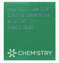
Today, I noticed this Chemistry.SE ad on Programmers.SE:

I find that this combination of dark blue text on a dark green background very hard to read (and the white shadow doesn't really improve the situation).
Could the color contrast be improved?
Today, I noticed this Chemistry.SE ad on Programmers.SE:

I find that this combination of dark blue text on a dark green background very hard to read (and the white shadow doesn't really improve the situation).
Could the color contrast be improved?
It seems resolved now.
Can be checked on live by this shortcut link after few/lots of refresh.
Update:- After the redesigning of HNQ ad, the base image has been altered a bit but mostly change is in size:
Note: Currently can't find any active HNQ image ad question to check the changes in text font and shadow , if any.