16

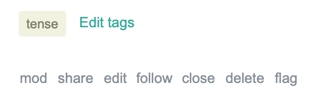
In the 'menu' under the post, some extra space has been added (I presume accidentally) between the 'flag' link and the other options:

enter image description here

It looks like the separators are always shown, even though their corresponding options might be hidden. Here's how a full menu looks, and it's still evenly spaced:

enter image description here

3
  • 1
    @JourneymanGeek Is this related issue also being reviewed? Commented May 25, 2020 at 16:26
  • 1
    I'm assuming it's all the same issue?
    – Journeyman Geek Mod
    Commented May 25, 2020 at 22:05
  • @JourneymanGeek no - it still isn't fixed yet
    – user707129
    Commented May 27, 2020 at 17:35

1 Answer 1

16

the extra spaces

once superfluously shown

now rendered per spec

2
  • 1
    Thumbs up for keeping up an old tradition! It's been a while since I saw a haiku ...
    – Glorfindel Mod
    Commented May 27, 2020 at 13:15
  • While we're at it, I suggest changing the tooltip style of follow to match the tootips of other buttons. Commented May 27, 2020 at 15:21

You must log in to answer this question.

Not the answer you're looking for? Browse other questions tagged .