54

As part of our project to make it easier for our community managers to run moderator elections for our Stack Exchange sites, we've just released new functionality related to creating, answering and reading the candidate questionnaire.

For most elections, we ask the community to contribute questions they want the moderator candidates to answer in a question collection Meta post. The community managers compile these suggestions into a final questionnaire that the candidates respond to.

Until now, using the questionnaire was inefficient and inconvenient for all involved:

  • Community managers had to manually copy and paste the suggested questions into a separate Meta post that contained the final questionnaire.
  • Candidates were asked to fill out a form to create their intro statement, then go to the questionnaire Meta post to answer the questionnaire (which involved copying and pasting) and then manually edit their intro statement to include a link to their questionnaire answers.
  • Voters were asked to switch back and forth between the Election page where voting takes place and the questionnaire Meta post as they made their decisions.

We've introduced functionality to solve all three issues.

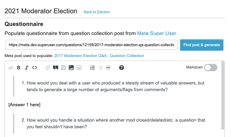
Community managers can now generate the questionnaire with a button click

We've built a UI for the community managers that lets them pull in the top questions from the community and quickly edit them into the final questionnaire.

Community manager interface that lets them generate questionnaire

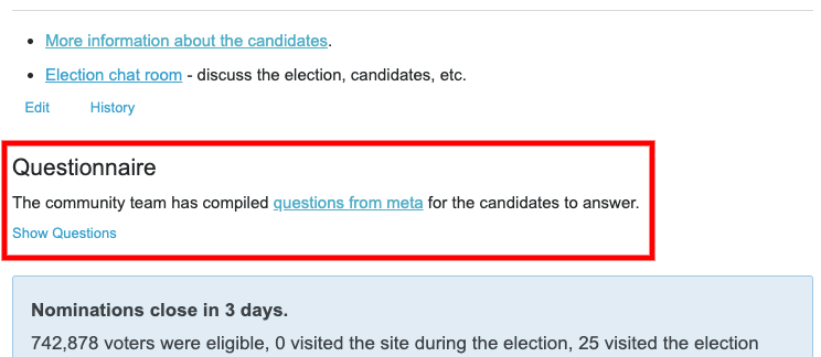
Instead of living in a separate Meta post, the final questionnaire is now published directly on the Election page.

Collapsed questionnaire on Election Page

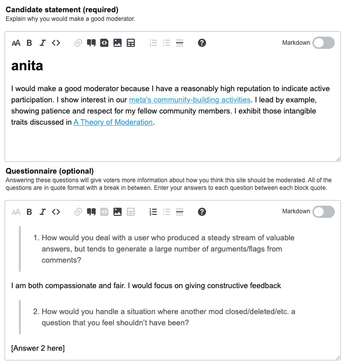
Candidates can now answer the questionnaire in one place

When candidates nominate themselves or edit their nomination, their candidate statement and questionnaire appear in the nomination UI.

Candidates answer questionnaire in nomination UI

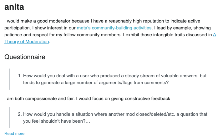
Voters can now see questionnaire answers in context

As voters evaluate the candidates on the Election page, the candidates' questionnaire answers appear underneath their intros. Because the answers can get lengthy, we show a snippet of each questionnaire, along with a "Read more" link that expands it.

Candidate questionnaire answers appear below their intro statements

More to come

We are continuing to work on this project and will be releasing additional features in the coming weeks. Look for updates with the and tags.

4
  • 1
    Great to see some new developments here. It's probably good to note that a few bugs have already been reported on Chemistry Meta: Moderator Elections: bug reporting for new questionnaire UI – I presume they don't need to be posted here.
    – Glorfindel Mod
    Commented Apr 6, 2021 at 17:45
  • Yay, looks nice! One question, though - is there a known criterion for the "pull in the top questions" functionality (just out of curiosity)?
    – 0Valt
    Commented Apr 6, 2021 at 17:56
  • 2
    @OlegValter Yes, there are two default questions used in every questionnaire, then we pull in up to 8 positively scored, non-deleted questions from the Question Collection post, then there are three optional default questions that get pulled in if the community hasn't contributed the full 8. Default questions: meta.stackoverflow.com/a/398885/7469818
    – Anita Taylor StaffMod
    Commented Apr 6, 2021 at 18:33
  • @AnitaTaylor - ah, frankly, to be honest, I forgot about the rule, thank you for clarifying the process is the same as when it was manual.
    – 0Valt
    Commented Apr 6, 2021 at 20:04

2 Answers 2

5

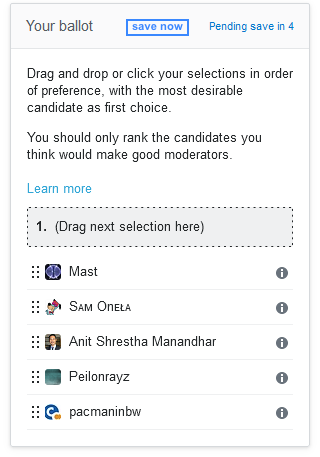
Could you please also add an explicit "save" button?

The automatic saving of votes seems to work just fine, but from a psychological point of view, I would prefer to hit some button, so I feel certain that they are really submitted (even if just a dummy button that does nothing :) )

Mock-up:

enter image description here

4
  • 2
    This isn't a feature request that we are going to implement, as nothing is broken. Our design and development team originally considered having a Save button but decided that autosave was a better solution.
    – Anita Taylor StaffMod
    Commented Apr 20, 2021 at 14:07
  • 2
    In any case, it is quite confusing the way it is, @AnitaTaylor When you go to the elections page for the first time, is not clear if your vote is already counting or not. Also, since there is an initial order it seems that you are making choices among all the candidates, while it can be the case that you just want to pick some of them (like in the old days). Now it seems to be compulsory to order all the candidates, so doing 'nothing' is also doing 'something'. Commented Apr 20, 2021 at 18:21
  • 1
    @fedorqui'SOstopharming' We've added explicit language to the ballot: "You should only rank the candidates you think would make good moderators."
    – Anita Taylor StaffMod
    Commented Apr 20, 2021 at 18:28
  • 1
    @AnitaTaylor mmm yes, but it would be useful to have a visual indicator on which candidates have been ranked. Like, I don't know, having a long line splitting those that have been ranked from those that have not, and being able to move a candidate from one block into the other. Commented Apr 20, 2021 at 18:31
4

Thank you for the update, it looks like a great improvement!

I do wonder though, would it be possible to have some sort of sandbox? In that way we could play around with it, trying to see if we can get things to break before it gets used in a real election?

1
  • 3
    Sorry, we don't have the ability to spin up publicly facing sandboxes. We test it ourselves in our dev environment before we push changes live.
    – Anita Taylor StaffMod
    Commented Apr 6, 2021 at 14:35

You must log in to answer this question.

Not the answer you're looking for? Browse other questions tagged .