216

Update 2

On March 2, 2022 we removed the Mobile button from the footer. This means the mobile views are removed entirely from Stack Overflow. Last week, we also removed the Disable Responsiveness button. With that, I’ve now marked this post as 🎉

Update 1

On Feb 14, 2022 we removed one of the last mobile views—the question page. When you visit a question, you will now be shown the responsive version instead. We will be following up to remove the Disable Responsiveness and the Mobile button in the footer. When that happens, this will be filed as .

Original post

I’m Aaron Shekey. I’m a product designer at Stack Overflow, working on our design system, Stacks. At the time of writing this, I’ve been chipping away at our front-end for 4 years. You may recognize my name and face from previous announcements like: Dark mode, fonts, post formatting, blockquotes, or the #1 feature everyone no one has asked for, confetti 🎉.

Stacks powers a bunch of our site—more each day. It’s a way for us to quickly build or refactor all kinds of features. Stacks has a ton of components like buttons and navigation, popovers, even a full-featured editor. It also has features itself. For example, by using Stacks, our designers and engineers get dark mode for free.

Stacks is also responsive by design. While you don’t quite get fully responsive layouts for free, it’s super easy to build views that scale to all viewports, regardless of device or window size. Traditionally, our approach to mobile devices was serving an entirely separate site that is loaded based on your user agent string. If our backend thinks you’re on a mobile device, we’ll show you a different view from if we think you’re on a laptop.

This creates a couple of issues. First, if you’re adding a feature to an existing part of the site, you have to build two separate front-ends—one for mobile, and the other for our desktop view. This introduces more opportunities for bugs, and has even introduced some security holes over the years. Our teams are full of busy humans, and it’s tough to execute, test, and deliver a single website, let alone separate ones.

Second, this creates an inconsistent experience for our user. The mobile views are generally more simple than the desktop views. Certain features have been left out of mobile over the years, others were shipped and unshipped. Others just never got built for mobile users. Over the years, the aesthetics between the two views have drifted.

Also, the mobile site is barely themed when visiting our Stack Exchange network sites. Lame!

Landscape

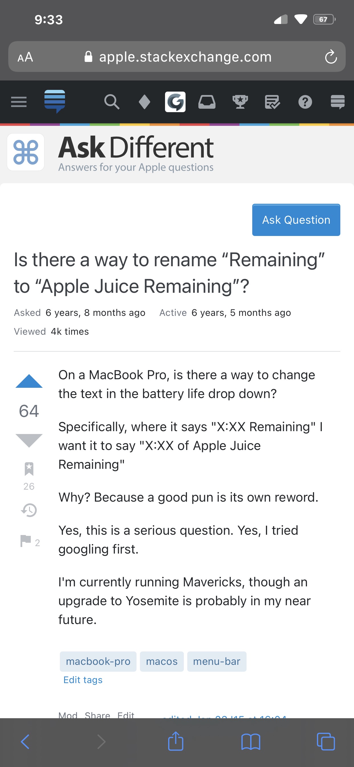
Currently, high volume views still have a unique mobile and desktop view. If you load some questions on your mobile device, chances are it’ll show:
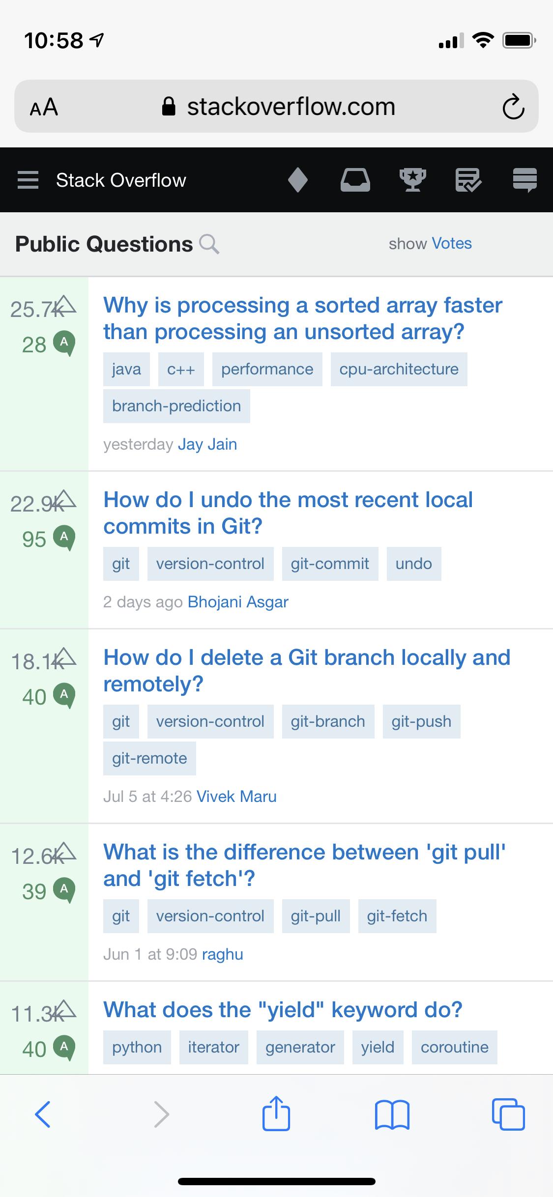
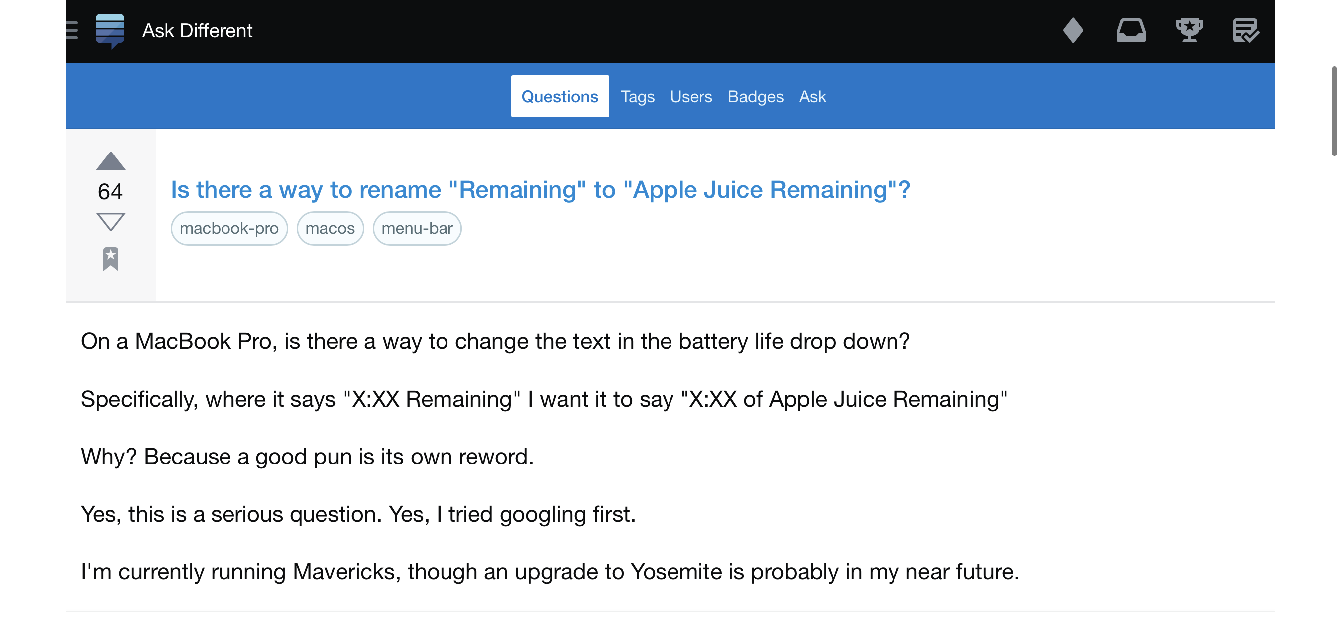
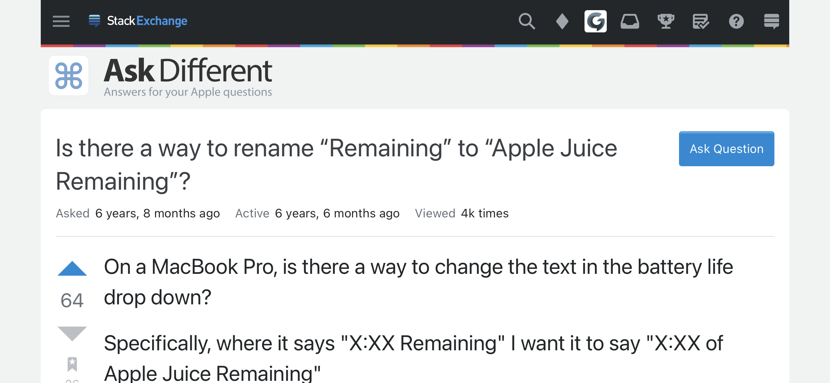
If you’re signed in to our site, and you’ve enabled responsiveness, it looks like this:

Instead of maintaining both of these, we’re going to unship the mobile view and opt everyone into the responsive views by default. Along the way, we plan on improving the responsive views we show.

Tasks

Reduce page weight

One of the benefits of a mobile-only view is that they can be a much smaller page load. This is the result of a mobile-first approach, but often comes at the cost of removing features.

In order to go fully responsive for all users, we’ll need to explore alternate designs that reduce overall page weight for all visitors, while maintaining desktop features on mobile.

For example, as it’s currently built, the footer we serve every user is surprisingly big from a page weight standpoint. We’ll need some design refinements to reduce the amount of HTML we’re serving over the wire while maintaining discoverability and search engine optimization. One possibility is serving parts of the footer asynchronously, only after the user has interacted with it.

Build responsive views where they don’t exist

Other views like user profiles simply don’t have a responsive view yet, since these pages haven’t been invested in recently. We’ll have to figure out how to handle navigation at the smallest breakpoints while maintaining all the desktop features.

Prioritization

You may have noticed that we’ve already killed a few mobile-only views. All the log in and sign up pages are now fully responsive—serving the single responsive view for each. Other pages like /users and /tags have recently switched to responsive as well. We’re going to first convert the easiest, least often visited pages first. Heck, some of these pages even we didn’t know existed.

Then, we’ll start addressing those known page weight issues by implementing light design changes, and refactoring more views to use Stacks components. Once that happens we can start killing mobile views of more highly visited views.

Ultimately, we’ll be leaving views like /questions and the individual question view to the very end. Then, when all mobile views are deleted, each user, regardless of device, will be seeing a single fully-responsive site.

Timeline

We hope to be done with this by the end of 2021. The Stacks team has a few engineers working on this nearly full time. We still have to introduce new features, fix bugs, and ship new versions of Stacks, but it’s something we’re working on in earnest—we don’t plan on setting it aside until it’s done.

We’ll be adding on existing and future mobile-only bug reports and pointing to this post since those views are getting unshipped.

51
  • 60
    “… opt everyone into the responsive views by default” Thank you! I don’t know why, but I run into situations where I get the mobile page every so often and I have to get all the way down to the footer, put on my reading glasses and find the tiny text link for full site which at least usually comes up with responsiveness enabled. Just thinking about the mobile view going away is a QOL improvement for me.
    – ColleenV
    Commented Jul 19, 2021 at 19:43
  • 5
    How "high up" are user profiles on your prioritization? I find that those pages are the only thing I still use the mobile view for, as the responsive design is fully "zoomed out" (for lack of a better term), making links difficult to click and other info different to find Commented Jul 19, 2021 at 19:45
  • 20
    THANK YOU! The old mobile view is horrible to use, and my phone keeps resetting back to the mobile view on certain sites. This is a huge QOL improvement for me too Commented Jul 19, 2021 at 19:50
  • 7
    @cairdcoinheringaahing It'll happen before the question/questions view, but after all the easier stuff. Our prioritization will be influenced by lots of simple but incredibly boring reasons—so not committing too publicly to a specific order. There is a lot of work to get those profiles fully responsive. A majority of the profile isn't built using Stacks components so we need to first refactor, then implement responsiveness, and then finally kill the mobile views.
    – Aaron Shekey StaffMod
    Commented Jul 19, 2021 at 19:58
  • 20
    This is good news. My only complaint is the "unship" terminology; pls take the mobile views into a dark alleyway and return alone, kthnxbye
    – Shog9
    Commented Jul 19, 2021 at 22:15
  • 50
    This is terrible news. The responsive pages are oversized and filled with bloat. Look how on your own screenshot there you can't even show all the icons in the top bar! Until you fix all the glaring issues, please don't remove the mobile design which actually works and is useable. Commented Jul 19, 2021 at 22:46
  • 3
    @curiousdannii the post seems pretty clear to me that the dedicated mobile views aren't going to actually be removed until everything is properly responsive. Some pages just won't default to the mobile view right now. Commented Jul 19, 2021 at 23:36
  • 12
    @TheWanderer The problem is that the "responsive" pages are terribly designed, and waste so much screen space. Commented Jul 19, 2021 at 23:39
  • 3
    @TheWanderer Indeed, but it's hard to feel optimistic when they haven't felt the need to fix it in all the years it's been like this. Commented Jul 20, 2021 at 0:03
  • 8
    Quick, slightly silly clarification - this is for the main sites only right? I'd be quite annoyed if I lost my mobile chat views
    – Journeyman Geek Mod
    Commented Jul 20, 2021 at 0:41
  • 4
    @Luuklag We've raised the limit to 3 for the time being (see the sidebar actually has all three currently).
    – Catija StaffMod
    Commented Jul 20, 2021 at 19:19
  • 11
    "For example, by using Stacks, our designers and engineers get dark mode for free." You mean you charge some people for dark mode?! Genius...
    – TylerH
    Commented Jul 21, 2021 at 16:27
  • 4
    I heavily use Stack Overflow on mobile with responsiveness disabled. I'm really going to miss this view going away, and it will make it much harder for me to contribute via my cell phone. If you're thinking of telling me to use the mobile app...just don't go there :-( Commented Jul 22, 2021 at 9:54
  • 4
    @user59748 the pages are network wide. There's little here that's SO only.
    – Catija StaffMod
    Commented Jul 26, 2021 at 12:14
  • 4
    I know I’m new and I’ve been using the responsive view for like 19 days. Tried mobile view today and I kinda like it. I know most of all the features are in reponsive but I like the mobile layout and how you can see the questions and answers and how they are aligned.!I’m gonna ride it till the wheels fall off
    – Big Joe
    Commented Sep 14, 2021 at 6:43

13 Answers 13

168

Can we increase information density on the responsive site on mobile?

All the padding on the desktop site is fine for a large screen, but there's a lot of wasted space on mobile. This is the single reason I keep going back to the mobile site, as I can see so much more information on screen without having to keep scrolling.

For example:

  • Ask Question is in a weird place, wasting an entire heading height.
  • The name of the site doesn't need to be such a big logo.
  • The text of the question goes all the way to the left edge on the mobile site, but is thinner on the responsive site. I know answers were already shifted over, but it's by less than the responsive site — again, lots of padding causing less content to be visible.
  • The font size is much larger unnecessarily, not just for the question title but the normal body font too!
  • Even little things like the size of the voting buttons or the date/view count being too prominent below the title contribute to less content area.

Overall less information density makes it a pain to use. I can't even see the user profile in this example, let alone two of the comments below the question!

In landscape, everything becomes huge. I can see the entire question body on the mobile site, whereas on the responsive site people on the other side of the room could now read the question from my screen.

Small buttons aren't an issue when they've got an appropriate layout — not everything has to be desktop scaled! If we scroll down a little on the responsive site, we can compare the simple spaced out horizontal row on the mobile site with the compressed columns on the responsive site. Despite the buttons being the same size, it's clear the the horizontal row is preferable to the one that puts ‘delete’ and ‘follow’ just a couple points distance away.

15
  • 43
    Yes, yes, yes please! Leaving the mobile views behind is great, but I would love to be able to maintain the smaller scroll distance and higher information density from mobile on the responsive view.
    – zcoop98
    Commented Jul 19, 2021 at 20:43
  • 23
    Lots of refinements to be had, for sure. We've gotta find a better home for that ask a question button. However, there are some pros to that responsive view regardless of scrolling. We can see some question stats, and we also get a community theme. Our mobile-only views have some tiny buttons for being optimized for mobile. There's a balance for sure. ✌️
    – Aaron Shekey StaffMod
    Commented Jul 19, 2021 at 20:46
  • 41
    @Aaron I understand and I see the benefits, but for me currently the benefits do not outweigh the downsides. I just want to make sure such things are considered before the mobile site is removed completely (I've added another set of screenshots), as these issues have existed for a long time but we've always had the mobile site to switch to.
    – grg
    Commented Jul 19, 2021 at 20:52
  • 16
    Don't forget the obnoxious triple hamburger menus! I'm astonished so many people prefer the responsive design. It wastes so much space. Commented Jul 19, 2021 at 22:50
  • 4
    Yeah, I'm still using the "mobile view" for exactly that reason. Especially when quickly moderating /questions the new view doesn't work quite well. Commented Jul 20, 2021 at 9:21
  • While you make fair points, I honestly don't think it's worth keeping a mobile site. If you can see a little less on the responsive site, scroll. Just slide your finger up the screen and voila! More stuff appears. It's not hard to do. Maintaining an entirely separate site to overcome this "problem" however, that is hard to do. It makes no sense.
    – Vincent
    Commented Jul 20, 2021 at 16:06
  • 6
    @Vincent I’m not at all suggesting keeping the mobile site. I’m asking that the benefits of the mobile site be brought to the responsive site — just some well overdue CSS changes, for when we no longer have the choice.
    – grg
    Commented Jul 20, 2021 at 16:27
  • @grg Ah. My bad.
    – Vincent
    Commented Jul 20, 2021 at 17:11
  • 12
    This is especially true for code blocks. They're even narrower than the post itself, on my phone I can read only maybe 15 characters on each line of code without scrolling horizontally. And when you rotate the phone, all the text scales, so you see the same amount! Commented Jul 20, 2021 at 22:59
  • 2
    @Cris How could I forget about landscape! Added to the answer, thanks. Code blocks also don't wrap on the responsive site, though I suspect people are more split on whether that's a good thing.
    – grg
    Commented Jul 21, 2021 at 5:40
  • 3
    Personally I would like to see a lot less padding/margins on the desktop site, too.
    – TylerH
    Commented Jul 21, 2021 at 16:29
  • There is a lot of wasted space on desktop as well, depending on your resolution. The sides show an awful lot of white for me by default.
    – Mast
    Commented Jul 21, 2021 at 16:53
  • @Mast I can't say that padding is good on large screen either. Problem is, large screens have huge variety DPI that not always properly reported to system and can be changed by user settings, and browsers behind them have variety of quirks related to determining padding "this doesn't work that way because it wasn't guaranteed by spec". WHile targeting mobile users, which mostly would just browse anyway, desktop and mixed platforms users, who actually write most of the answers, get annoyed by too sparse "empty" pages and huge holes between lines of "modern", "material" view of today's fashion.
    – Swift
    Commented Jul 22, 2021 at 6:51
  • @Mast what looks on one combination of browser, screen and modern UI design, looks awful on other. I ran onto website that was designed by someone with 4K screen. ANd that was Support Site of relatively active social network (SecondLife). On my 1080 there 1cm gaps between lines. On his they are 2mm :P While more or less fixed now, the site got still that "a lot of whitespace" look
    – Swift
    Commented Jul 22, 2021 at 6:53
  • If the responsive view was as functional and visually-mature as the existing ‘mobile’ view, people would probably not even notice the transition. As of now, it will be a radical shift for many; see:: meta.stackexchange.com/a/372478 Commented Dec 3, 2021 at 0:54
67

Can reducing the bandwidth of page loads please be made a higher priority?

As I posted 1.5 years ago, one of the key uses for the mobile site was so that users on slow Internet connections (dial-up, 2G, any connection less than 1 megabit/s) could access the site and have it load in reasonable time, while the full site (at least at the time) would take extremely long to load as lots of assets that occupy lots of kilobytes would have to be loaded.

To quote from that post:

Basically, mobile data providers in India offer "unlimited" data, and limit daily usage to between 1-1.5 GB per day. Beyond that, your speeds are reduced to much, much slower speeds (in my case, 64 kbps, which is just a tad faster than dial-up). You might think, you're not likely to use so much data in a day, as you can use Wi-Fi, right? Unfortunately, my relatives and (mostly) everyone living in the suburbs have disconnected their home broadband connections (DSL only) in favor of doing everything over mobile LTE data.

I maxed out my mobile data allowance quite a bit during my trip. While (I'll be honest) I was using the Internet too much sometimes, most of the time it was because I accidentally left some background process running on my laptop (which would be tethered to my phone), partially or fully depleting my allowance early in the day. The responsive site simply would not load over the slowed Internet connection. The mobile site, on the other hand, would load relatively quickly and be almost completely usable on the slow connection. I'd like to be able to access the network even if my connection ends up slowed.

As per the staff answer there:

As I said above, the mobile views are eventually going to be removed. But in so doing, we definitely do not want a regression of functionality and performance for users.

The post mentions slimming down HTML to reduce overall bandwidth consumption. However, has there been any research done on SE's end as to further assets (not only HTML, but also images, sprites, CSS, JS snippets, etc.) that can be slimmed down so they have a smaller file size? This also applies to faster connections, especially those that are limited by overall data consumption, e.g. the 1.5 GB per day limit I mention in the previous post.

Judging from the votes on an agreeing answer, I think this is important for quite a few users. To quote from there:

You don't have to maintain two sites, but you do need to work through what happens on bad connections and make sure everything is still usable. More than just users in India will thank you, this will even be a noticeable benefit to people on good solid broadband connections too!

(Yes, I know the staff answer asked for more details, but I had already left India at the time I posted that, and so couldn't provide them.)

16
  • 9
    Maybe I'm missing it but the question seems to explicitly cite that slimming down the responsive view is necessary and even gives the example of the footer being hefty to download. Is there something about the question that you feel doesn't address this issue?
    – Catija StaffMod
    Commented Jul 19, 2021 at 20:13
  • 6
    @Catija It wasn't clear to me that that was mostly referring to bandwidth, but rather client-side loading (as in CPU performance to render a particular HTML). While there was a reference to reducing HTML size, it didn't say anything about assets (e.g. images), which have a much larger size than HTML (on the whole). Commented Jul 19, 2021 at 20:15
  • 19
    @Sonic Not sure if it counts for all that much, but I work with front end web professionally, and I definitely read "page weight", "smaller page load", and "reduc[ing] the amount of HTML we’re serving over the wire" in the post as referring to bandwidth concerns almost exclusively... in addition, CPU performance for loading web pages just isn't a big concern or constraint in this area; that's an extremely uncommon bottleneck. I totally agree with highlighting this concern though, it's a really major one.
    – zcoop98
    Commented Jul 19, 2021 at 20:27
  • 1
    Most graphical assets on Stack Exchange are SVGs, but some site themes do use PNGs. The SVGs look quite well-optimized already. Some PNGs can still be optimized using tools like Trimage (PNGCrush, OptiPNG, etc.), e.g. the header and footer graphic here on MSE (by 49.5 %, from 31.1 KB to 15.7 KB). But then again, the MSE header background can also be remade as an SVG. Some other PNGs are already maximally optimized. Commented Jul 19, 2021 at 20:31
  • 5
    @zcoop98 I have several old computers running modern operating systems; on such systems, the speed test shows a fast connection, but it takes time because the CPU has to render the page. Also, the staff answer to my prior question mainly talks about that, so I thought Aaron was talking of the same here. Commented Jul 19, 2021 at 20:34
  • 8
    Another thing that can be optimized: raster graphics are often served with a higher resolution to devices with high-DPI screens, which of course requires more bandwidth. Fortunately, there’s a <picture> element supported in all of Stack Exchange’s supported browsers which addresses this issue. Currently, Stack Exchange doesn’t seem to use it. Commented Jul 19, 2021 at 20:43
  • 7
    Back in 2012, I spent a couple of weeks with what was literally a 16-20 kbps connection. While that's extreme, testing against what you might expect to be a reasonably potato connection. There's tools that simulate these IIRC - and might be worth looking at. As a bonus, a fast site on a slow connection is even faster site on a fast connection
    – Journeyman Geek Mod
    Commented Jul 21, 2021 at 2:05
  • @JourneymanGeek Only had a 28.8k modem handy? Commented Jul 21, 2021 at 2:09
  • 1
    Crappy CDMA dongle thing actually. I would not consider this a reasonable baseline in 2021 of course, I didn't in 2012 - but working out what is the worst worth supporting would be a good idea.
    – Journeyman Geek Mod
    Commented Jul 21, 2021 at 2:24
  • 7
    This is a good reason to aggressively block ads! Commented Jul 21, 2021 at 6:39
  • @VictorStafusa If only Chrome for Android and iOS supported extensions...
    – TylerH
    Commented Jul 21, 2021 at 16:30
  • 6
    @TylerH Firefox for Android does, hint hint, nudge nudge.
    – Mast
    Commented Jul 21, 2021 at 16:57
  • 2
    @Mast There are also separate apps that block ads across all apps, such as Blokada, which I use. Commented Jul 21, 2021 at 18:09
  • @Mast Yes, I use it sometimes, but there are things/sites that Chrome mobile just handles better, unfortunately.
    – TylerH
    Commented Jul 21, 2021 at 18:25
  • And if you don't like mobile Firefox, there are Chromium forks which do enable real extension support on Android. Kiwi Browser is one open-source one, although it's usually a couple of Chromium versions behind. @TylerH Commented Jul 26, 2021 at 17:53
32

The switch to opting everyone into the responsive views by default has been long-awaited for me. It was a somewhat frustrating experience to have to scroll to the page footer and click the "full site" button (a button that is really tiny, I'll add) to switch to it anytime the website deities deemed my phone unworthy and stuck me with the mobile-web view. Thank you for this, seriously.

Your continued work with Stacks and making everything fully responsive has really paid off, as operating SE on my phone is kind of a walk in the park nowadays. The review queues, which used to be somewhat difficult to use, are easy to navigate with the mobile friendly changes you made. Various UI elements are simply easier to read in this view than the mobile-web view, not to mention the responsive site just looks better.

Despite this obviously being a very welcome change for me personally, I do appreciate that you're giving us a heads-up and slowly disabling mobile-web pages, and with a sizable amount of time between now and your timeline's end date (~5 months). Thanks for the notice!

5
  • 1
    What browser do you use on mobile? All the ones I am familiar with (which isn't many, granted, just Firefox, Chrome and duckduckgo browser on Android) have a very easily accessible toggle to switch to desktop sites. I haven't used that link in many years.
    – terdon
    Commented Jul 19, 2021 at 20:45
  • @terdon I use Chrome, but awhile ago I had tried toggling on the "Request desktop site" button for MSE and the responsiveness was super hosed, presumably because I didn't use the avenue expected (clicking "Full site"). I went ahead and tried it just now, and the page was super zoomed out and looked kinda bad. I'm using a Google Pixel 3a, FWIW.
    – Spevacus Mod
    Commented Jul 19, 2021 at 20:52
  • 5
    Well, you just blew my mind. I always used the toggle and have simply believed that the whole "responsive" thing is crap. I just tried switching via the link in the footer and it looks so much better, I can't believe it! It had never occurred to me that there would be a difference. It's obvious in retrospect, the mobile browser will be spoofing its ID string and pretending to be a desktop, but I never knew! Thanks!
    – terdon
    Commented Jul 19, 2021 at 20:58
  • 4
    @terdon I'm not certain, but "Request desktop site" likely does something along the lines of emulating a larger display as well. A desktop browser still receives the responsive "mobile" view if you shrink the width enough :-)
    – Ryan M
    Commented Jul 19, 2021 at 21:26
  • 1
    @terdon every time I use that, the browser tells the site my full display resolution and so everything shows at 1440p on a 6" display. Commented Jul 19, 2021 at 23:37
24

Can we please stop redirecting mobile users to the mobile site immediately, rather than waiting until it's completely removed?

Currently, users who browse the site from a mobile device are redirected to the mobile view, and must click an explicit link to access the full site. Worse, the cookie that said link sets has an annoying habit of expiring every now and then, which results in mobile users being suddenly redirected back to the mobile view even if they've clicked to access the full view even earlier.

If the mobile view isn't receiving any more bug fixes during this meantime, it's important that any existing or future bugs not be shown by default to most people. I think it's important that this redirect be removed immediately, rather than delaying it for when the mobile view is removed altogether. This way, such bugs are only visible to those who explicitly access the mobile site.

5
  • 1
    How does this align with your other answer here?
    – Luuklag
    Commented Jul 20, 2021 at 6:50
  • 5
    @Luuklag This is asking for the removal of the redirect, not the mobile site itself. The site should still be accessible manually in the interim period. Commented Jul 20, 2021 at 6:51
  • 2
    So, you are concerned about bandwith, but want people to load the large site first, before giving them the option to switch to the smaller site. I think there are way more elegant solutions here. 1. stop the cookie from expiring, 2. Post a banner on top of the mobile site, redirecting to this post, en the full site view.
    – Luuklag
    Commented Jul 20, 2021 at 7:13
  • 2
    @Luuklag That button need only be clicked once, at which point the mobile view will load for subsequent loads. Besides, if the full site has some of its components downsized, it'll be a moot point. Commented Jul 20, 2021 at 7:14
  • Looking at SuperUsers, the responsiveness is good on "full view" but editing is hopeless without zooming and shifting the page around, so I would hold off switching off automatic mobile view until the responsiveness issues are sorted. See my answer Commented Jul 28, 2021 at 7:10
12

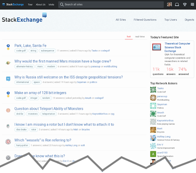
What about http://stackexchange.com (the “Hot Network Questions”)? Its lack of mobile/responsive view is the only reason I still have the ancient Stack Exchange mobile app installed.

For reference, here’s what that page looks like for me:

Cropped Pixel 3 screenshot of stackexchange.com

… clearly not usable.

5
  • 1
    What would you like to use that page for?
    – Luuklag
    Commented Jul 26, 2021 at 11:07
  • 1
    @Luuklag I don’t understand the question. Commented Jul 26, 2021 at 11:16
  • 2
    You say you can't use the page, but to me its a perfectly clear page, even when on mobile without its design being responsive. So what would need to change?
    – Luuklag
    Commented Jul 26, 2021 at 11:20
  • 7
    @Luuklag Just look at the screenshot: the text is unusably small. You can barely read it, or tap the links. In fact, sometimes the font is slightly bigger (so that might be why it seems usable to you). Try going to another page — at least for me, the font size seemingly-randomly switches between different pages. Commented Jul 26, 2021 at 11:23
  • 7
    @Luuklag Mobile friendly sites should be just that. Mobile friendly with links which are clickable and text which is easily read. You compare the mobile friendly versions of the other sites to the image given in this post. Commented Jul 28, 2021 at 6:38
11

Just want to add my support to this decision and thank you for it. For a long time I experienced frustration with this practice of websites serving a scaled-down, feature-limited version of their sites, sometimes obvious by the dedicated URI like m.example.com. Often I tried doing a "request desktop version" and it didn't work and I was stuck with the mobile version. But I have seen a gradual recent move to responsive design instead, just like you're doing, which is good news.

By the way, I noticed that on my mobile in landscape mode (832px X 306px) stackoverflow.com/questions shows a limited version, compared to my tabled in portrait mode (810px X 968px), without being signed in. In other words, the mobile has less horizontal information, even though it's actually wider. I suppose that's one of the issues you're going to fix with this project, as you explained, so thank you and good luck with it!

6
  • 1
    You do know that there is a "full site" link in the footer of every page, right?
    – Luuklag
    Commented Jul 21, 2021 at 9:28
  • 6
    Yes, I do. This wasn't a complaint or a request for help. Just an example of why it is better to make the "full site" the default, and a "thank you" note for doing it. Apologies if it confused or bothered anyone.
    – Nagev
    Commented Jul 21, 2021 at 9:37
  • @Luuklag which is often inaccessible because of "ignore touch" margin on bottom of screen, e.g. in MUI +Chrome, you have to hit into 1mm spot. That margin is there to provide gesture "grip" afaik. Also hitting that link erases whatever you already wrote. By the way on screen larger than 6" there is no need for mobile view, desktop site works perfectly, resolution often is even bigger than average "office" desktop. Maybe there is portable way to determine capabilities of devices. Currently tablets, netbooks and smol phones are in same category.
    – Swift
    Commented Jul 22, 2021 at 6:59
  • You may be referring to Wikipedia. Isn't there an (easy) workaround to avoid the "m." prefix (not a rhetorical question)? Commented Jul 22, 2021 at 14:03
  • No, never seen that on Wikipedia, didn't even know it was mentioned there. I don't know what workaround that is, but I remember trying everything I could think of, manually changing the URI, doing "request desktop version", but it constantly redirected to the "m" version. I am not talking about stackoverflow by the way. I think I had better luck with Edge on my tablet, but I digress...
    – Nagev
    Commented Jul 23, 2021 at 21:58
  • 1
    Meanwhile, some of us love those scaled-down feature-limited versions even on desktops because they tend to load very quickly. Commented Jul 27, 2021 at 11:26
6

(Cross-posted from part of an answer to a different question, as the content is probably more broadly relevant here)


Regarding the removal of the ‘mobile’ site

Before you go ahead with the switchover, please try and make sure the responsive view on mobile has parity with the mature design elements of the existing ‘mobile’ site.

Example:

Here is a page found at random:

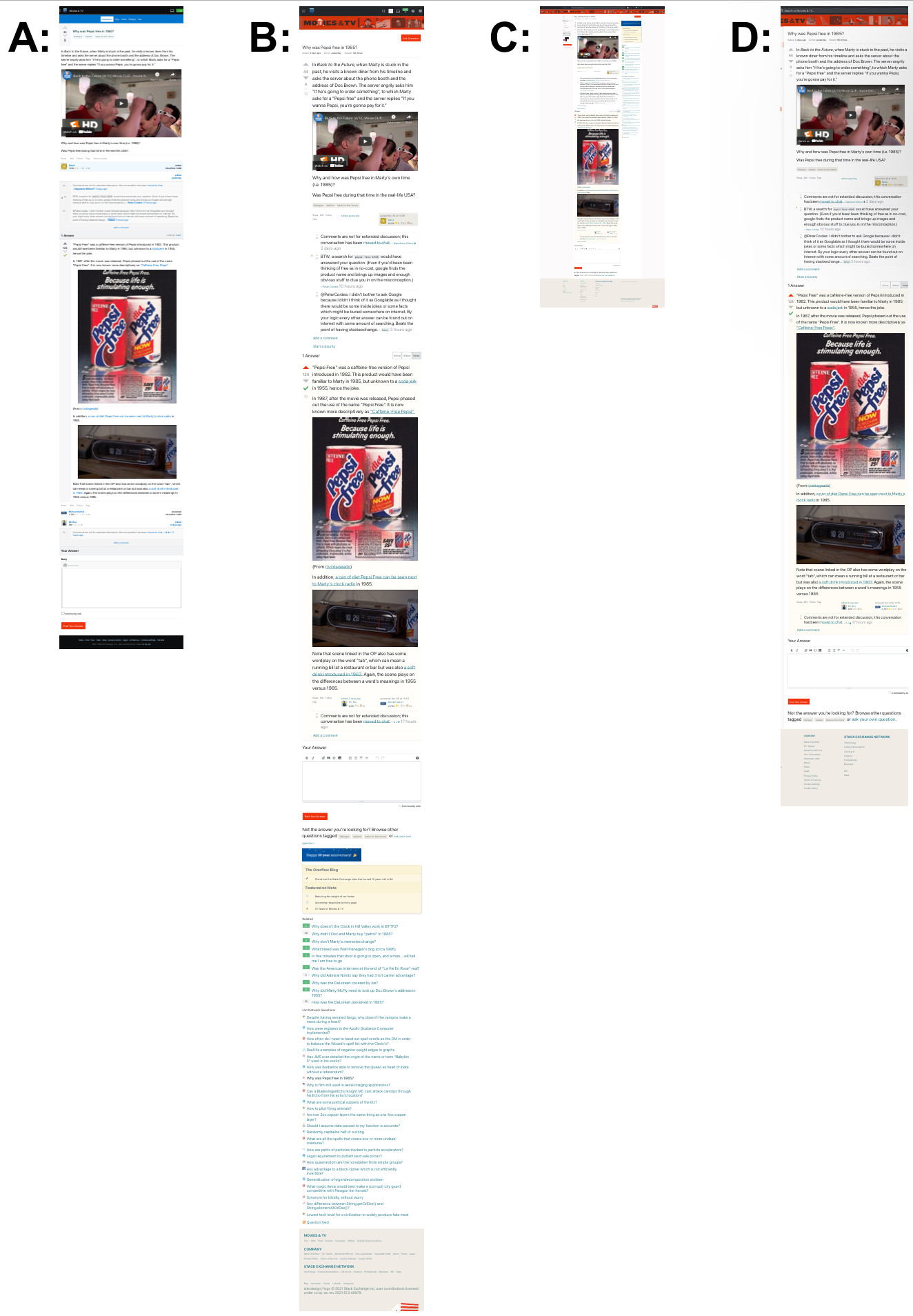
These are screenshots from my iPhone of that page as it appears (as of several days ago), in the deprecated ‘mobile’ view (A) and the ‘full-site’ view in both ‘responsive’ (B) and ‘non-responsive’ (C)/(D) modes (higher-resolution pdf version):

Overview (low resolution due to Imgur 2MB limit)

Notes:

  • Screenshots taken at about 2120 UTC on 2 December 2021
  • (If the links in the images seem small, that is because my little iPhone’s browser is set to to default all sites at 50% zoom.)

Legend (and links to individual screenshots):

* as if a user ‘pinch-zoomed’ until the main content column filled the width of the screen for reading


Differences of note*:

* (besides the obvious and excessive difference in length)

In the existing ‘Mobile’ view:

  1. the answer submission form is at the very bottom of the page
    • is therefore easy to find / navigate to (a touch-screen analogue to “Fitt’s Law”, perhaps?)
  2. the page title is shorter (category excluded?),
    • which makes reading browser tabs
    • or a list of browsers bookmarks / history entries on a narrower screen much easier,
      • especially for longer category names; example browser history with a relatively short category name: browser history snippet
  3. The comments on both question and answers are not optimized for space nor ease if reading
  4. it’s just much shorter and less visually cluttered

Page title variations:

  • A: Why was Pepsi free in 1985 - Movies & TV Stack Exchange
  • B: dialogue - Why was Pepsi free in 1985 - Movies & TV Stack Exchange
  • C: dialogue - Why was Pepsi free in 1985 - Movies & TV Stack Exchange
  • meta.stackexchange.com auto-formatting: Why was Pepsi free in 1985?

Summary

As I understand*, the current plan is that A and the footer link to C will be going away soon.

(I assume that ‘C’, or at least something like ‘C’, will continue to be available by selecting the “Show Desktop Site” option in a mobile browser.)

Is that correct?

* based on what I read elsewhere on this page and on the links below


Related:

6

The current responsive view works fine on my own cellphone, but it's got a pretty nice screen.

What screen resolutions are y'all supporting now that there's no dedicated mobile view (which was pretty good on potato grade screens) and what'll you be testing against?

2
  • 8
    We do our best to support down to 320px, which is the original iPhone SE—my favorite device of all time. Will we support that in n years? Hard to say.
    – Aaron Shekey StaffMod
    Commented Jul 25, 2021 at 15:41
  • 1
    @AaronShekey Good to hear, and thank you for your efforts! Although small things like that iPhone SE (that at least some, including me, are still happily using) have screens that narrow, the current iPad models in landscape orientation also offer pop-up browser windows that look to be about the same width; these optimizations by the SE team will likely have much longer-lasting value, even when discrete devices of that size may no longer exist. Commented Dec 7, 2021 at 16:06
4

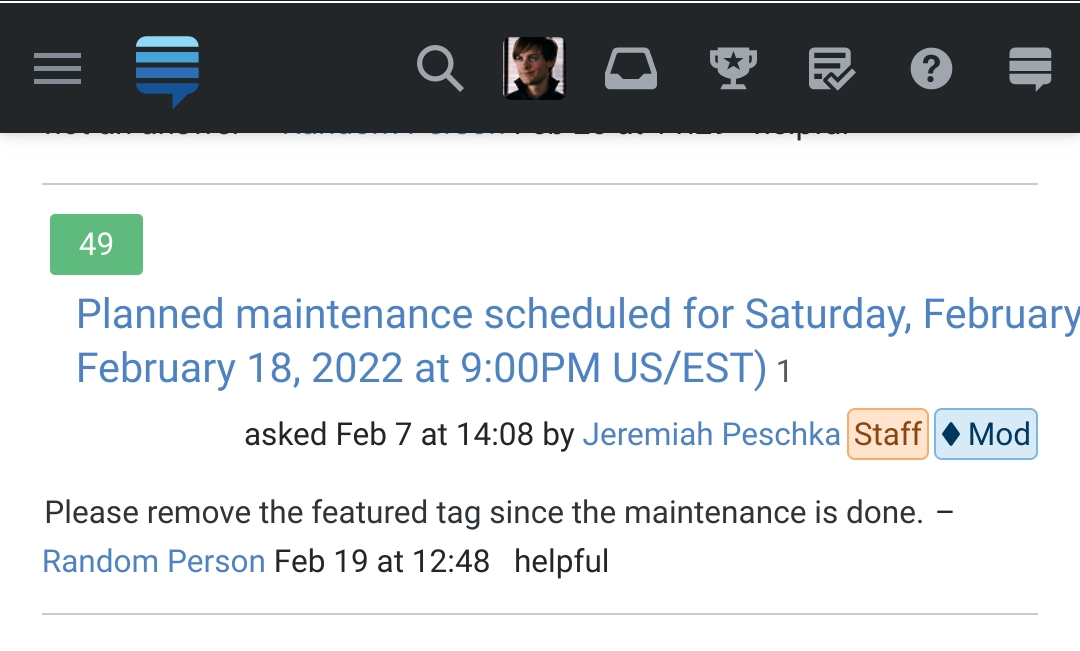
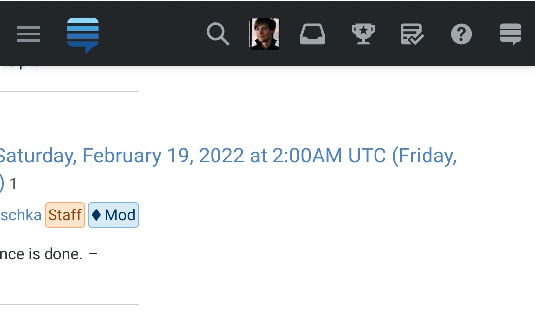
As well as the main Stack Exchange site (https://stackexchange.com/) not being mobile responsive, the meta sites are not quite correct either.

The top bar is not helpful in switching stack sites Meta site top bar on mobiles

Let alone the fact that the main site top bars are more useful

Main site top bar on mobiles

It was commented that per-site metas are on their own domains, (actually they are on their own subdomains aren't they) so you have to click “full site” for each of them. They may be on separate domains or subdomains — as that includes Stack Overflow and Super User — but they are all part of the same company and website (Stack Exchange). Therefore the mobile responsiveness should be the same, surely.

It seems as pointed out by that comment that the suggestion by @SonictheAnonymousHedgehog needs to be applied.

This will also sort out an issue I have just this moment seen, which is that editing through a mobile doesn't give you all the benefits a computer screen gives as you only have the "Add picture" button" available. Having said that, going "full site" on here is not responsive enough with the top bar,

Enter image description here

and you can forget about editing a post!! Editing a post here even, switches mobile responsiveness off. Clicking disable responsiveness link at the bottom then clicking enable responsiveness does nothing with either click.

Looking at Super User, the responsiveness is good on "full view", but editing is again hopeless without zooming and shifting the page around, so I would hold off switching off automatic mobile view until the responsiveness issues are sorted.

1
  • 5
    Per-site metas are their own domains, so you have to click “full site” for each of them, too. Commented Jul 28, 2021 at 6:29
3

Please improve the way flag history page looks like in mobile.

The fact that we can scroll horizontally in the page makes the UI look ugly.

enter image description here

enter image description here

1
2

Cookies are used for keeping us logged in on all various subdomains are they not?

Why not add "full site" to the cookie so that it can be applied to all subdomains while deprecating mobile views?

That way the same user experience is given in all the SE sites, you are not having site specific cookies for each "full site" setting, and you are reducing cookie usage.

3
  • It is a cookie already, a site specific one that is.
    – Luuklag
    Commented Jan 15, 2022 at 13:27
  • Yes @Luuklag but as I pointed out the cookie which is used to keep us logged in to all SE sites could lock the "full page" setting for all sites could it not? That way you are not having site specific cookies for each "full site" setting, reducing cookie usage. Commented Jan 15, 2022 at 16:10
  • 3
    We're not exactly going to spend time expanding a feature that is about to be removed. Hopefully within the month.
    – animuson StaffMod
    Commented Jan 15, 2022 at 16:57
2

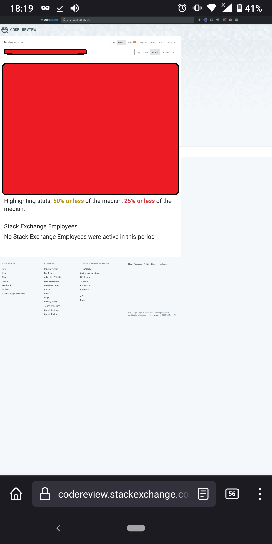
Is it possible the admin panel has been forgotten (or simply not gotten around to yet) in the overhaul? This is what it currently looks like (after redaction) on mobile:

Admin panel

Page displayed: *.stackexchange.com/admin/

Firefox 95.2.0, Android 10 on a 6" 2160x1080 display.

1

On March 2, 2022 we removed the Mobile button from the footer. This means the mobile views are removed entirely from Stack Overflow

That is not true, here is a screenshot:

mobile link in footer of chat

This was taken now, in the chat, which is part of Stack Exchange.

So please at least don't mark this as completed as long as parts of Stack Exchange still use the mobile theme and let the users switch to it.

4
  • 2
    Chat isn't included. The chat mobile view isn't being removed.
    – Catija StaffMod
    Commented Mar 3, 2022 at 12:43
  • @Catija I thought switching to mobile view in chat would also change to mobile theme on main, but after gathering my courage and actually trying it out, turns out that's not the case, so it's less bad than I thought. Still, would be nice if the announcement (i.e. the question here) would be edited to clarify it is all applying only to the Q&A sites, not to chat. Commented Mar 3, 2022 at 12:54
  • I think, currently, we shouldn’t bother with reporting bugs on Area 51, Chat, and Stack Exchange. These sites / pages are severely outdated and need an overhaul anyway. Commented Mar 3, 2022 at 13:01
  • @SebastianSimon sure, and it's not like bugs reported on the main Q&A sites are fixed... rate these days is 1-2 fixed, at most, per month. Not really encouraging people to keep reporting bugs. Commented Mar 3, 2022 at 13:35

You must log in to answer this question.

Not the answer you're looking for? Browse other questions tagged .