Update
As of 2021-10-21T18:05:38+00:00 this is now live across the network. If you find any issues, you can post them as answers on this question. Try to give some details about your browser and platform if that’s relevant. Thanks for all the feedback so far!
Original Post
We’ve been chipping away at the user profiles since the last round of changes. I’m back to share a quick video tour of the final round of changes to the profile on our way to responsiveness. We’d like to deploy these changes later this week, but first wanted to let folks know what we’ve got planned.
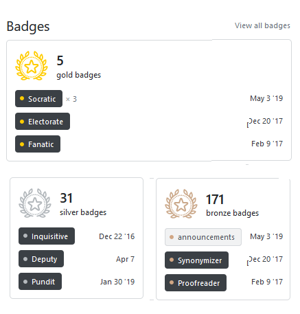
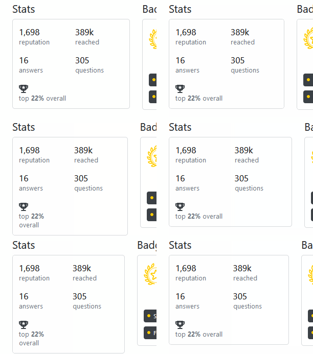
Things should now wrap and squish, allowing you to view the entirety of the profile on any device or window size without having to do any horizontal scrolling. Let us know what you think.
We’ll update this post (and title) when the changes are live. They’ll be going live network-wide.
Some changes
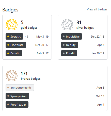
- Columns should all line up and have a spacing of 24px. No more weird gaps!
- Headers across each section are now unified along with their various calls to action
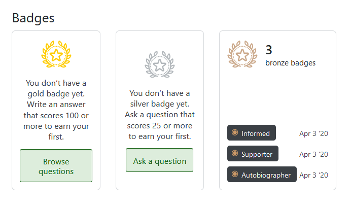
- Each section now has a card aesthetic
- Question lists have all moved over to the right column to unify line length and general aesthetic
- The tags section is now a list
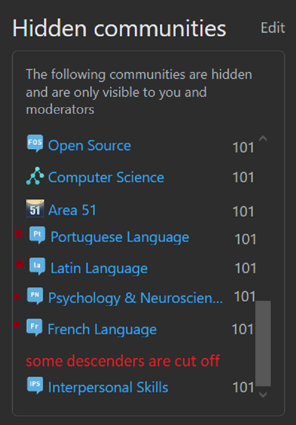
- We’ve gotten rid of some of the blank slates. For example, if you don’t participate in the network, we don’t need to show the network.
Screenshots
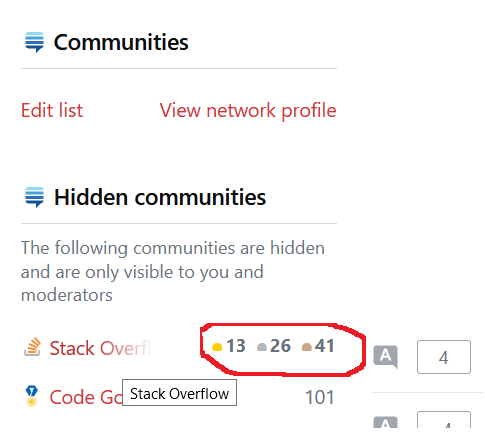
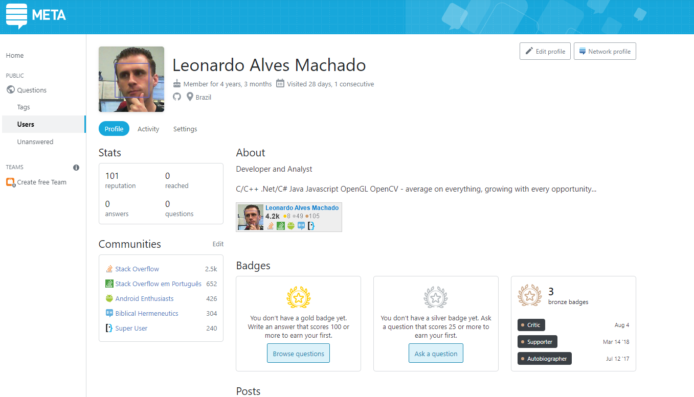
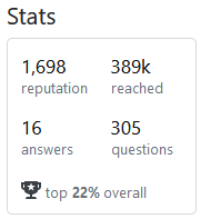
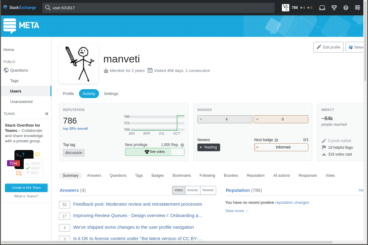
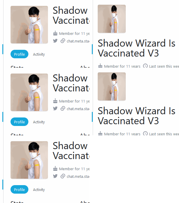
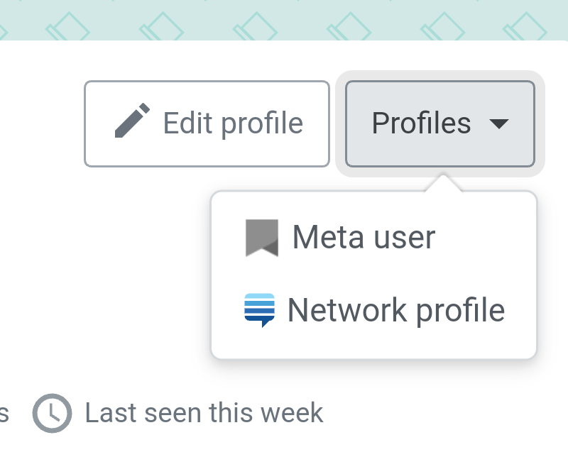
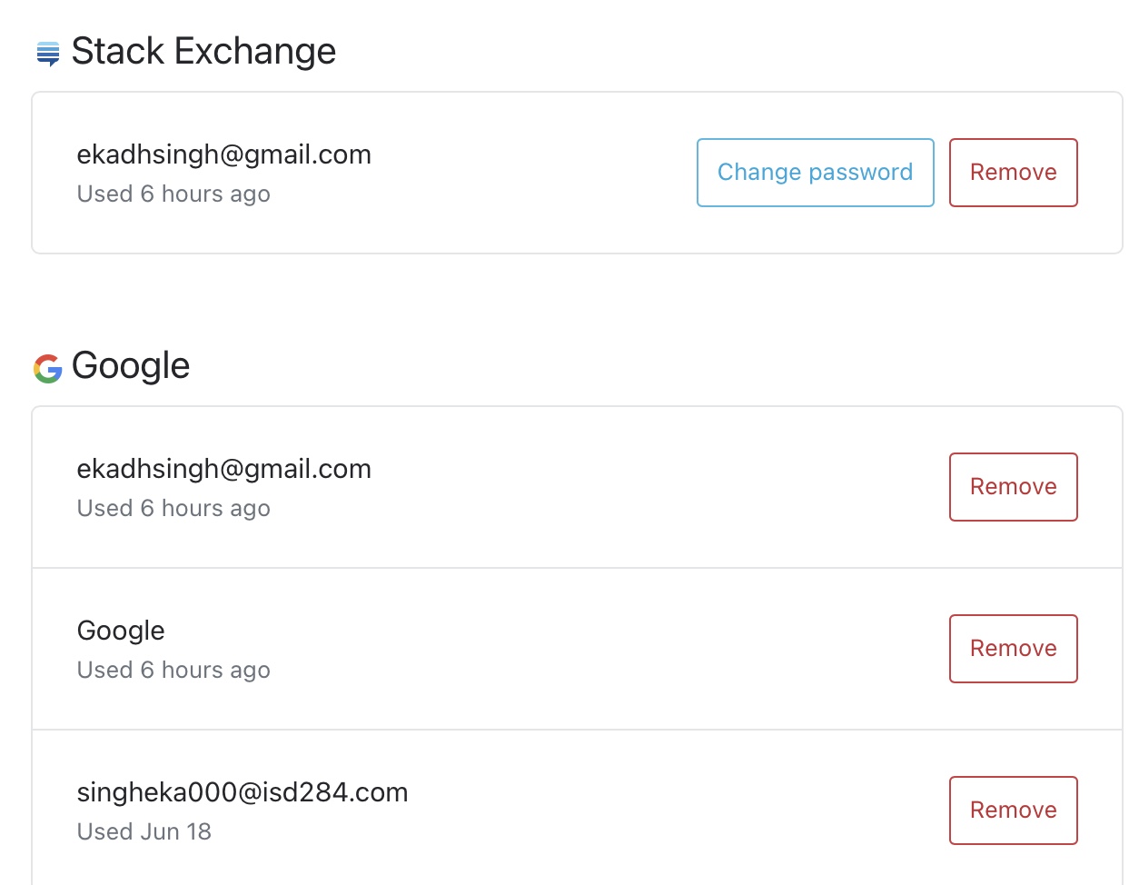
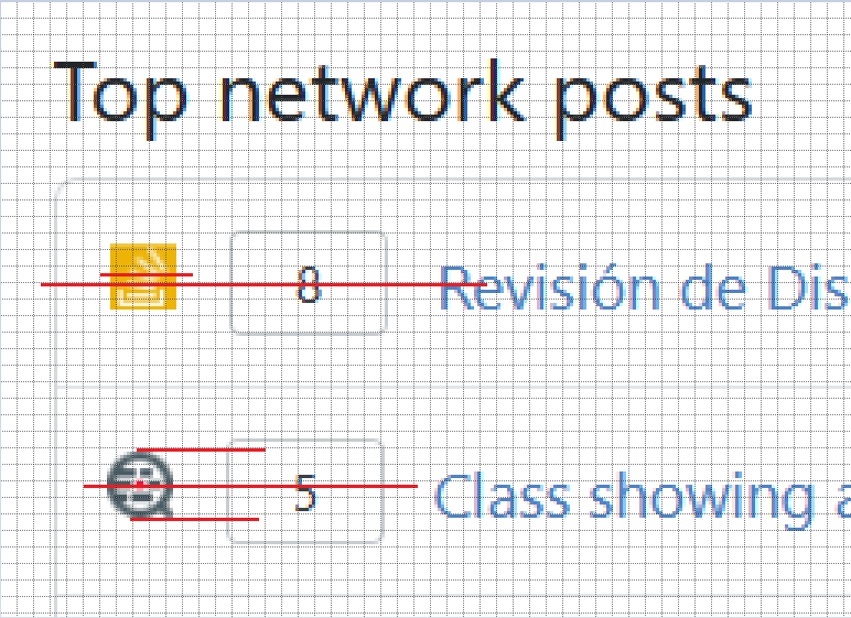
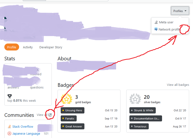
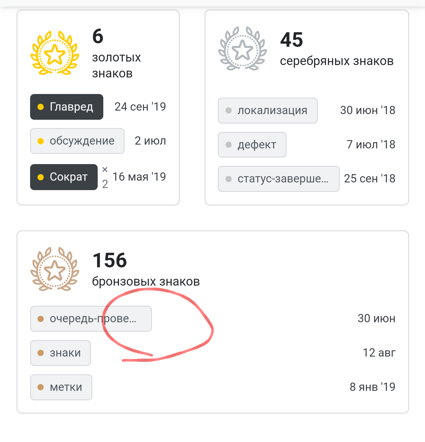
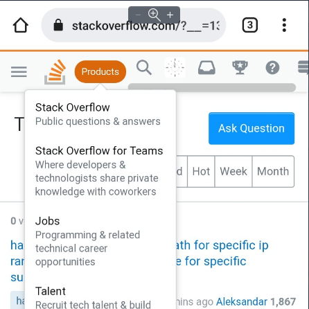
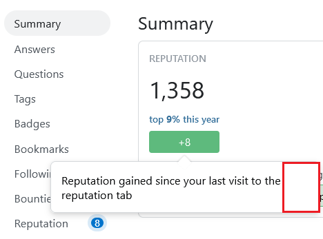
If you want to see this in action, check out the video tour. Since the feature is live, the screenshots below are linked, rather than embedded, to reduce the amount of necessary vertical scrolling on the page.








messWithOllieboolean must have been set totrue😜 Sorry about that. We've actually been making some changes that should be unrelated there, but I've let some folks know to keep a look out.