96

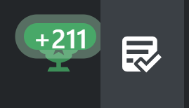
I don't normally care much about these things, but the new fuzzy outlines (and related changes) on the numbers of unread messages / rep delta really hit my eyes wrong (and my eyes are already challenged enough, thanks). It's not a "who moved my cheese" thing, it's an "it's much harder for me to read it now" thing.

For those who, like me, have a tendency toward double-vision or focus issues, please consider an option for plain numbers without the outline (for these and for other places you might be considering adding such an effect). Or just remove the fuzzy outline entirely. (Is it really an improvement for people with "normal" vision in some way?) Specifically, an option that:

  • Removes the fuzzy outline - Done!
  • Restores the original slightly-larger size - Done? Looks like it's 11px now, and was 11px in February's stacks.css, so...maybe hadn't changed? The screenshots seem like it had, but...
  • Removes the bolder font style - Done? Similarly looks like it's 600 now and was 600 in February's stacks.css (but again, seemed to have changed)
  • Restores the larger margins (and makes them consistent again) - Still needs doing

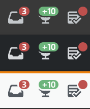
New harder-to-read numbers - light:

Notifications bar with fuzzy ring around numbers - light

Dark:

Notifications bar with fuzzy ring around numbers - dark


I should note that it's not just fuzziness, though that was what I focused on (no pun!) in my original post. A couple of pictures from Justin's post below draw a clear contrast (er, again, no pun):

Old design:

number with square background and decent margins

New design:

smaller number with round background, fuzzy effect, and smaller inconsistent margins

I'm not a designer, but:

  • The numbers are actually a bit smaller
  • They're a bit bolder (font, not just color), making them (for me) harder to read
  • The margins are much more narrow, defeating the contrast of the number with what's behind it, again making the number harder to read
  • The top/bottom margins are inconsistent
  • The numbers are crowded by the more-circular border radius
13
  • 4
    Related question: Idea behind new top header icon color. Should I be posting this as an "answer" there? (We normally only do that on announcement posts rather than others' questions, right?) Commented Mar 30, 2022 at 10:11
  • 5
    Guess you are out of luck with that given it's a part of the Stacks redesigned topbar... FYI, folks, Stacks is open-source, so we might just as well create issues for feature requests directly on the repo - at least that gives them a chance of being noticed: github.com/StackExchange/Stacks/issues
    – 0Valt
    Commented Mar 30, 2022 at 10:15
  • 21
    100% agree, this looks utterly horrid. The faint outline achieves nothing other than make it harder to see,
    – Stu
    Commented Mar 30, 2022 at 10:27
  • 6
    The white icon on black background is pretty distracting too, not to mention the ugly rounding of the indicator, uneven spacing… the old design was way better. Commented Mar 30, 2022 at 10:31
  • 11
    Hard to believe this went through UAT and got a thumbs up!
    – Stu
    Commented Mar 30, 2022 at 10:41
  • 4
    Meanwhile, things (even small things with big impact) that would help the biggest site in the network go undone. Commented Mar 30, 2022 at 11:37
  • @T.J.Crowder Snippets? SE will sunset it when it will become too much of a burden. Business, so money is first priority. (i.e. when it cost too much to maintain something, and that something has no income, it's time to just get rid of it) Commented Mar 30, 2022 at 12:10
  • The top and bottom margins being inconsistent has already been reported here: New responsive Activity page. It’s specific to the Segoe UI font having a lower baseline and it’s supposed to already be fixed. No repro with Liberation Sans, which is what my Firefox on Arch Linux happens to use. Commented Mar 30, 2022 at 12:46
  • 1
    Quick, someone upvote me so I can test! :P - In all seriousness though, I agree. I do like the lighter colour of the buttons, but reducing the size of the fuzzy border around the notification, and increasing the padding inside the actual notification div would be a lot better.
    – Robotnik
    Commented Mar 30, 2022 at 22:41
  • 1
    Looks like they removed the fuzzy outline.
    – Justin
    Commented Apr 1, 2022 at 19:19
  • 1
    W000t!, normality is restored 🎉🎈. Maybe it was an early April fool after all.
    – Stu
    Commented Apr 1, 2022 at 19:28
  • 1
    @Stu not yet, when there are notifications, still bright white. And small text. Commented Apr 2, 2022 at 18:08
  • 4
    Are you guys just bored? It seems like all sorts of unrequested UX features have been added to StackExchange with little to no warning and no clear benefit.
    – David L
    Commented Apr 3, 2022 at 17:28

5 Answers 5

70

I see only disadvantages to this design. The semi-transparent border only takes up space, making the badge look larger while providing even less room for the content. The numbers are really squished into the small area, they should have at least some margin to the borders. The transparency also has quite different visual effect on the white and black versions of the top bar, making it hard to create a version that works on both.

So the numbers are harder to read because they're squished into a small core badge, and the icons are also harder to see because the semi-transparent part overlays a larger part of them. This combines the disadvantages of smaller and larger badges while providing none of the benefits of either.

It also just looks plain weird to me, I've never seen a badge/notification design like this. The old version was much better.

On a black top bar the red outer layer is almost invisible, this makes the design look extremely inconsistent if you have both red and green notifications:

enter image description here

9
  • 8
    I suppose it could be worse (just) - thankfully it doesn't animate, slide, bounce, glow, pulse..... yet.
    – Stu
    Commented Mar 30, 2022 at 10:37
  • 10
    @Stu - Move your mouse over the inbox when you have an indicator. :-D Commented Mar 30, 2022 at 10:38
  • 8
    I'll get my coat.
    – Stu
    Commented Mar 30, 2022 at 10:38
  • 2
    @Stu Don’t give them ideas. Commented Mar 30, 2022 at 10:39
  • 8
    @user3840170 Don't worry, they are perfectly able to invent such torture devices all by themselves. Rememberer this pulsating blue dot from Documentation? The memory still hurts! Commented Mar 30, 2022 at 10:48
  • @samcarter_is_at_topanswers.xyz Thankfully I don’t, because I have never visited Documentation. Commented Mar 30, 2022 at 11:28
  • @user3840170 Lucky you! Commented Mar 30, 2022 at 11:28
  • 2
    I think the folks involved in making this change should take note of the use of white glow on BadHTML and consider whether they might have been trapped in the monkey house for too long. Just because modern CSS allows you to do something doesn't mean you should do it. I've always wondered the rationale behind red notification indicators though. Why not blue like the logo so we can get that serene nature feel instead of that traffic light vibe? We have couple shades of blue, and some green, red, yellow, and orange on a single page. It looks like source code highlighting.
    – ColleenV
    Commented Mar 31, 2022 at 17:12
  • Still not fixed, and the nav bar icons are too bright IMHO.
    – einpoklum
    Commented Apr 9, 2022 at 20:34
52

Yes, it would be great if these changes could be reverted back to the previous design. The reputation text appears smaller than before (probably because it's crammed into that capsule layout), and makes it harder to see. I've got eye problems, and this just made it worse.

Also, the red outer layer for the inbox notification indicator is pointless if the top bar is in dark mode, because it's practically invisible. Please consider changing it back.


Previous design for reference:

New design:


Also, note how the highlight(?) (when you hover over the review queue icon) cuts a small part of the trans[lucent]/[parent] border (on the right side) of the reputation indicator:

enter image description here

This is not the case on the left side (when you hover over the inbox notification icon).

4
  • 2
    @T.J.Crowder: I added a previously saved screenshot for your reference :)
    – Justin
    Commented Mar 30, 2022 at 11:24
  • 1
    Thanks! Sure enough, slightly smaller. And just wow, side-by-side like that, the change is even worse looking. Unbalanced margins, much too small margins for the contrast level, etc., etc. Commented Mar 30, 2022 at 11:34
  • 1
    I brazenly stole links to those images and used them in the question. :-D Commented Mar 30, 2022 at 11:55
  • 1
    No worries; It deserves more attention in the question than in the answer.
    – Justin
    Commented Mar 30, 2022 at 11:56
25

I'm not getting any younger, and after years of working in front of a PC screen my eyesight isn't getting any better.

Personally I think the fuzzy edges make the icons harder on the eyes.

1
  • @mirabilos SE's designers are really good, but I think they're trying to innovate elements that were already close to optimal - so improving on the existing solutions just isn't easy. In this case I think the elements look more stylish, but it just isn't working so well visually.
    – bad_coder
    Commented Mar 30, 2022 at 21:05
20

It looks somewhat better if you add this custom stylesheet:

.s-activity-indicator {
  box-shadow: none
}

.js-achievements-button .s-activity-indicator {
  border-radius: 3px;
  padding: 4px;
  height: auto;
  top: 4px !important;
}

.js-inbox-button .s-activity-indicator {
  height: 18px;
  width: 18px;
  padding: 4px;
  top: 4px !important;
  text-align: center;
}

enter image description here

I'm not too proficient in CSS so tips are welcome.

2
  • 23
    Thanks, could be a useful workaround hopefully in the short term. I'm really not keen on users have to do things like that for basics like this, though. Commented Mar 30, 2022 at 11:00
  • 1
    I'd really like to have these changes implemented so that the people who want the new style would be made to use custom CSS to get them, instead of the other way around... (I was going to put a smiley here, but I'm not smiling, actually.)
    – ilkkachu
    Commented Mar 30, 2022 at 16:29
13

We've made some changes to the design and removed the box shadow (referenced here as "fuzzy outline") around the notification indicators.

We were originally using our unmodified activity indicator component for these indicators. We use these indicators a bit across the site to designate things like "new activity", but this is the first place we're using them over text and with numbers inside. We reviewed the context in which these are used and came to an agreement that the semi-transparent box shadow makes the layout a bit busy/distracting/confusing.

We went back to the old design a bit, which handled this context better. Technically, we didn't remove the box shadows, but made them the same color as the background they sit on. This gives the indicators a bit of extra visual weight as they "carve out" the area around them.

We're currently reviewing other improvements to this component, such as possibly increasing the padding, to improve the user experience.

7
  • This is a pretty good approach, the "carved out" appearance works well. Commented Apr 5, 2022 at 20:14
  • 1
    This is a huge improvement; thanks for listening to feedback here! I definitely think you need to expand the padding a bit more (or reduce the border radius to make it less rounded)—the numbers are still constrained to too small of a space to be easily readable. If you're worried about available space, perhaps the "+"/"-" sign on the reputation indicator could be made smaller? I know that's a bit tricky, because now you need multiple <span>s, each with a different font size, but it might help buy enough space to add padding. This is a readability issue, so can't be discounted as preference.
    – Cody Gray
    Commented Apr 6, 2022 at 4:44
  • 4
    Honestly have to say, though, as happy as I am that you're willing to listen to feedback, and still iterating and working on improving upon this, it's frustrating that this (and other bug fixes) had to be done after it had already been released to production. This should've been staged/trialed for evaluation, and then we could have provided this feedback to you much earlier, you could have iterated on it before launching, and saved yourself and us a whole lot of frustration, embarrassment, lost time, etc. Please seriously consider setting up a testbed/staging area for future UI changes.
    – Cody Gray
    Commented Apr 6, 2022 at 4:47
  • 1
    Thanks for what you've done so far! Definitely an improvement. Also definitely still needs more room around the number to be readily legible. Thanks for your last point that you're still working on that. Commented Apr 6, 2022 at 7:38
  • 1
    Could you guys please consider increasing the amount of padding around the numbers - or revert to a square shape? it feels half-done and cheap with the borders crowding the numbers this much Commented Apr 6, 2022 at 19:25
  • So this is better than what it was - but what about it actually needed changing? As it currently stands the almost completely circular edges now encroach on the white-space around the digits making it look cramped and less-clear than previously, and worse, the digits are not aligned vertically, having uneven padding top and bottom; it's also not in keeping with the other design elements that have only a very small border rounding, or the bounty figures that still retain the better square container.
    – Stu
    Commented Apr 6, 2022 at 21:25
  • I don't understand why you insist on doing things this way. When there is a near-consensus that a design change is wrong and bad, you should first revert it, then discuss the change, or tweakings of that change, before re-introducing it.
    – einpoklum
    Commented Apr 9, 2022 at 20:33

You must log in to answer this question.

Not the answer you're looking for? Browse other questions tagged .